Category
Print
Date: 27 Dec 2012
Comment: 0
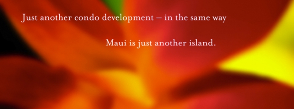
Papali Wailea
This unique development of 24 single-family homes in Wailea, on the island of Maui, needed a marketing and design program to set it apart from the more typical condominium residences in the area. The project began with the development of the name, Papali (“gentle slope” in Hawaiian), which reflected the site’s landscape and sweeping views of West Maui. A complete kit of materials for brokers and prospective buy
Read More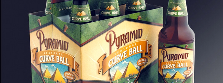
Date: 27 Dec 2012
Comment: 0
Pyramid Breweries
Brand-building through packaging development, advertising and promotional collateral, as well as defining the brand experience within the Alehouses, has helped Pyramid Breweries deliver a consistent customer experience, seamlessly connecting the brand from 6-pack to table. RMB Vivid has created a diverse range of products and experiences for Pyramid, from Curve Ball summer ale point of purchase materials to surface t
Read More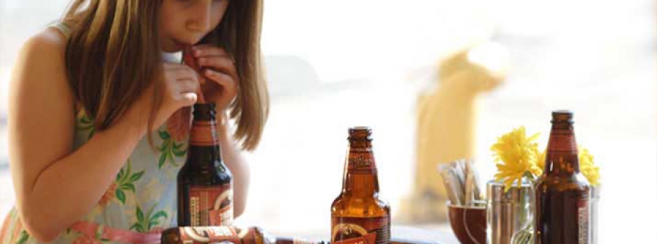
Date: 27 Dec 2012
Comment: 0
Thomas Kemper
Thomas Kemper has been craft-brewing each soda from scratch for over a decade. RMB Vivid repositioned their brand messaging and package design to reflect a hardworking, craft-brewed aesthetic, creating a greater visual connection to the soda-making process. Natural textures, warm colors and layered graphics evoke the sodas’ earthy aroma and sweet creamy taste. Our ongoing work for Thomas Kemper has included spe
Read More
Date: 27 Dec 2012
Comment: 0
Vulcan
RMB Vivid designed a comprehensive corporate identity and signage project for Paul Allen’s Vulcan Inc. The company, formerly known as Vulcan Northwest, was renamed to reflect its growth from a local company into a global presence. RMB Vivid distilled Vulcan’s culture and vision into a meaningful and memorable brandmark and identity system. The mark was designed to be easily reproduced in any media and was
Read MoreDate: 27 Dec 2012
Comment: 0
Martin’s Point
Martin’s Point is a progressive, not-for-profit health care organization that strives to provide the best possible health care experience. They recently acquired several other organizations to expand their offerings and were in need of aligning all the brands to their singular mission. RMB Vivid guided the overall brand architecture transition and designed a wide range of materials from the new logomark to establishi
Read MoreDate: 27 Dec 2012
Comment: 0
Enso
The 130-unit residential component of this mixed-use building in South Lake Union required a comprehensive program highlighting its evolving location, thoughtful Northwest styling and LEED-targeted design. The name Enso came from a calligraphic symbol meaning enlightenment and strength, represented by the open O letterform in the logotype. We used recycled paper, warm neutral colors with rich highlights, natural text
Read MoreConnect
Copyright 2024 RMB Vivid