Enso
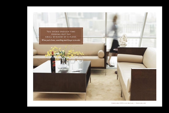
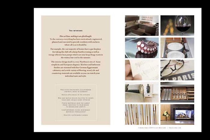
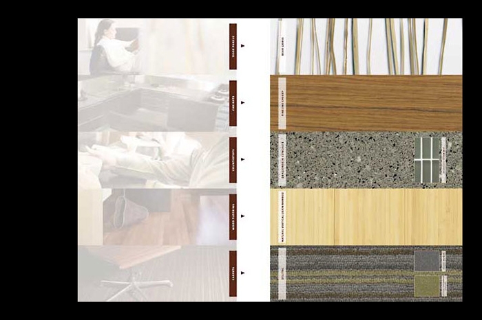
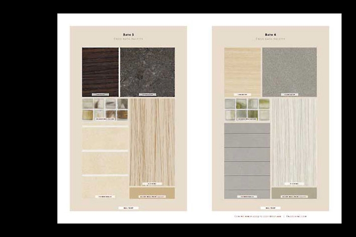
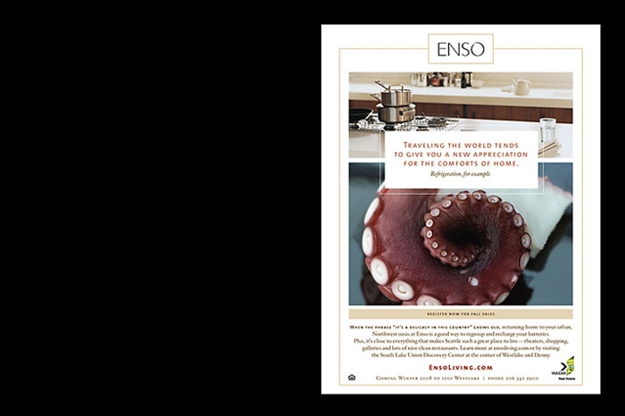
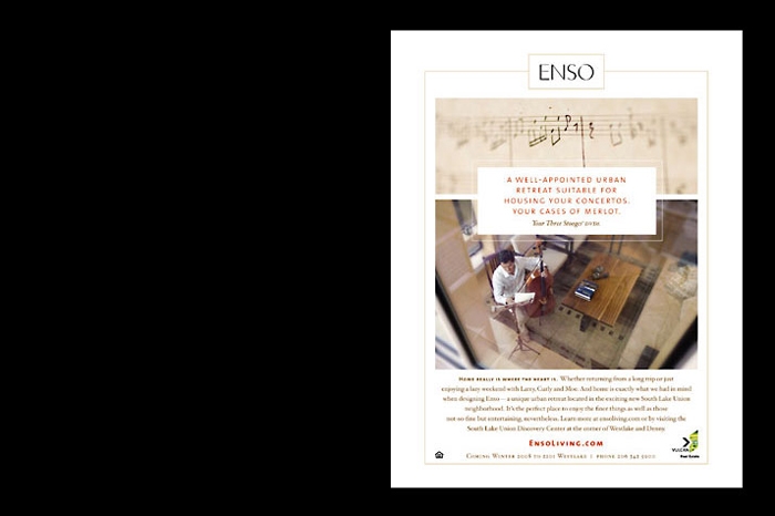
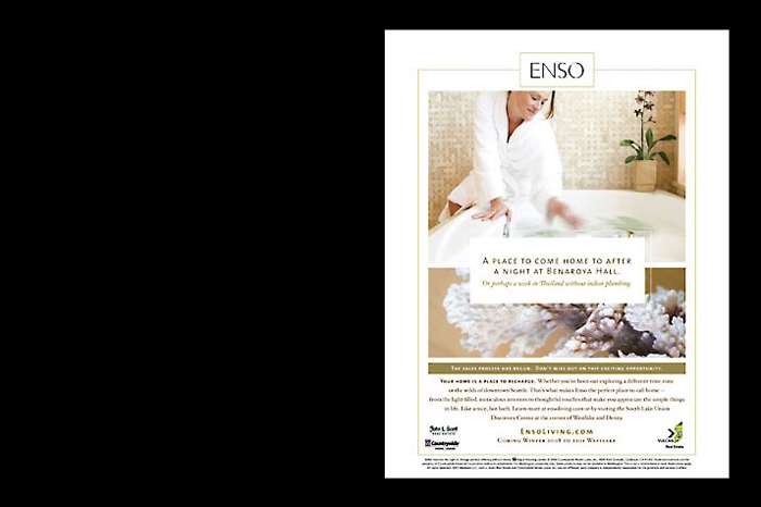
The 130-unit residential component of this mixed-use building in South Lake Union required a comprehensive program highlighting its evolving location, thoughtful Northwest styling and LEED-targeted design. The name Enso came from a calligraphic symbol meaning enlightenment and strength, represented by the open O letterform in the logotype. We used recycled paper, warm neutral colors with rich highlights, natural textures and soft, light-infused interior photography in Enso’s collateral to emphasize the concepts of sustainable living and urban retreat. The Enso story extended to a sales kit for prospective buyers, marketing brochures, advertising, signage, and a website and presentation center.
view related interactive →
Client:Enso
Category :Print
Connect
Copyright 2024 RMB Vivid