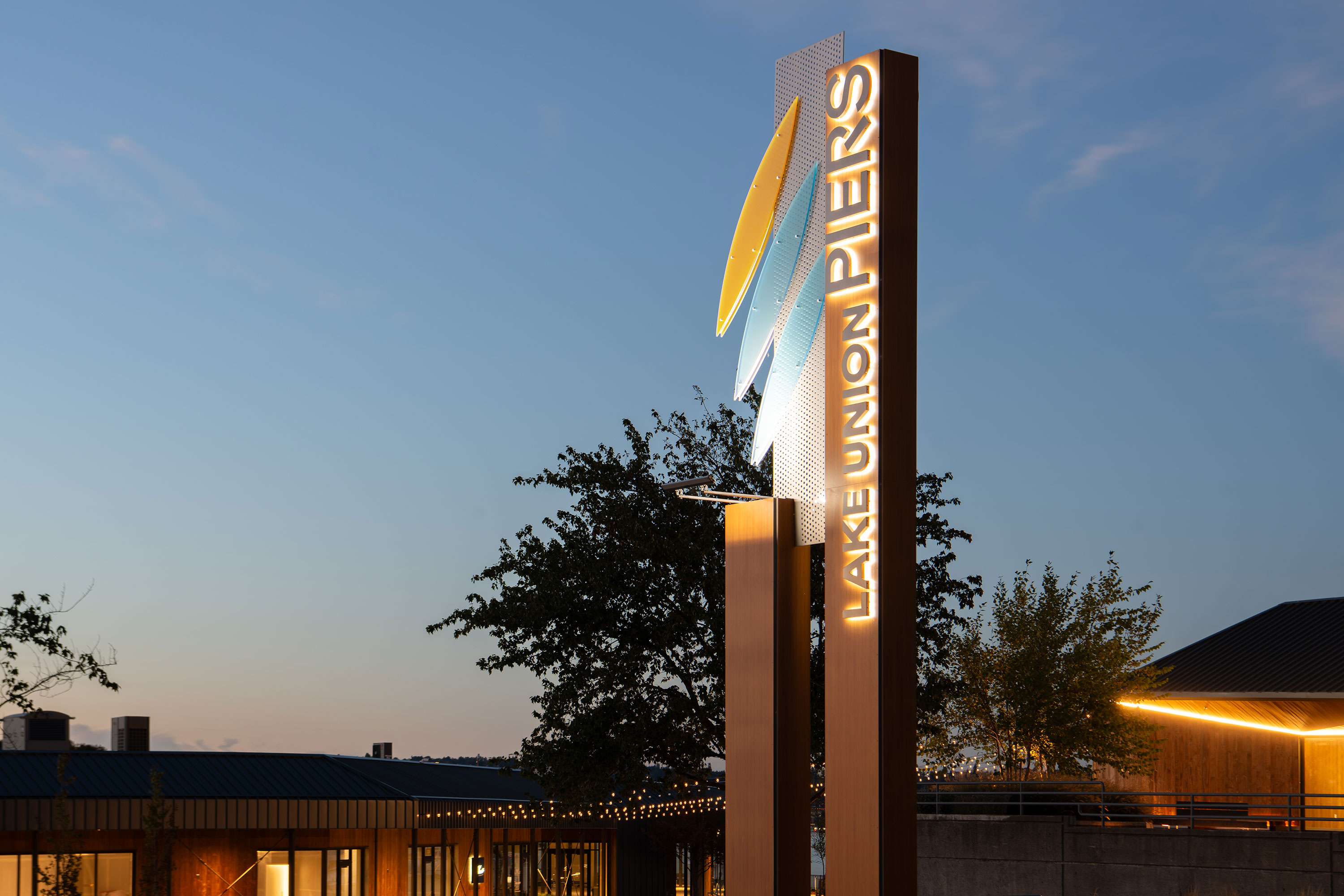
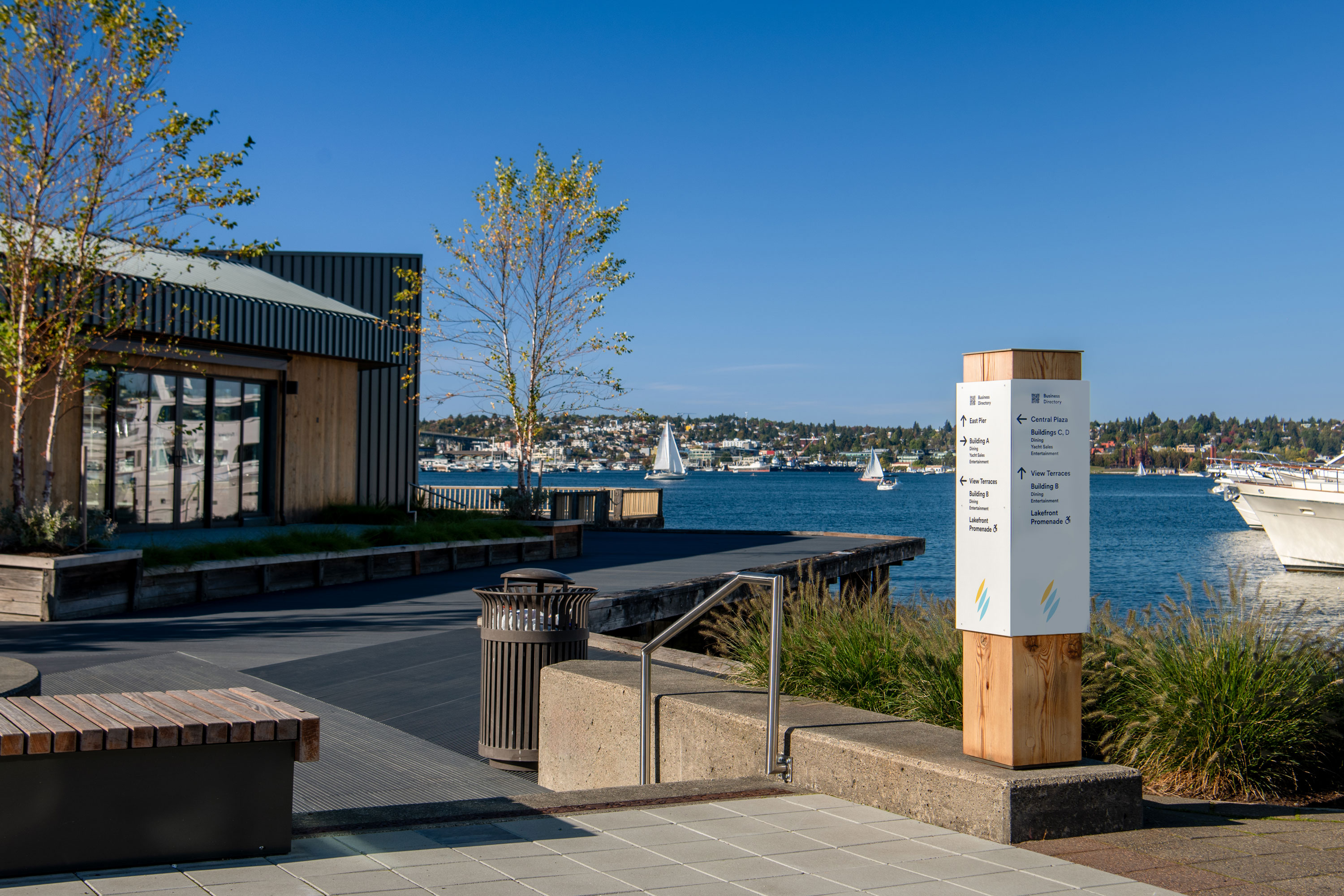
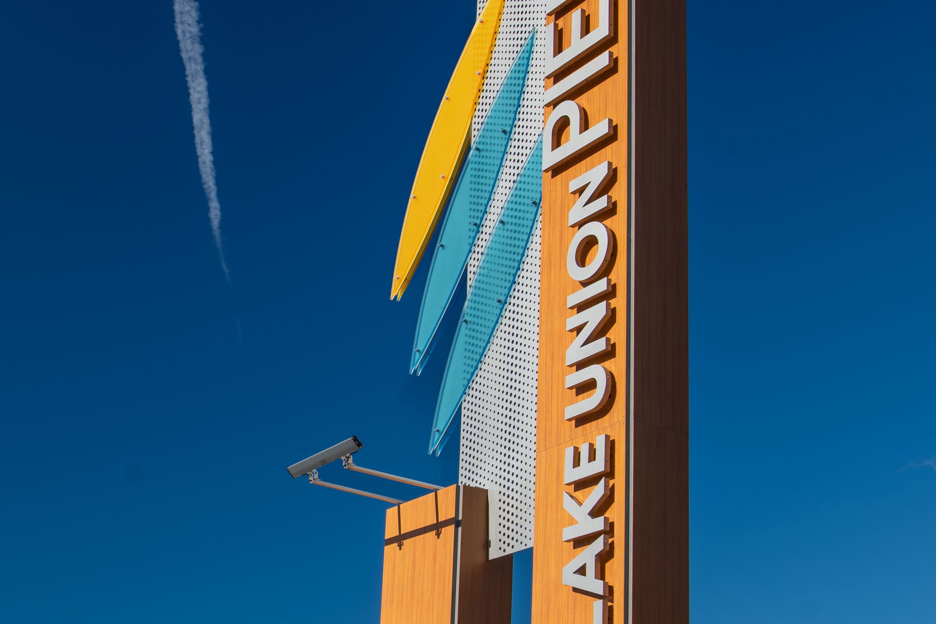
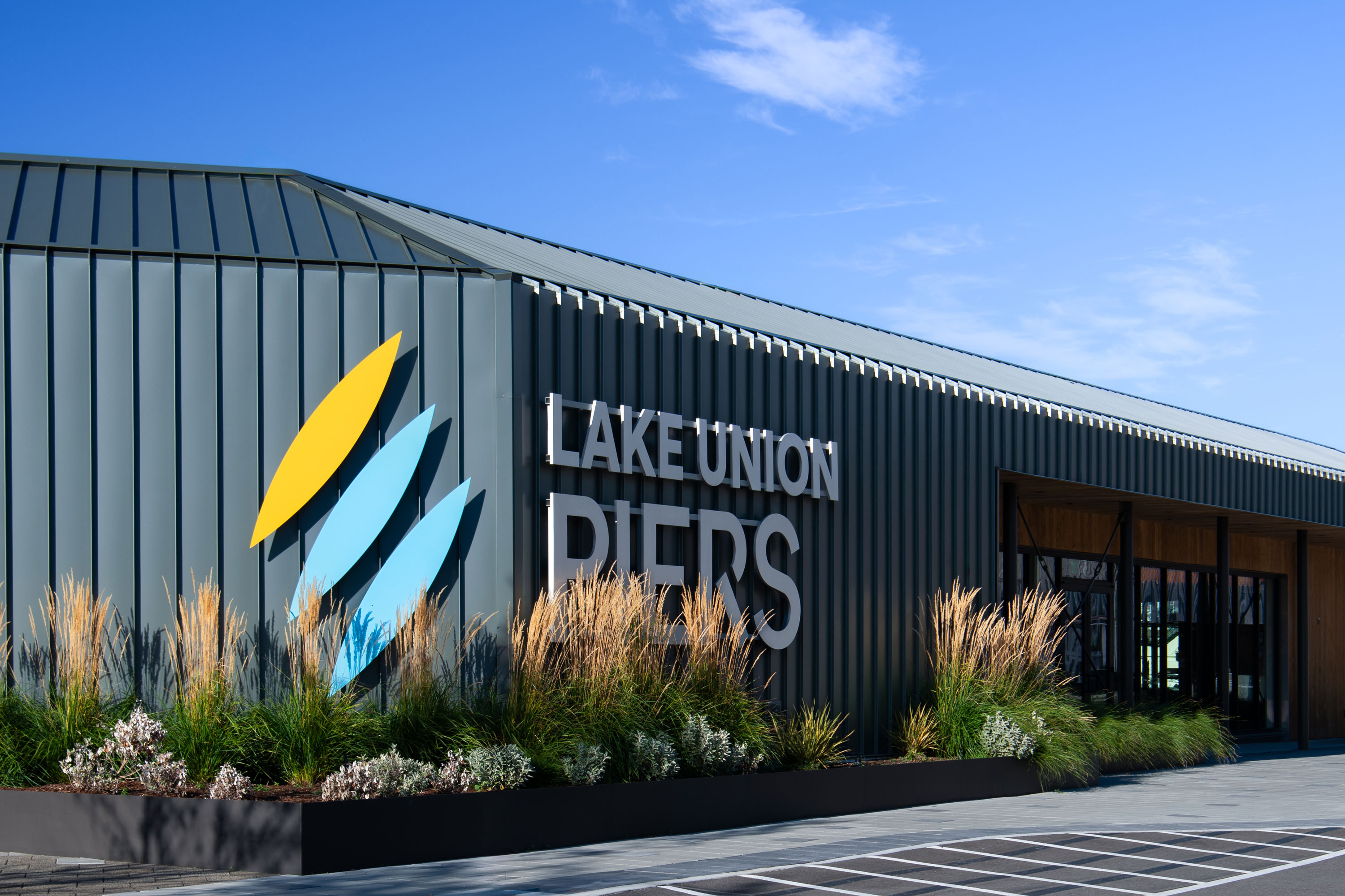
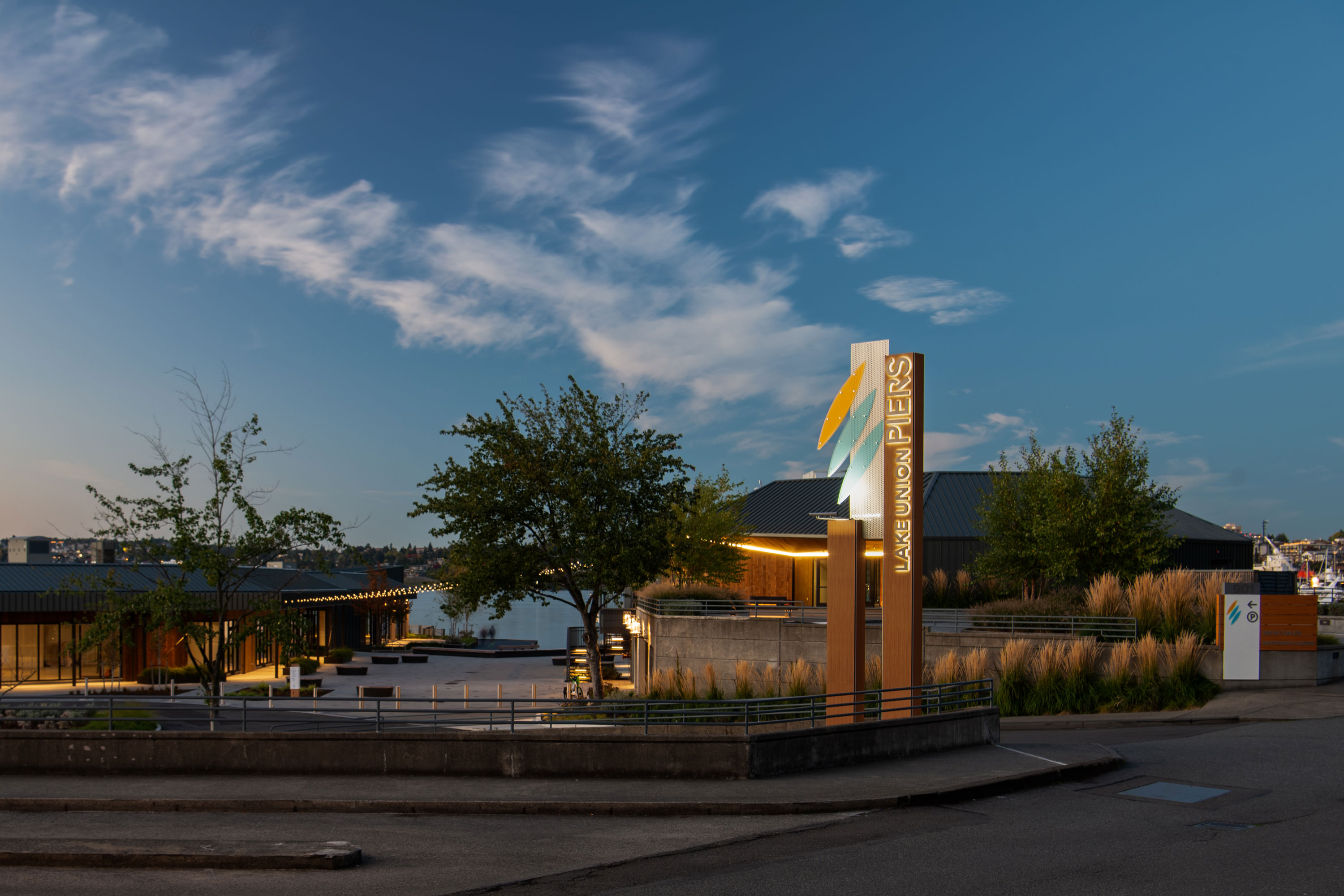
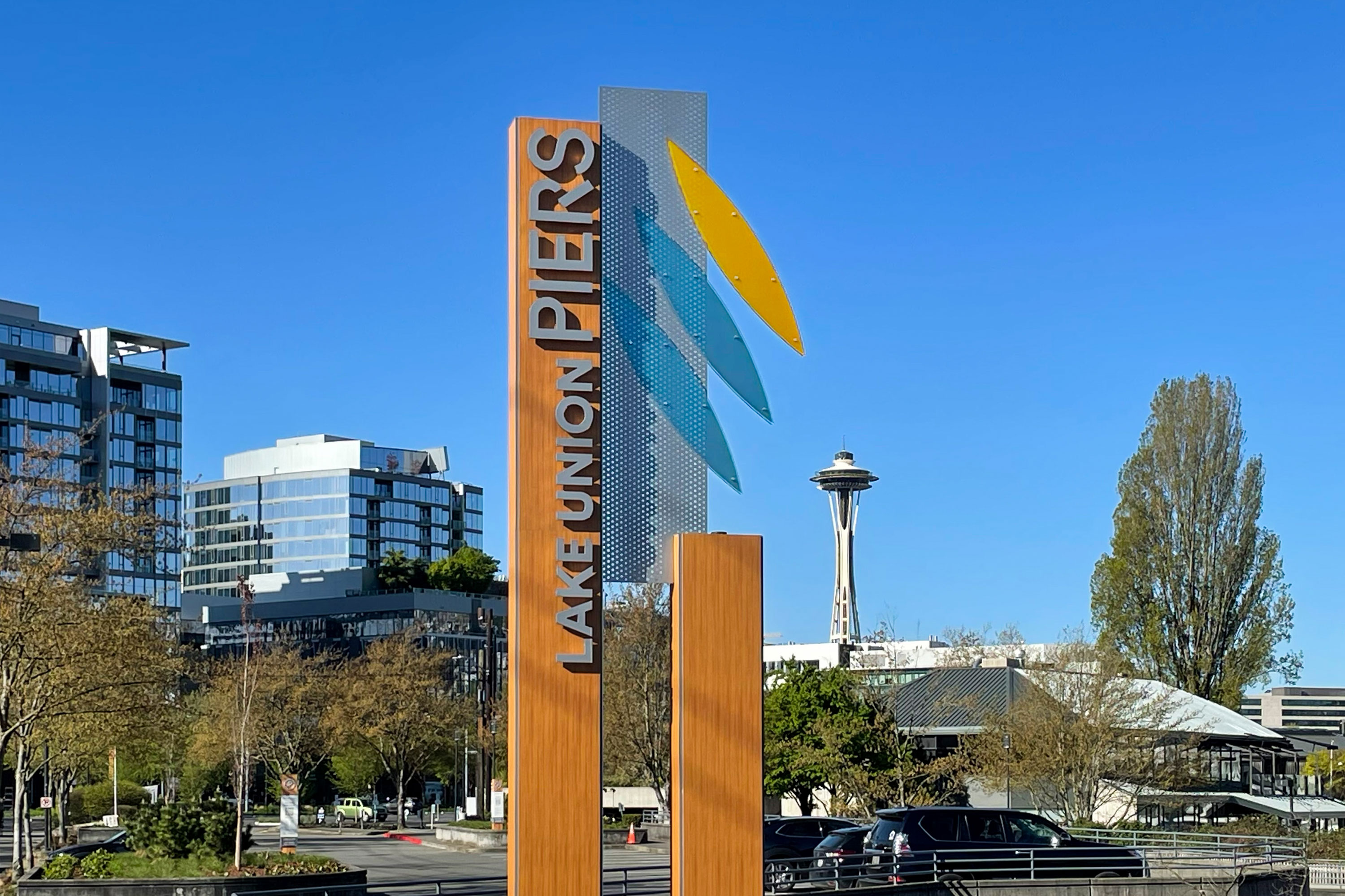
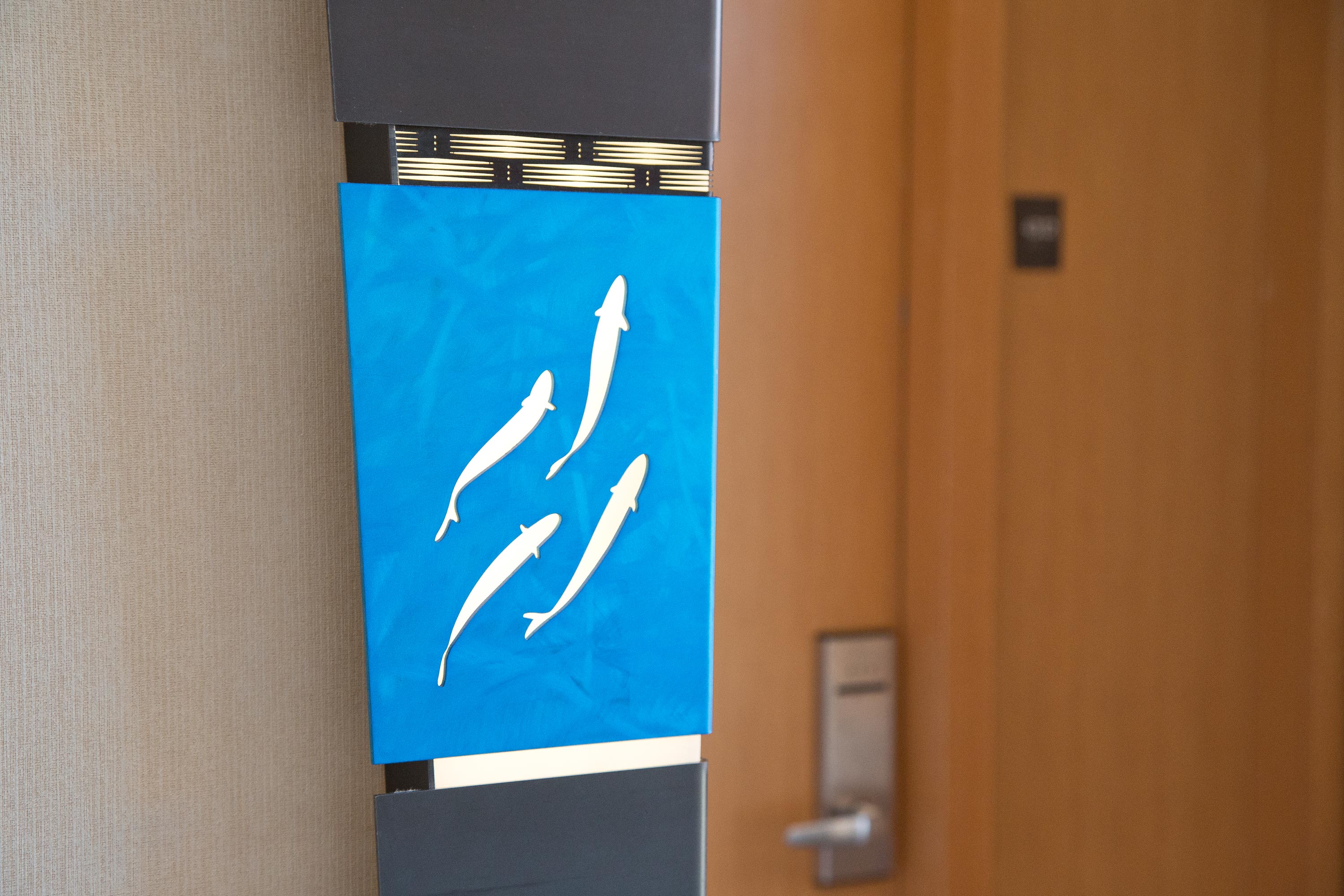
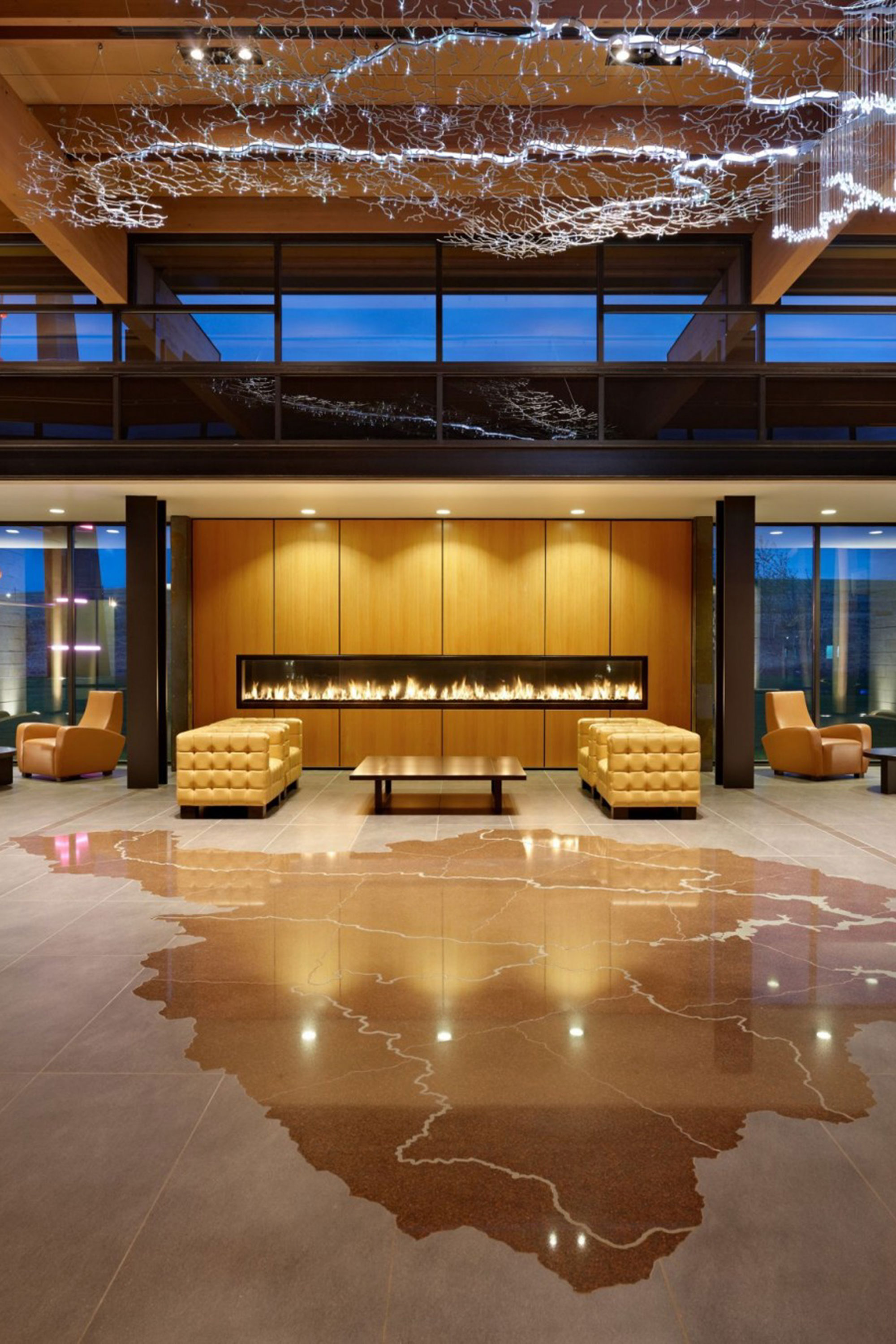
Lake Union Piers


Delivery_
Branding
Visual Identity
Environmental Graphics
Website
Year_
2024
About_
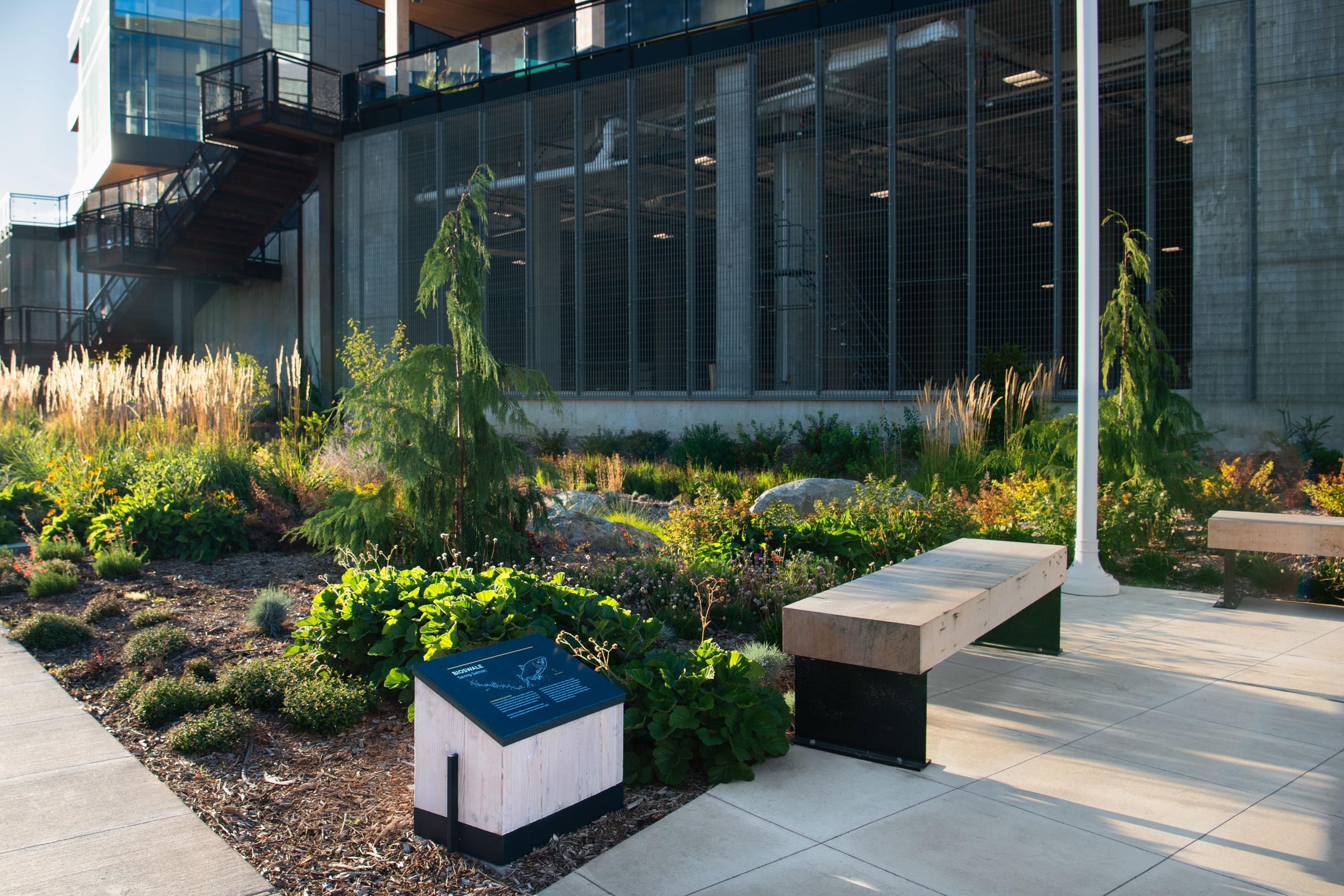
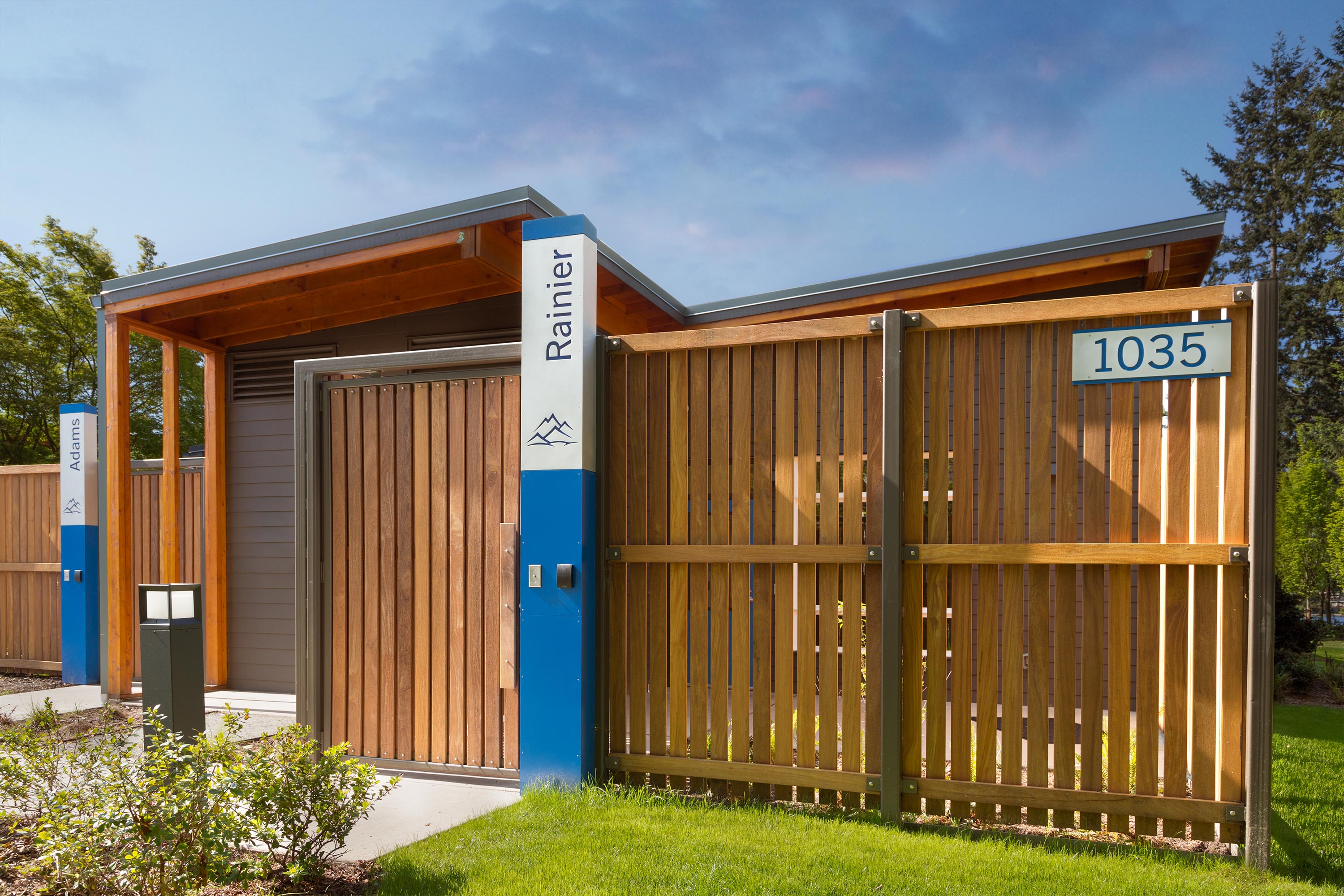
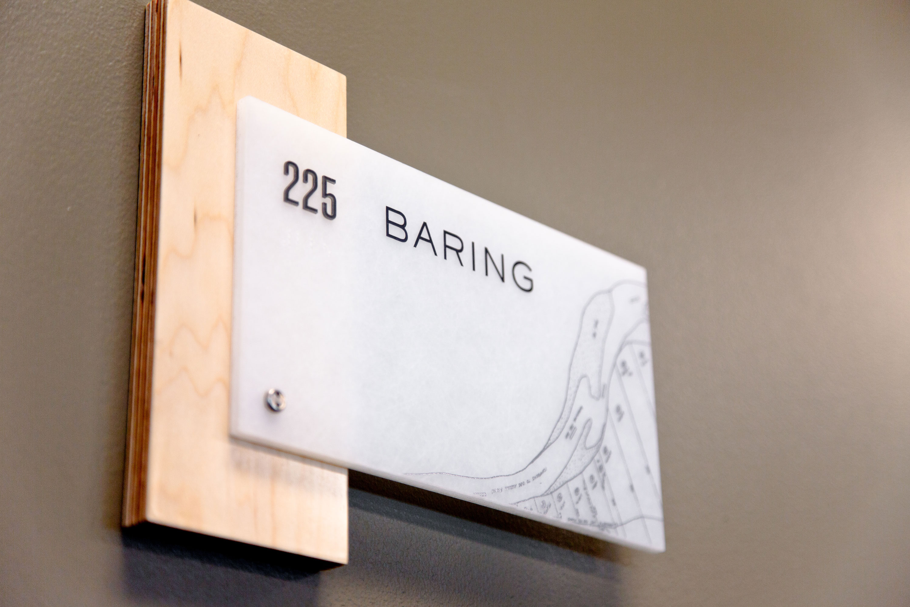
Guided by a sustainable and reciprocal relationship between people and the natural world, Indigenous people have lived for thousands of years around what is known in Lushootseed as the “small lake.” Lake Union has had many lives, and experienced numerous transitions as Seattle’s population has shifted. Throughout the 20th century, industries such as shipbuilding were the dominant presence around the lake. The shoreline was an industrial no-man’s land up until the 1980s, when the City shifted the shoreline’s land use from industrial to commercial at South Lake Union; this led to the development of Chandler’s Cove, which, although had good intentions, proved ineffective with its confusing pedestrian access trails which greatly complicated the process of traveling to and from Lake Union Park.
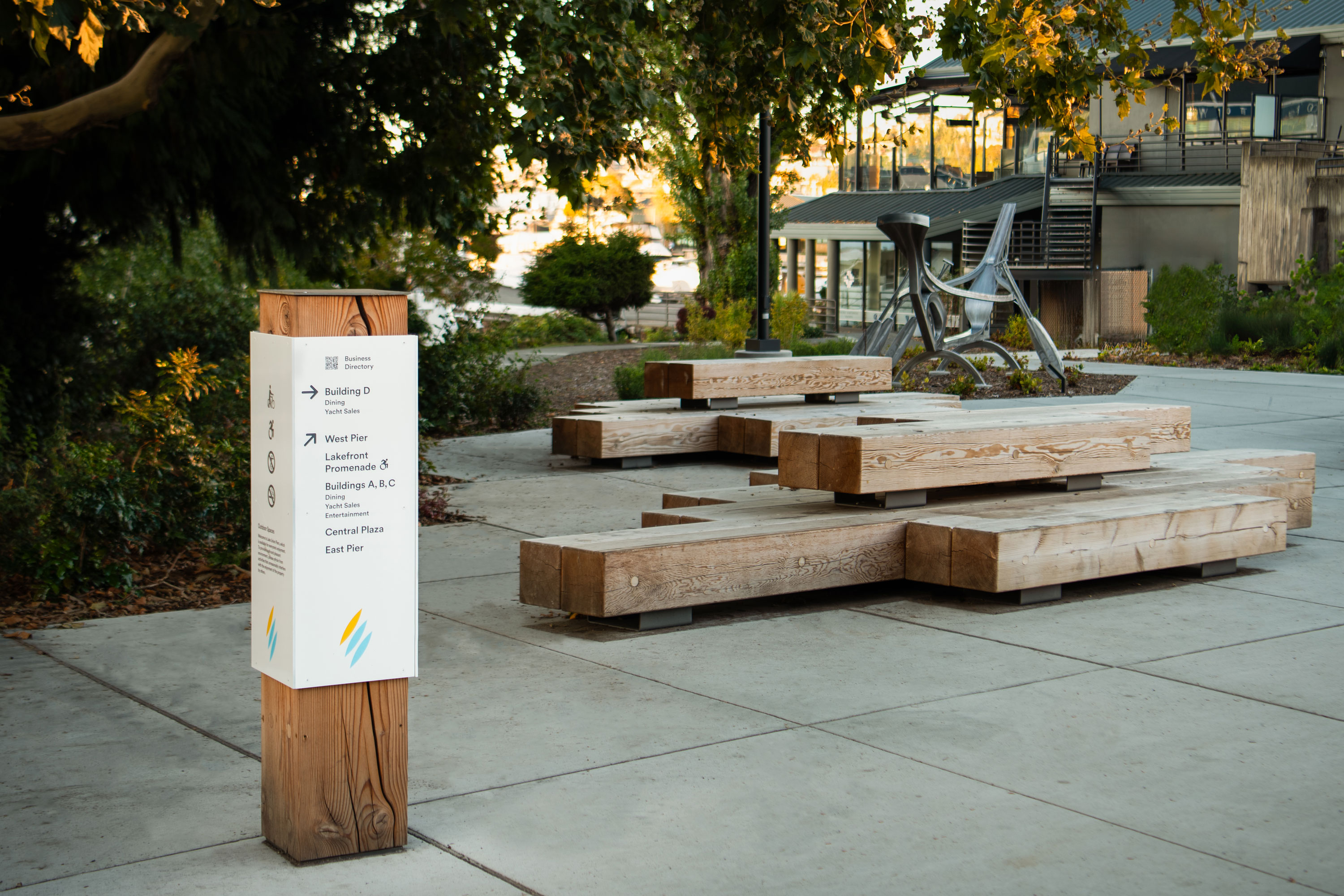
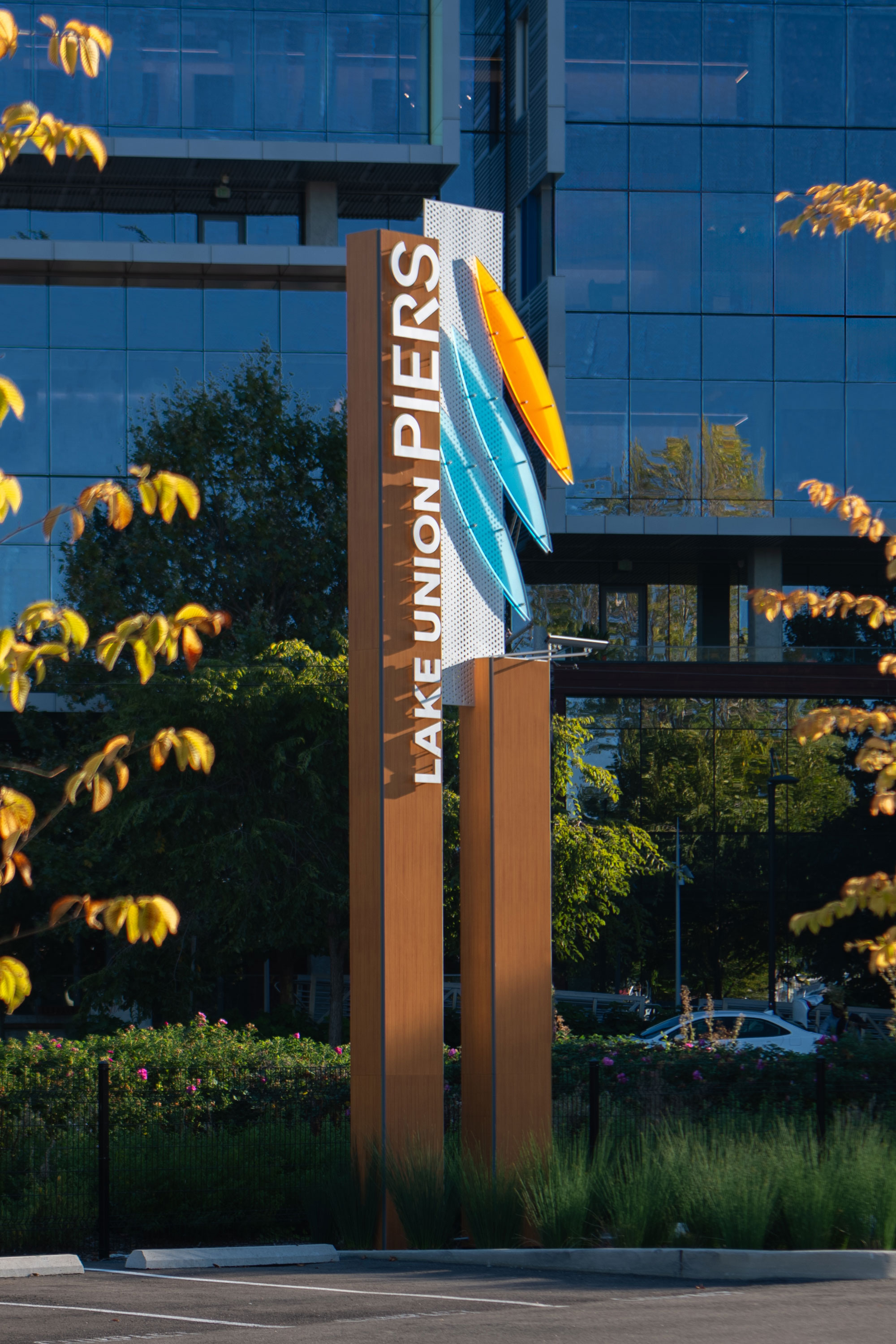
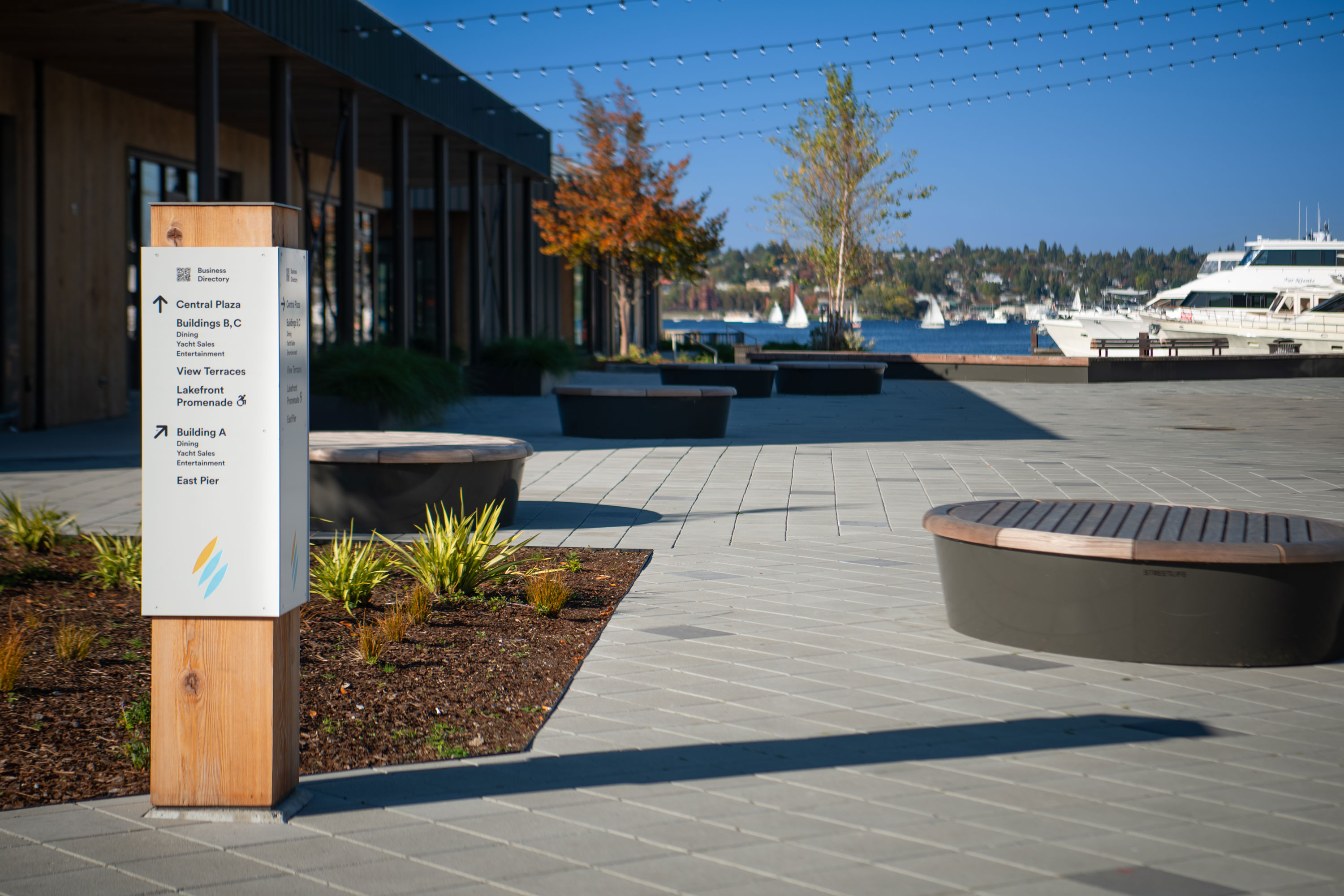
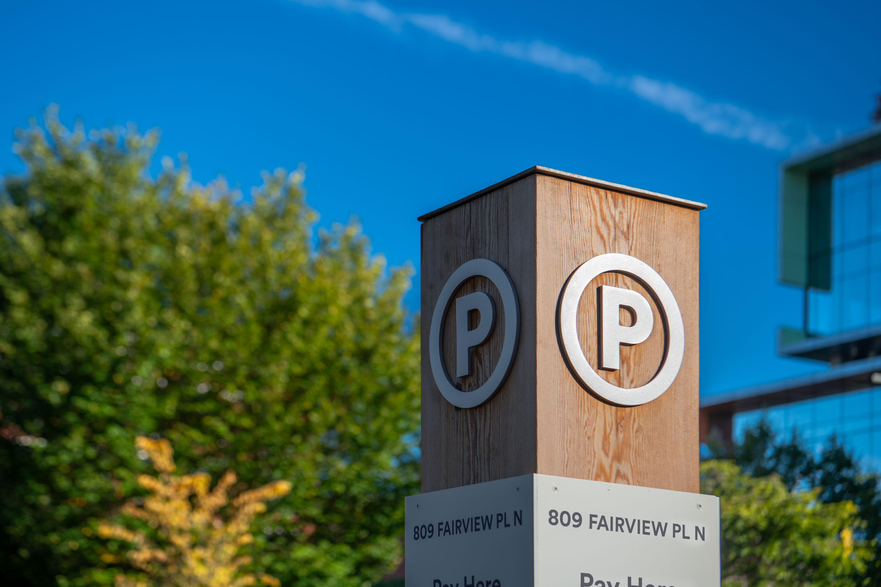
In recent years, thoughtful redevelopment remade the area as an innovative center for human health, recreation, and technology, continuing its long tradition of transformation and adaptation to change. The architectural team, Miller Hull, studied a variety of solutions for the site, ranging from complete demolition and new construction to light-handed renovations of the existing structures. Ultimately, a comprehensive renovation of the existing architecture gave new life to the site, and an improved lakefront experience in keeping with the neighboring park. The rebranding of the site as Lake Union Piers acknowledges this direct connection to the lake and park with symbolism to evoke the ever-present watercraft that have long visited its shores. Throughout the site, integrated wayfinding provides continuity, and upon approach, well-placed site identity welcomes visitors to this vibrant destination along the water.
Learning Resource Center
Delivery_
Environmental Graphics
Year_
2023
About_
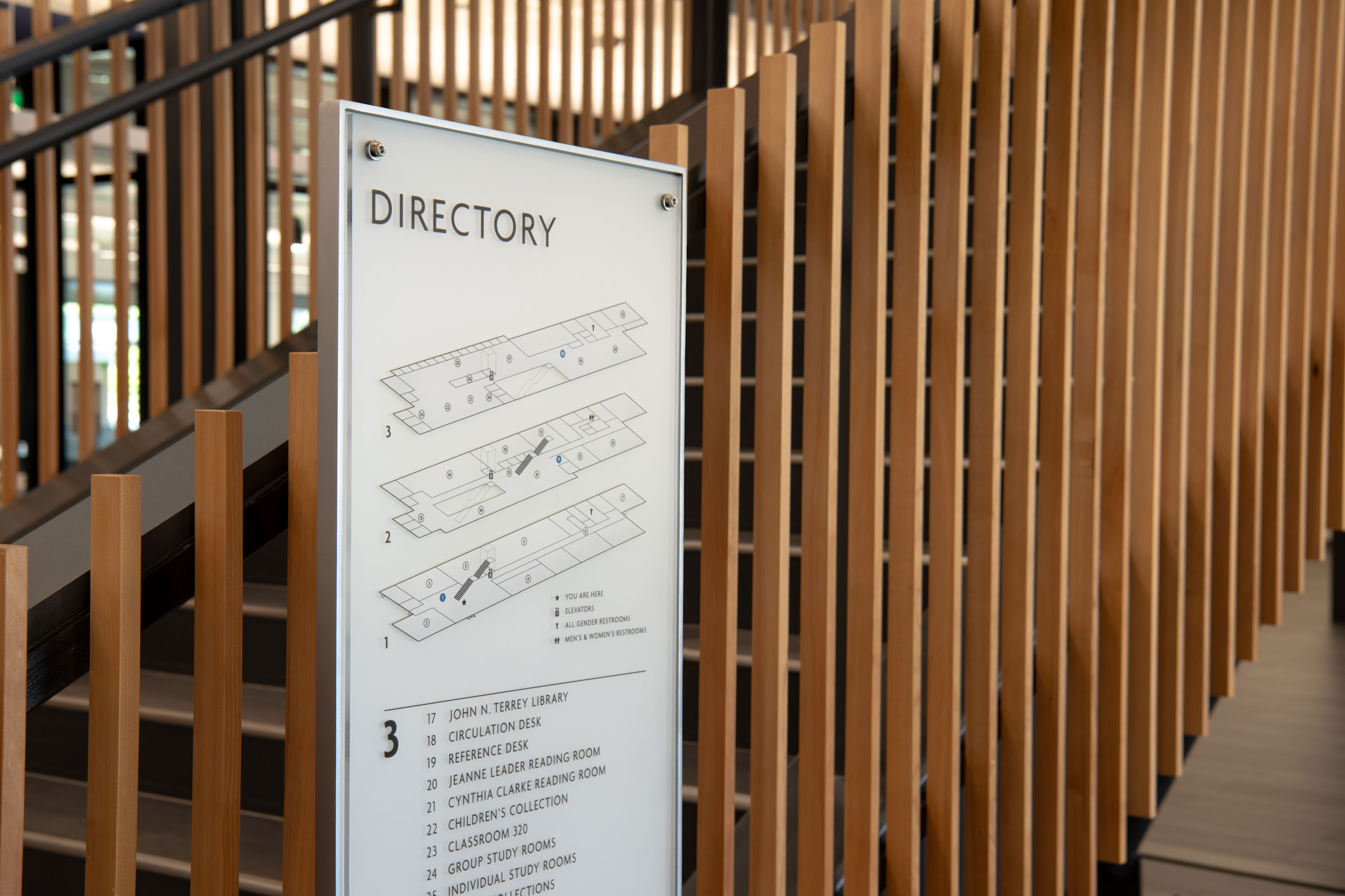
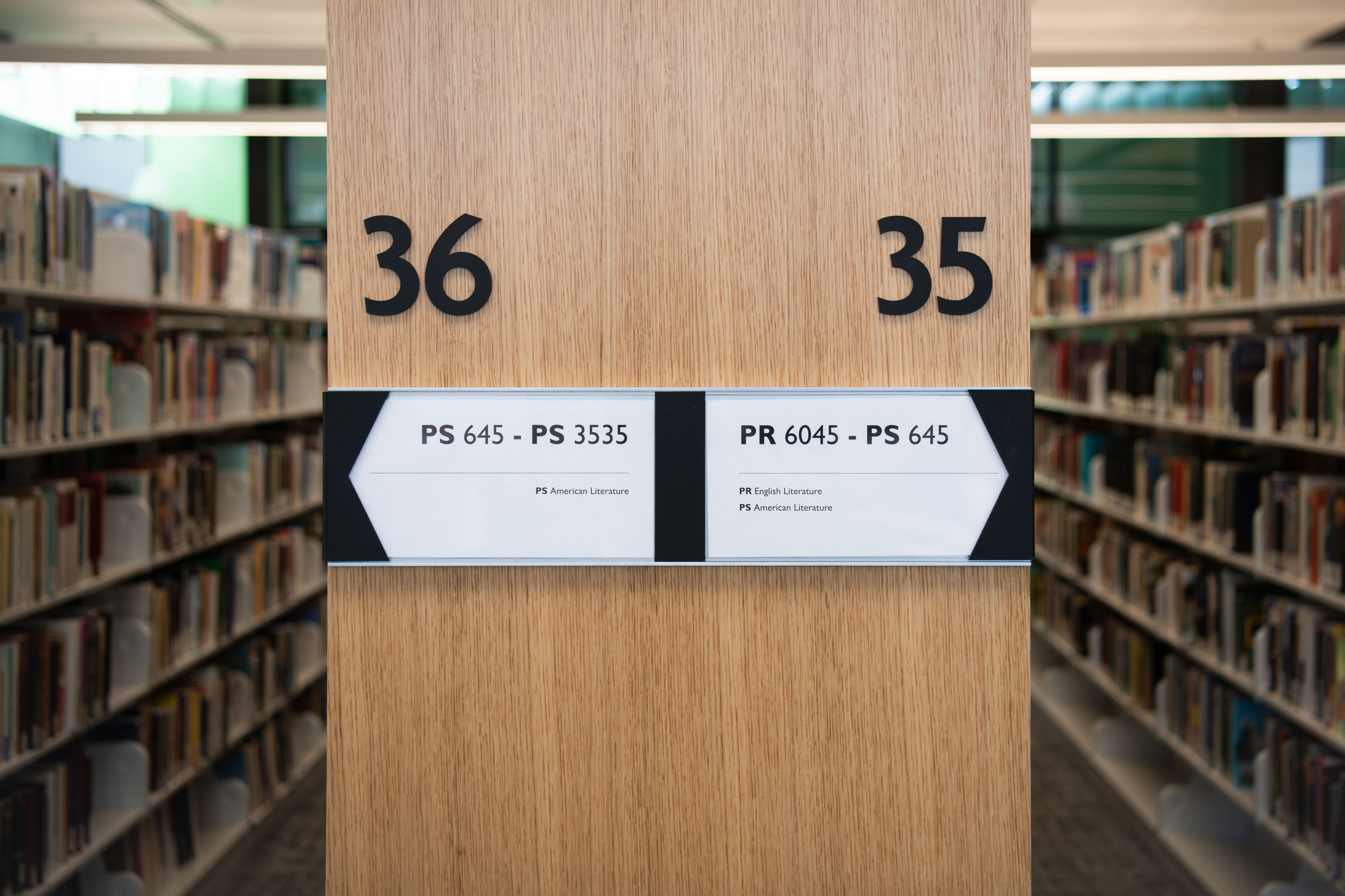
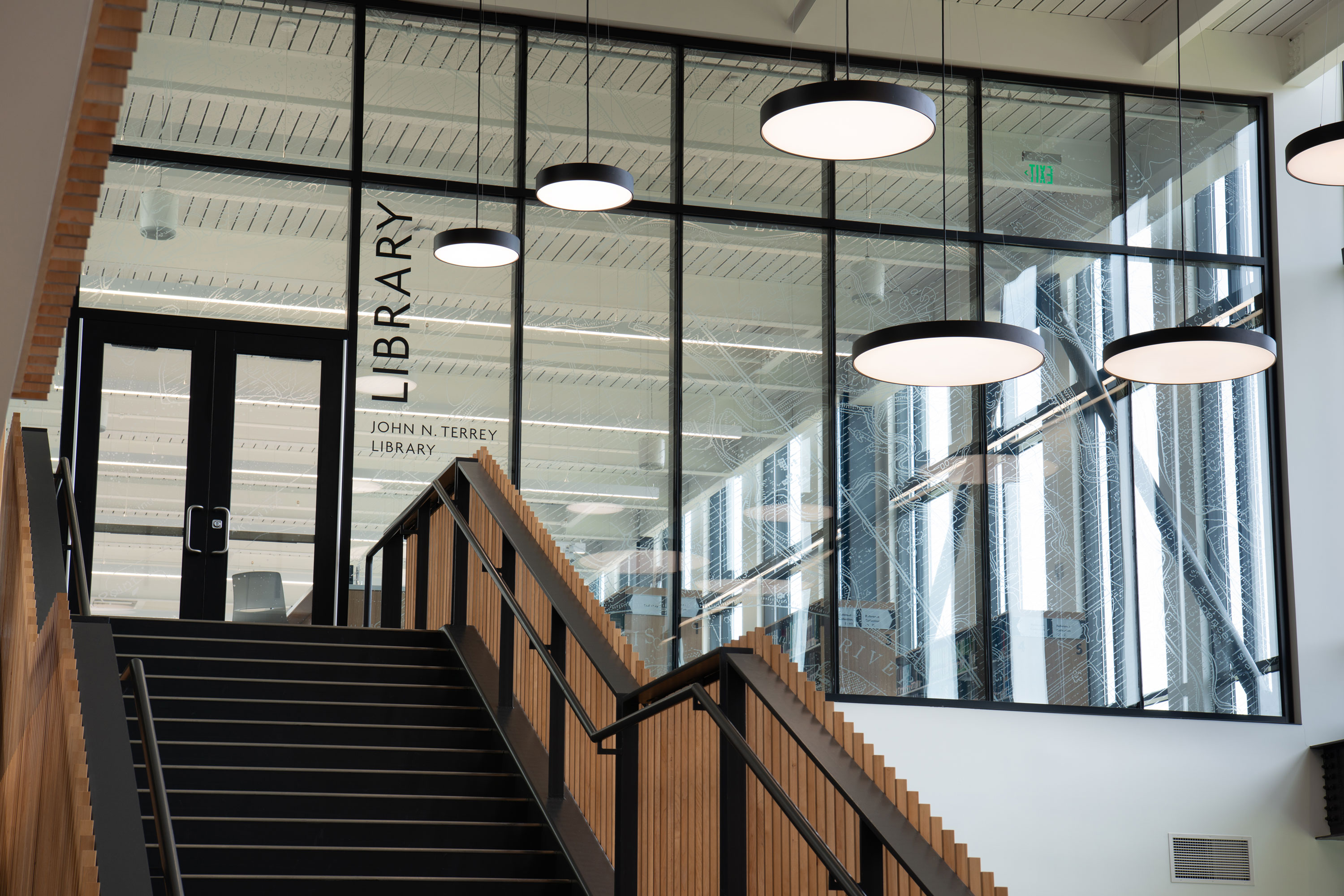
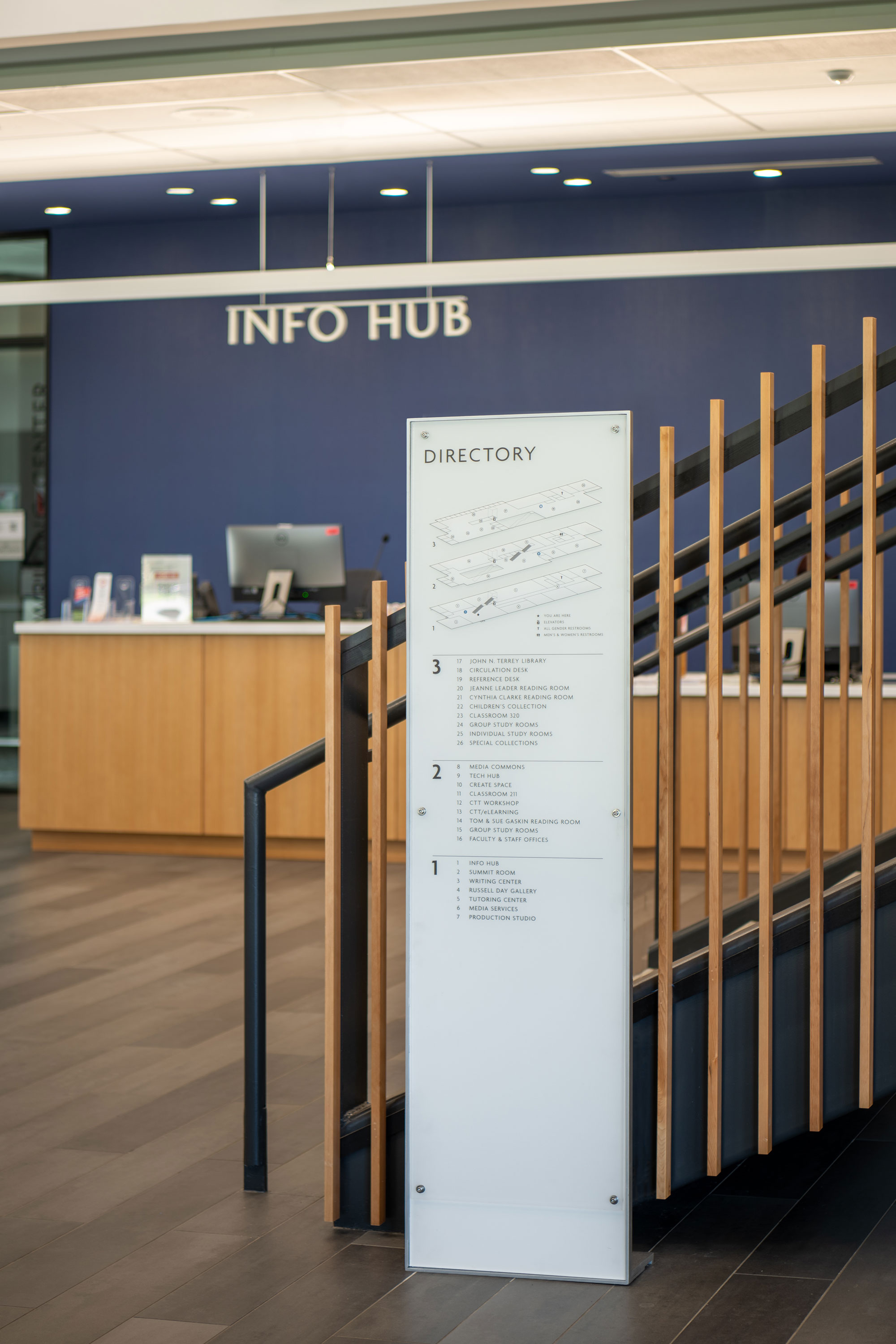
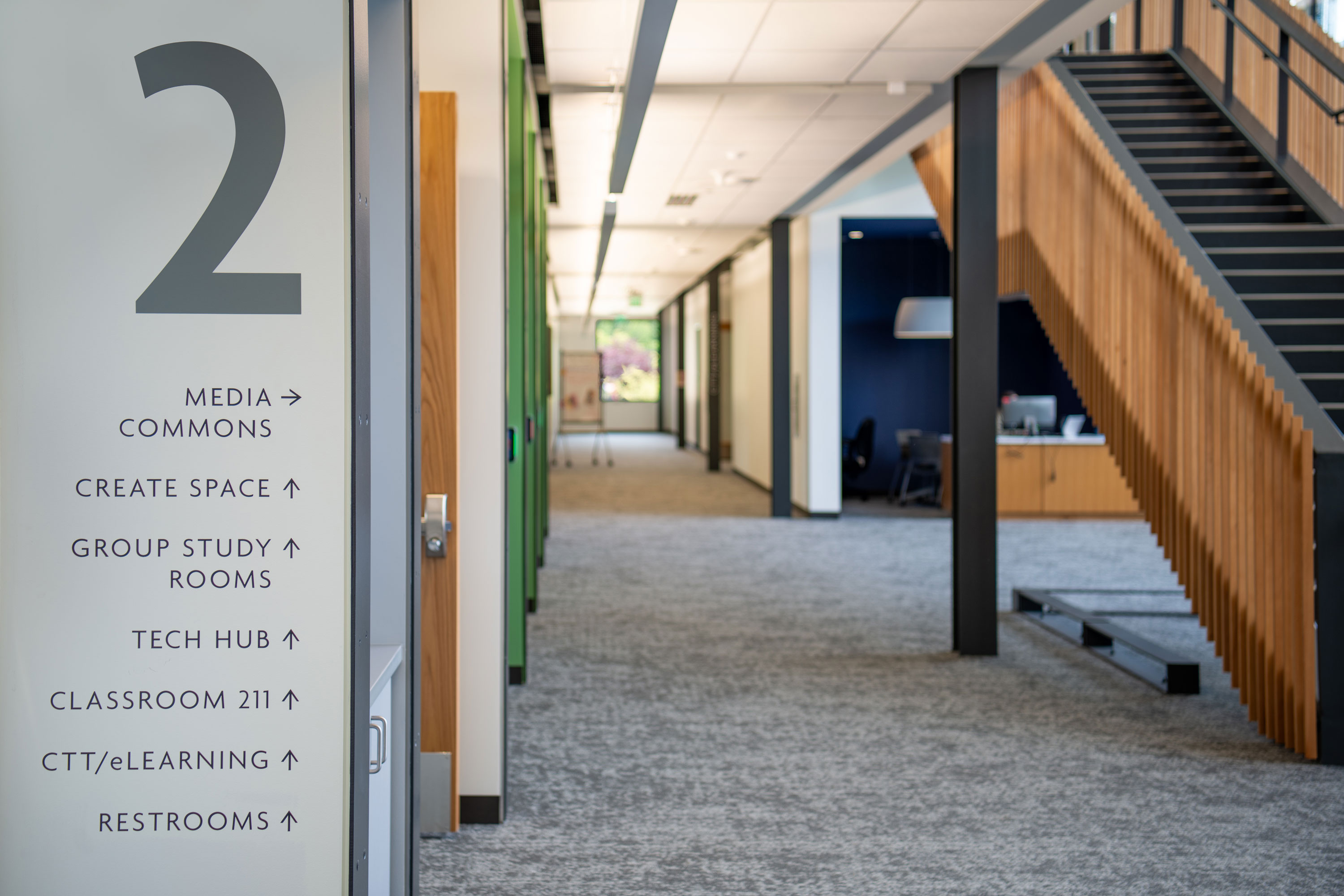
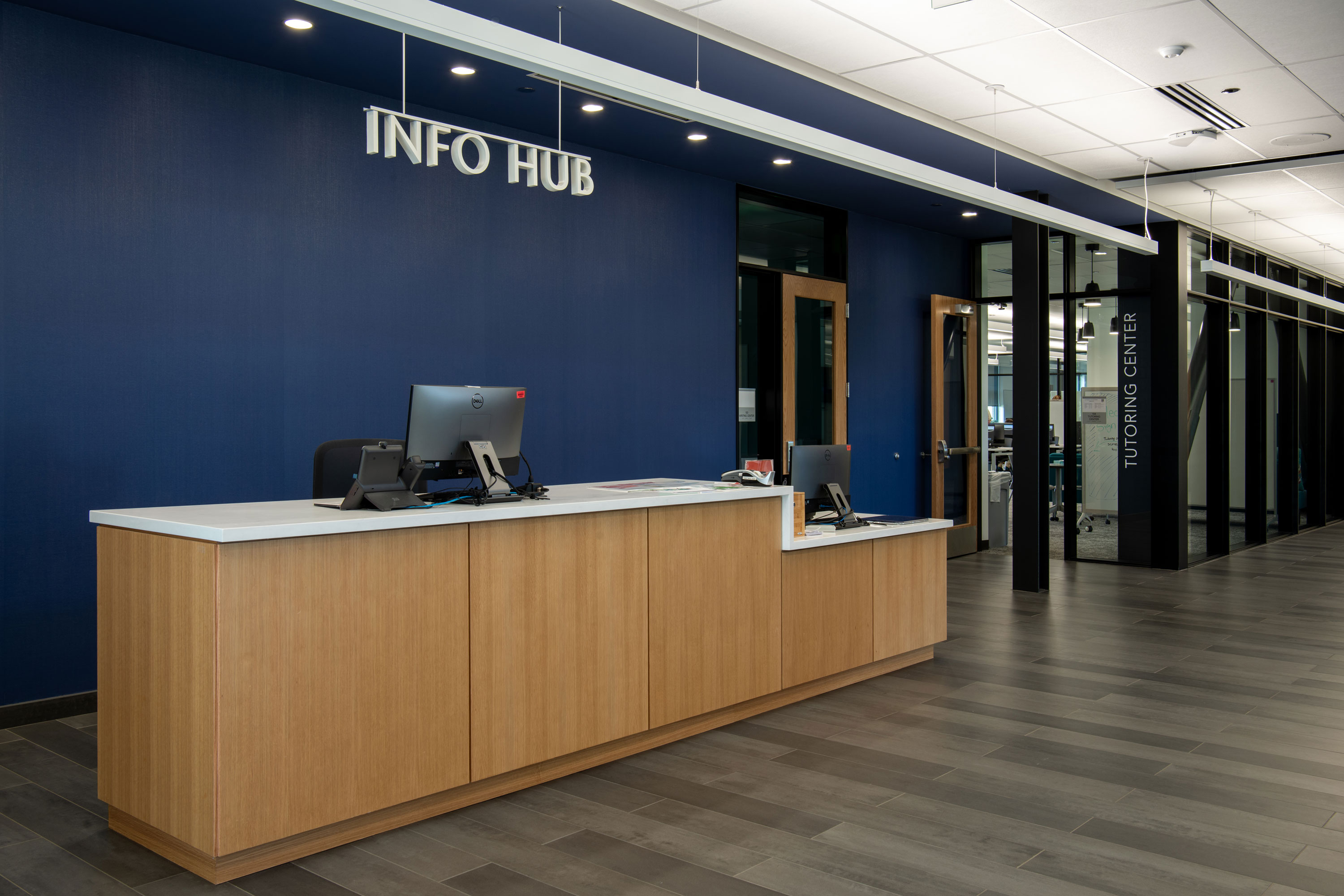
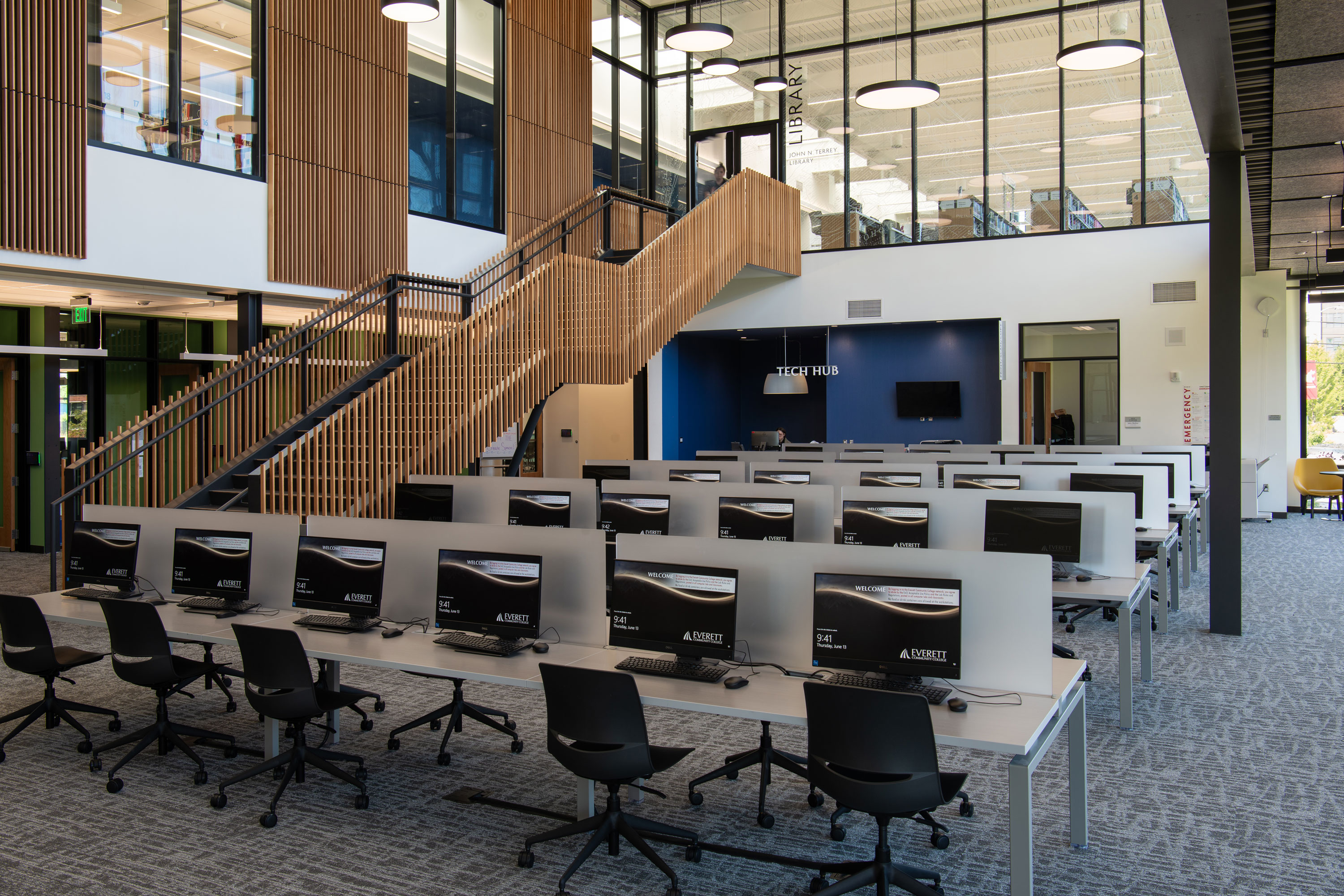
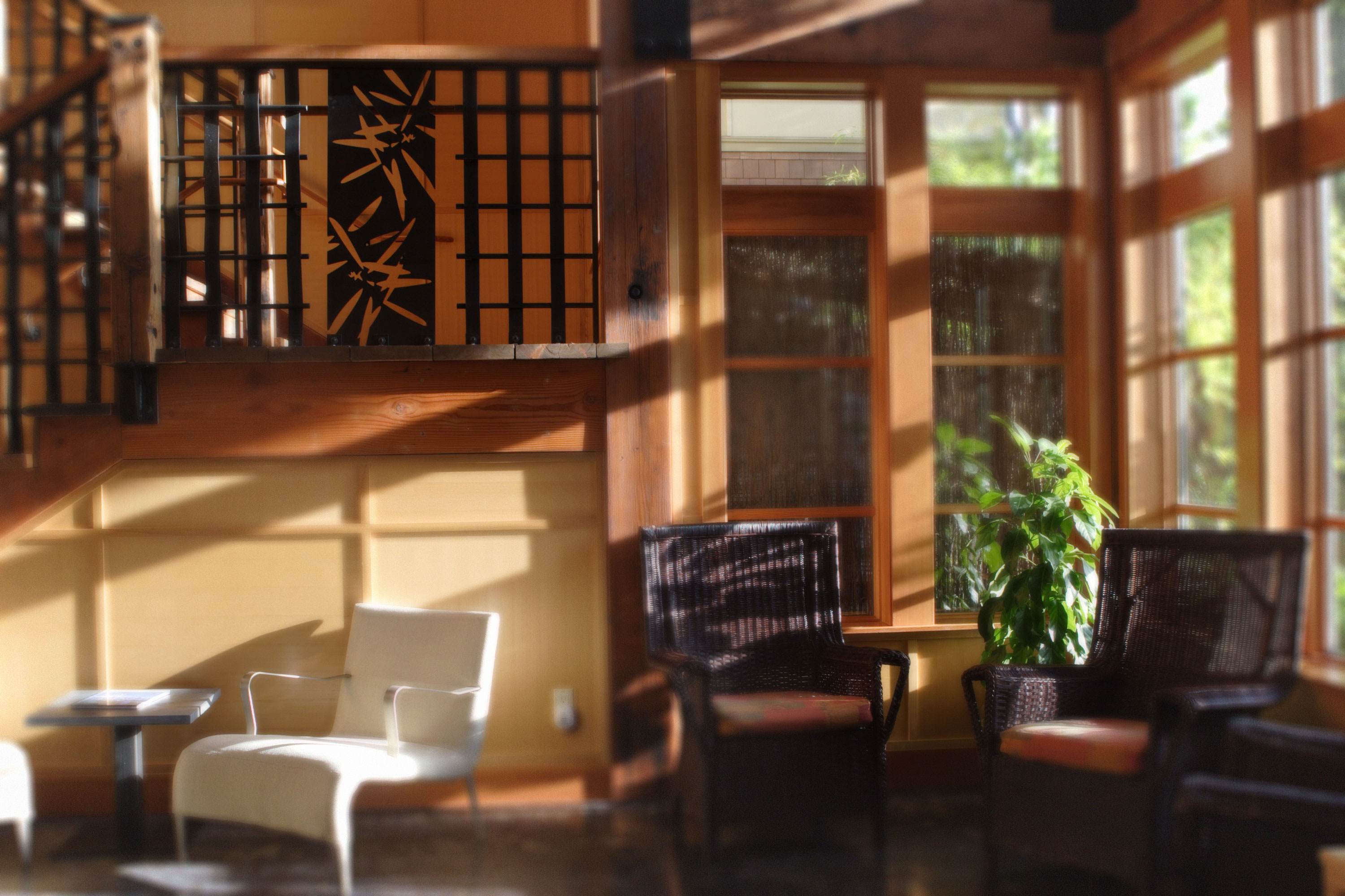
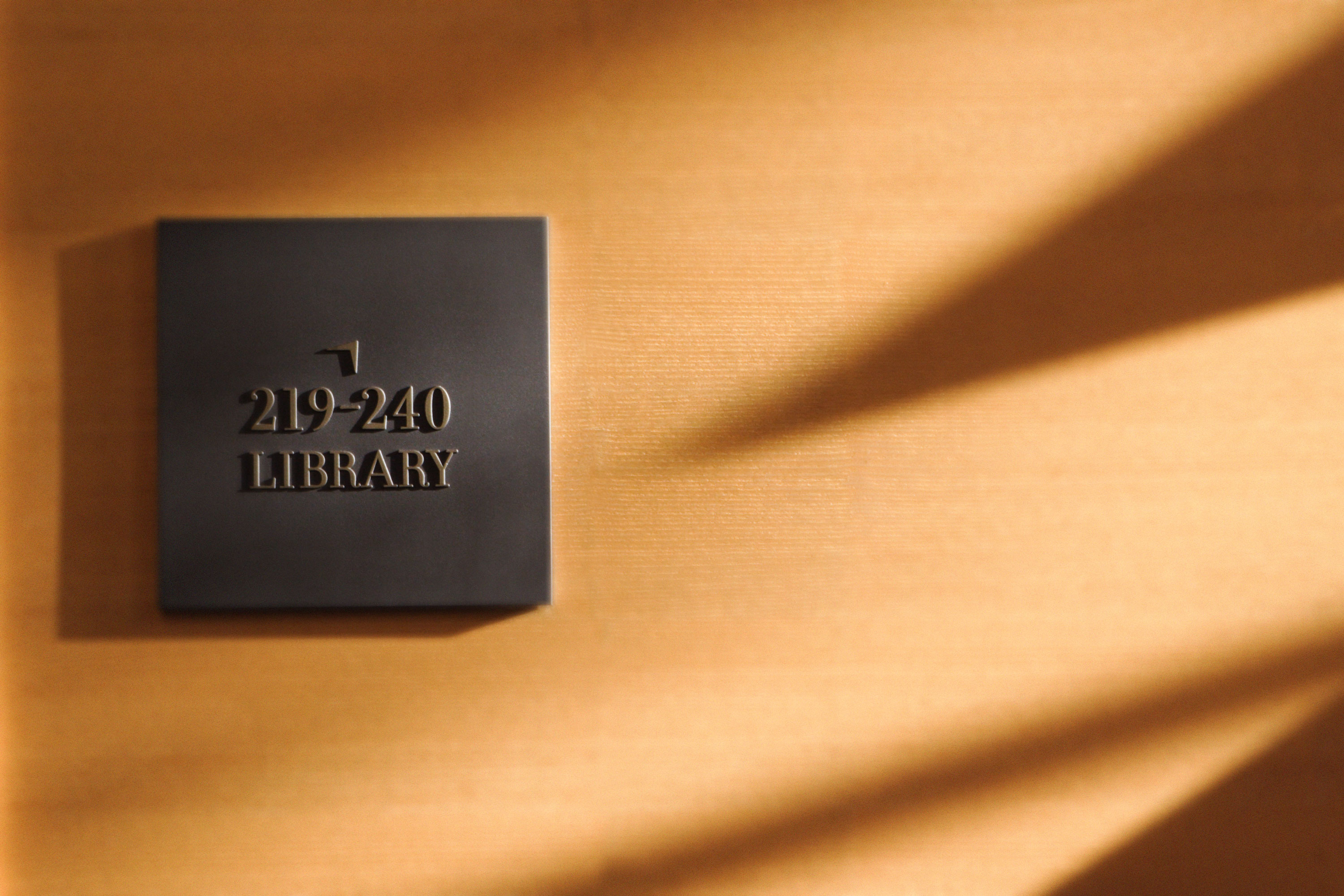
The Cascade Learning Resource Center anchors Everett Community College’s campus expansion across Broadway with a dynamic mix of programs and services to serve its diverse student body. The signature building works with the neighboring WSU Everett Center to define a new quadrangle and set a pattern for future development.
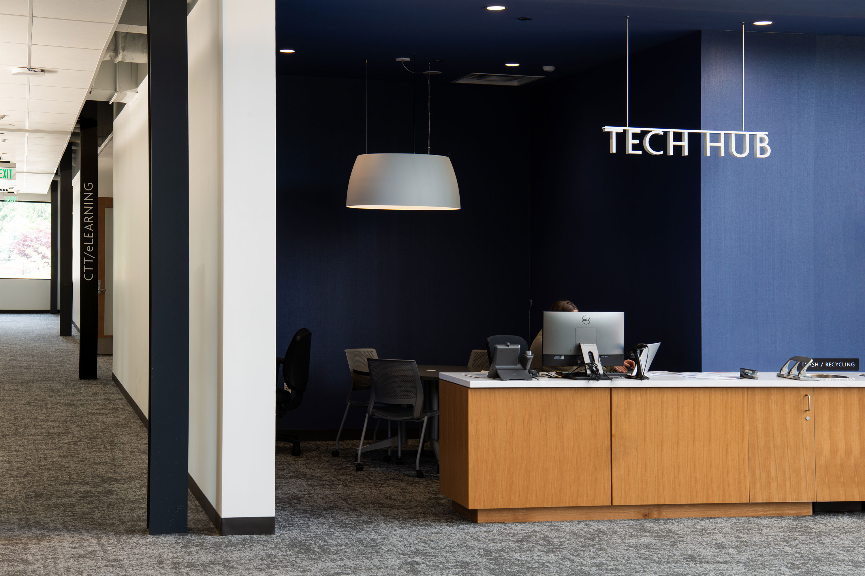
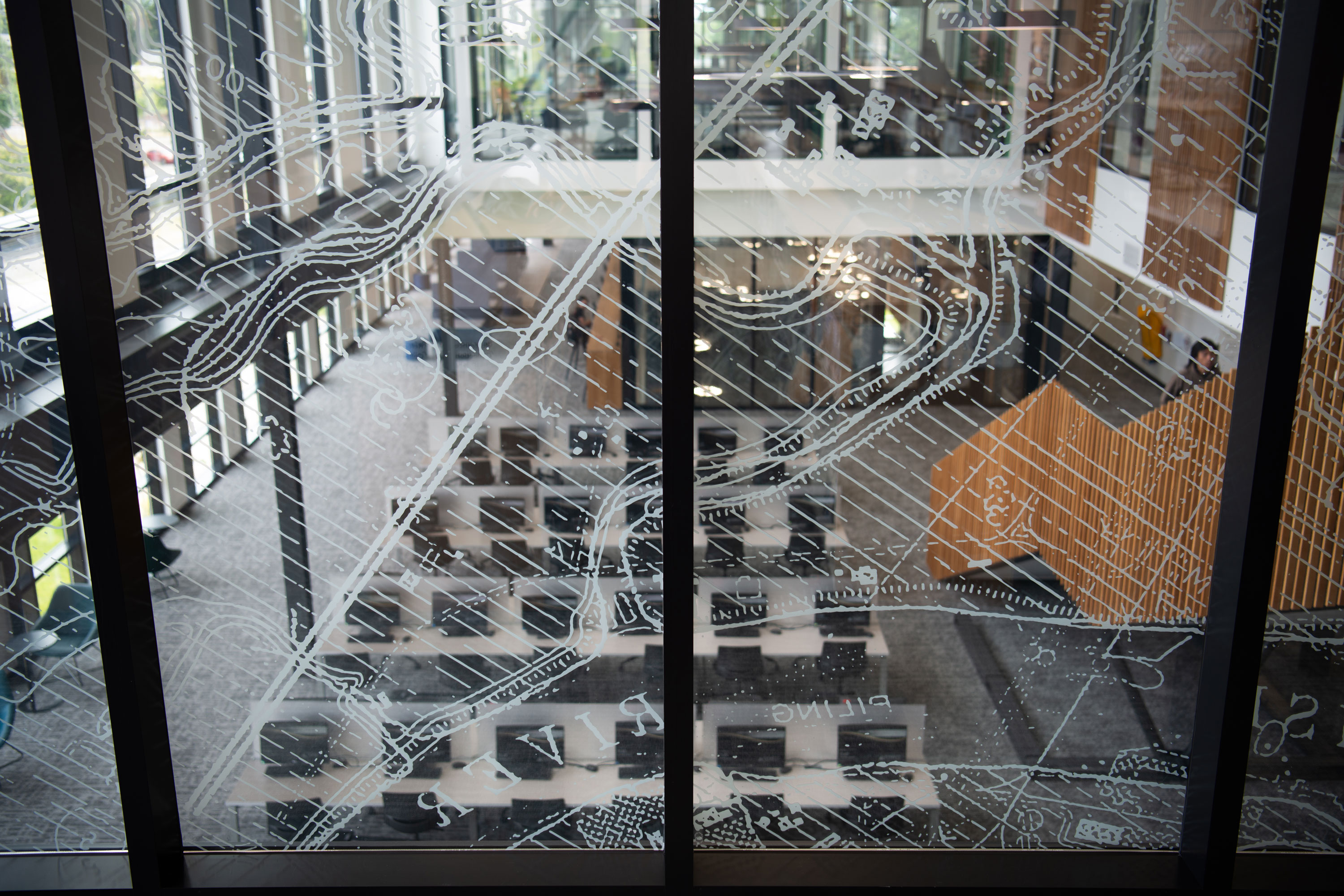
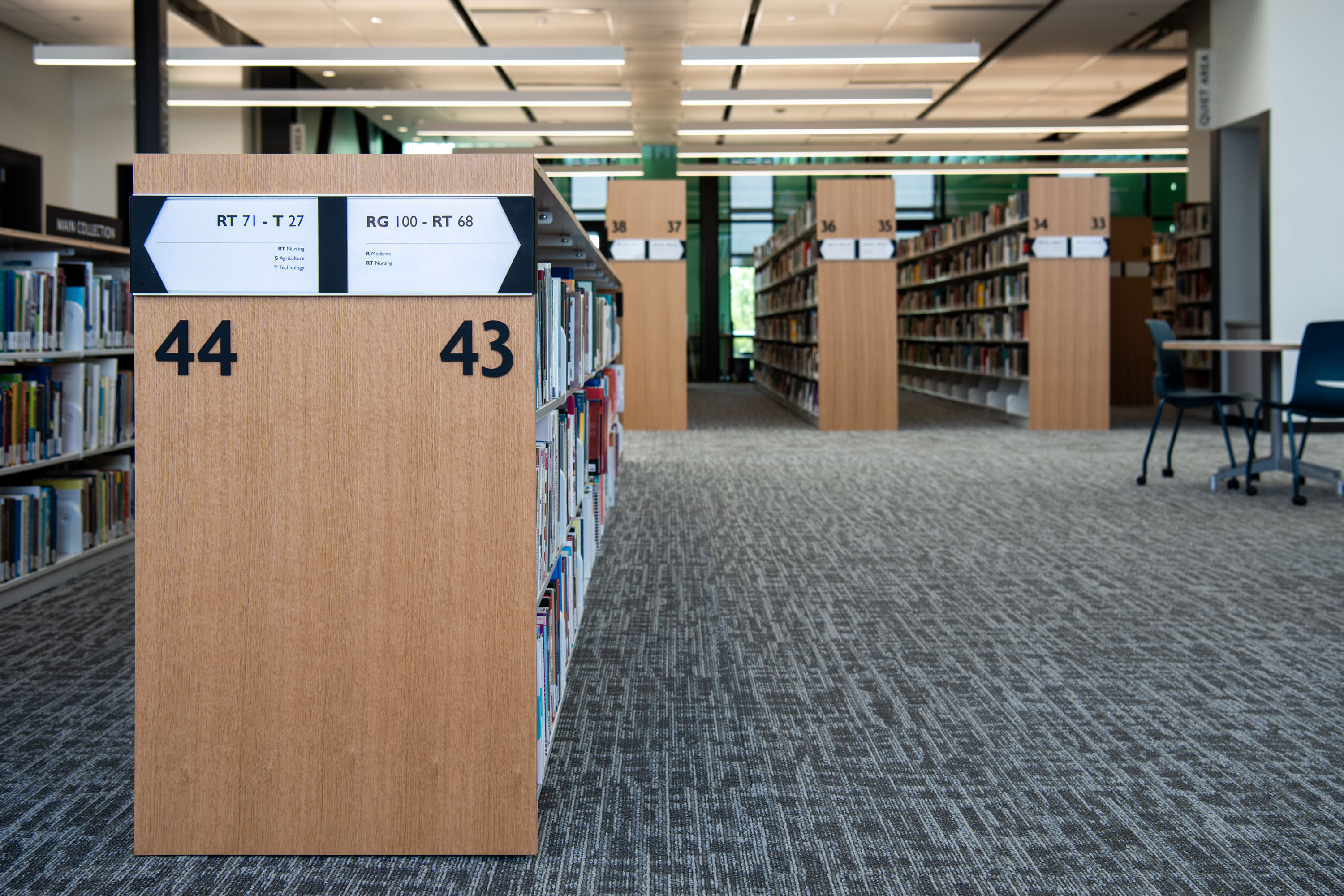
The LRC building is a magnet for students—a central stair rises through an atrium that connects the building’s programs, from active uses at the ground level to group study and media commons on the second floor and terminating with quieter individual study and reading rooms at the library. Spaces are organized to facilitate wayfinding and promote peer-to-peer engagement. The environmental graphic design extends the architectural and material design language throughout the building with a design scheme that builds upon historic Snohomish River Delta imagery coupled with hub area identities and a comprehensive program for the library stacks.
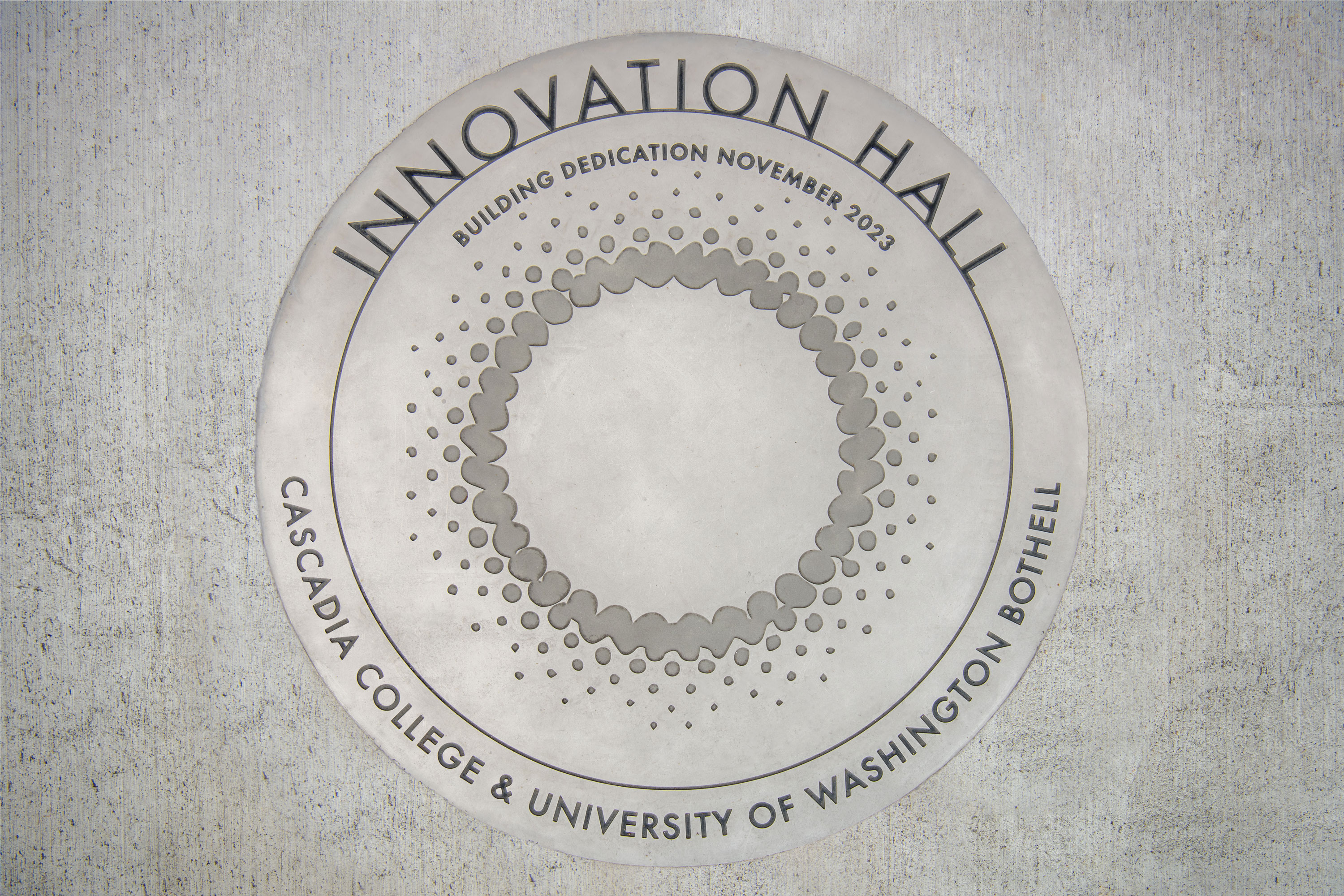
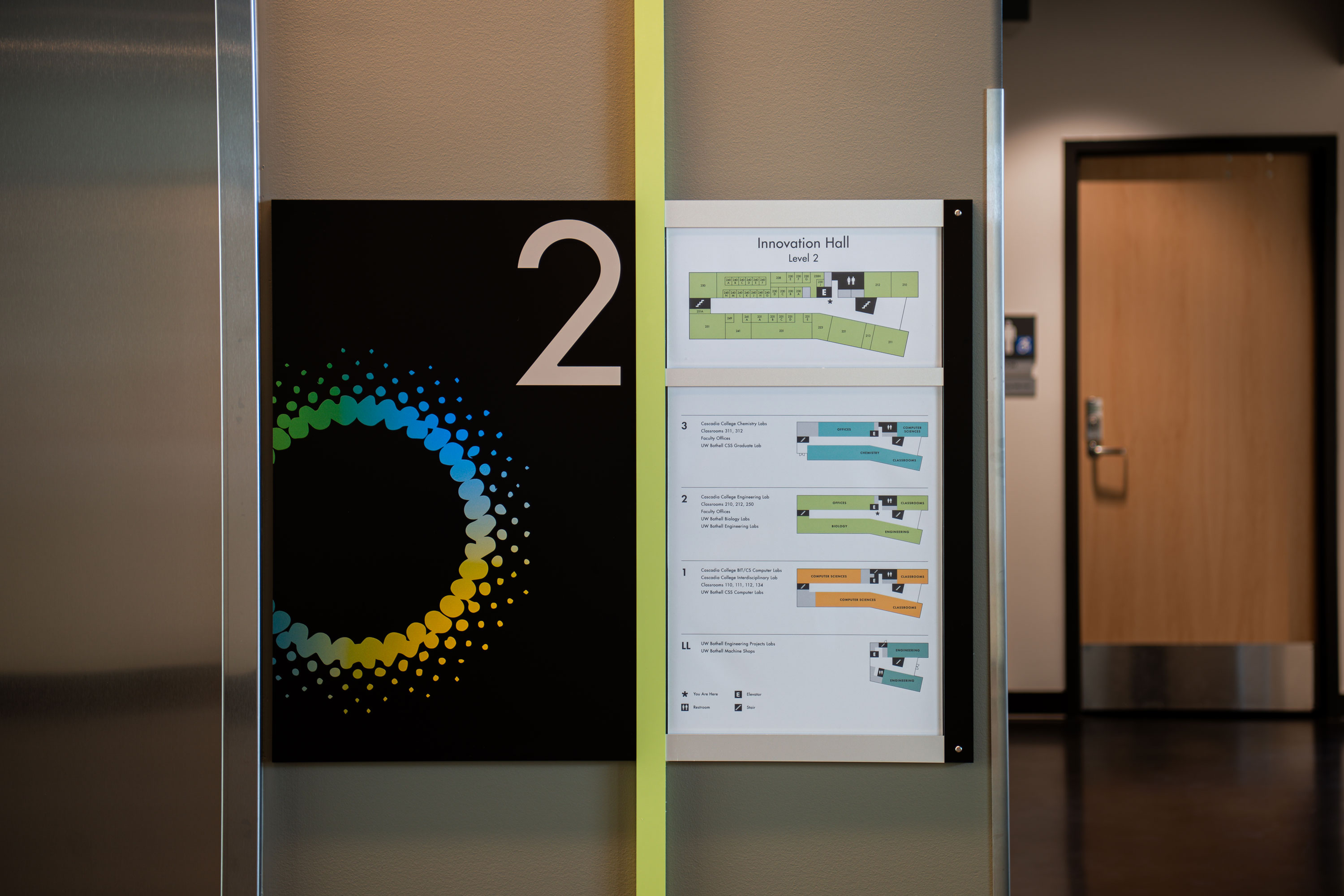
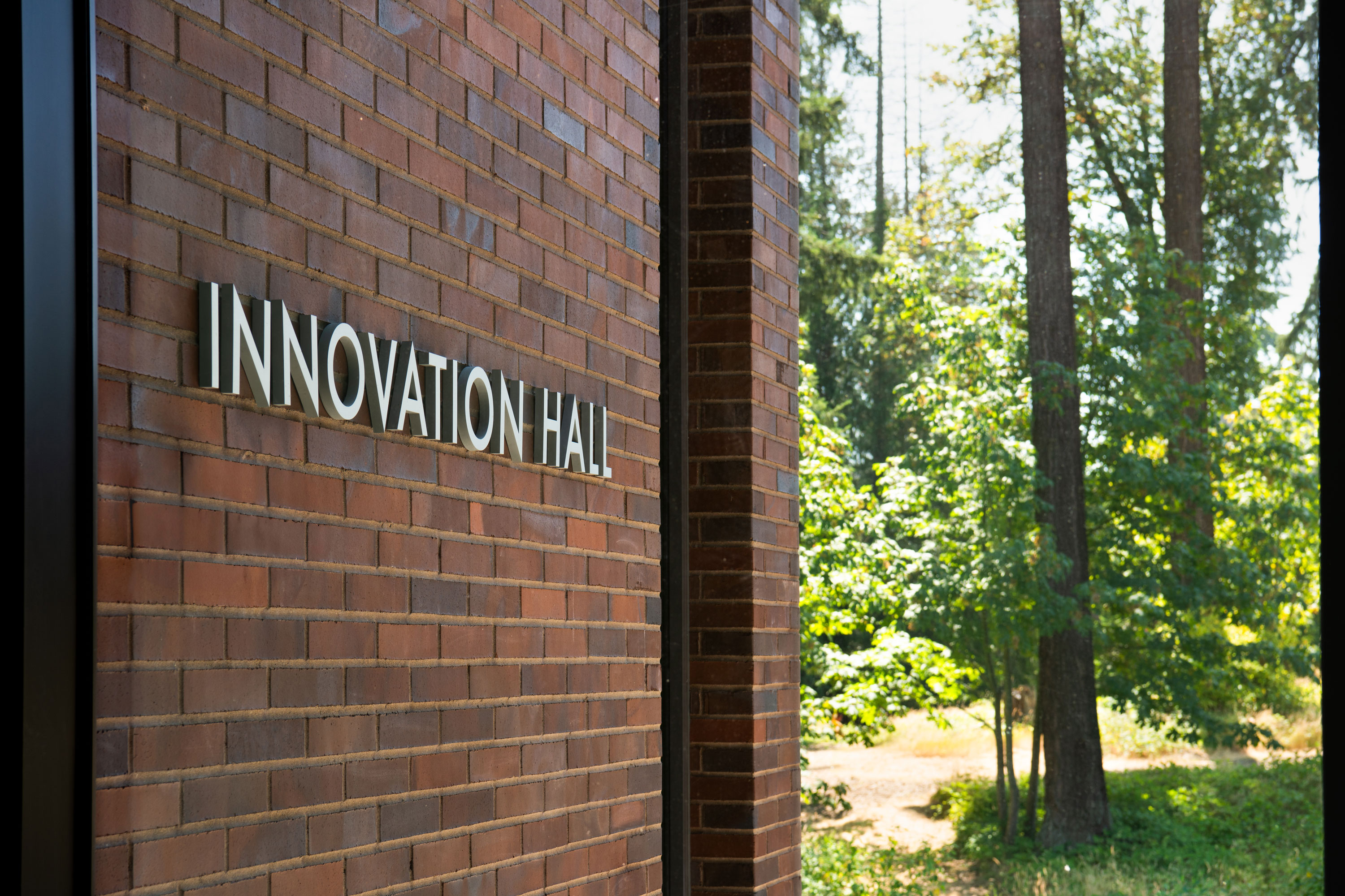
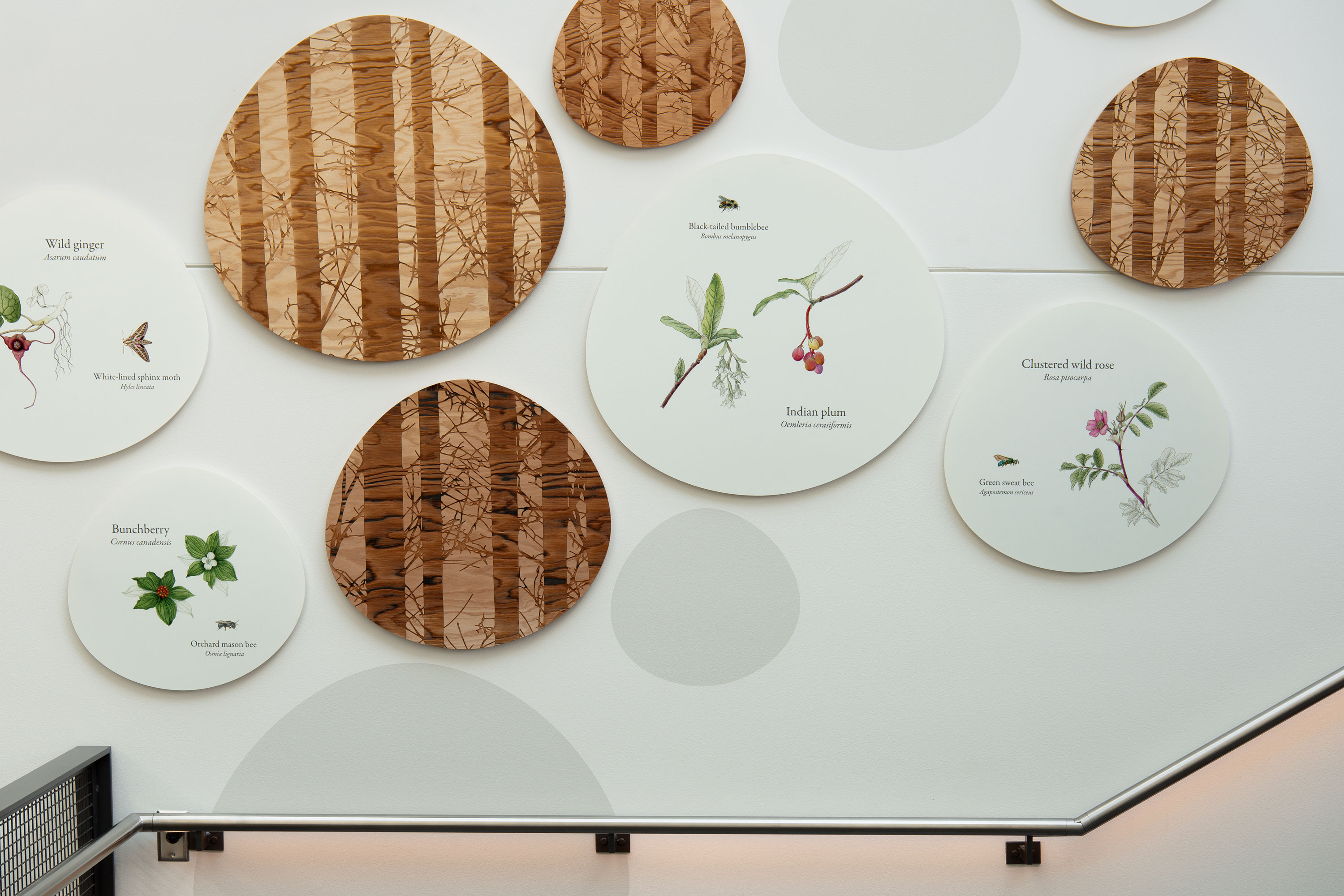
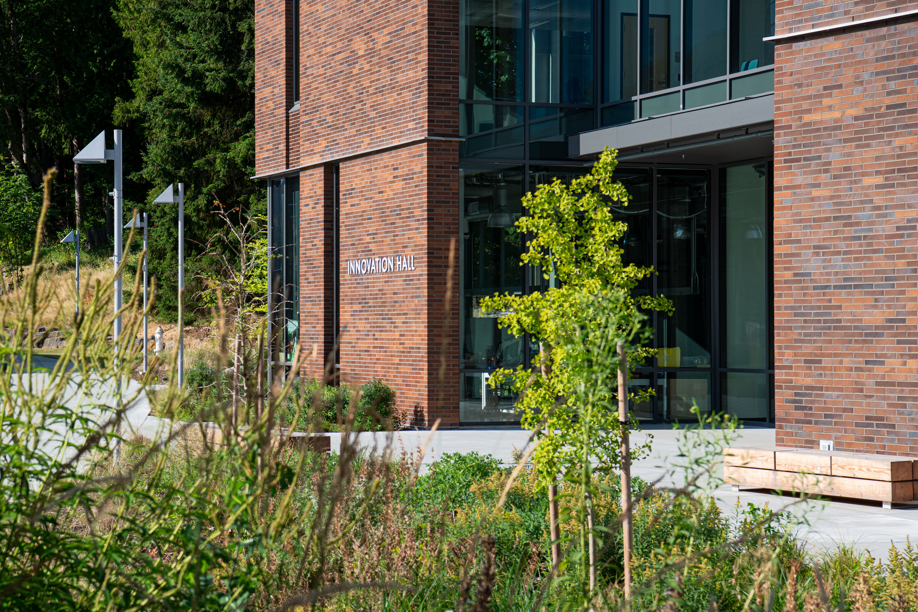
Innovation Hall


Delivery_
Visual Identity
Environmental Graphics
Year_
2023
About_
UW Bothell and Cascadia College partnered to fund and build this new STEM building. Innovation Hall was designed to foster student collaboration and house specific labs, including engineering, computer science, biology, and physics. The building will allow UWB and Cascadia to enhance collaboration between the institutions and support their ability to graduate more students prepared for the STEM workforce.
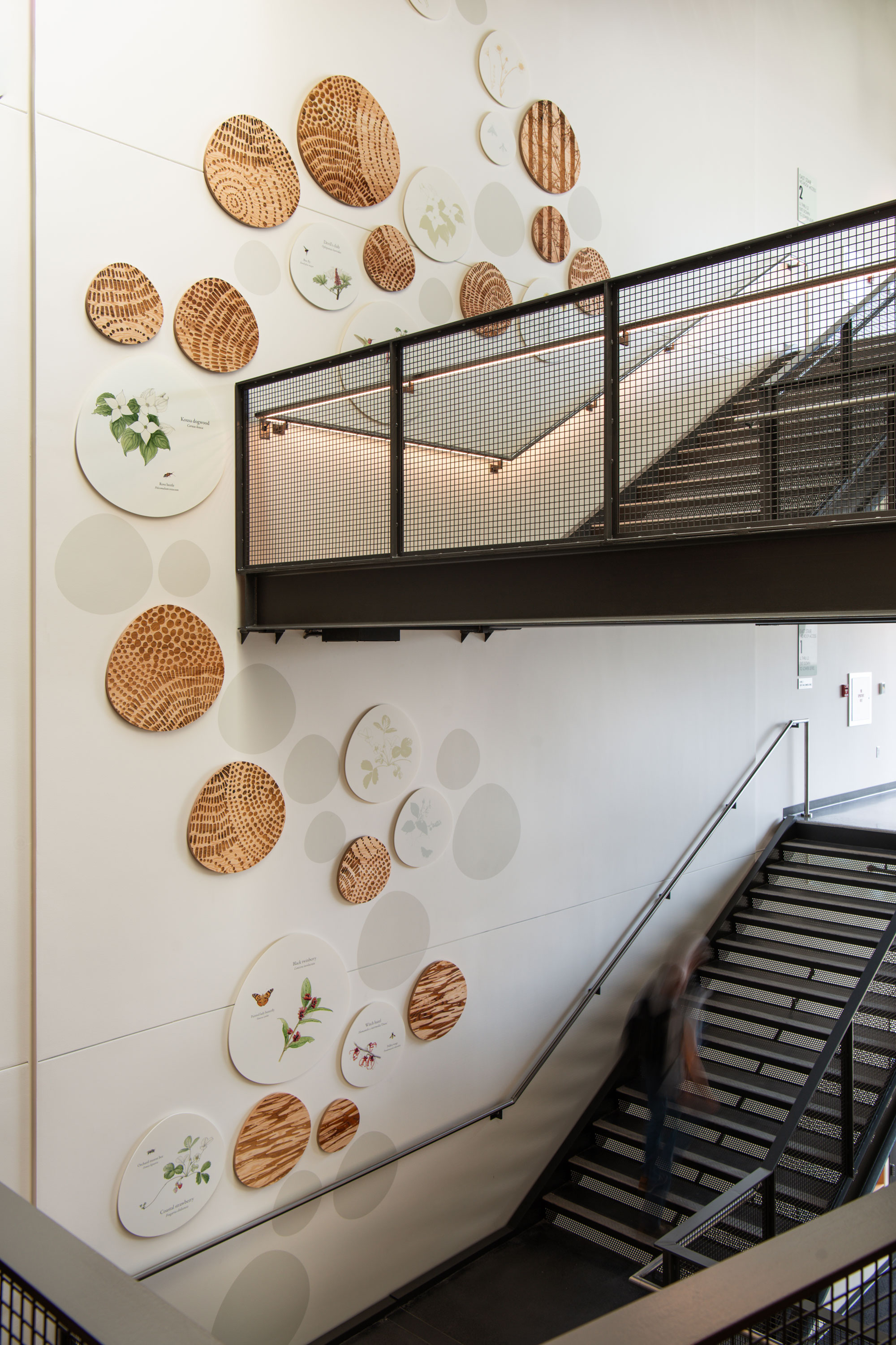
Innovation Hall is bathed in light. A skylit central atrium and monumental stair connect Innovation Hall’s levels and departments. Individual and group study spaces are distributed along this central mixing area, encouraging student collaboration and reinforcing a sense of community. The building is sited at the center of campus on a slope between wetlands and an upland conifer forest and surrounded by a landscape that supports climate adaptive plantings and local pollinators. The building identity and wayfinding is symbolized by an emergent motif inspired by the unique environmental attributes of the site and the building’s spirit of collaboration. To connect inside and outside, an installation inspired by sustainable planting initiatives present throughout the campus ecosystem are exhibited along the height of the monumental stair. The installation features pollinator-friendly plants and pollinators ranging from the wetlands to conifer forest. Illustrations in this exhibit were drawn by the botanical artist Janene Walkky.
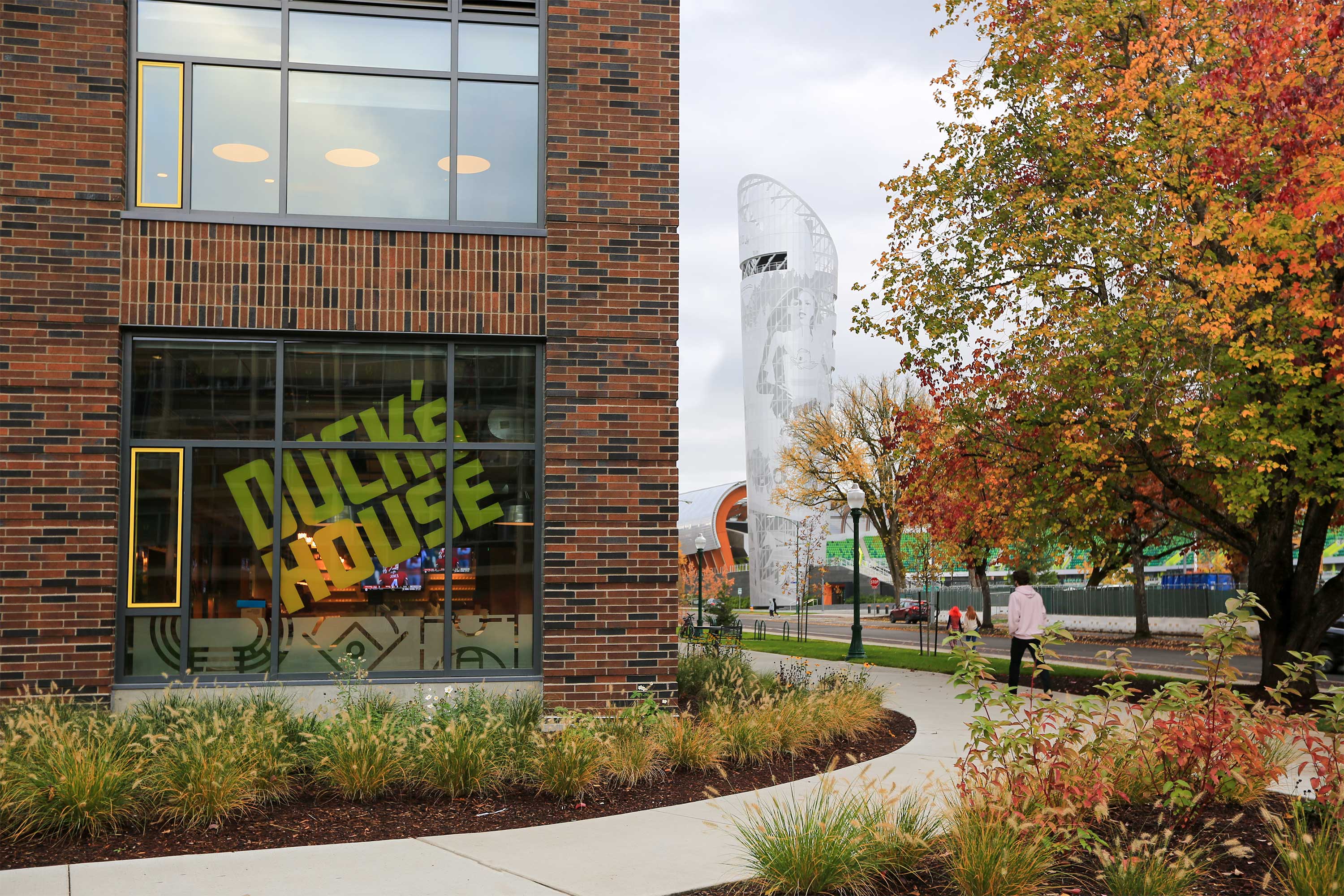
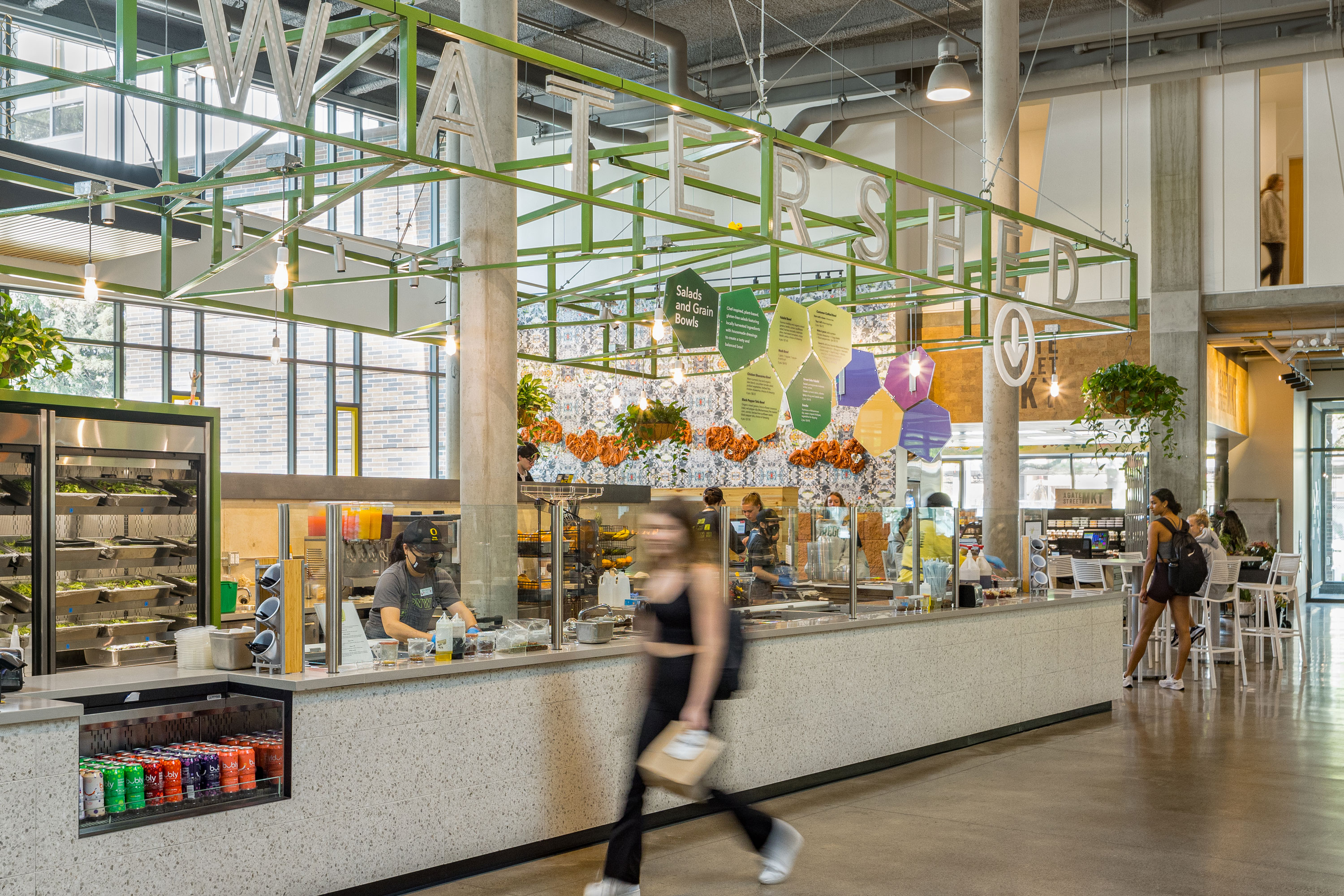
University of Oregon


Delivery_
Branding
Visual Identity
Environmental Graphics
Year_
2022
About_
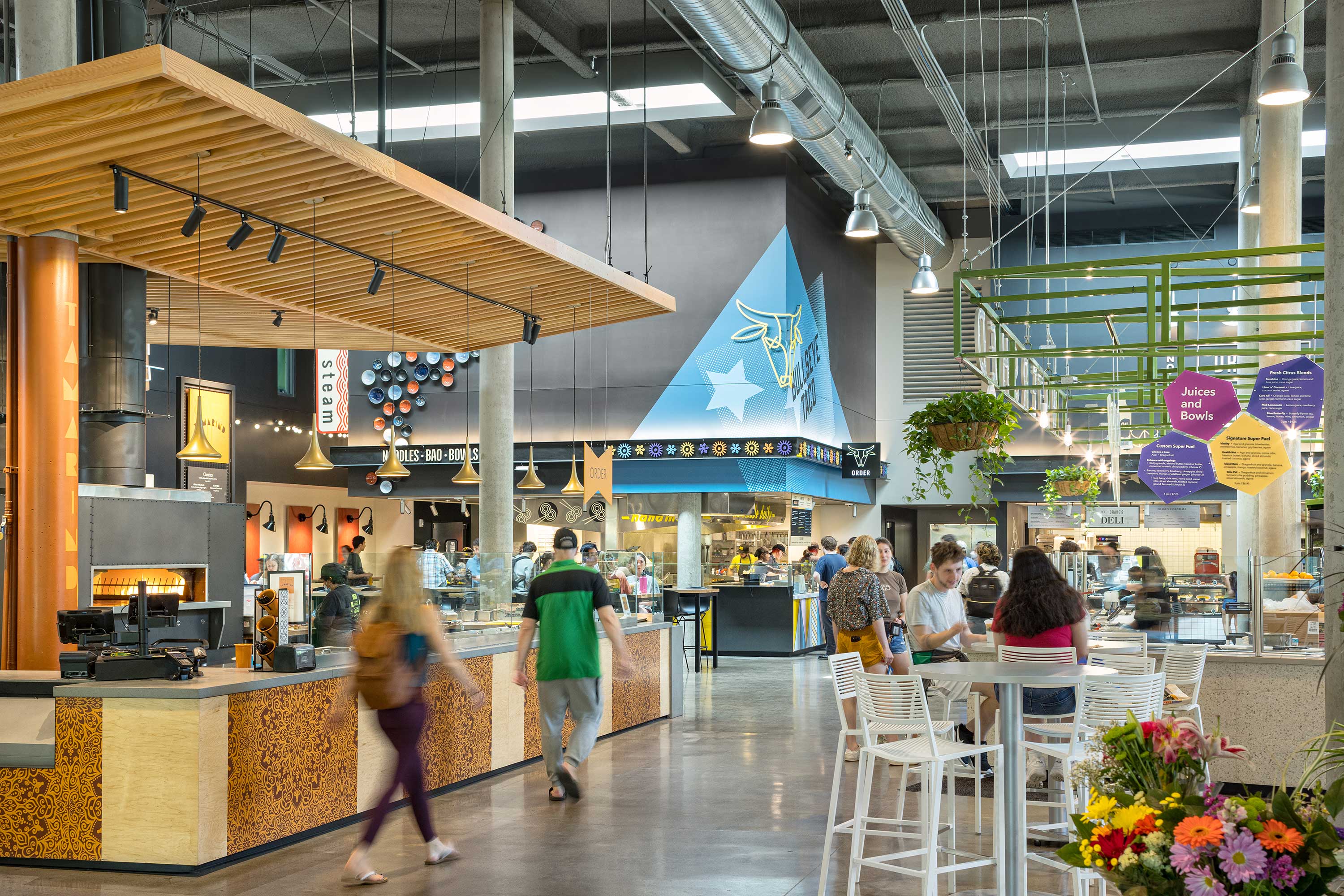
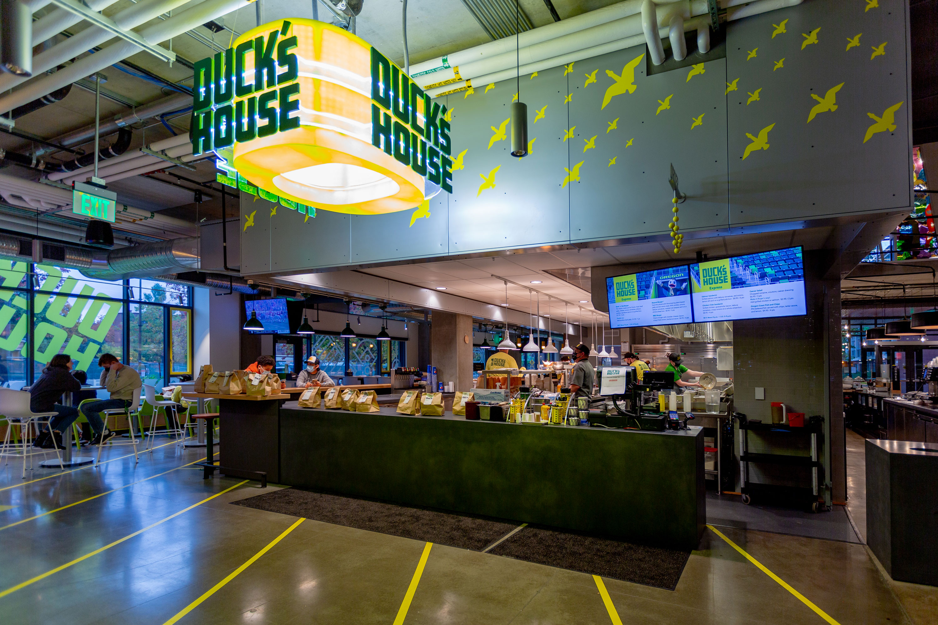
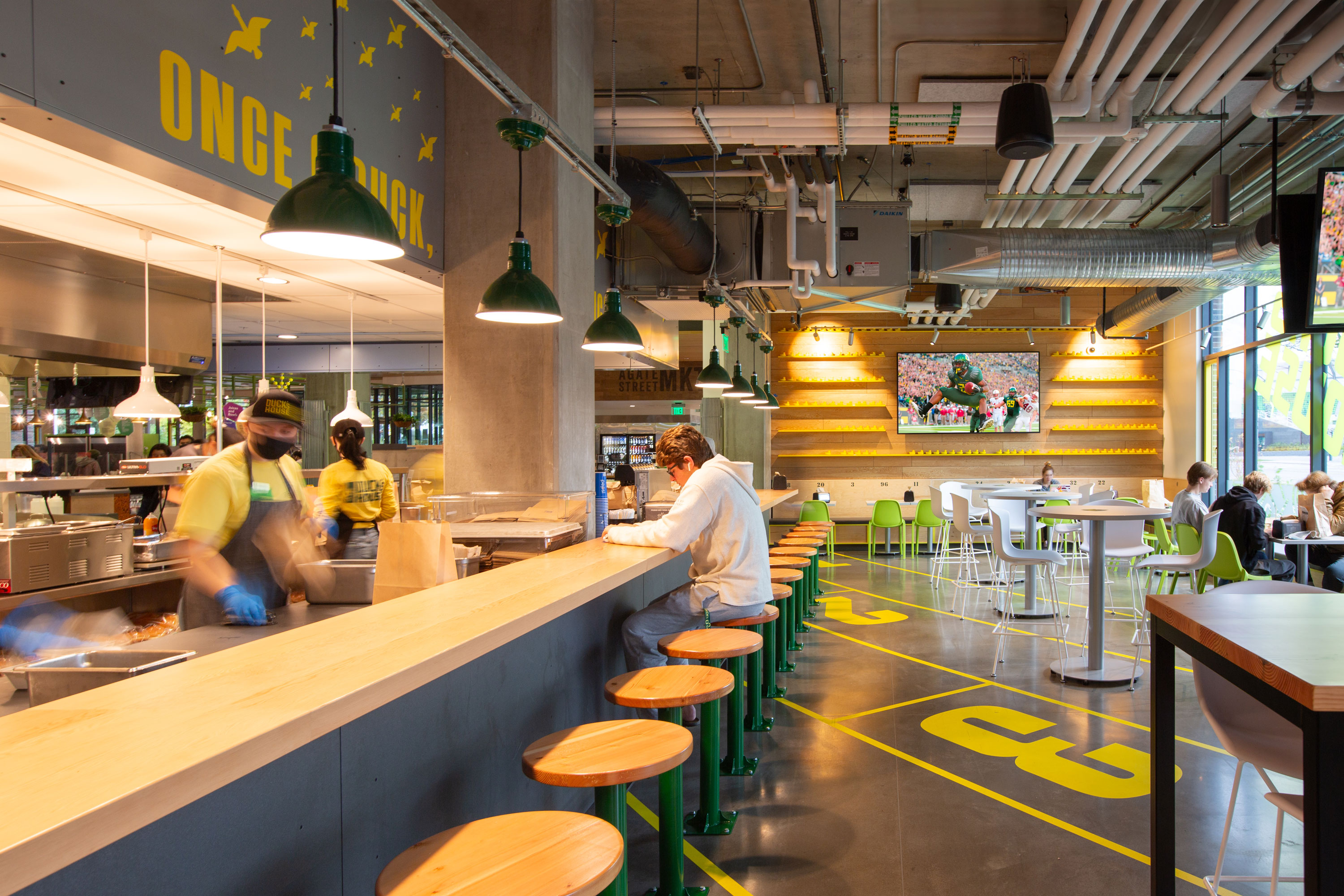
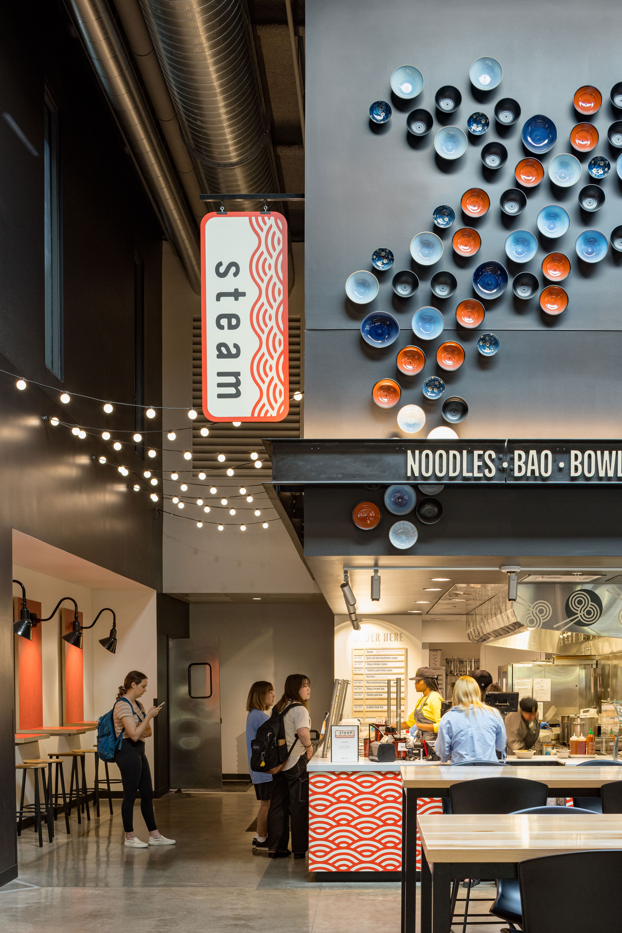
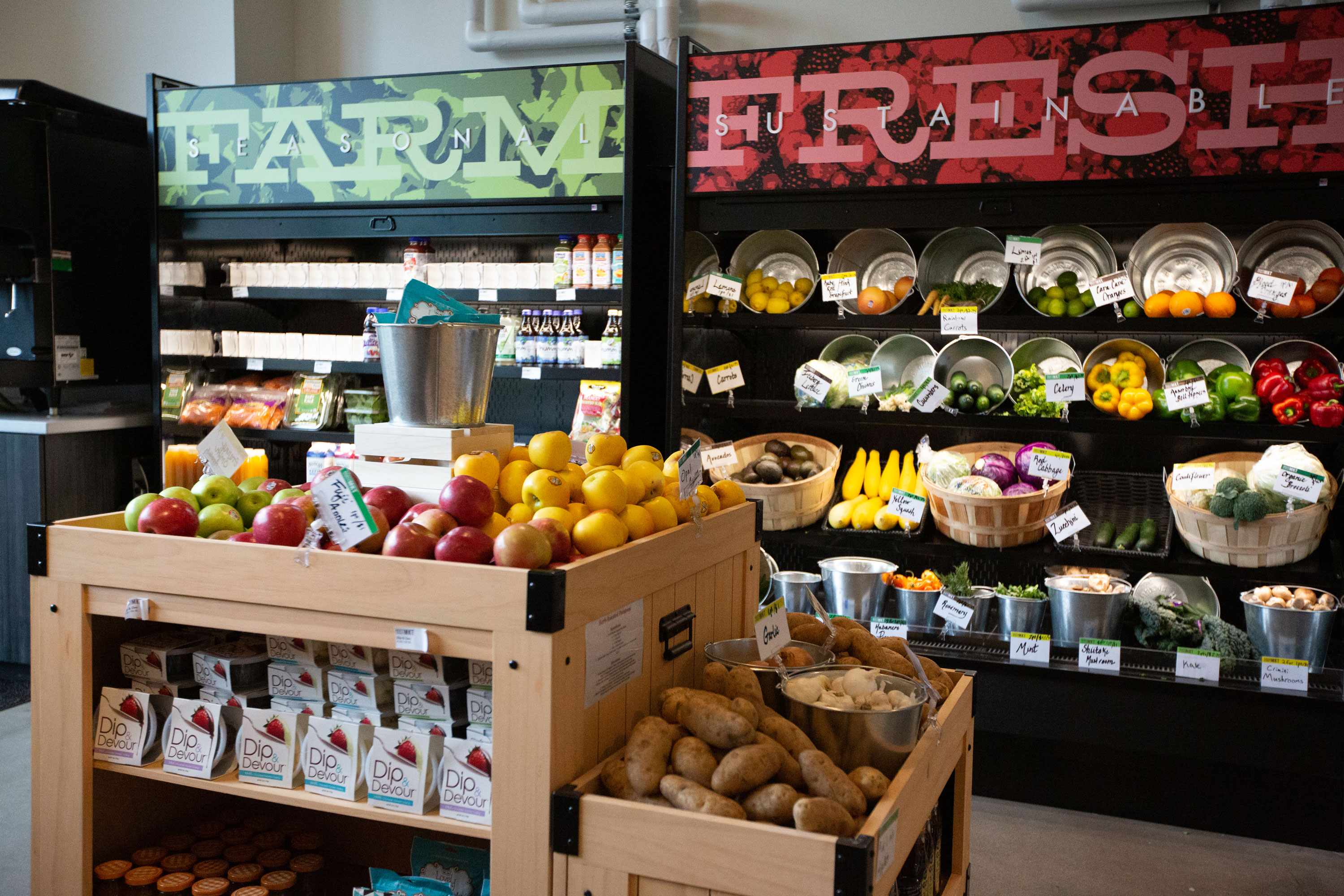
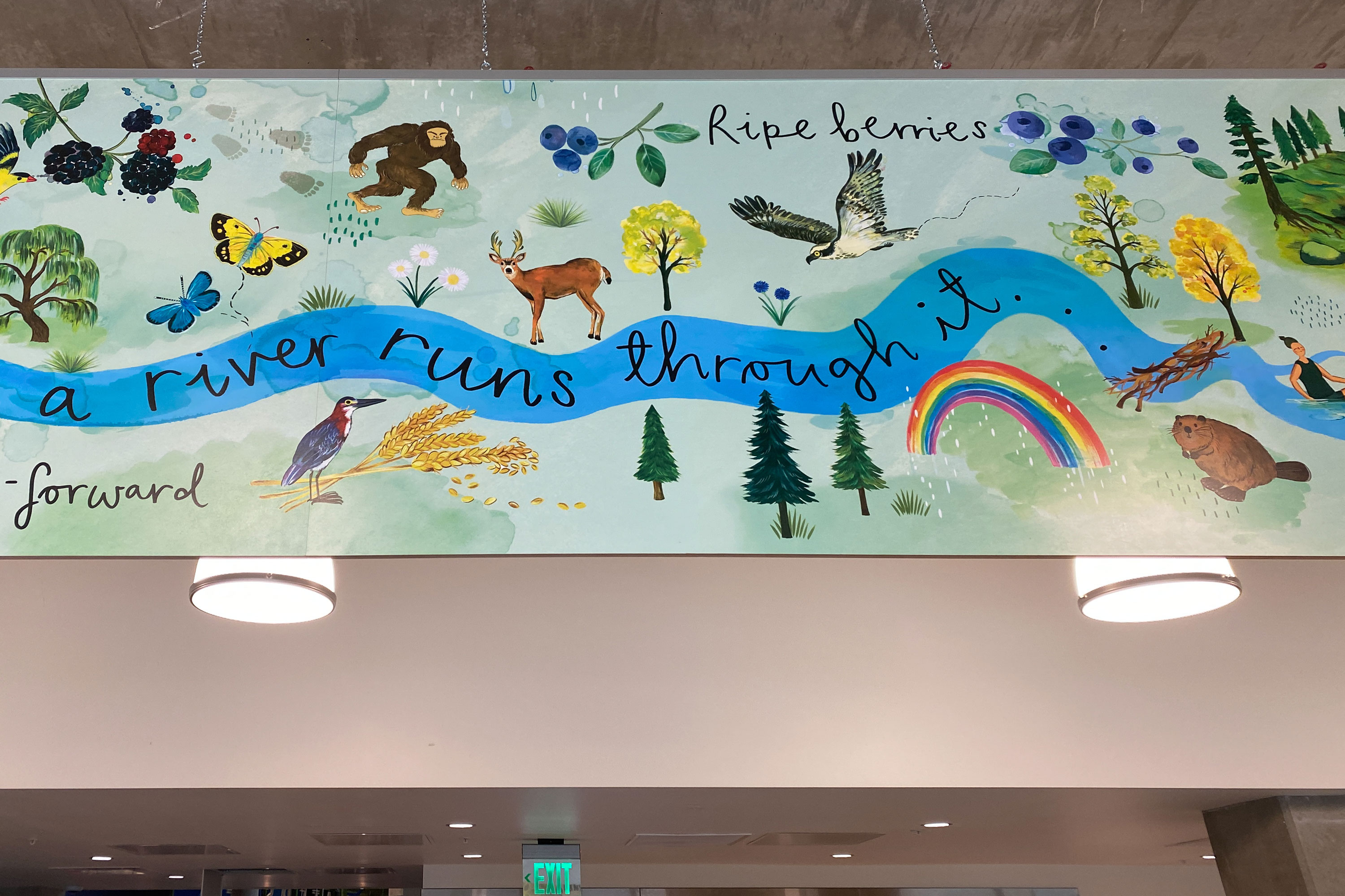
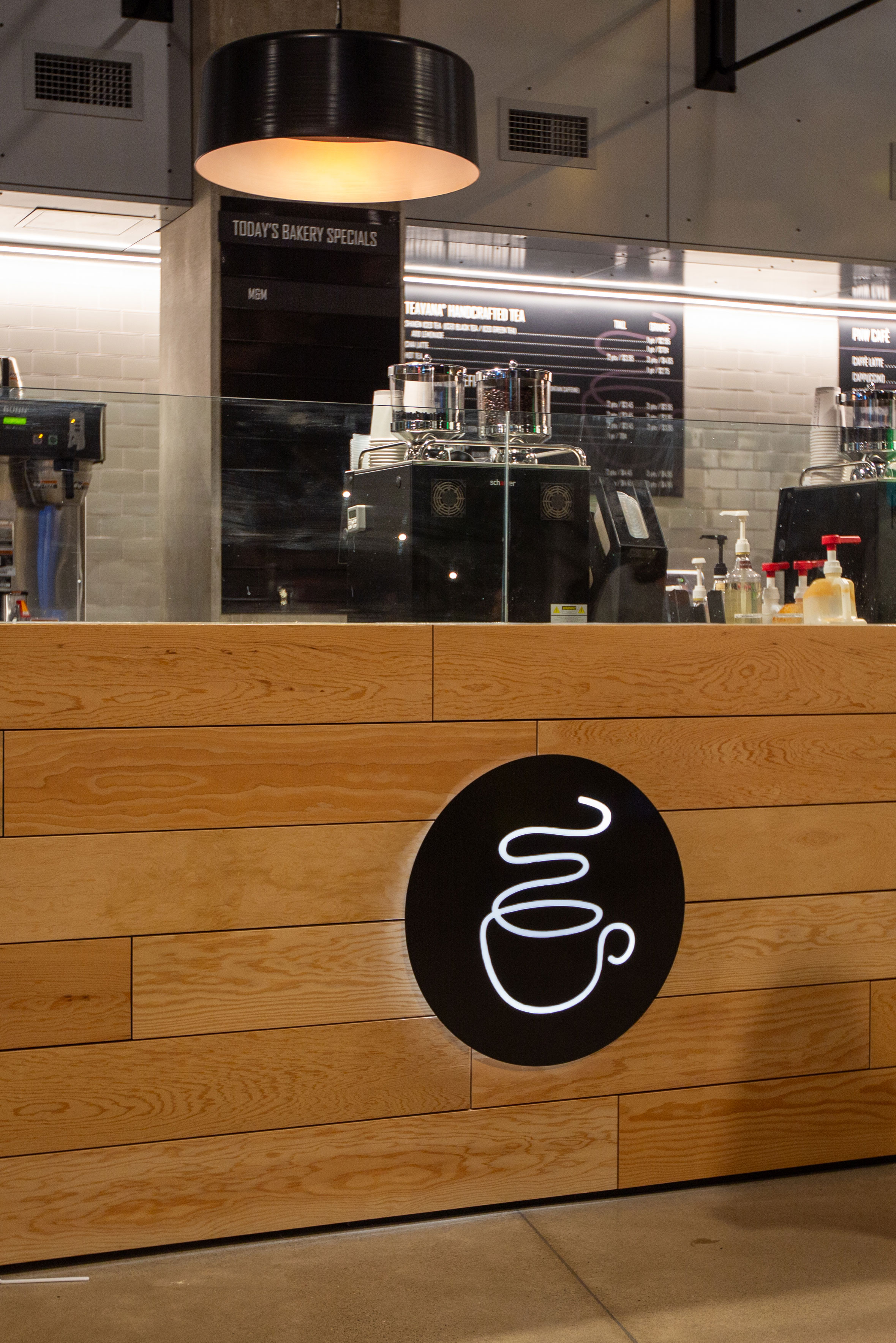
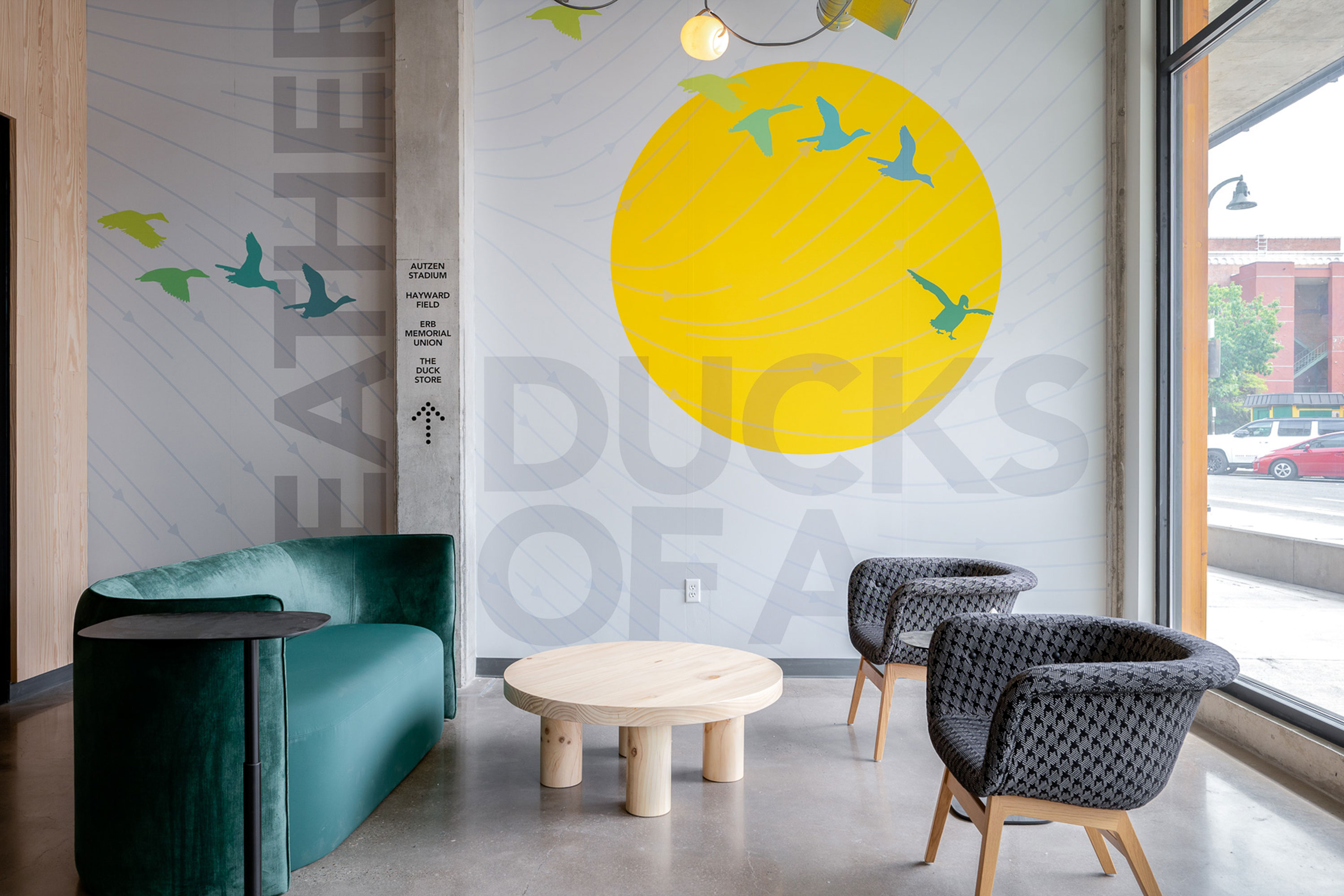
The University challenged the architectural team, Rowell Brokaw and Mithun, to design and deliver a project that could compete with market-rate student housing in Eugene and keep education equitable and affordable. DeNorval Unthank Jr. Hall is dedicated to honor the University’s first Black architecture graduate. The new building influences prospective students’ first impressions of the campus and University as a whole. The first floor is home to the university’s Welcome Center and PNW Public Market, together they showcase the very best the University of Oregon has to offer its incoming Ducks.
Adjacent to the Welcome Center, the PNW Market, the largest dining venue on campus, encompasses nine food venues, a range of seating areas, and multiple art installations from local artists. Open, layered, and well-lit, the eclectic food venues range from bao and noodles, a deli counter, and biryani to wood-fired pizza, and pub-style fare, Duck’s House. Ingredients are locally sourced from more than 25 farms in the surrounding Willamette Valley. Each venue was designed with a unique identity and menu, but collectively the impression embodies a unified spirit and the area’s rich history of handcrafted and locally made food.
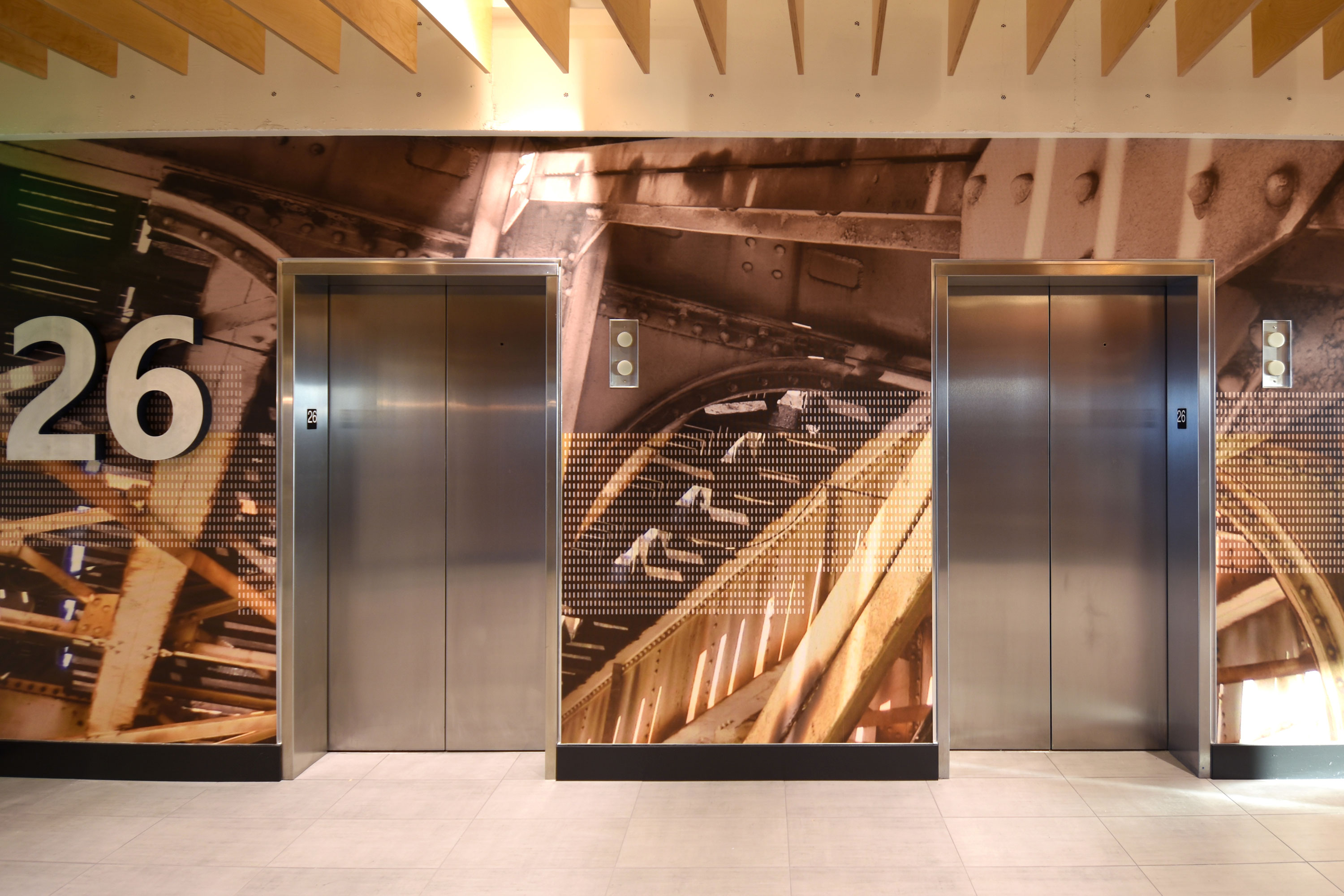
Northlake Commons


Delivery_
Environmental Graphics
Year_
2024
About_
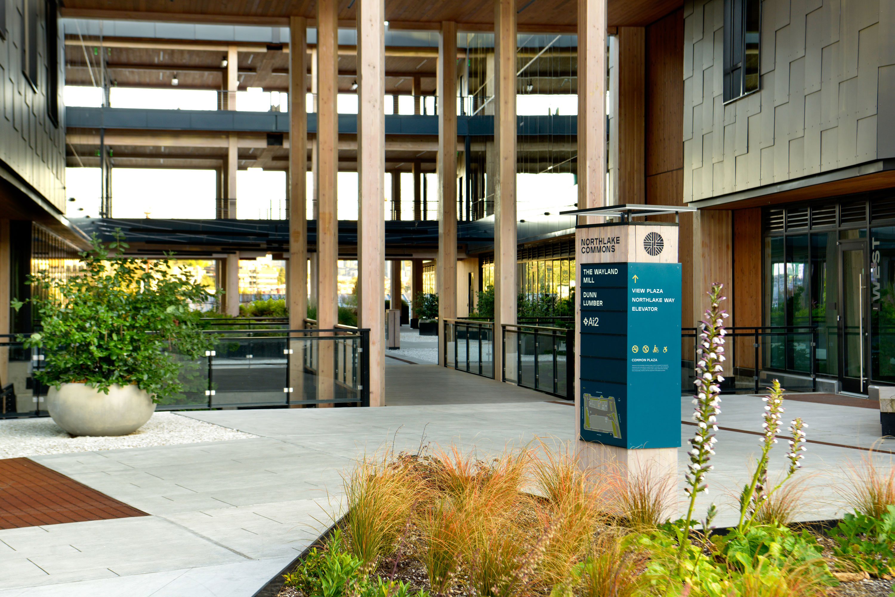
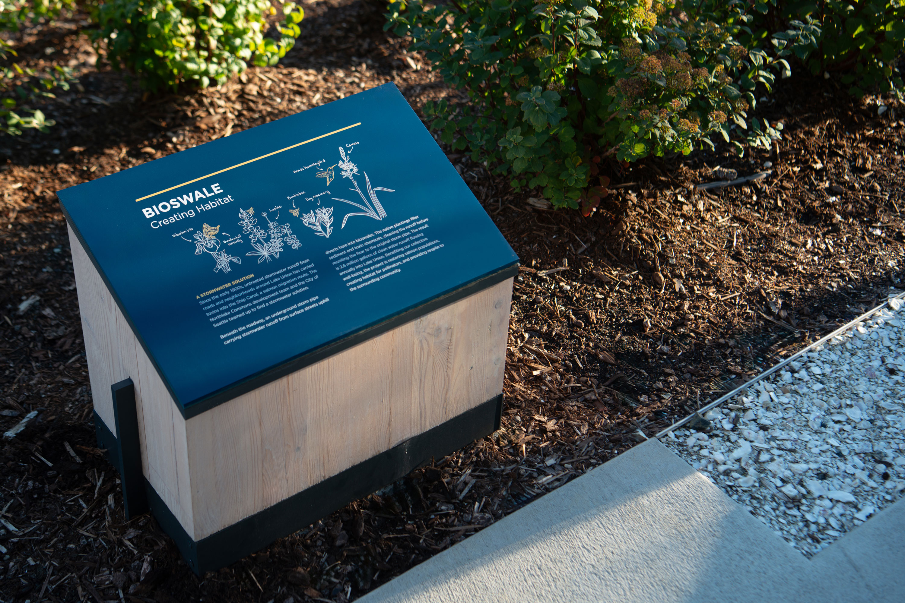
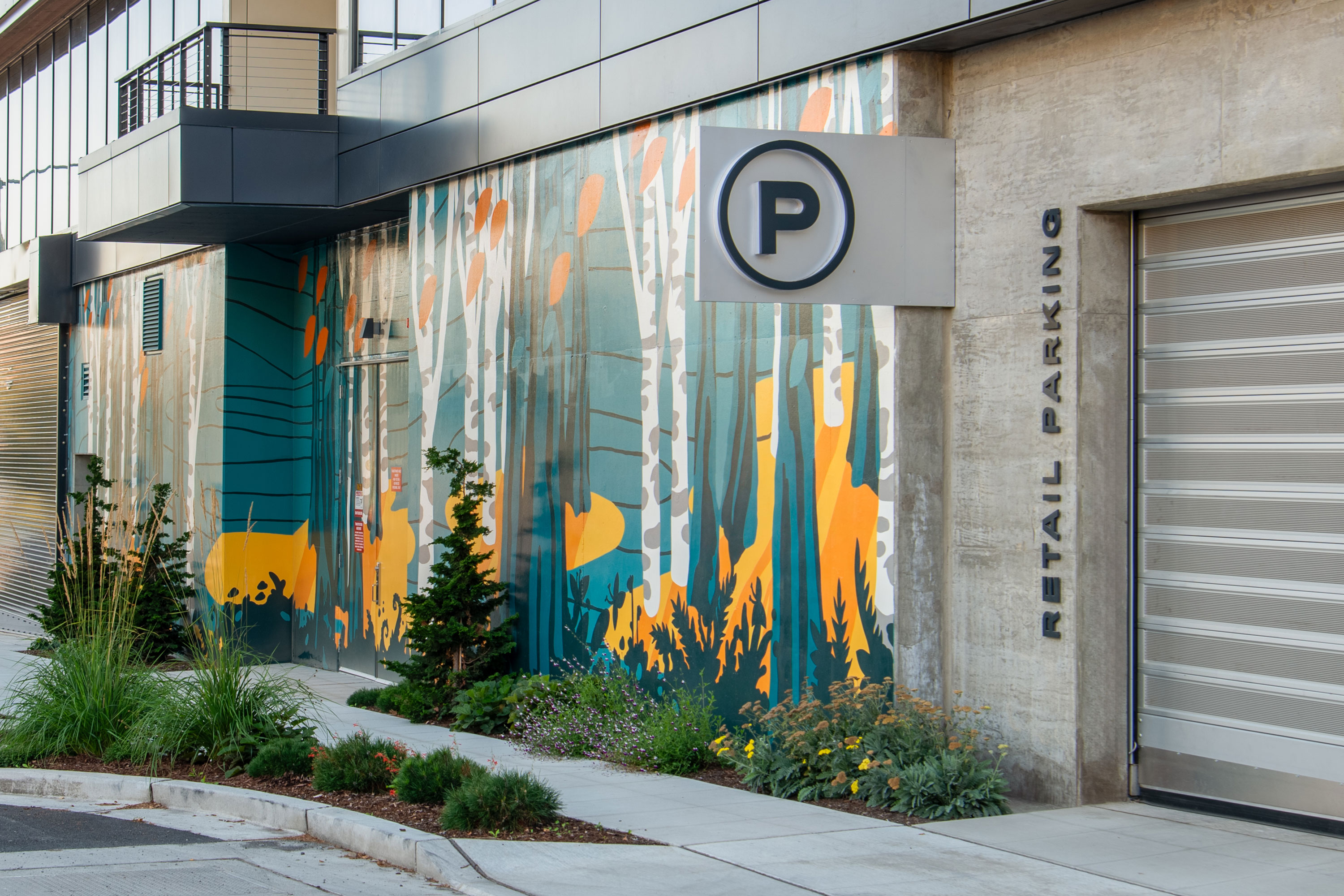
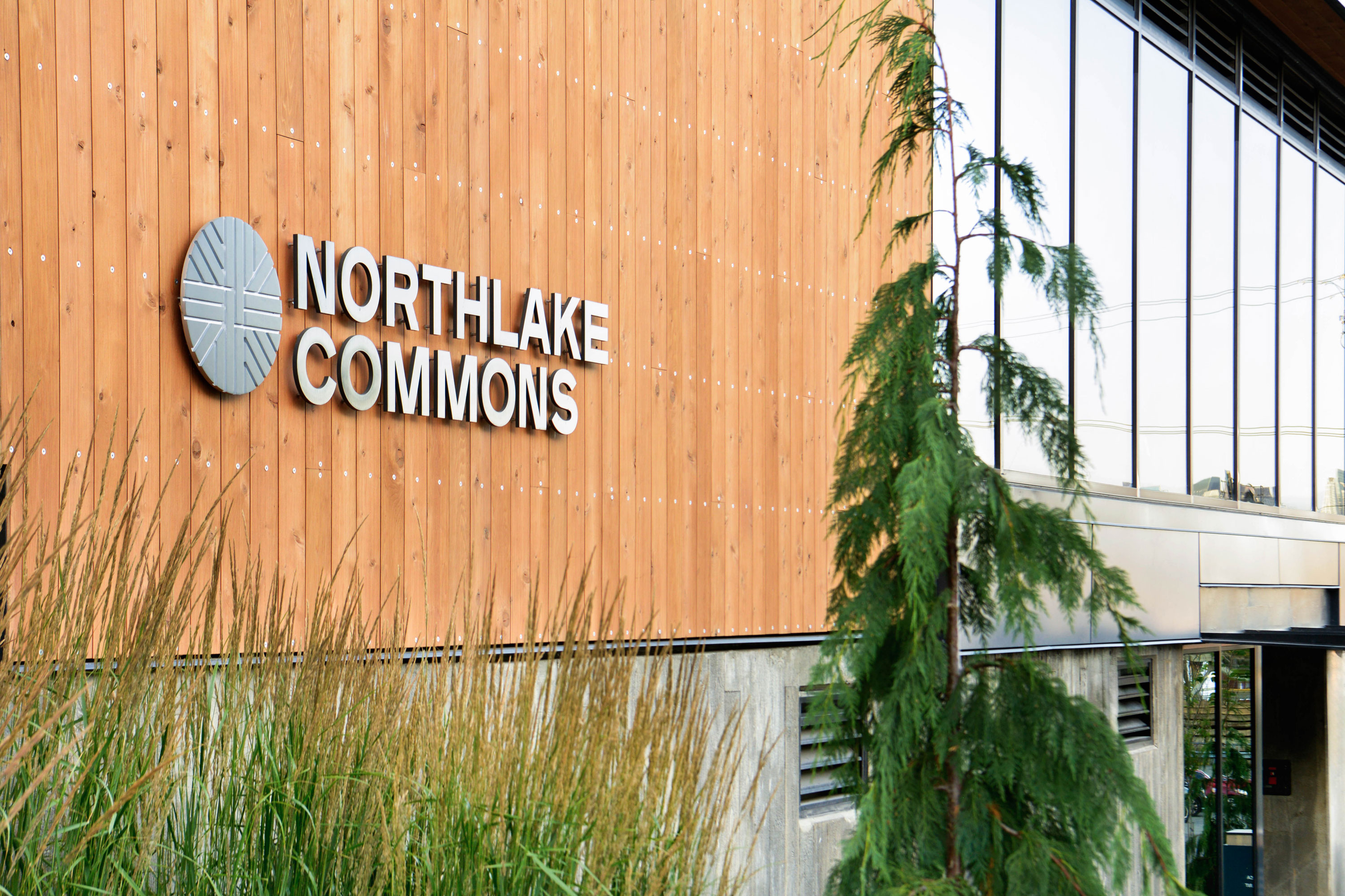
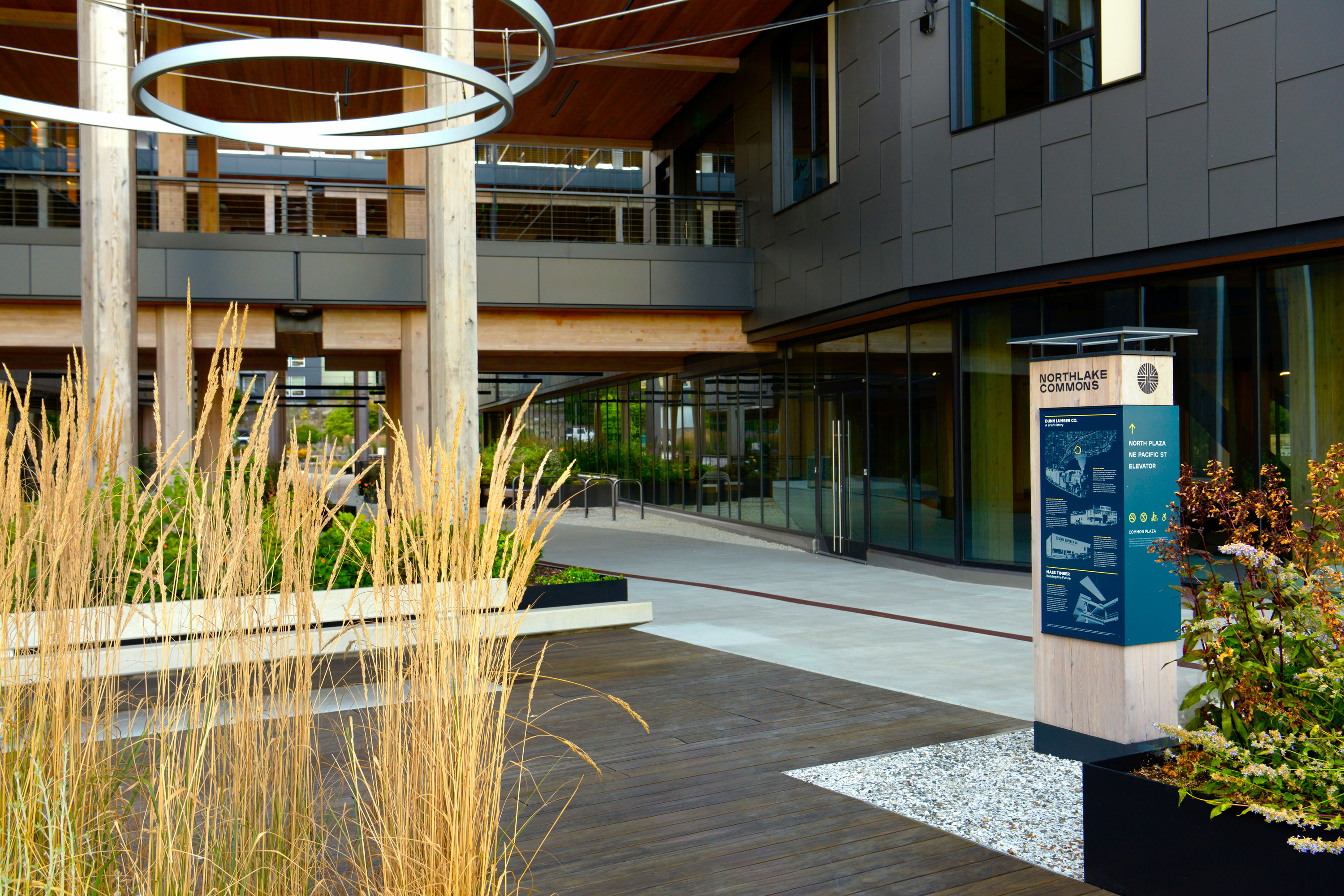
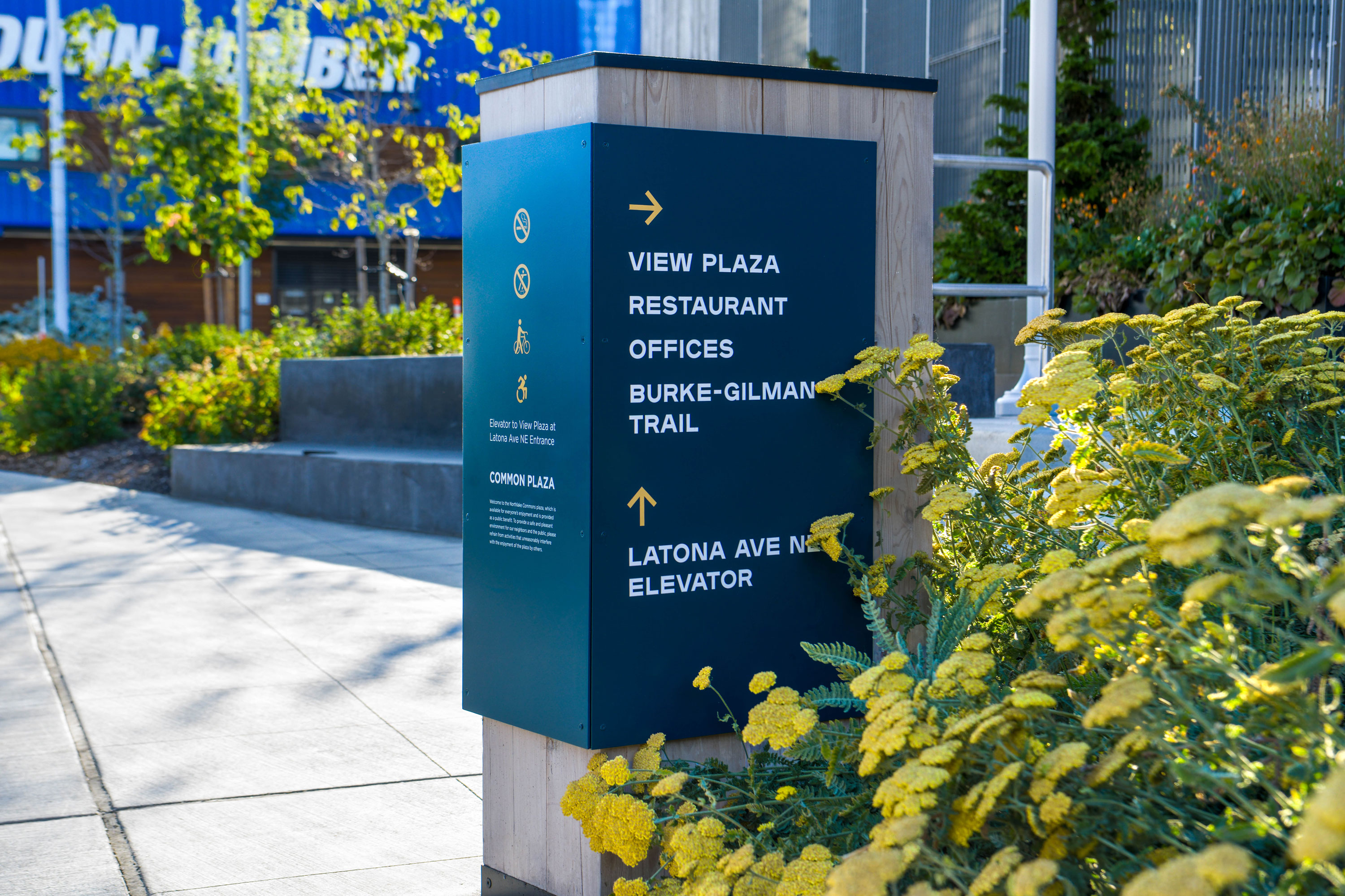
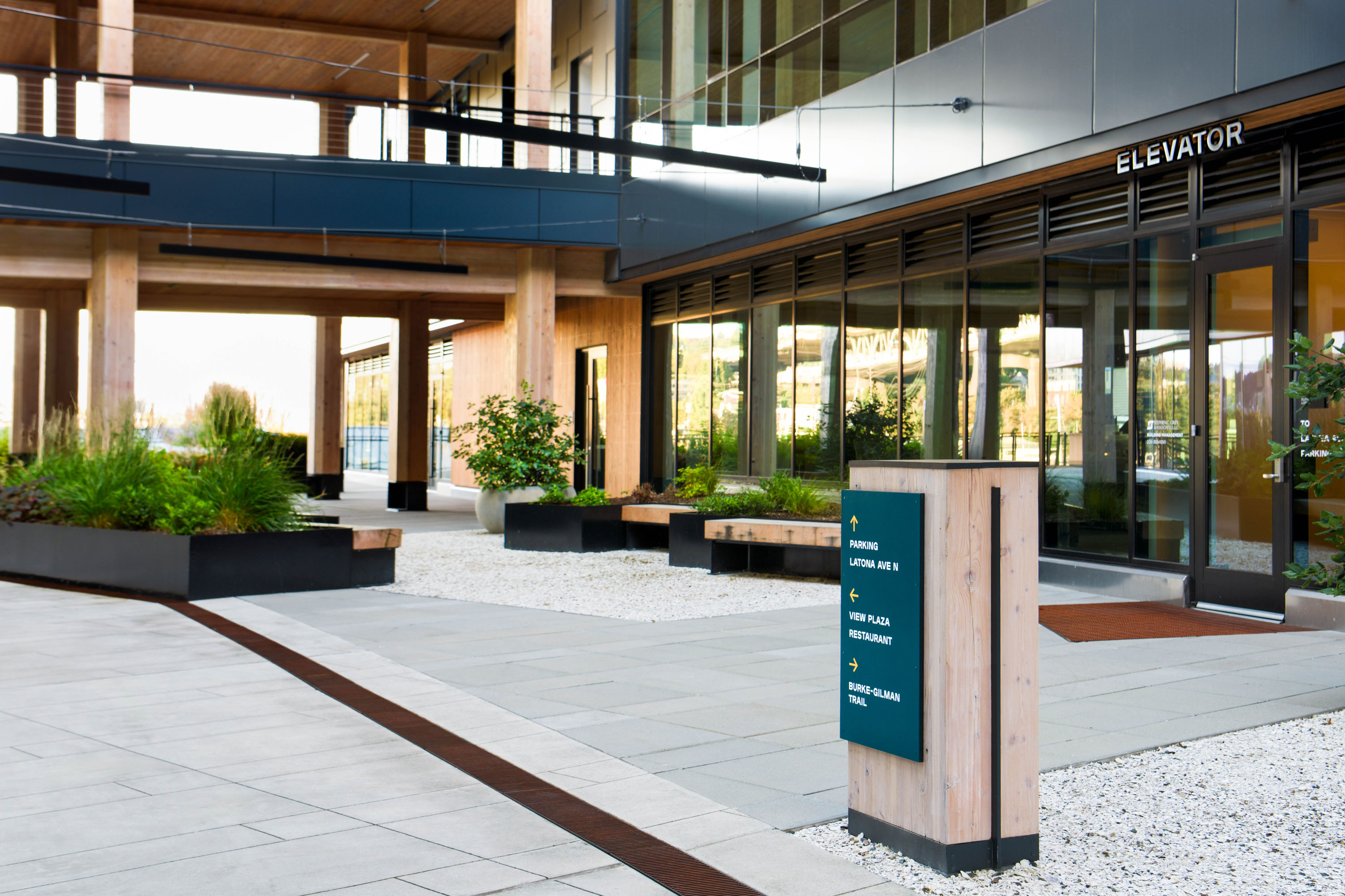
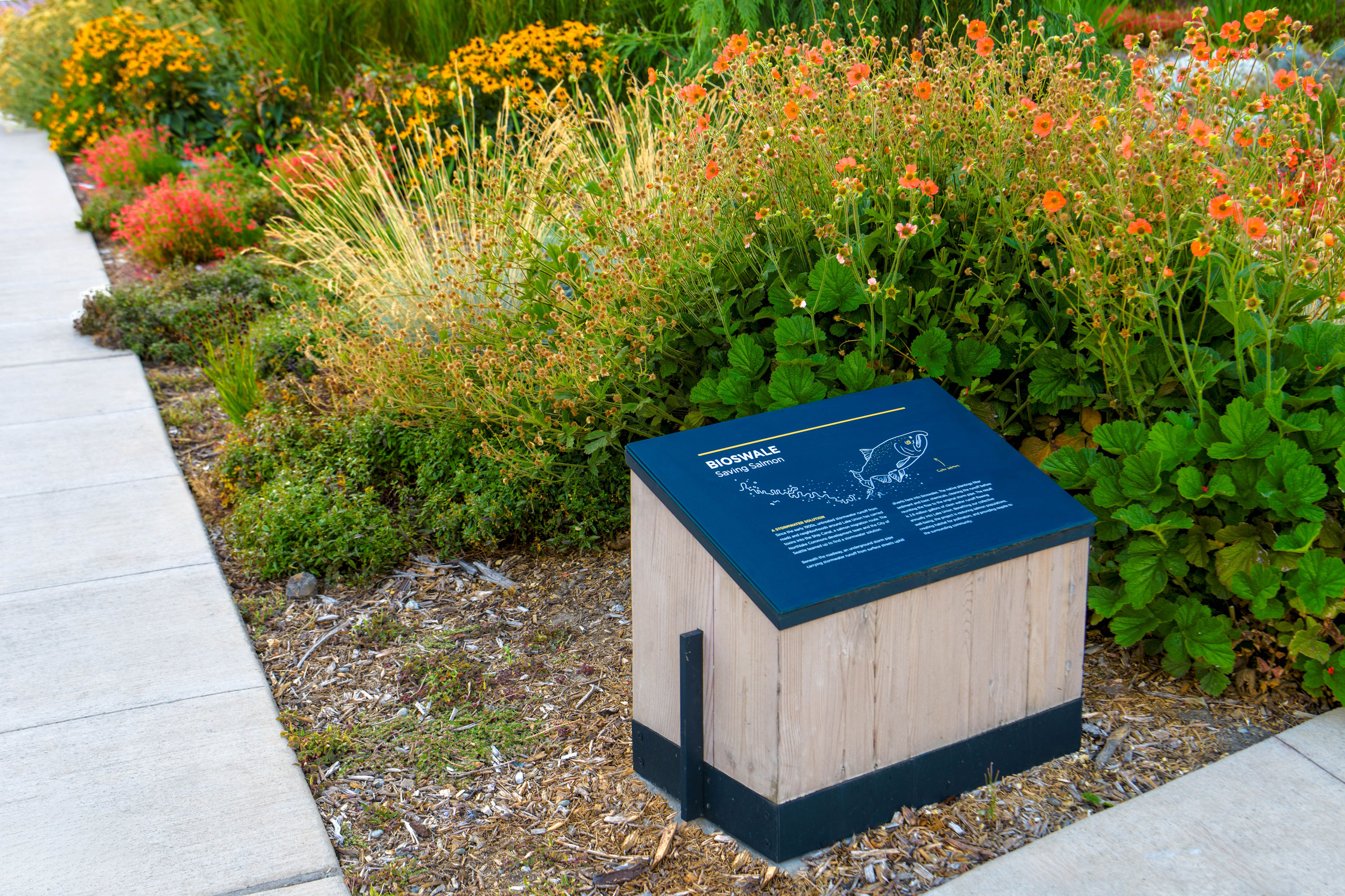
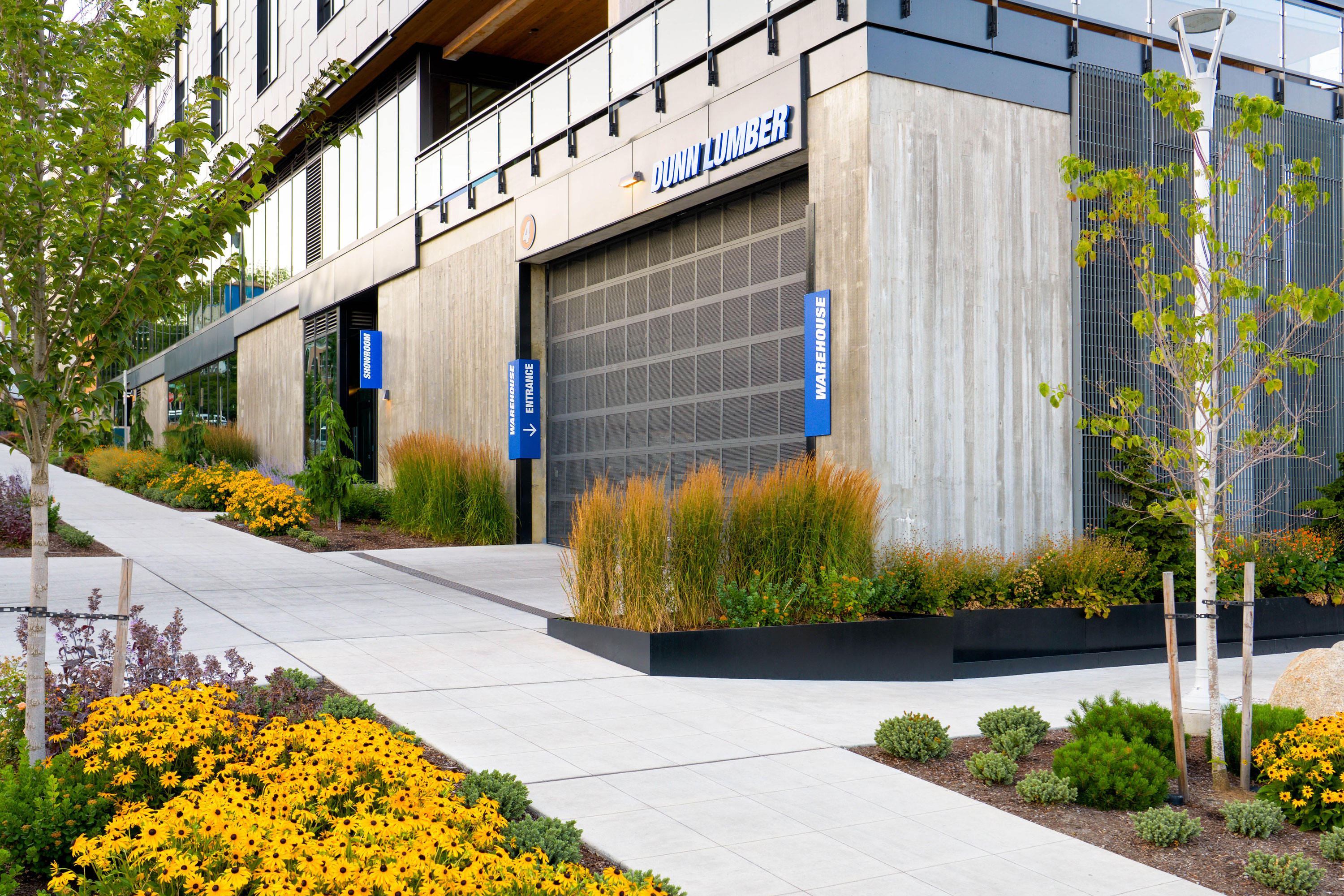
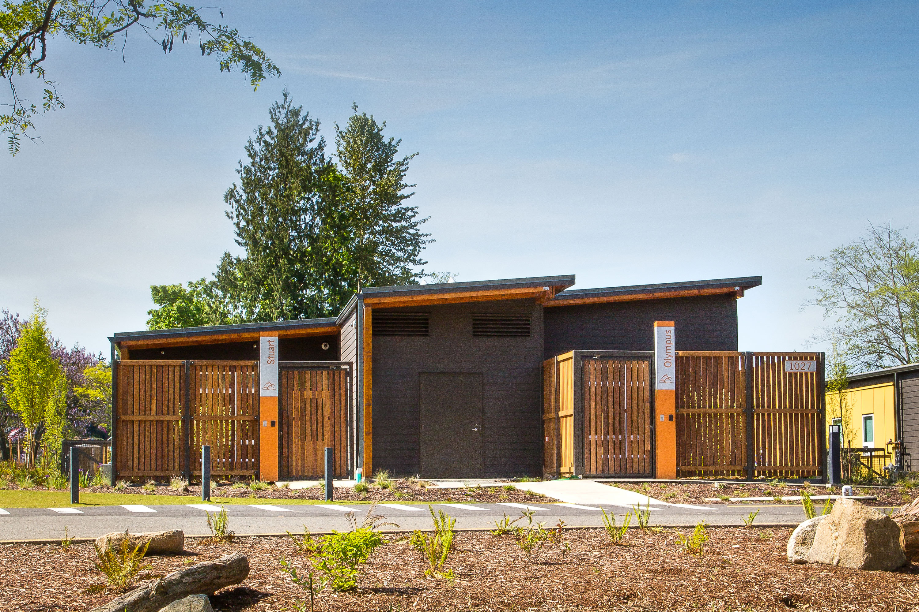
Situated on Dunn Lumber’s original lumber yard, Northlake Commons pays homage to the site’s history while looking to the future of workplace environments and the neighborhood. The North Lake Union neighborhood is taking shape—a place where Seattle’s industrial heritage and academic center meet modern-day vision and values. Paying homage to the Dunn family’s historic connection to the site, this new multi-use commercial building incorporates heavy timber both indoors and out, opening with unique purpose onto the Burke-Gilman trail and the water beyond. The innovative landmark elevates the human experience in the workplace, curating an ecosystem that brings professional and personal engagement together into a built environment.
Site Identity and wayfinding elements were crafted from glulam remnants reclaimed during the mass timber construction. In addition to these sign elements providing material continuity and orientation on site, the design includes interpretive panels on Dunn Family history, mass timber construction technique, and sustainable features of the landscape design. On the lower-level Dunn Lumber maintains a new warehouse and showroom extending their history on site and into the future.
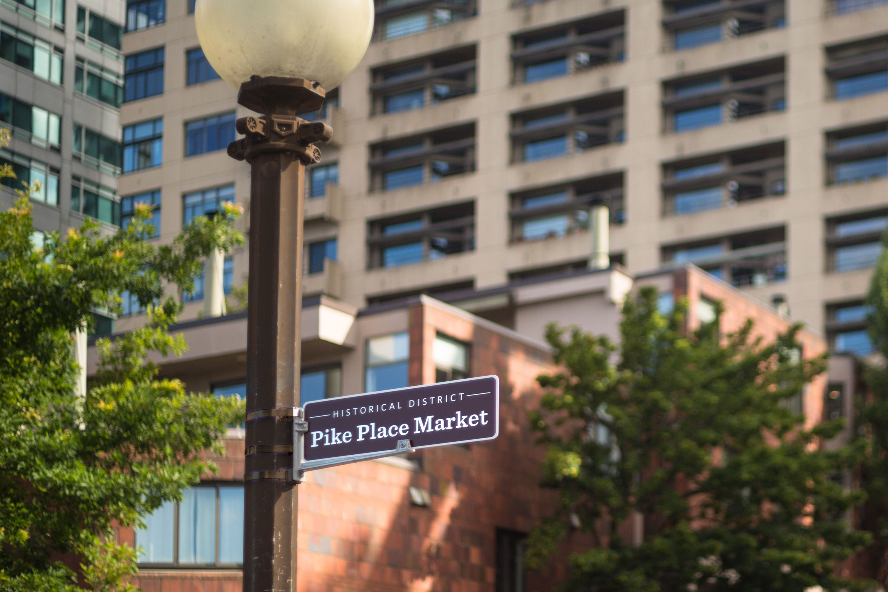
Pike Place Market


Delivery_
Visual Identity
Environmental Graphics
Year_
2014
About_
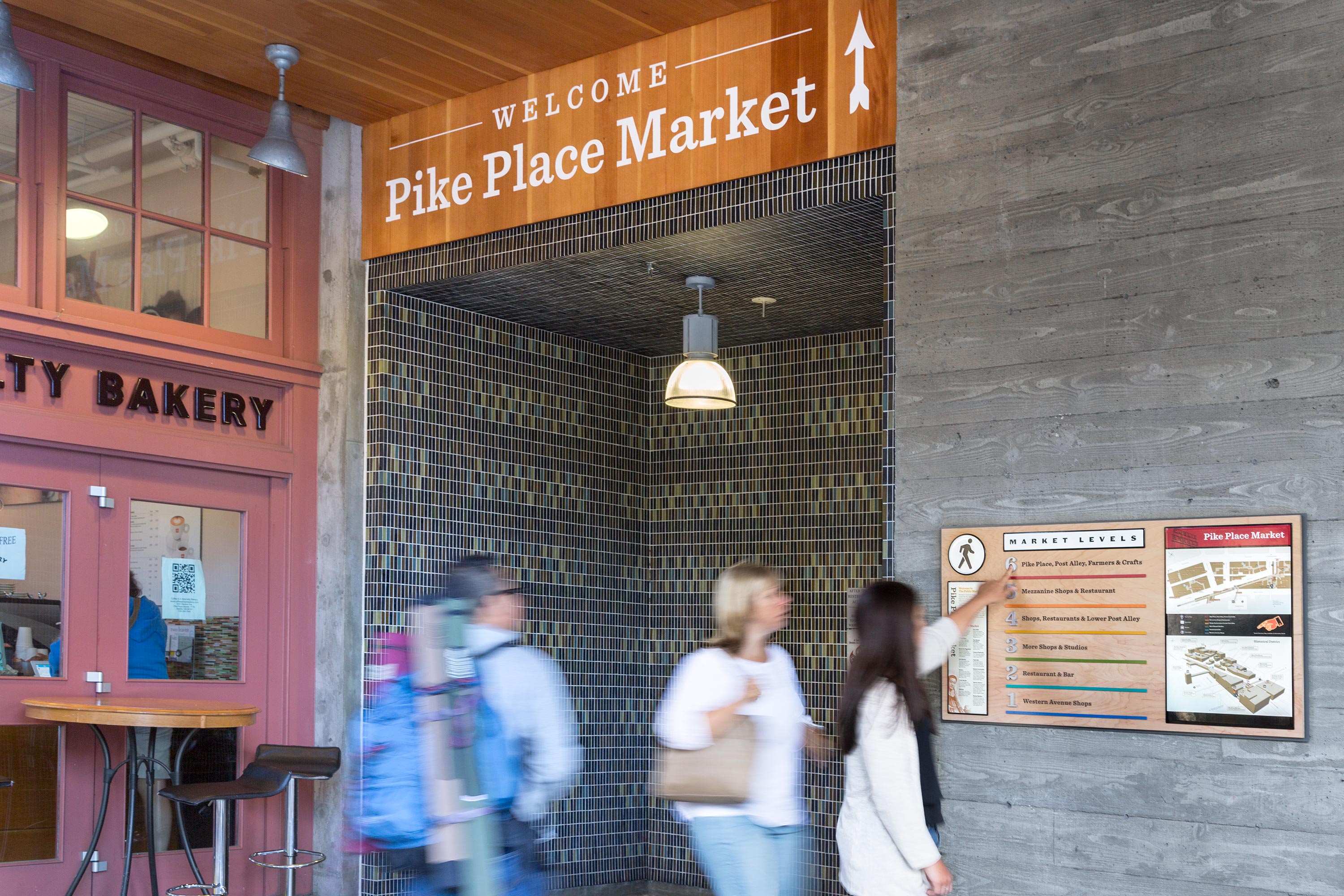
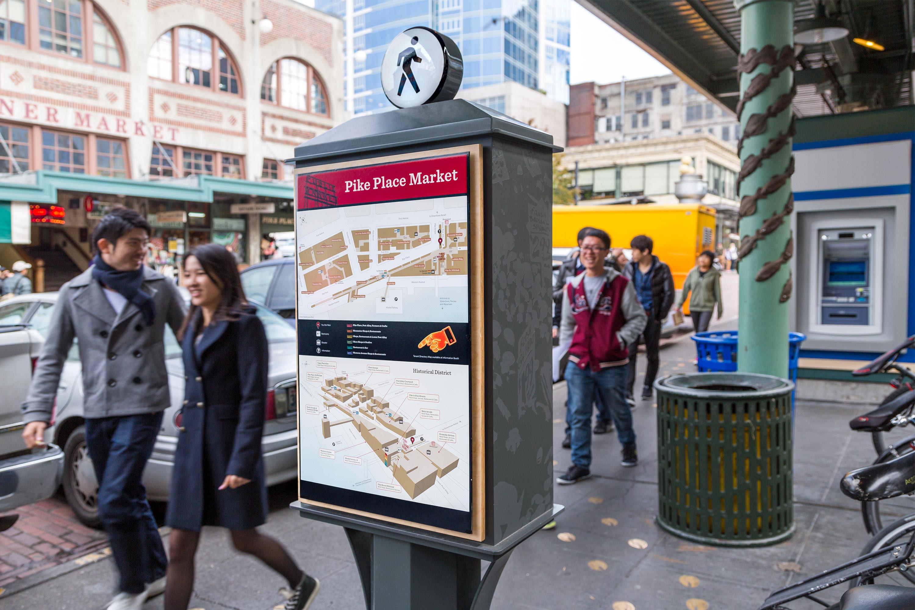
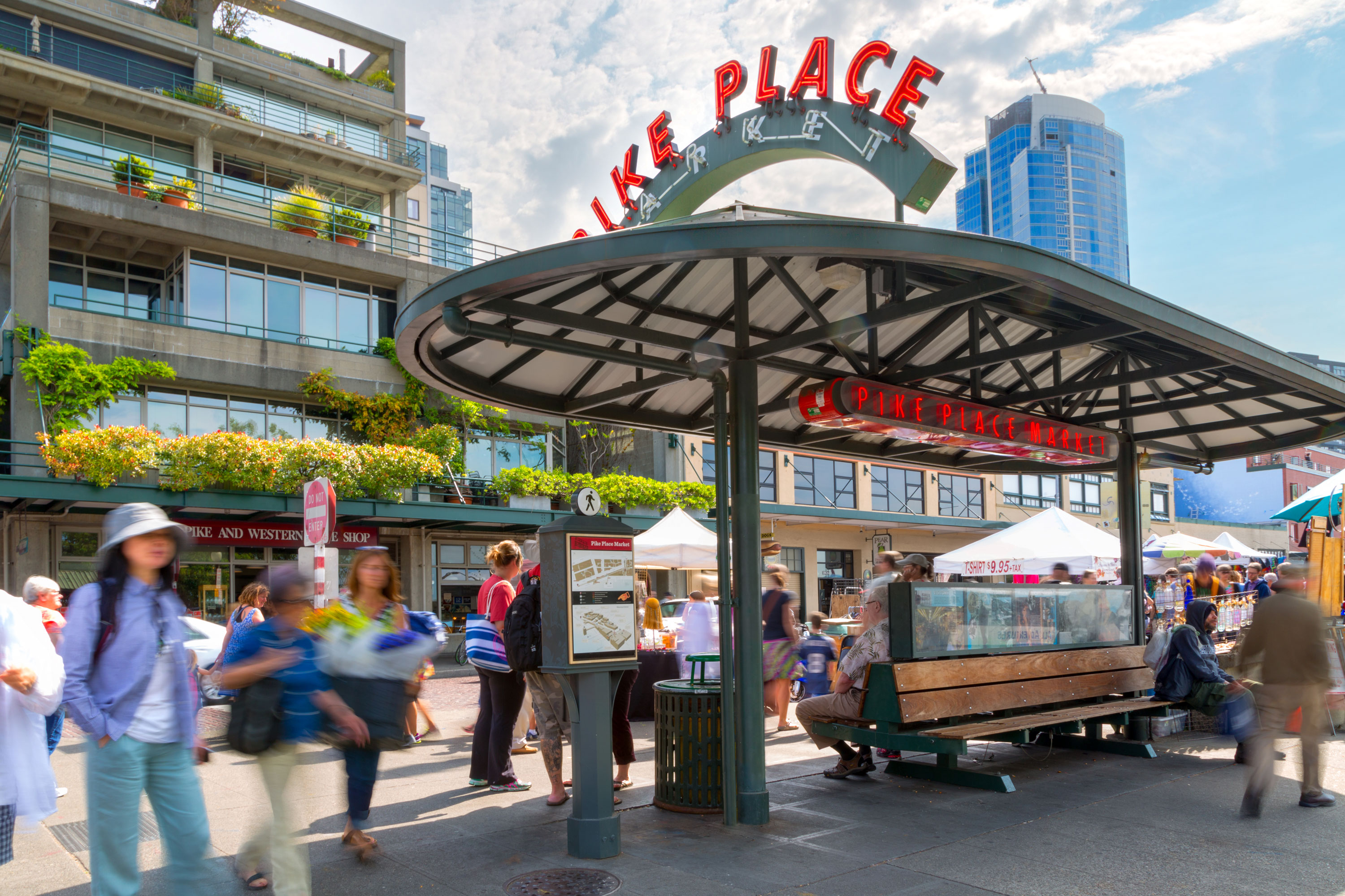
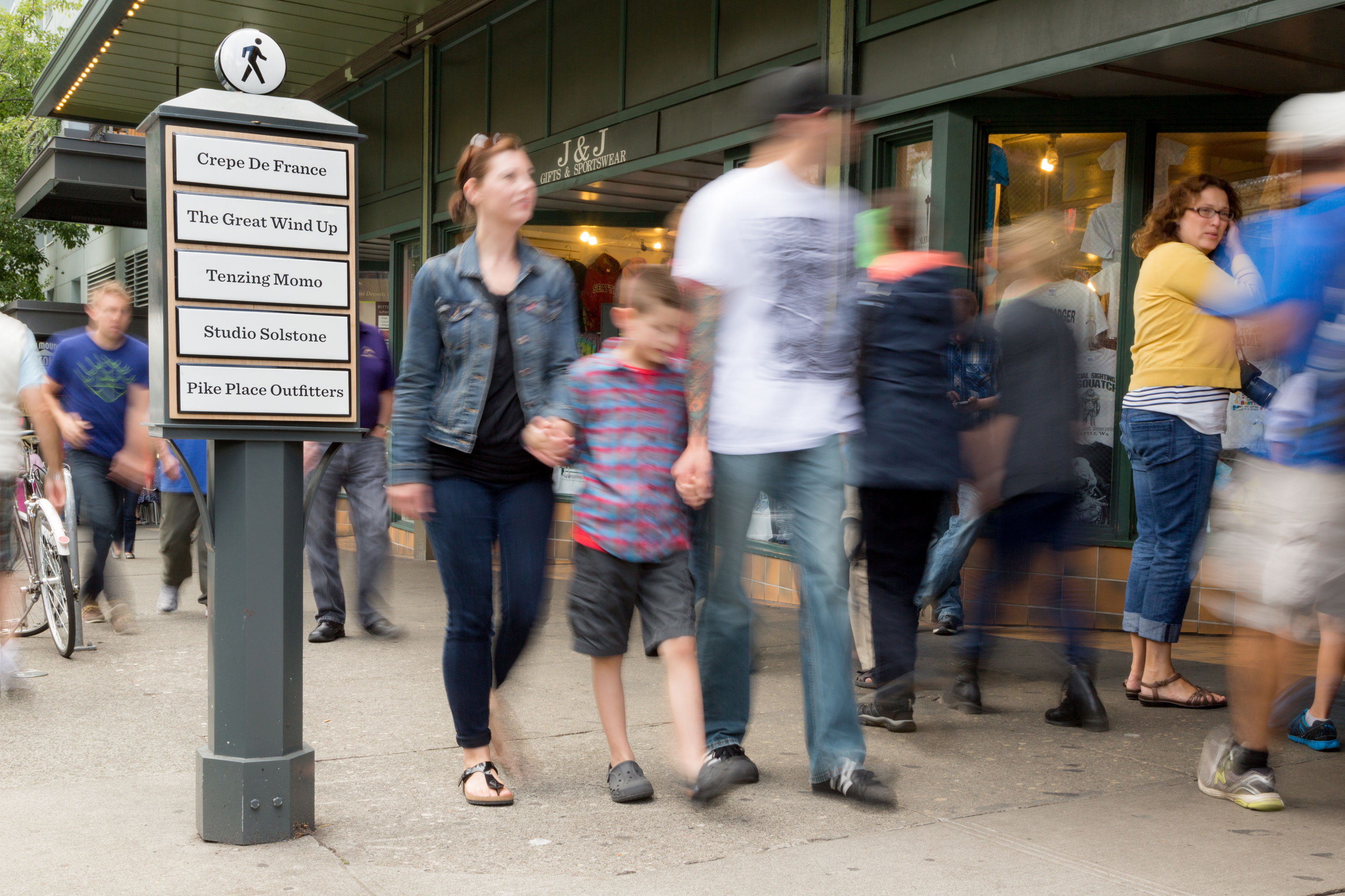
Pike Place Market is one of the most iconic marketplaces in the country. Incubating over 200 small businesses, craftspeople, and farmers, it is considered the soul of Seattle and has been a coveted place for over a century for locals and tourists alike to immerse themselves in a distinctly Seattle-centric culture.
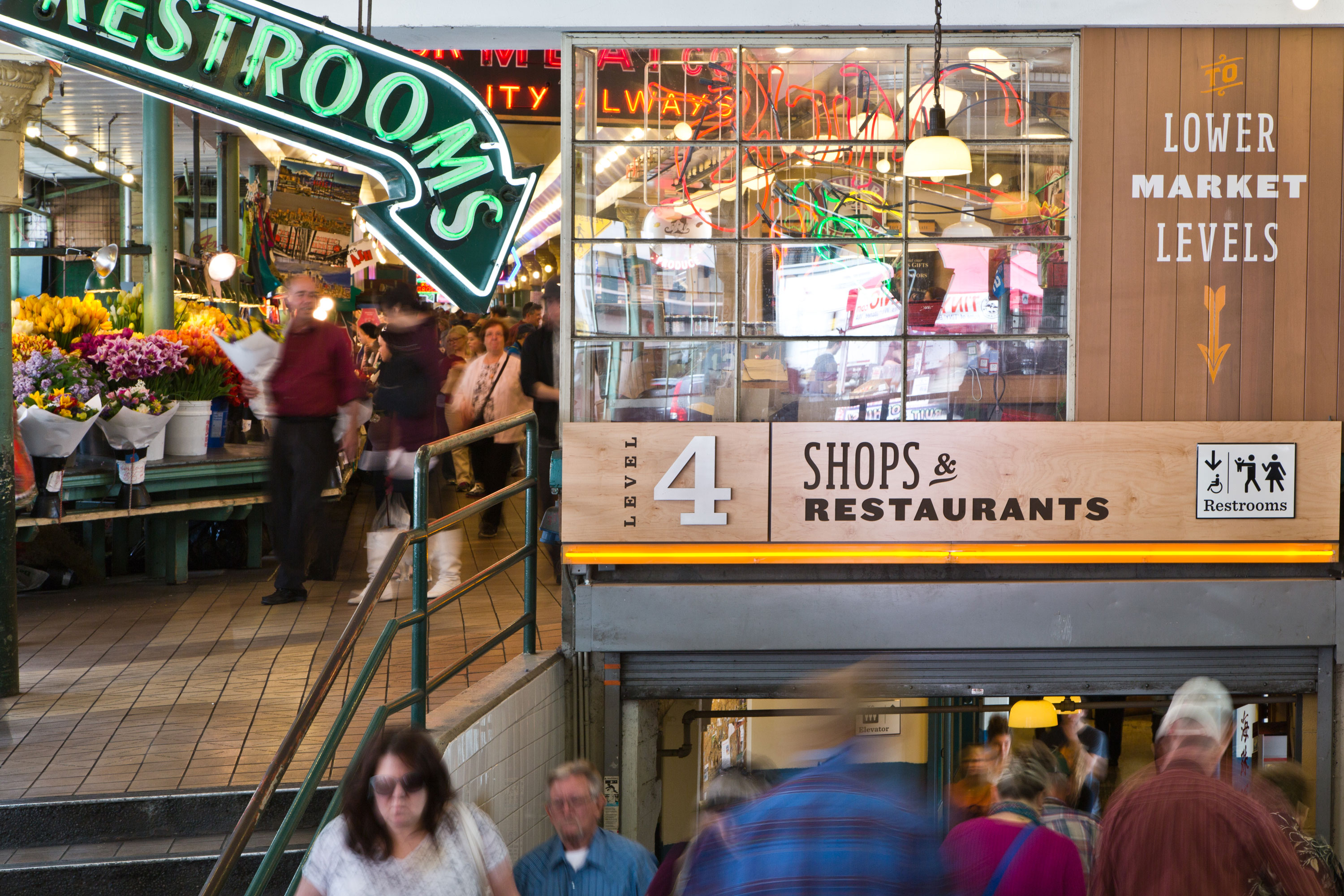
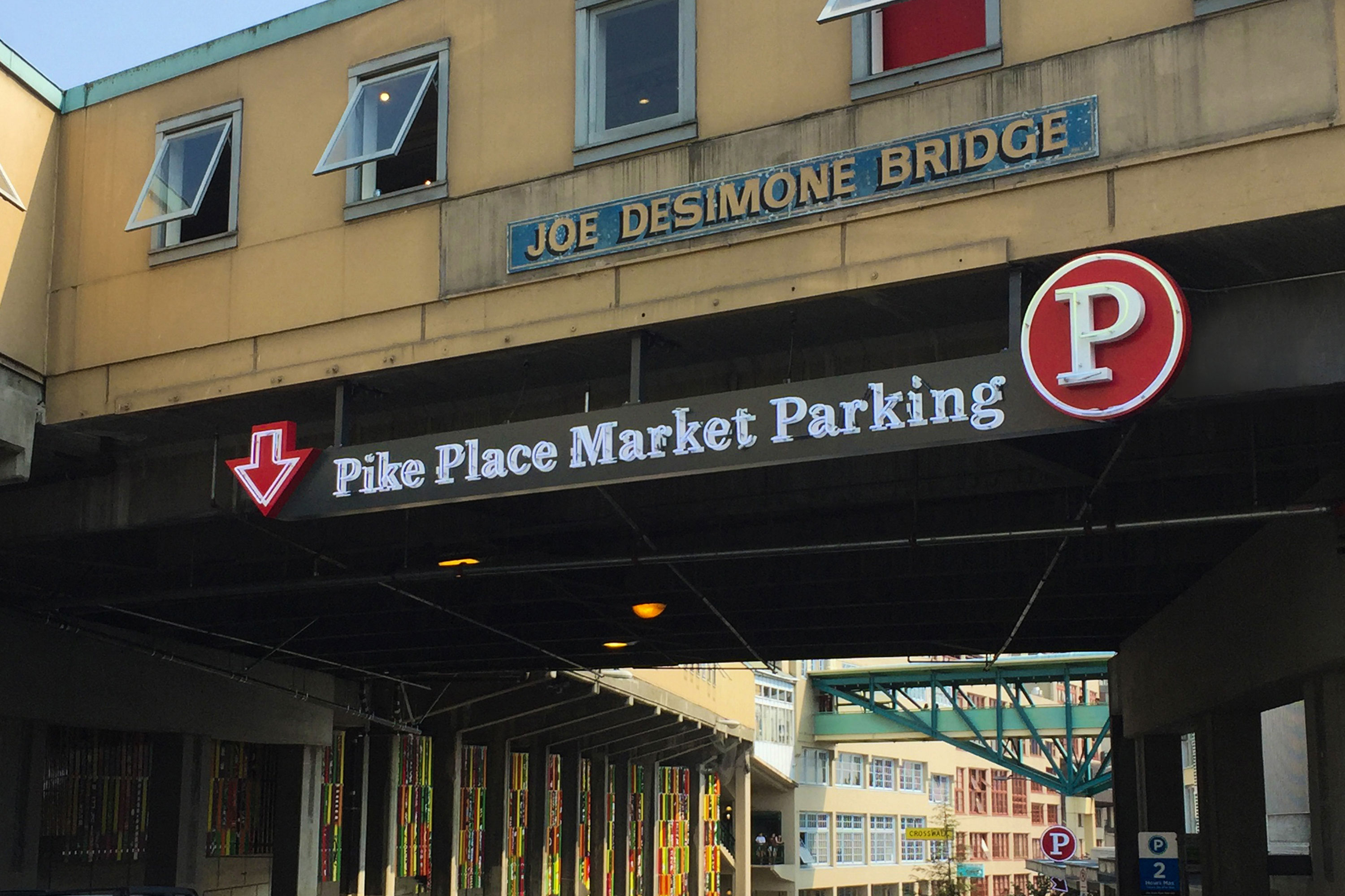
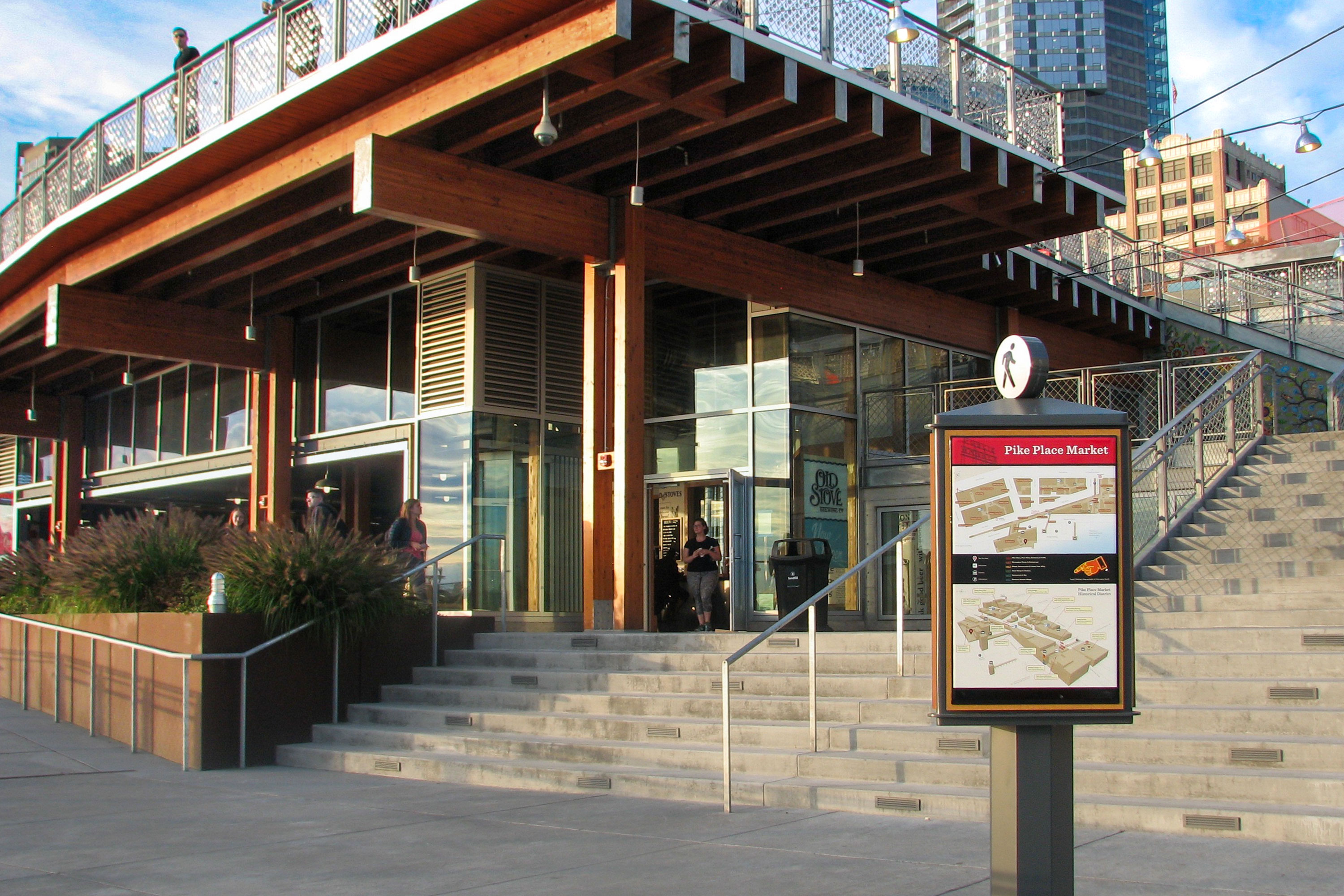
Upon completion of a three-year renovation to replace aging infrastructure and rebuild the Pike St. Hillclimb, this wayfinding program was designed to highlight renovated areas and draw attention to new restrooms and elevators. The wayfinding included the design of map pedestals to communicate the breadth and story of the historical district with carefully sited orientation maps at specific locations. In addition to orientation, these free-standing pedestals provide important facts and history about the Market. Made of utilitarian high-contrast enamel and the use of whimsical iconography to stand out in the bustling environment they retain a playful character and sense of fun. Entrance headers to the lower levels are integrated with wood and neon to distinguish the levels and carefully designed to complement the historic structures. To emphasize the importance of the historical district, new signs were coupled with street signs to communicate the threshold and arrival at the district.
In 2017, the MarketFront addition designed by Miller Hull to connect the Market to the Seattle’s newly developed Waterfront was the second phase of work to extend the wayfinding program.
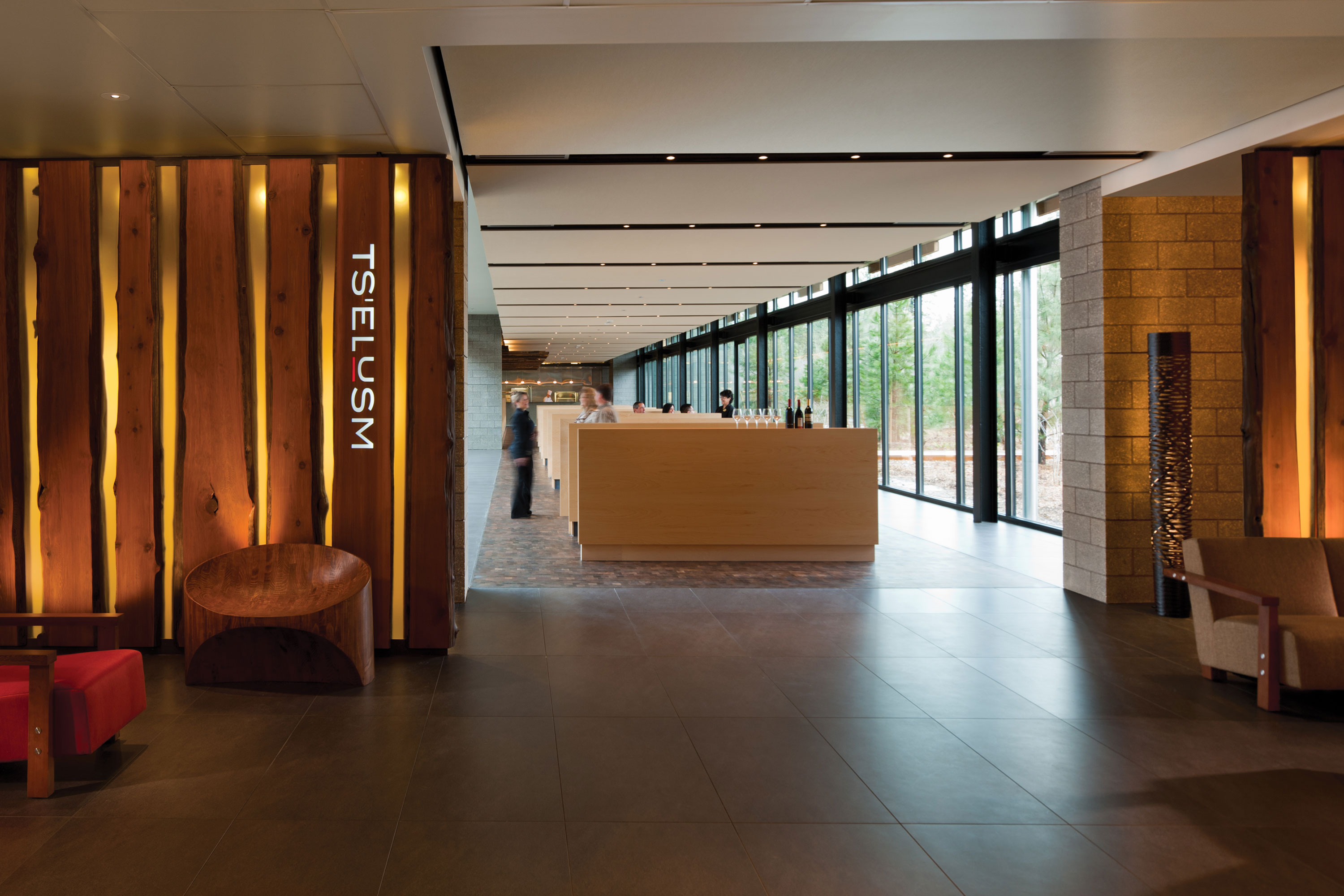
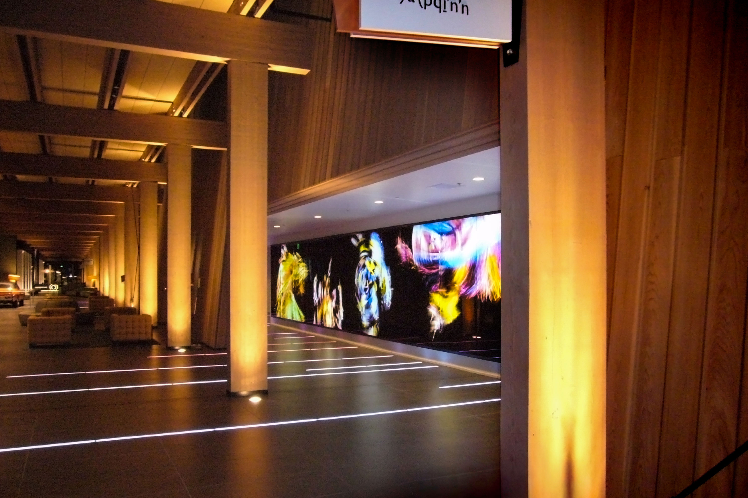
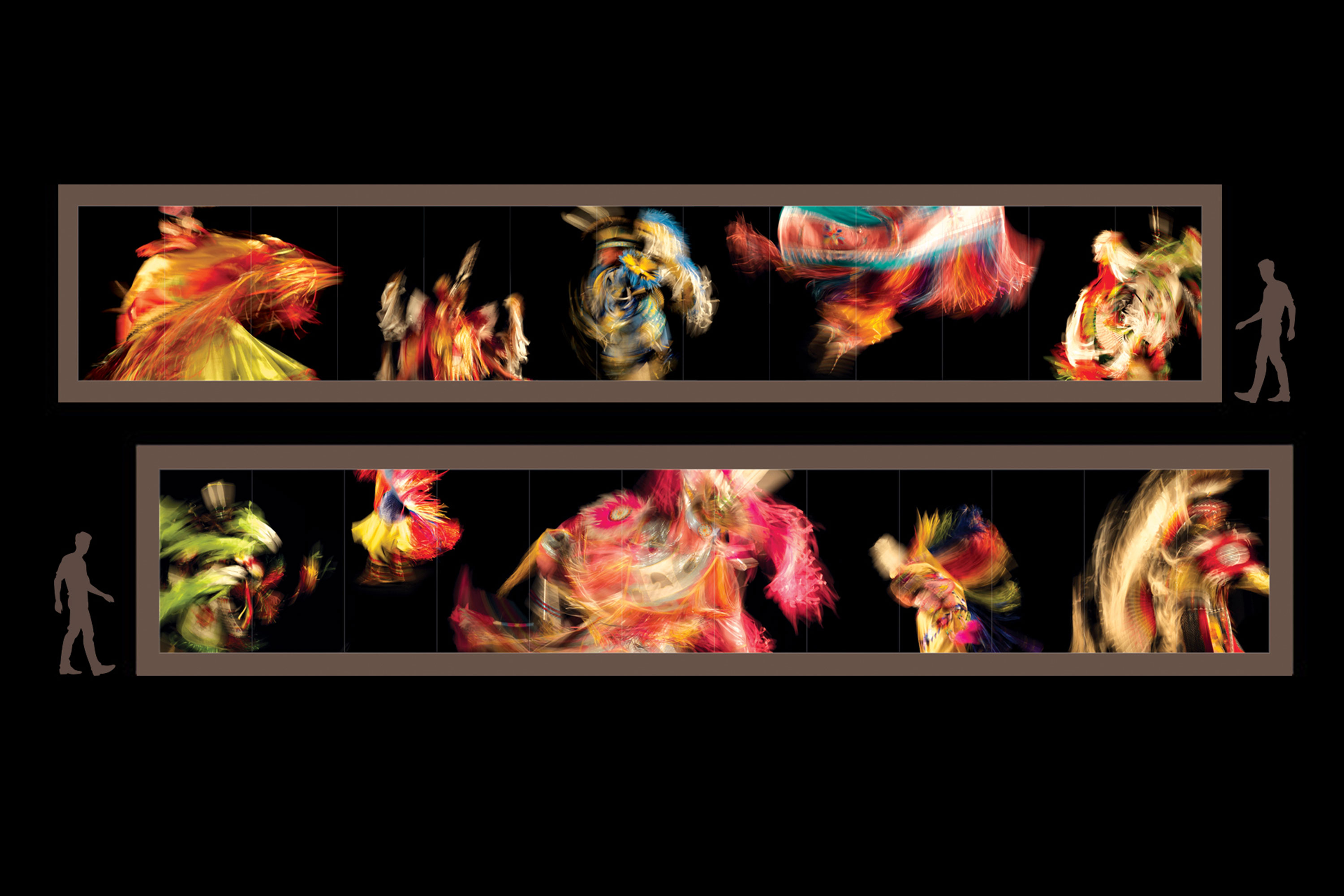
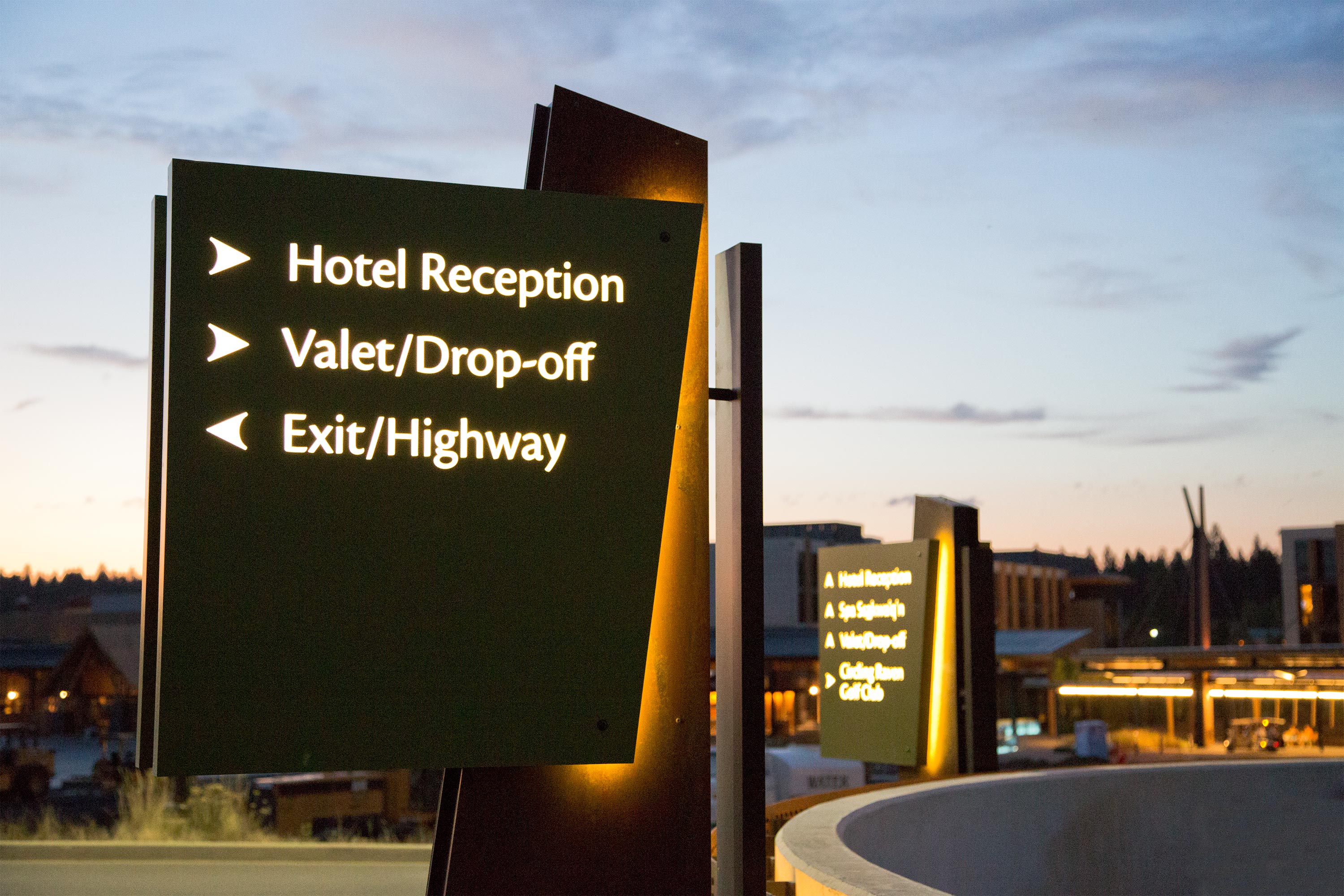
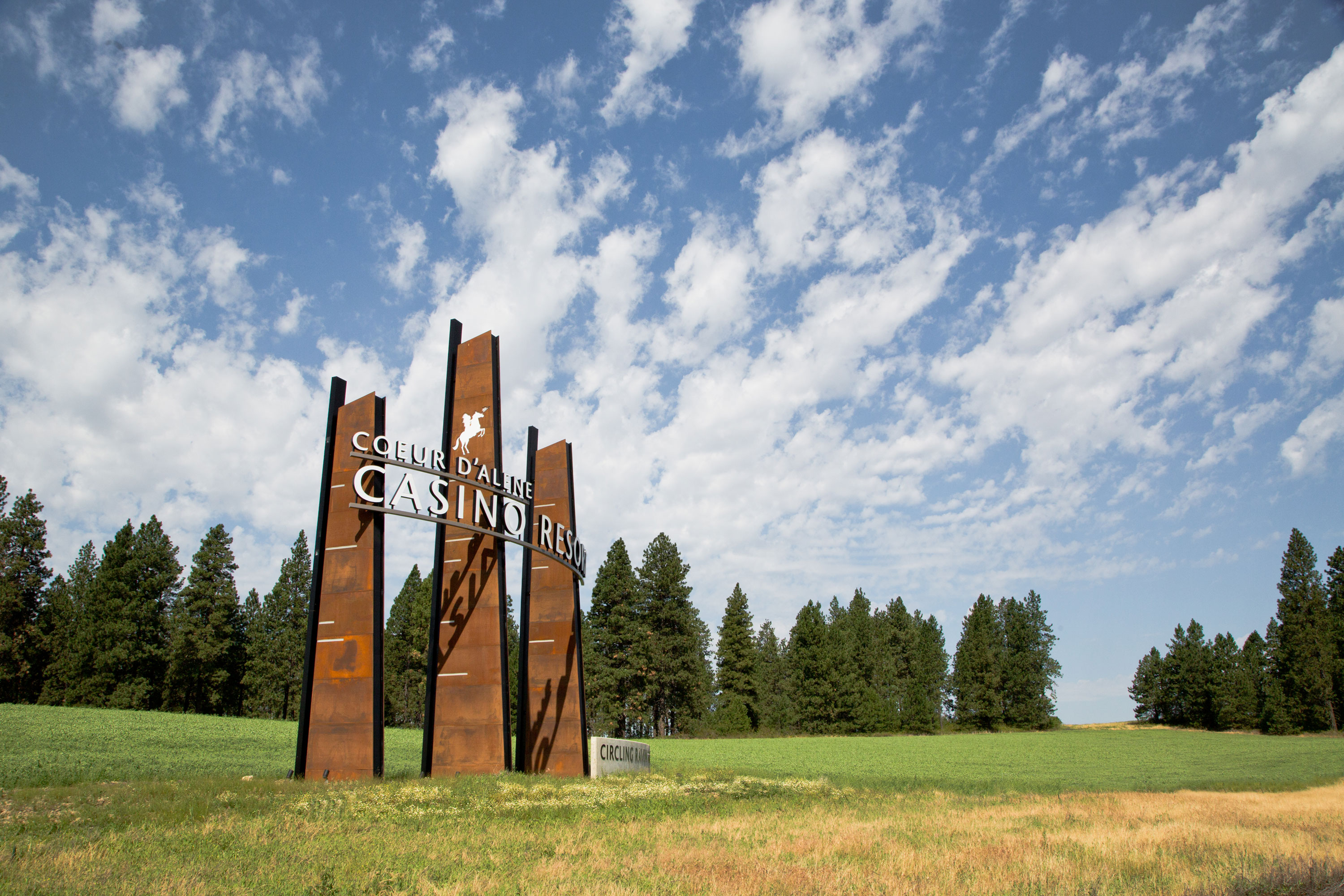
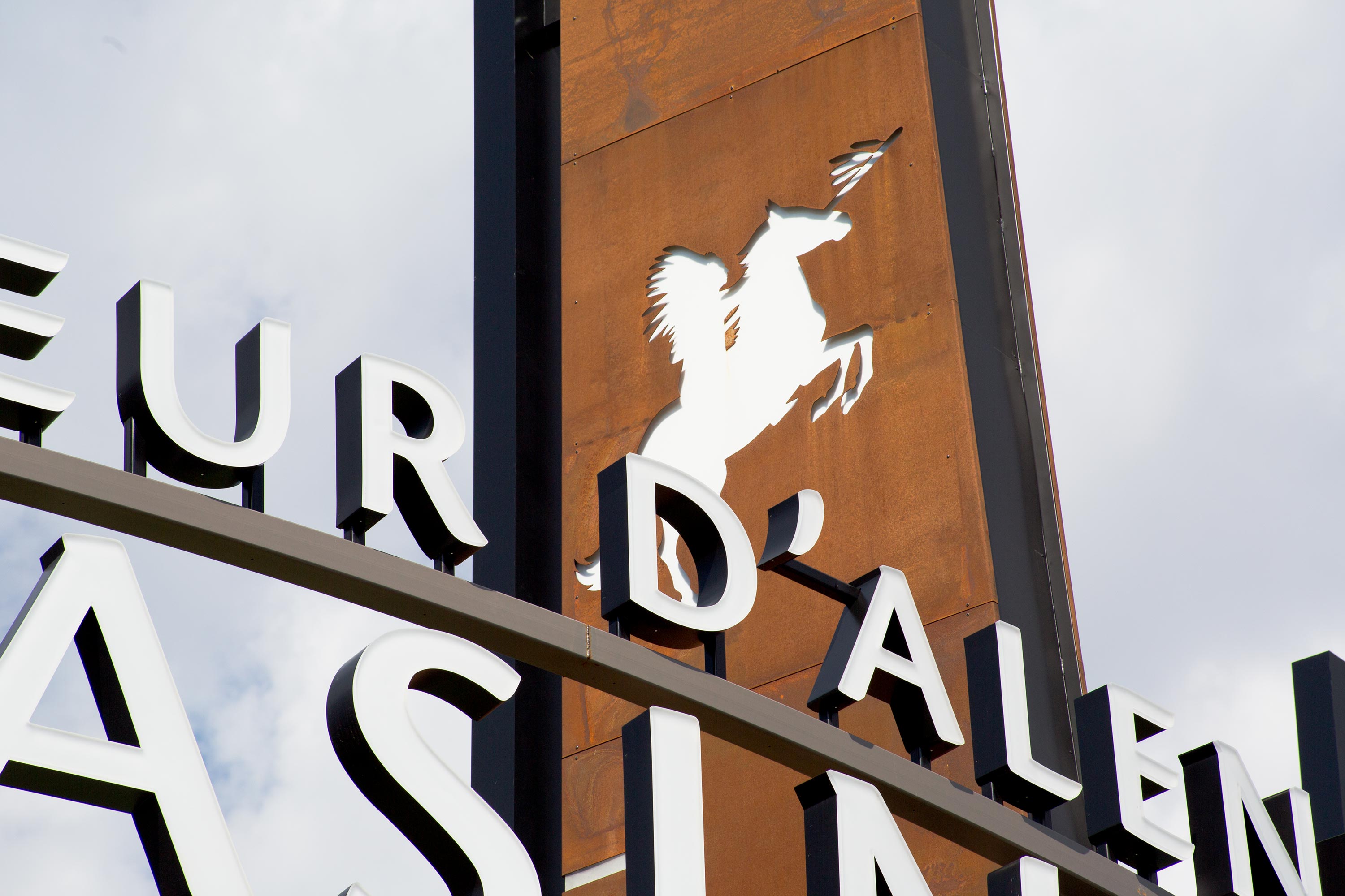
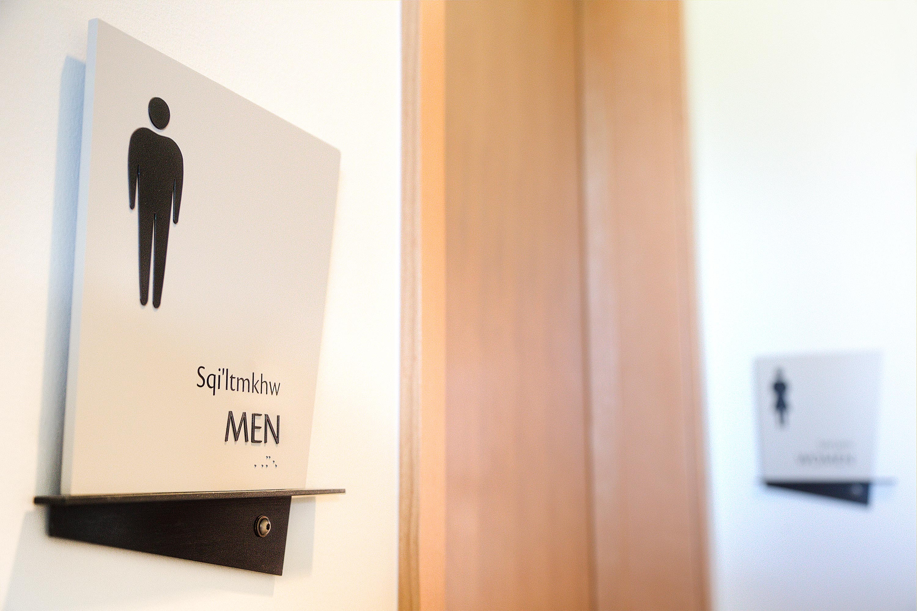
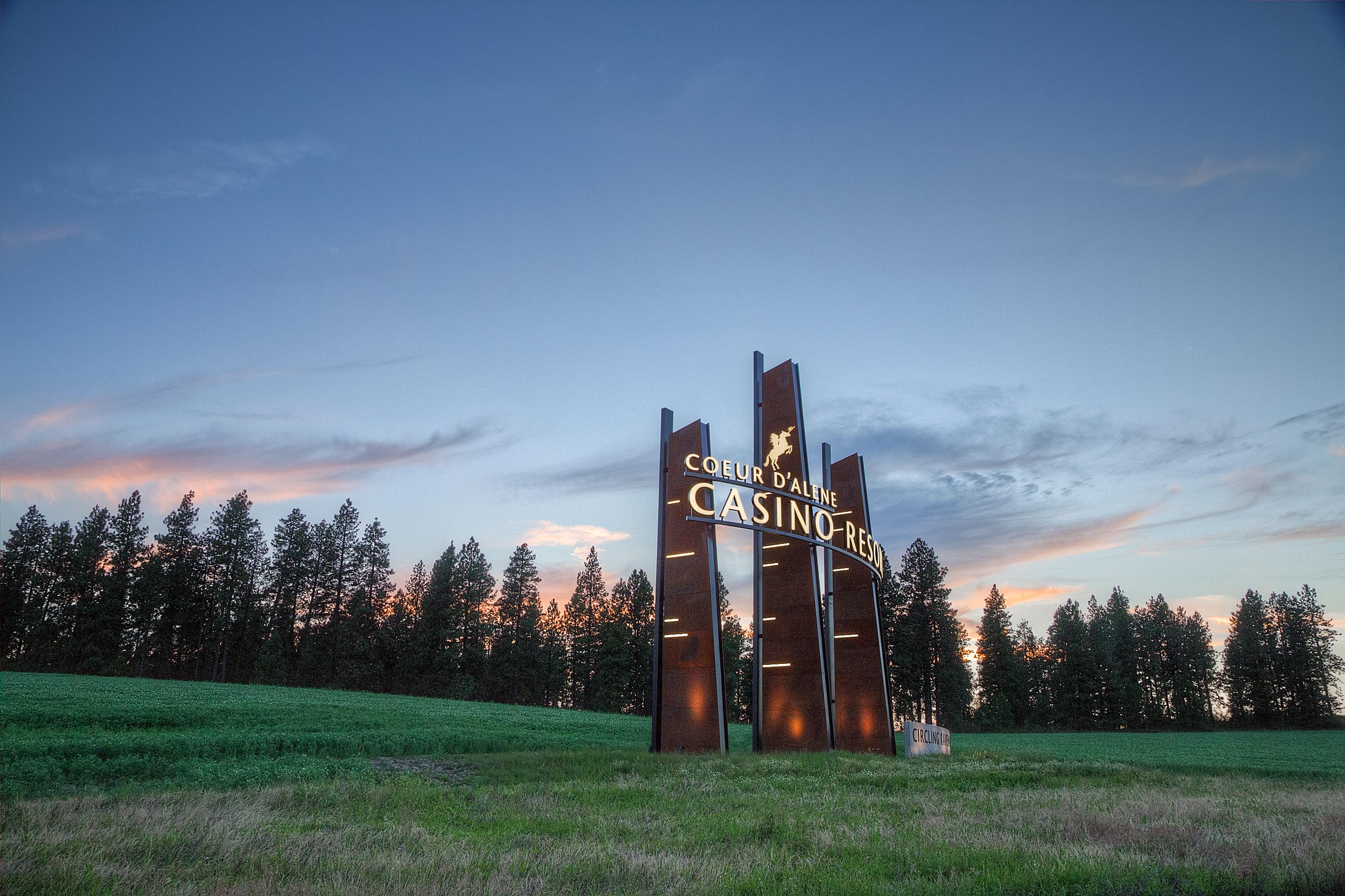
Coeur d’Alene Tribal Resort


Delivery_
Branding
Visual Identity
Environmental Graphics
Year_
2011
About_
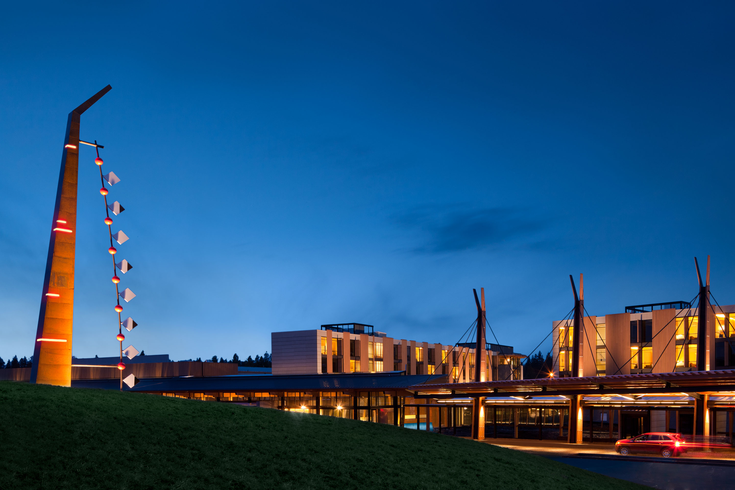
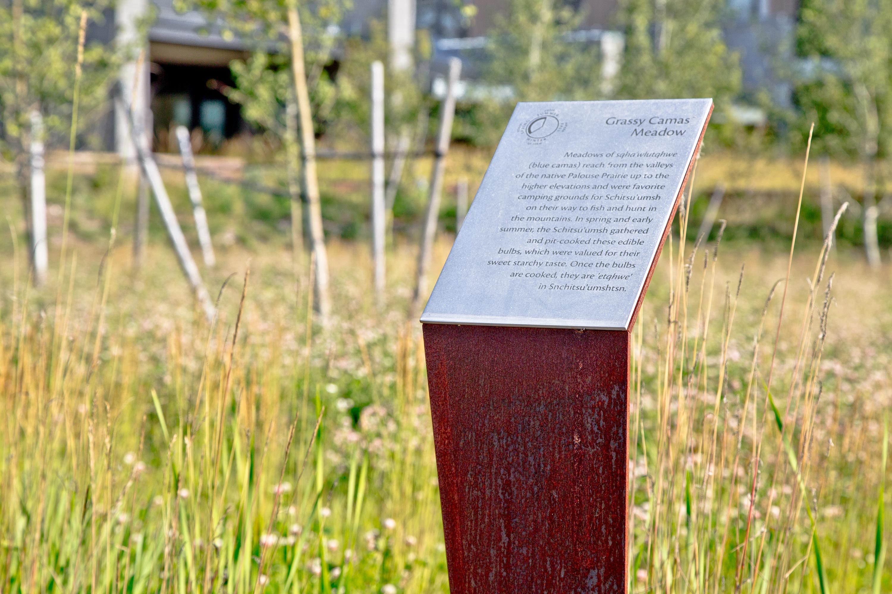
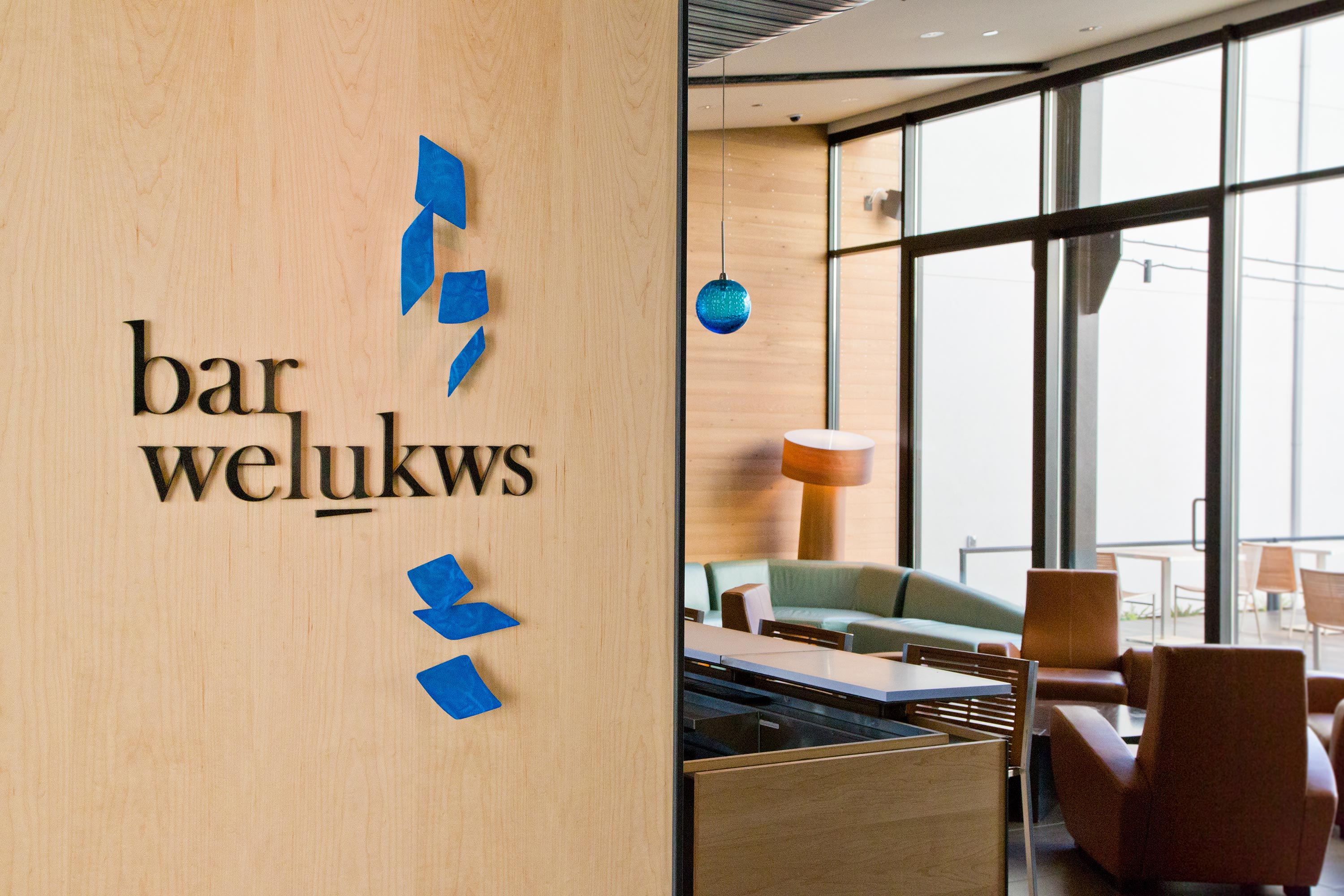
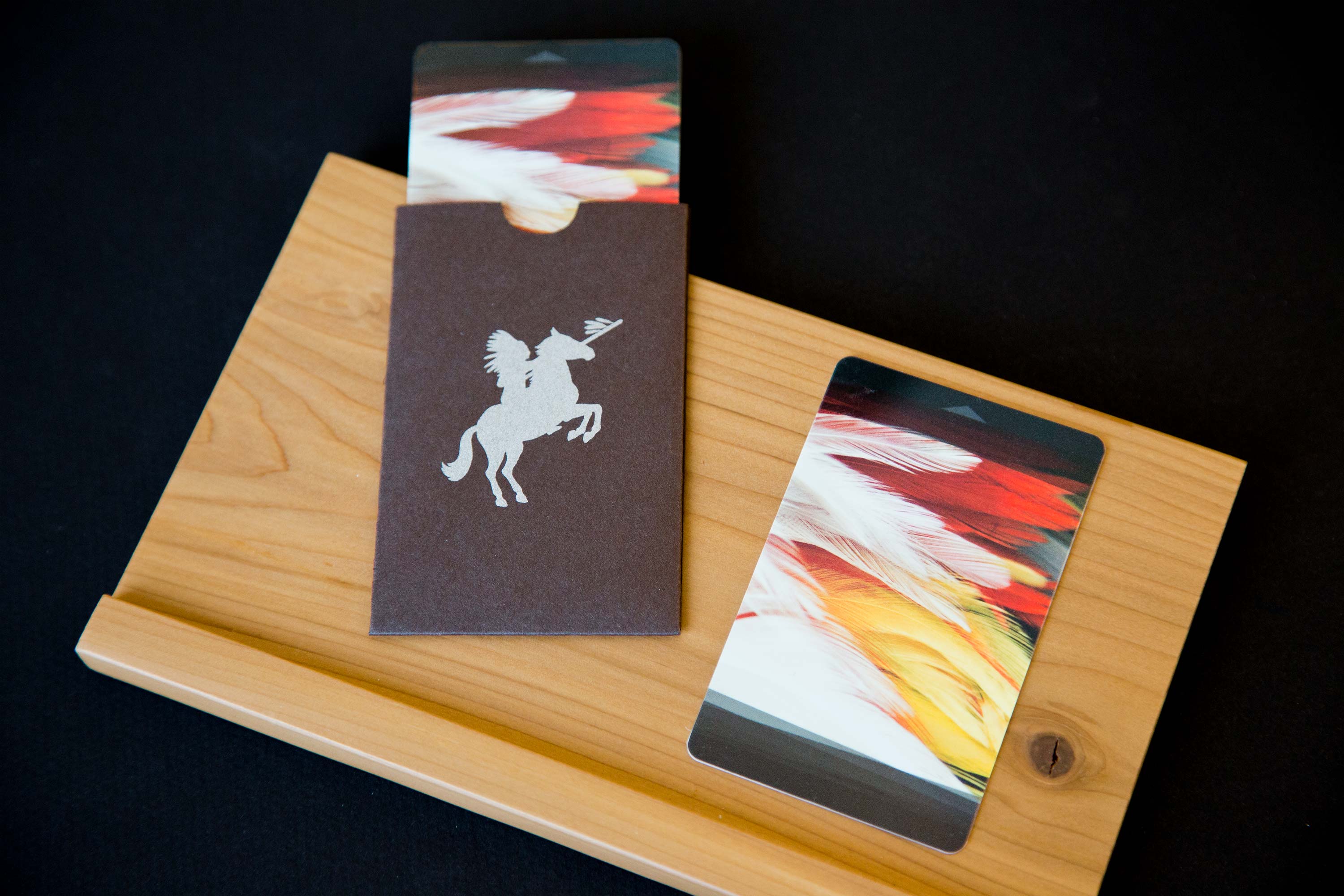
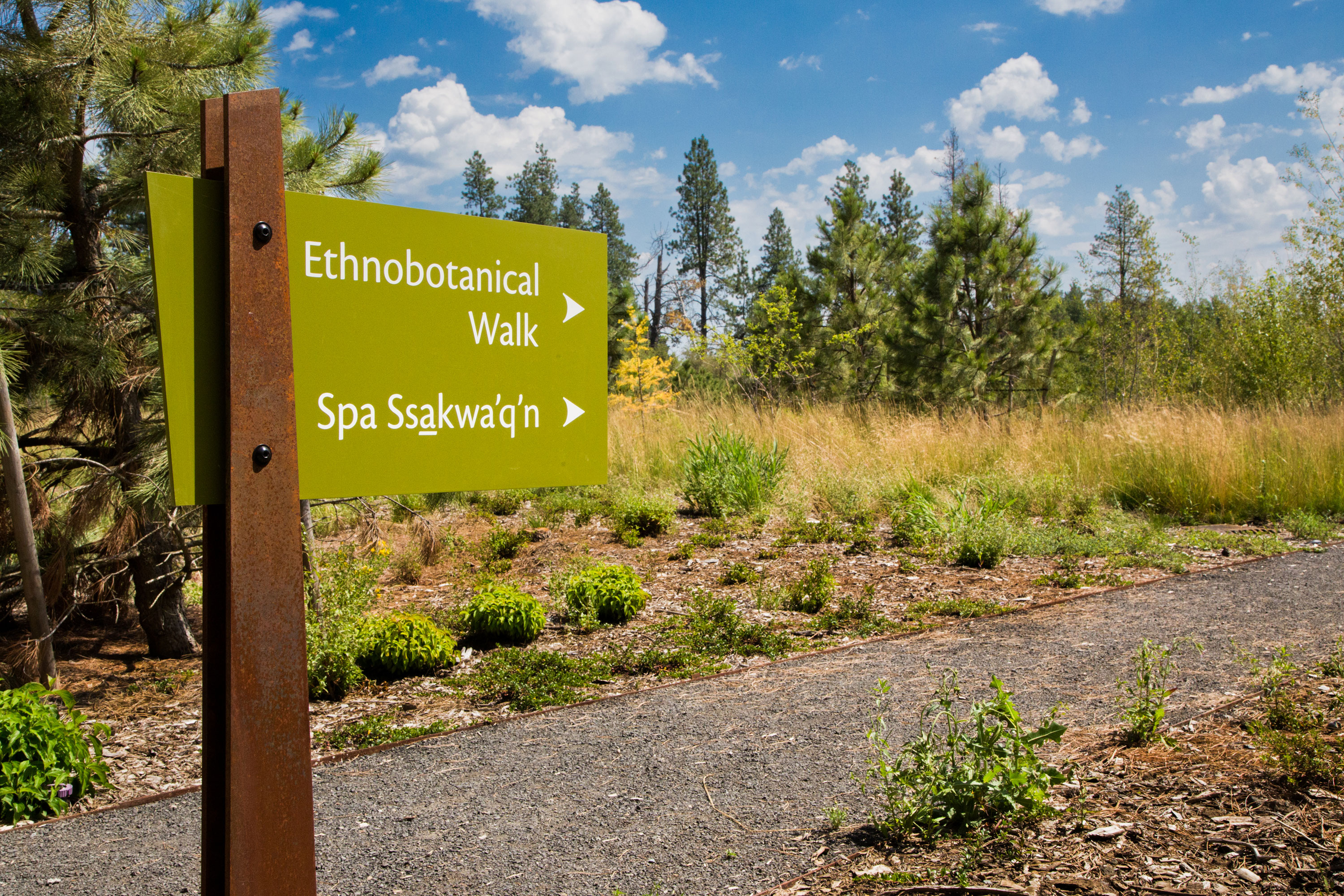
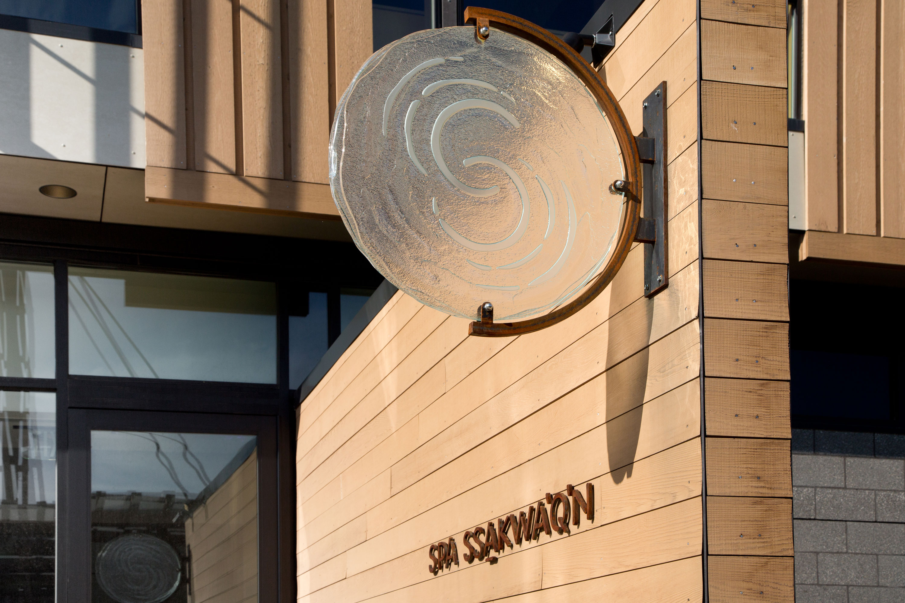
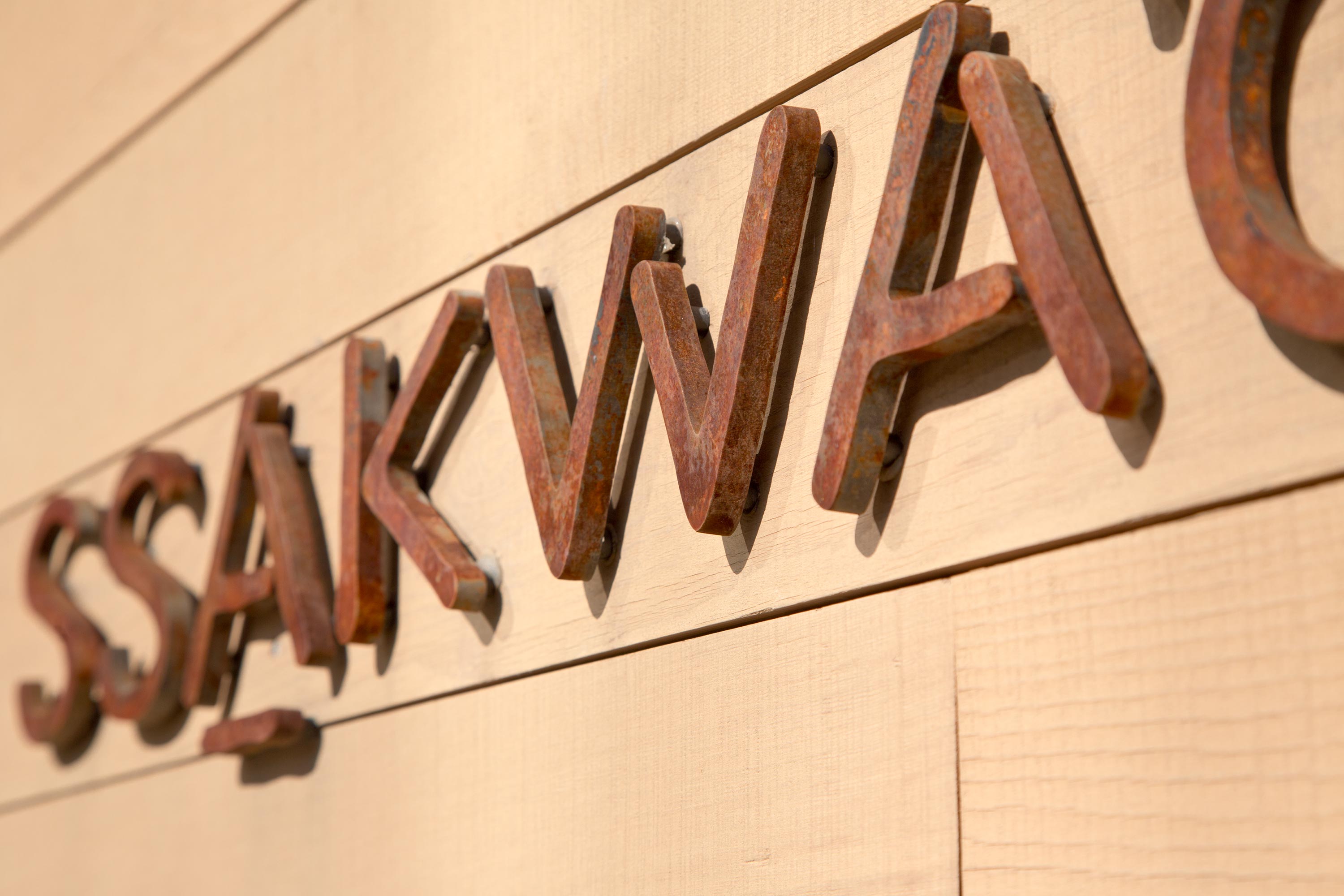
The Coeur d’Alene Tribal Resort is an existing 250,000 square foot complex located in the rolling hills of Northern Idaho. The Palouse region near the shores of Lake Coeur d’Alene is the homeland of the Coeur d’Alene Tribe. This major resort renovation designed by Mithun aligns the master plan with the Coeur d’Alene’s physically beautiful environment and a desire to honor ancestral heritage, balanced with the modern world. The new hotel and spa achieved LEED Gold and a 4-star resort experience.
The team led the development of a comprehensive signage program inside and out including many tribal expressions throughout the property. Working closely with tribal members, the architects, and Creo Industrial Arts, the sign fabricator, the environmental graphics feature a wide variety of sign types and expressions ranging from interpretive markers for the ethno-botanical walk, resort entry monuments integrated into the landscape, spa and venue identities, and site-wide wayfinding. Unique tribal expressions include a specialty backlit glass wall mural in the welcome lobby with custom photography of tribal dancers and framed artworks in the hotel rooms featuring traditional Coeur d’Alene beading.
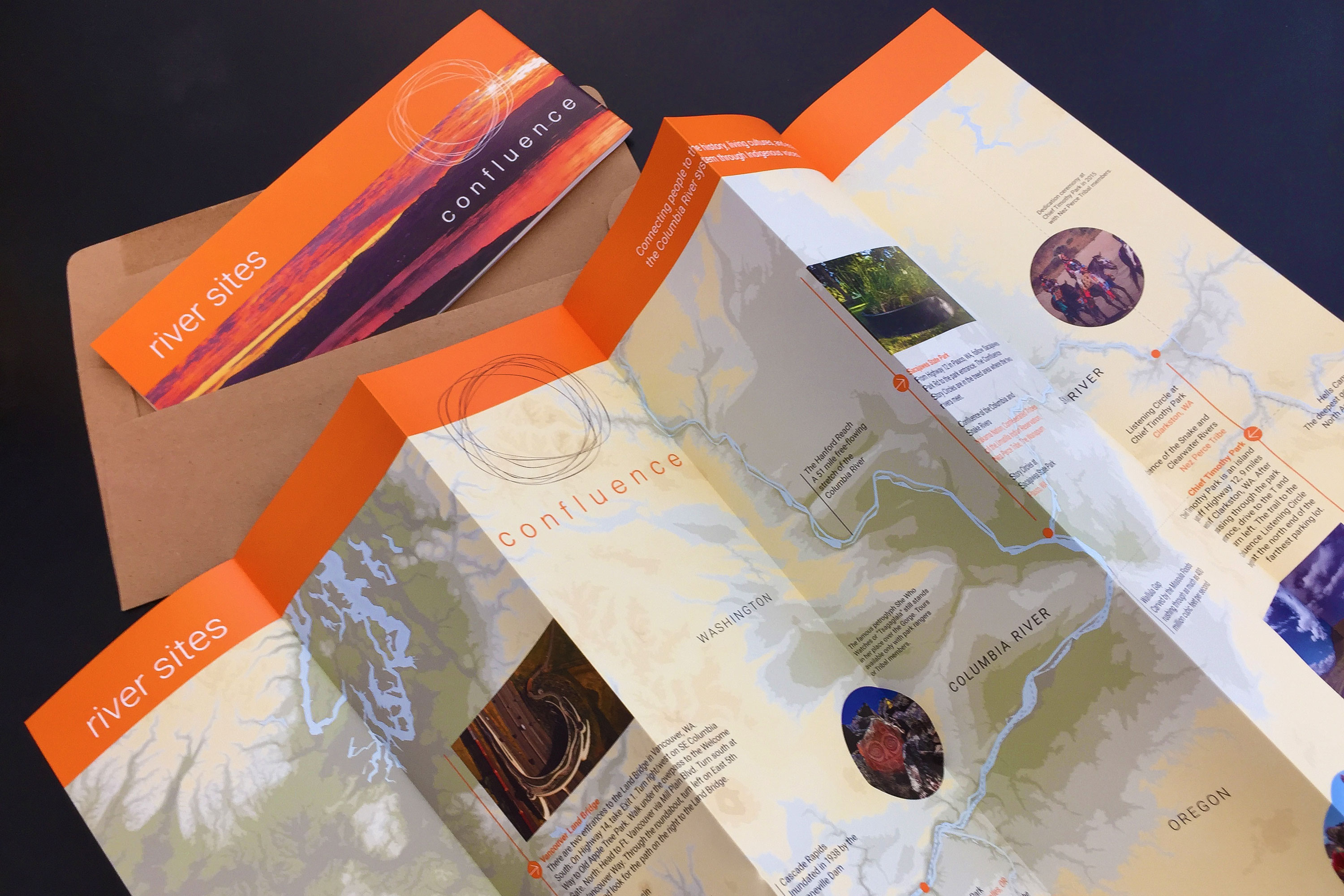
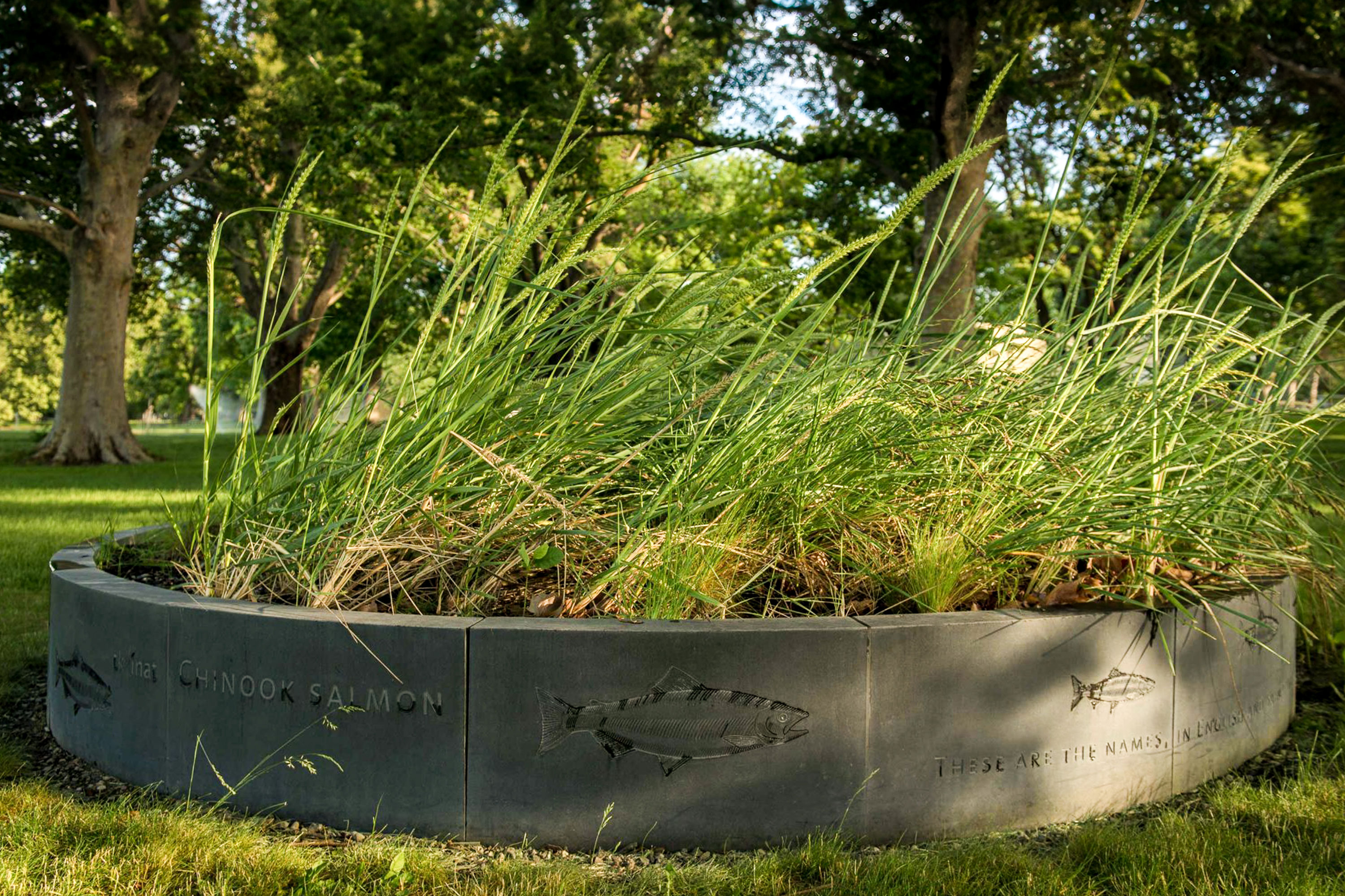
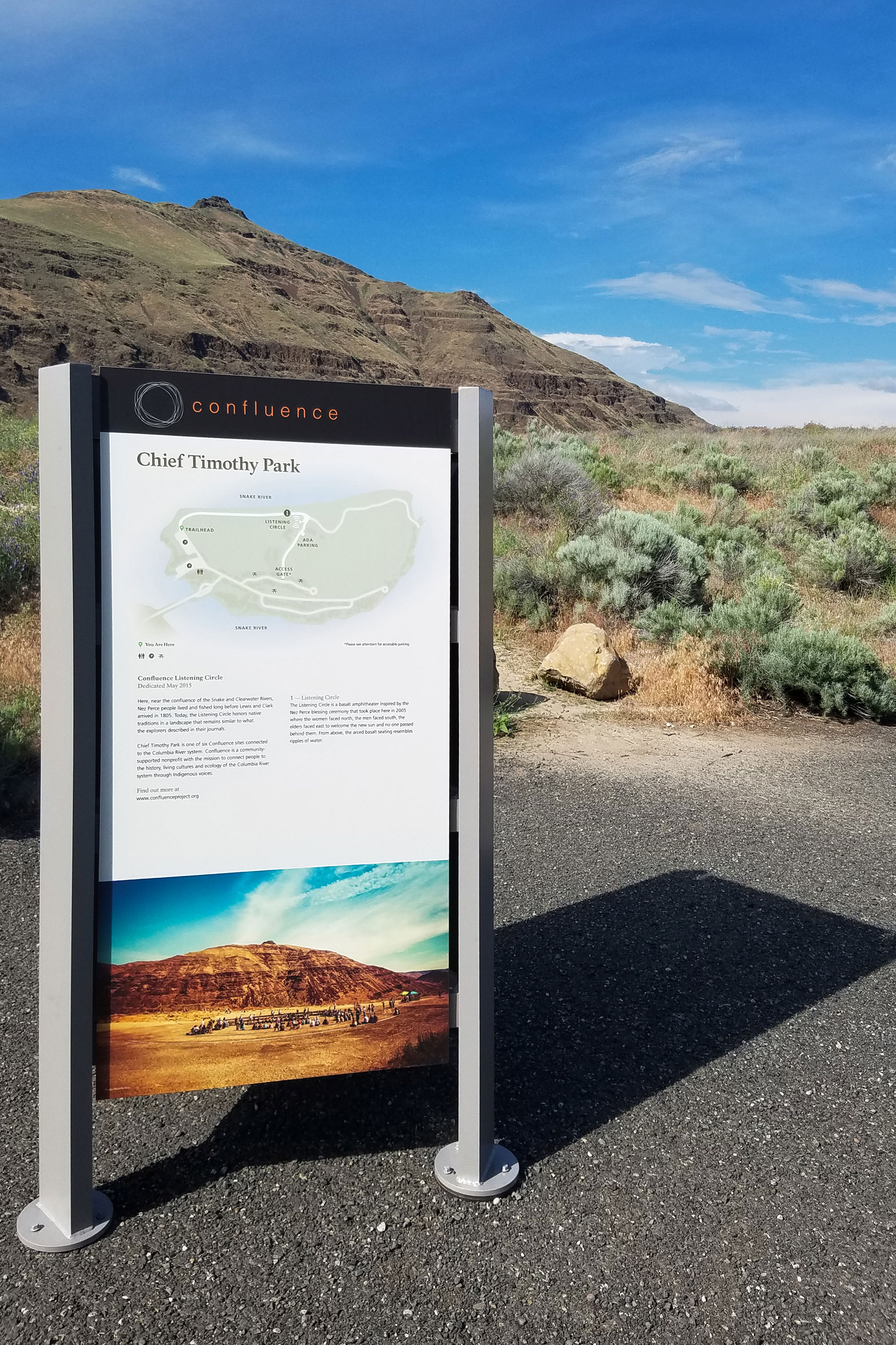
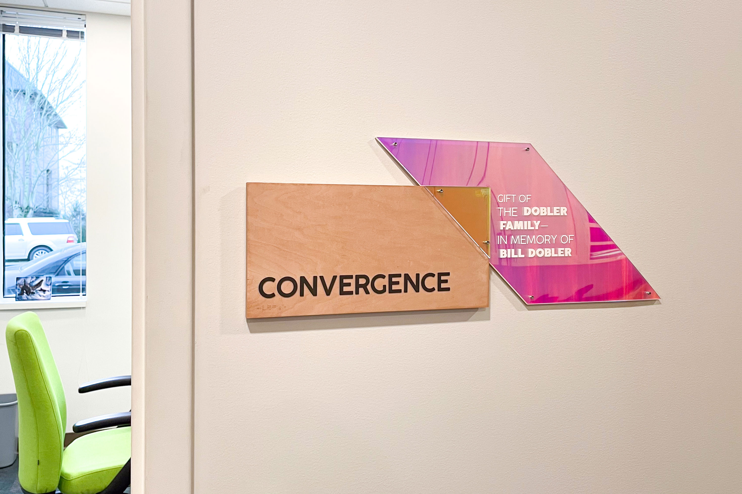
Confluence
Delivery_
Visual Identity
Environmental Graphics
Website
Year_
2018
About_
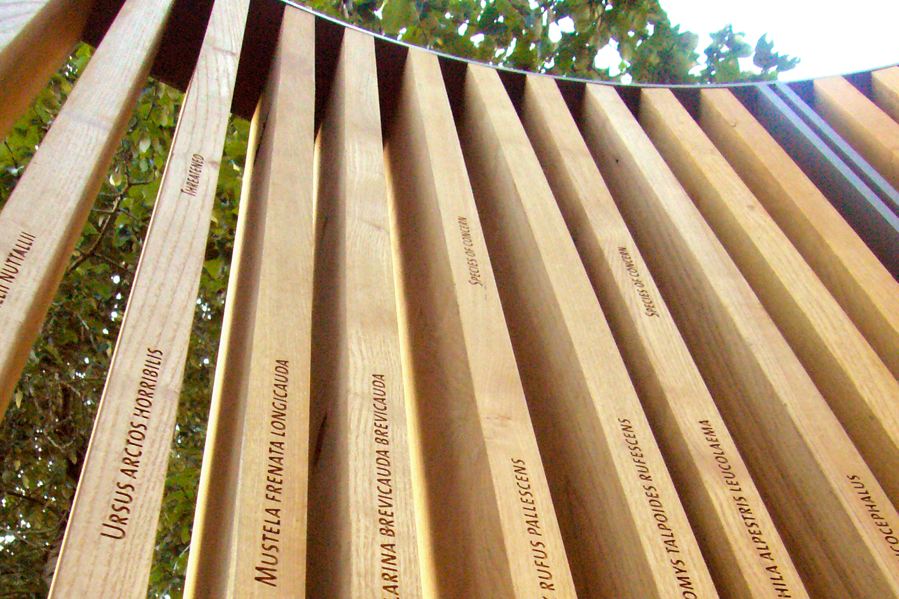
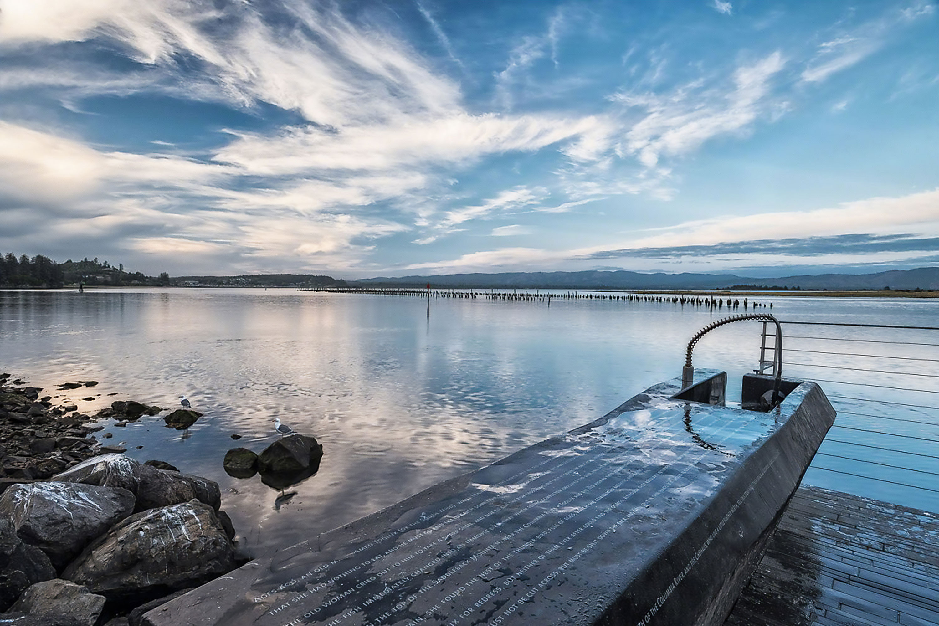
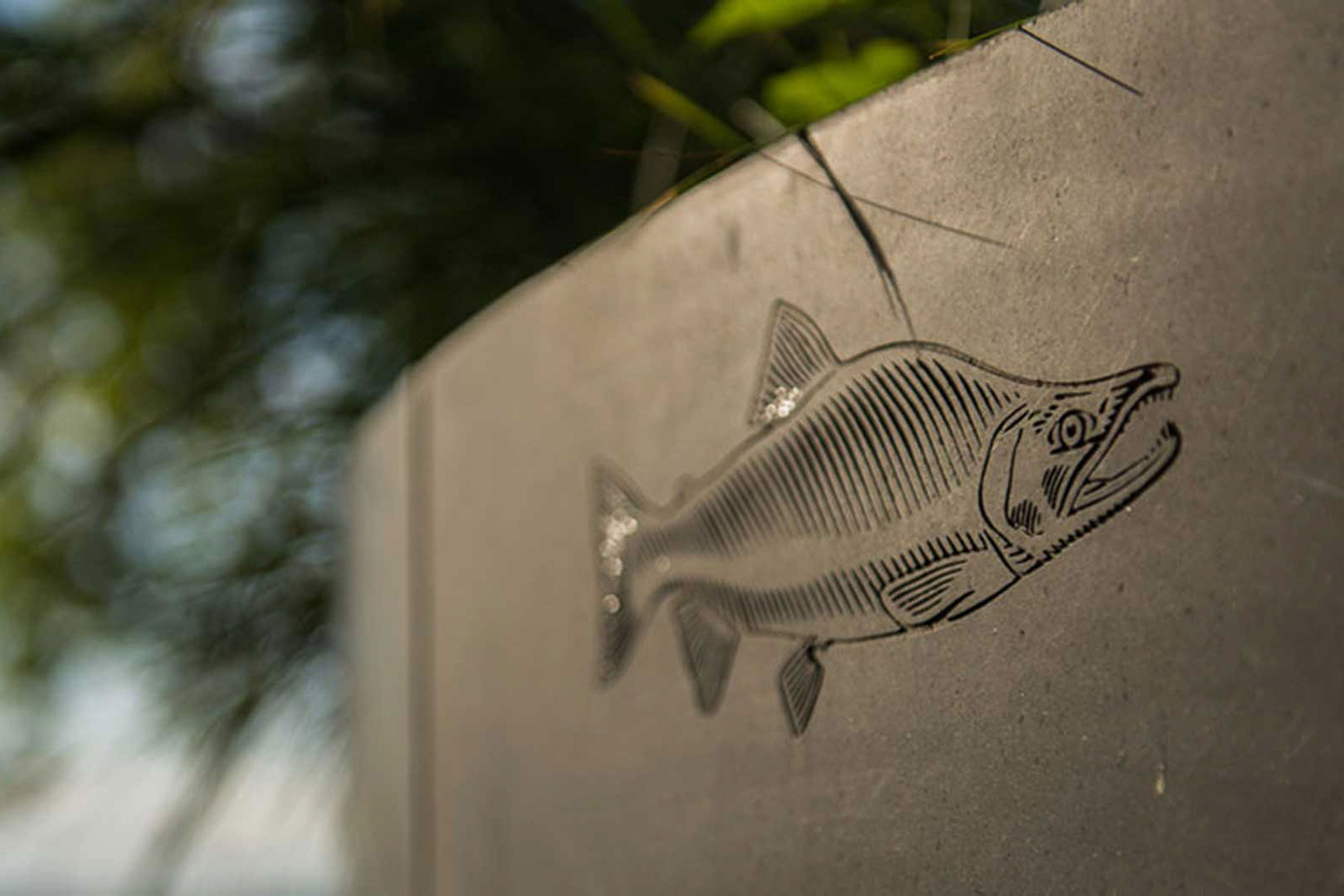
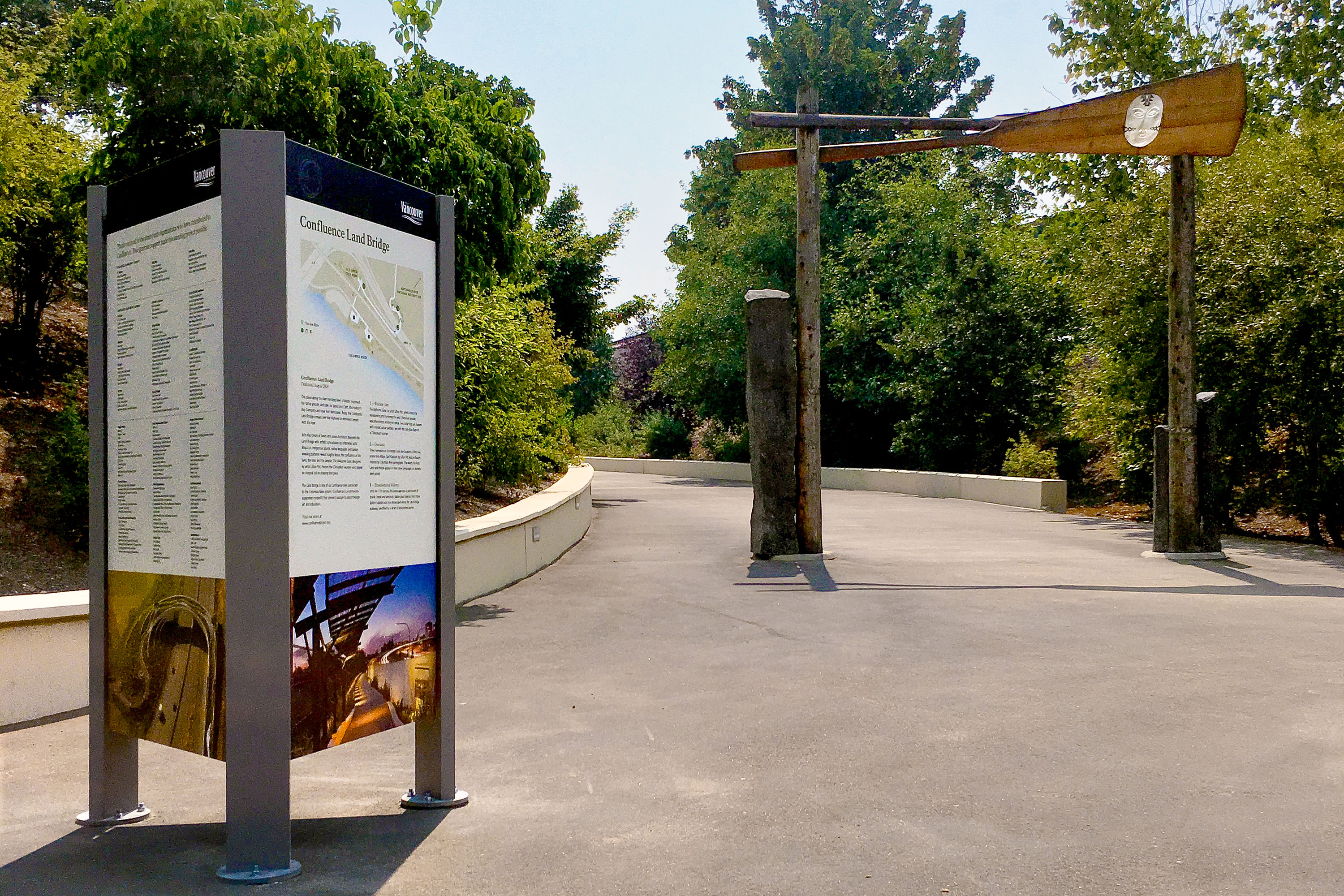
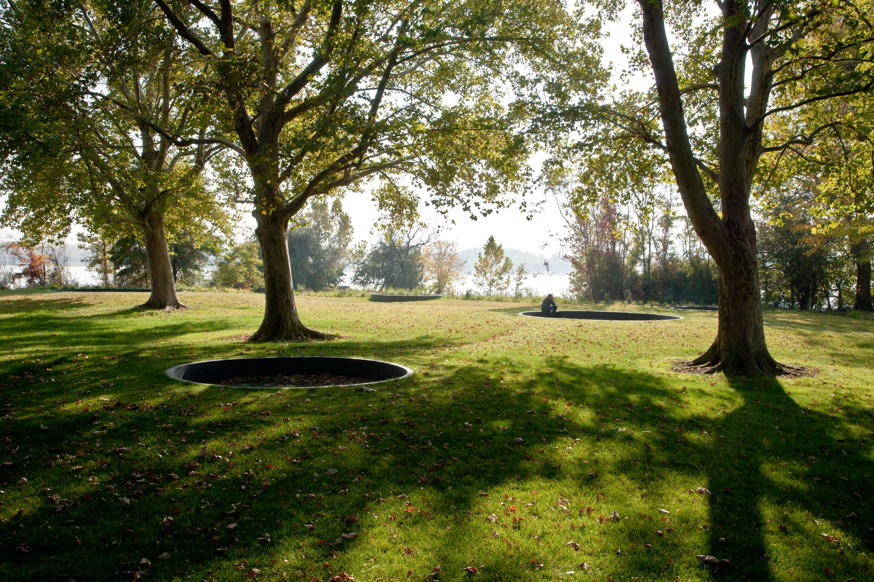
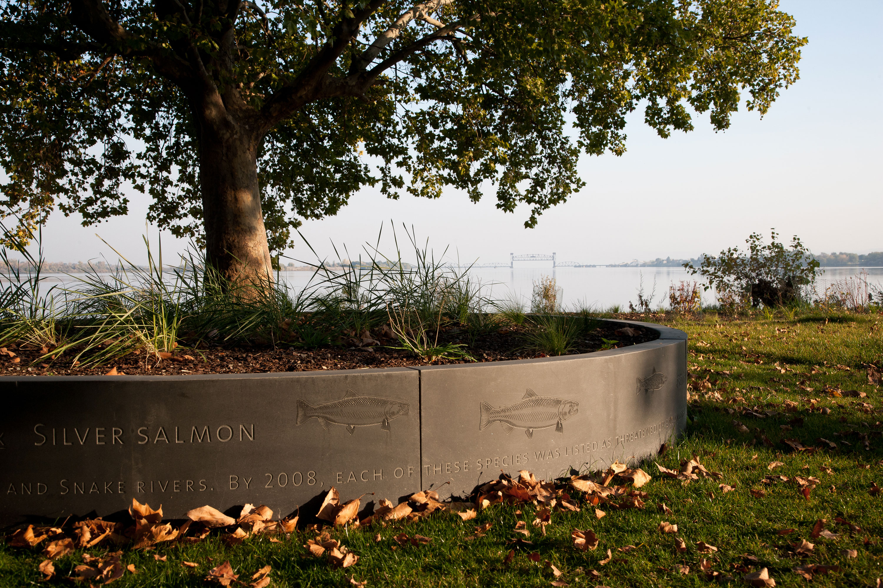
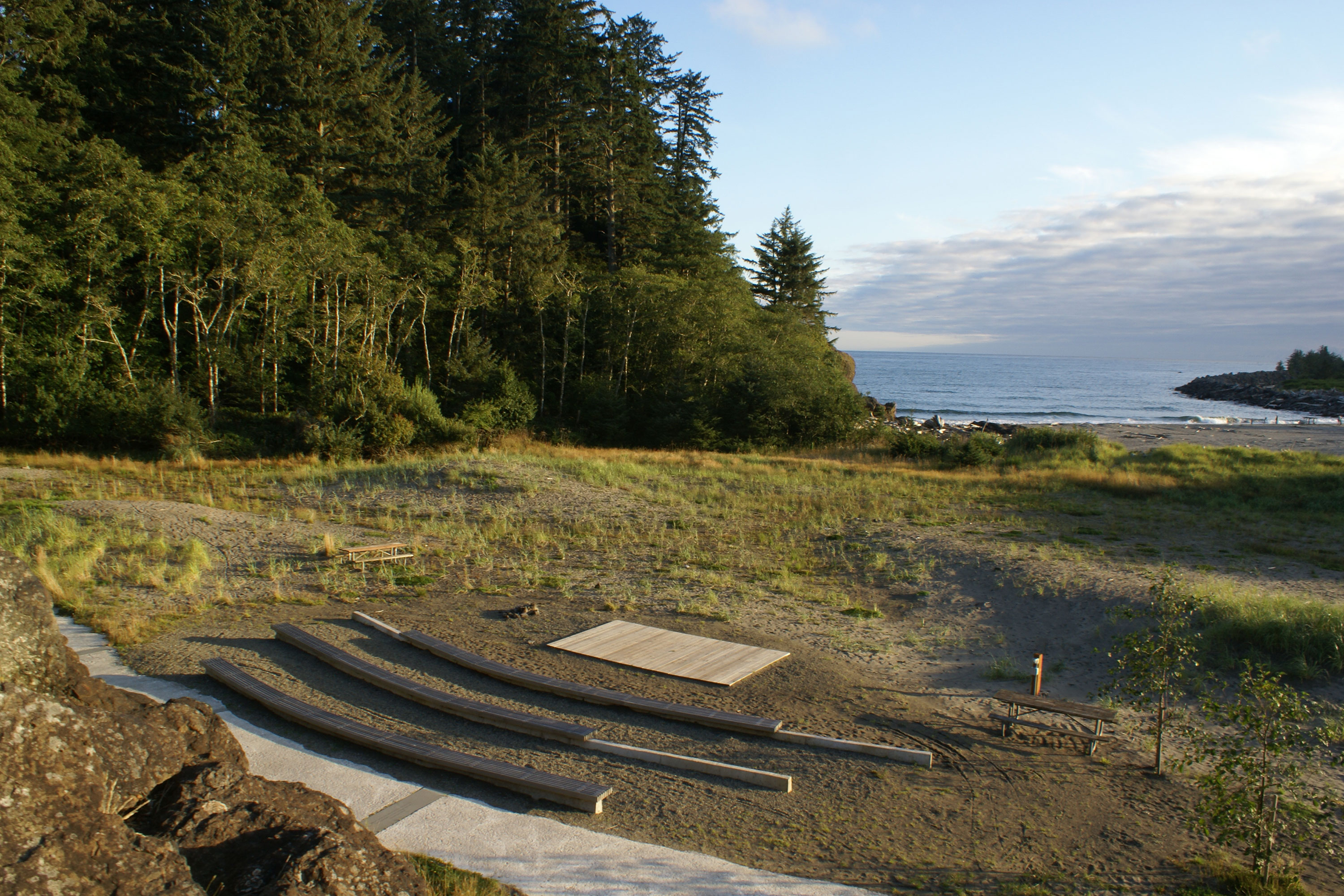
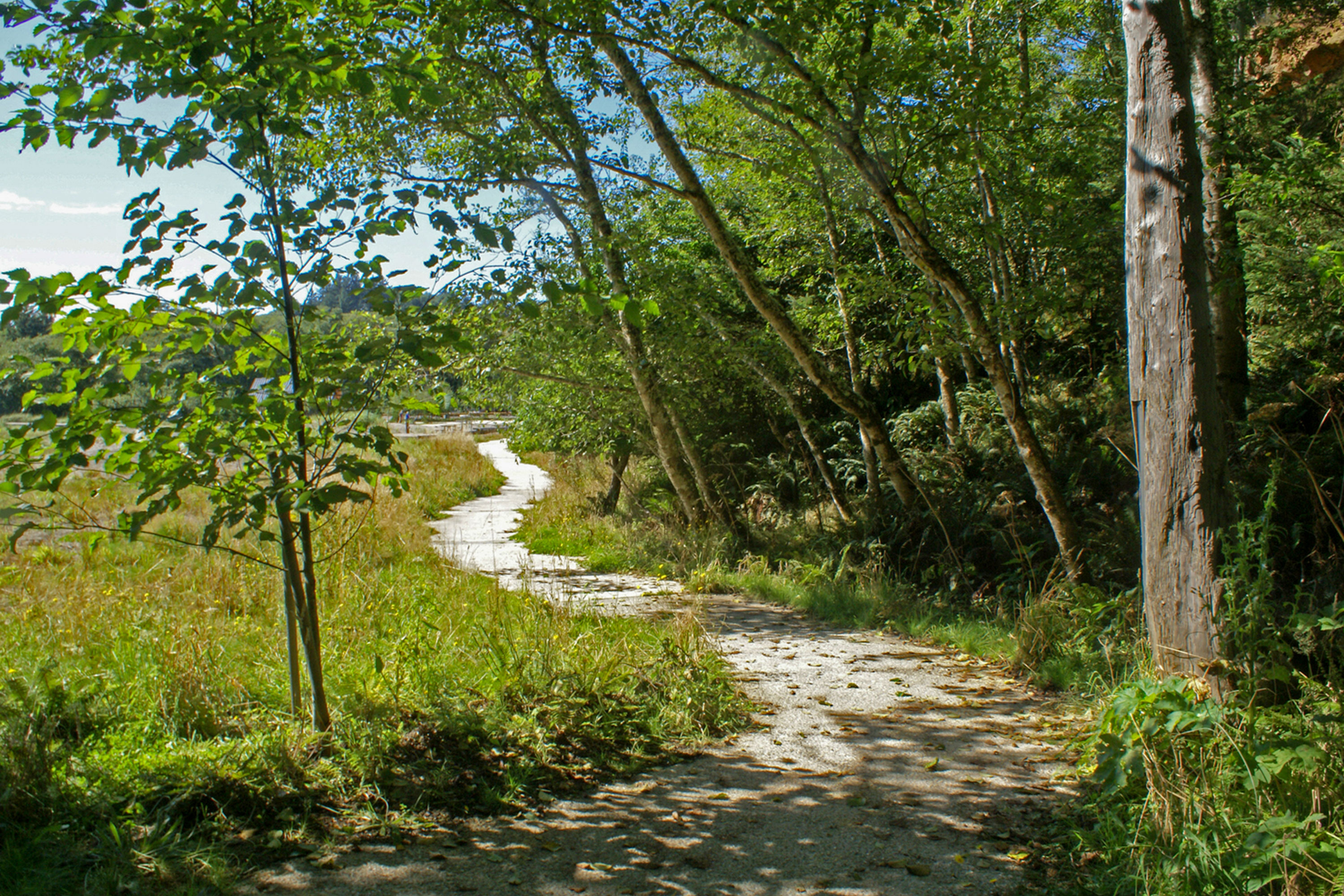
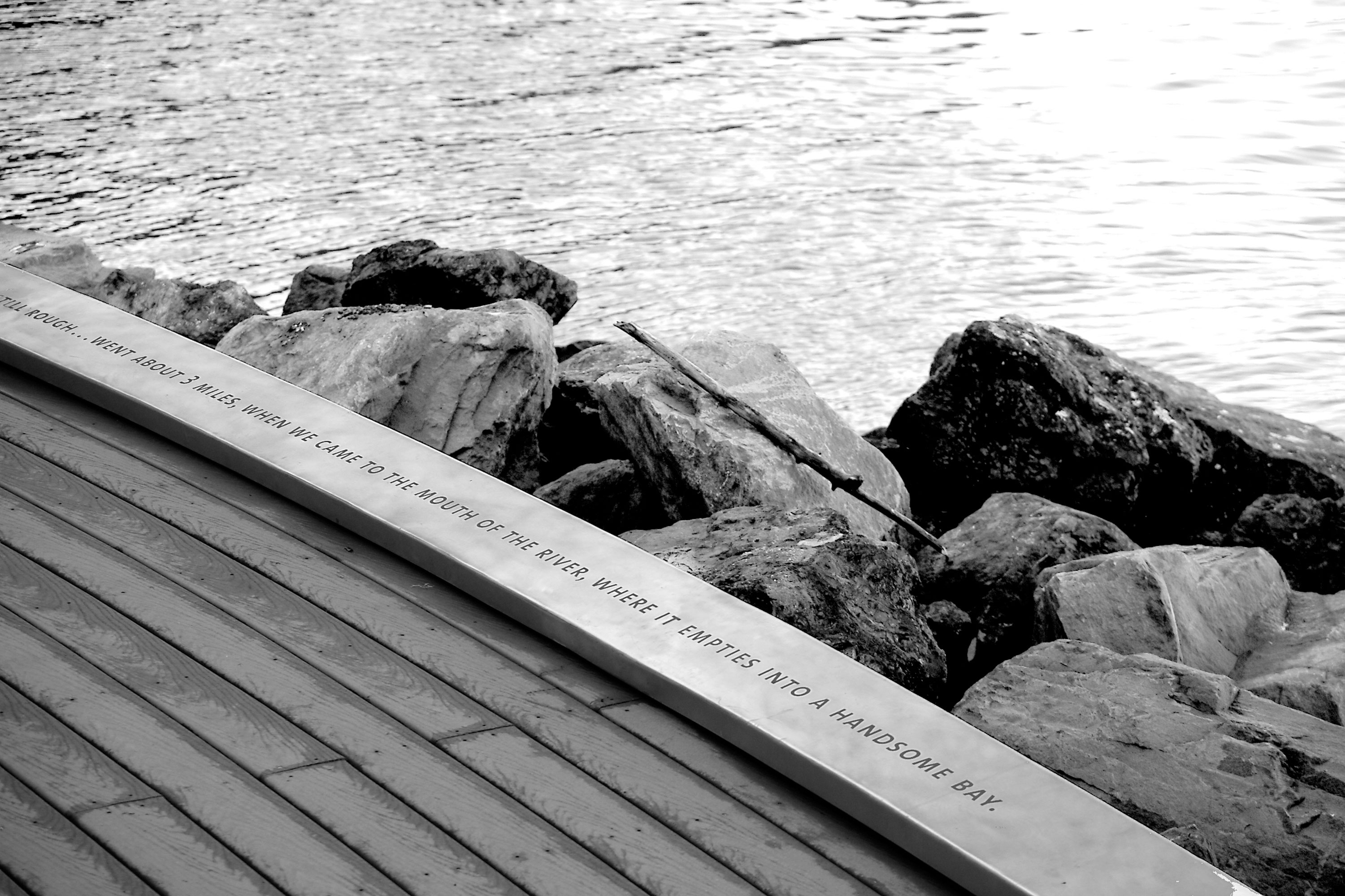
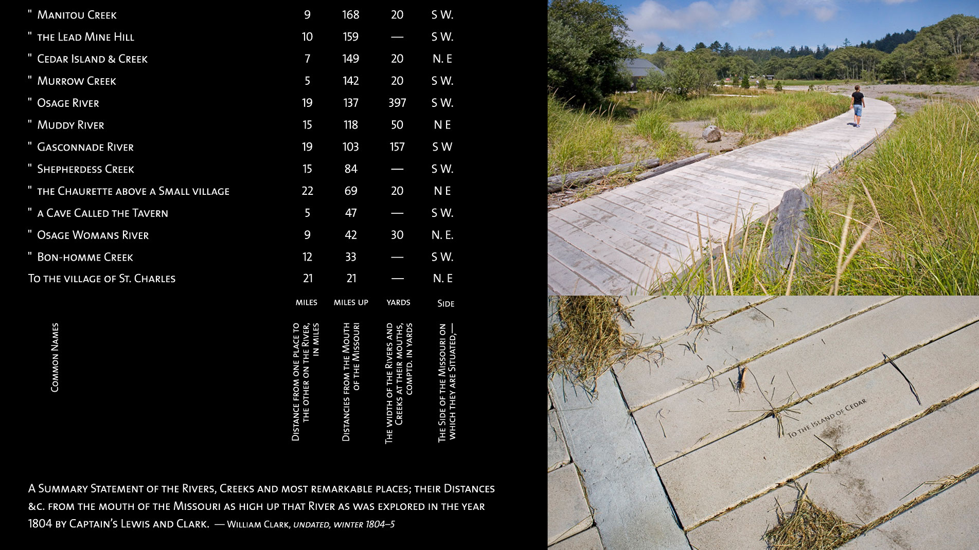
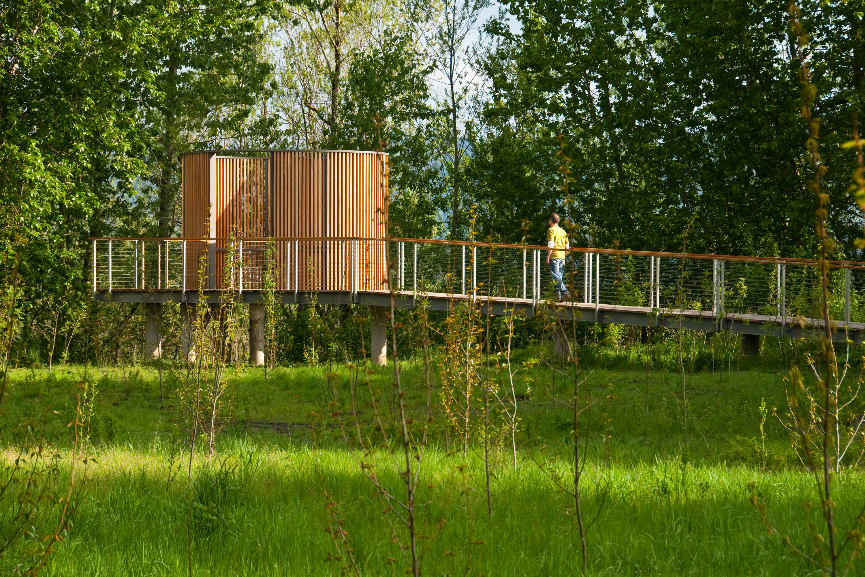
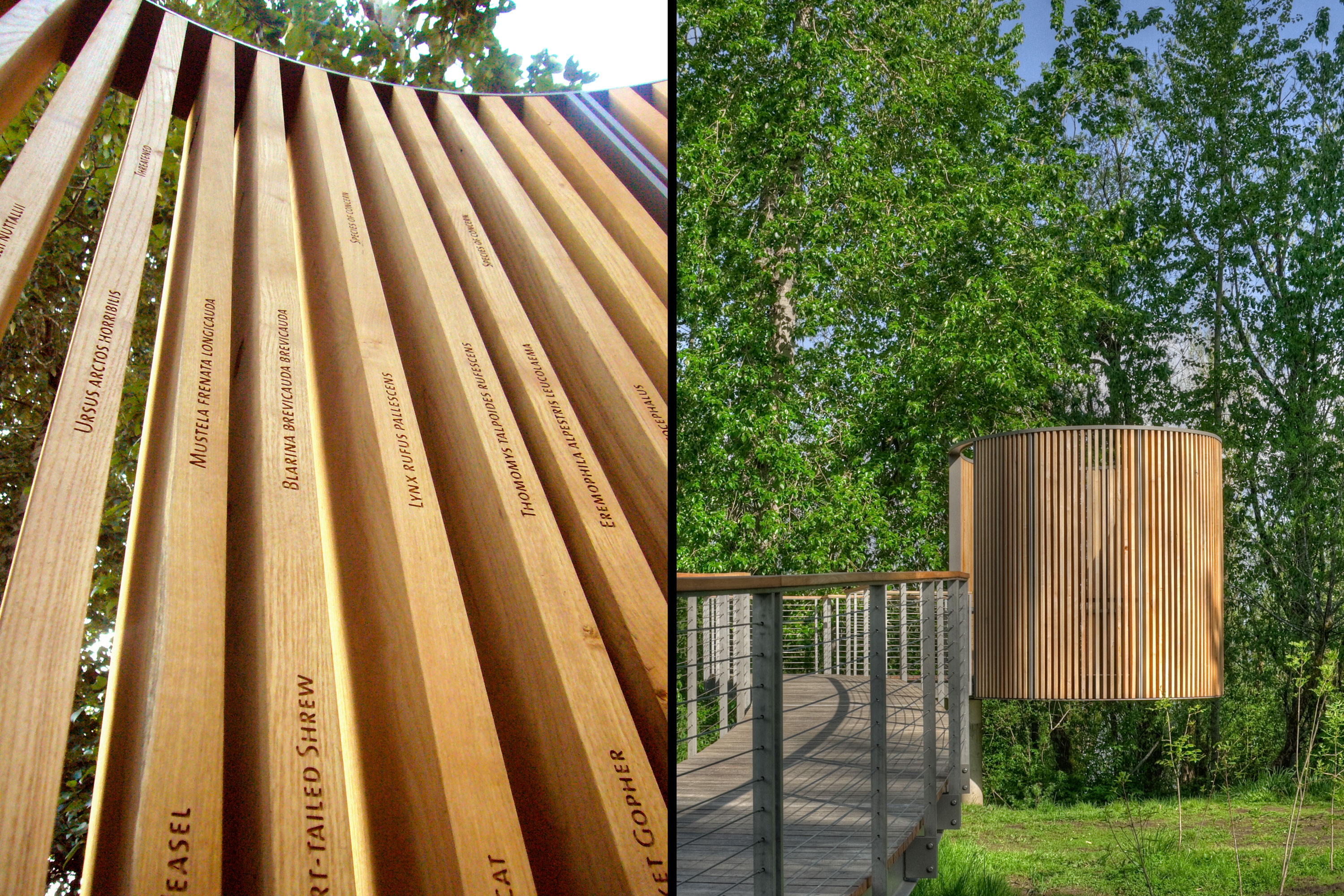
Confluence is an initiative to reclaim, transform and reimagine places along the historic Columbia River Basin through art landscapes, educational programs, and public gatherings in collaboration with Northwest tribes and communities. Each site along the 450-mile course of the project is a place where waterways merge or Indigenous Peoples have gathered, and each was a scene of meeting between Native Americans and the Lewis and Clark Expedition. The River Site landscapes, designed by Maya Lin, express the history, living cultures, and ecology of the river through Indigenous voices and expedition narratives in the form of art landscapes. Each site features texts integral to the Indigenous way of life and the historical and ecological changes that have shaped each site. The texts are etched and engraved into a wide variety of materials ranging from locally sourced basalt and black locust to recycled concrete and metal. At the approach to each site, orientation kiosks complement the art landscapes, community-supported activities and gatherings along the river.
In conjunction with the physical sites, Confluence maintains an immersive digital library, designed by the team, to host a wide variety of content, media and programming to connect the living cultures with many voices along the river. Visit confluenceproject.org to learn more.
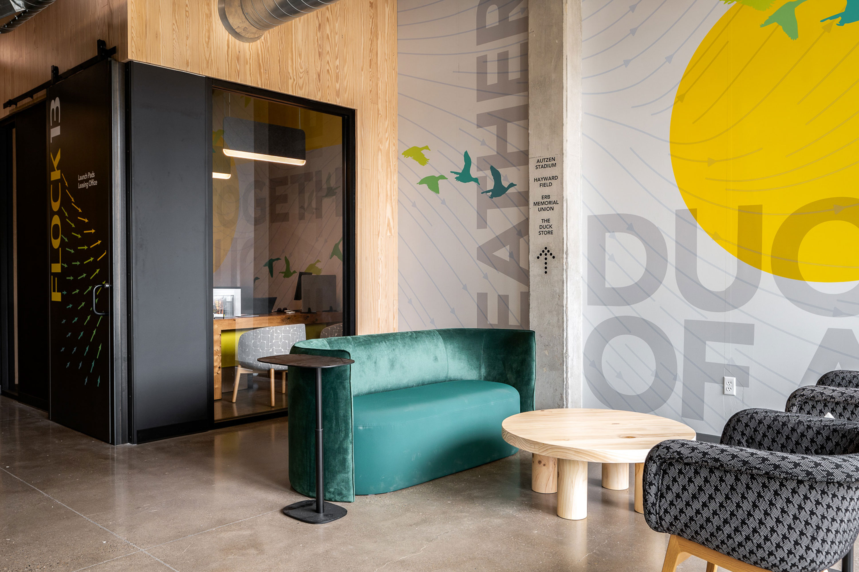
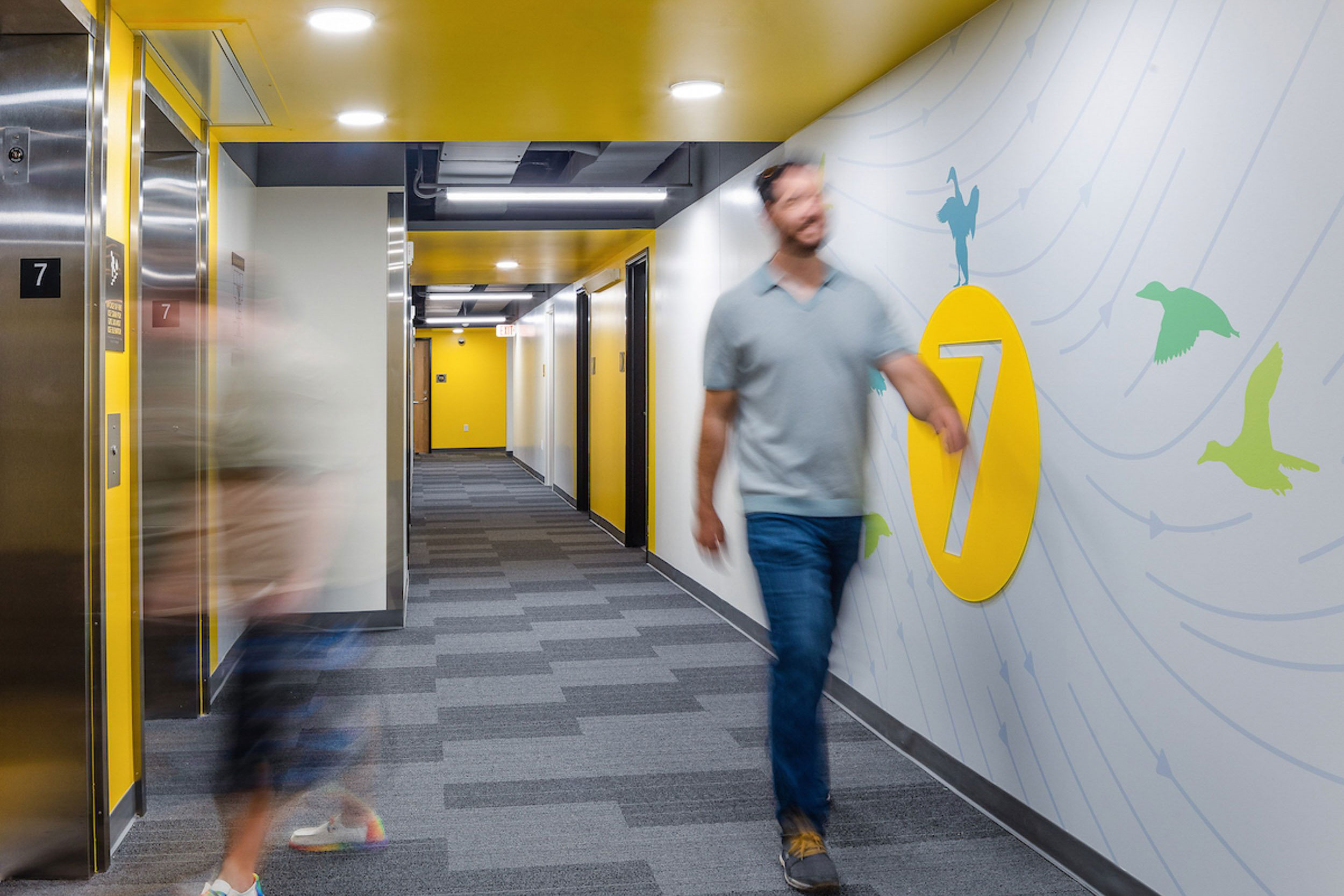
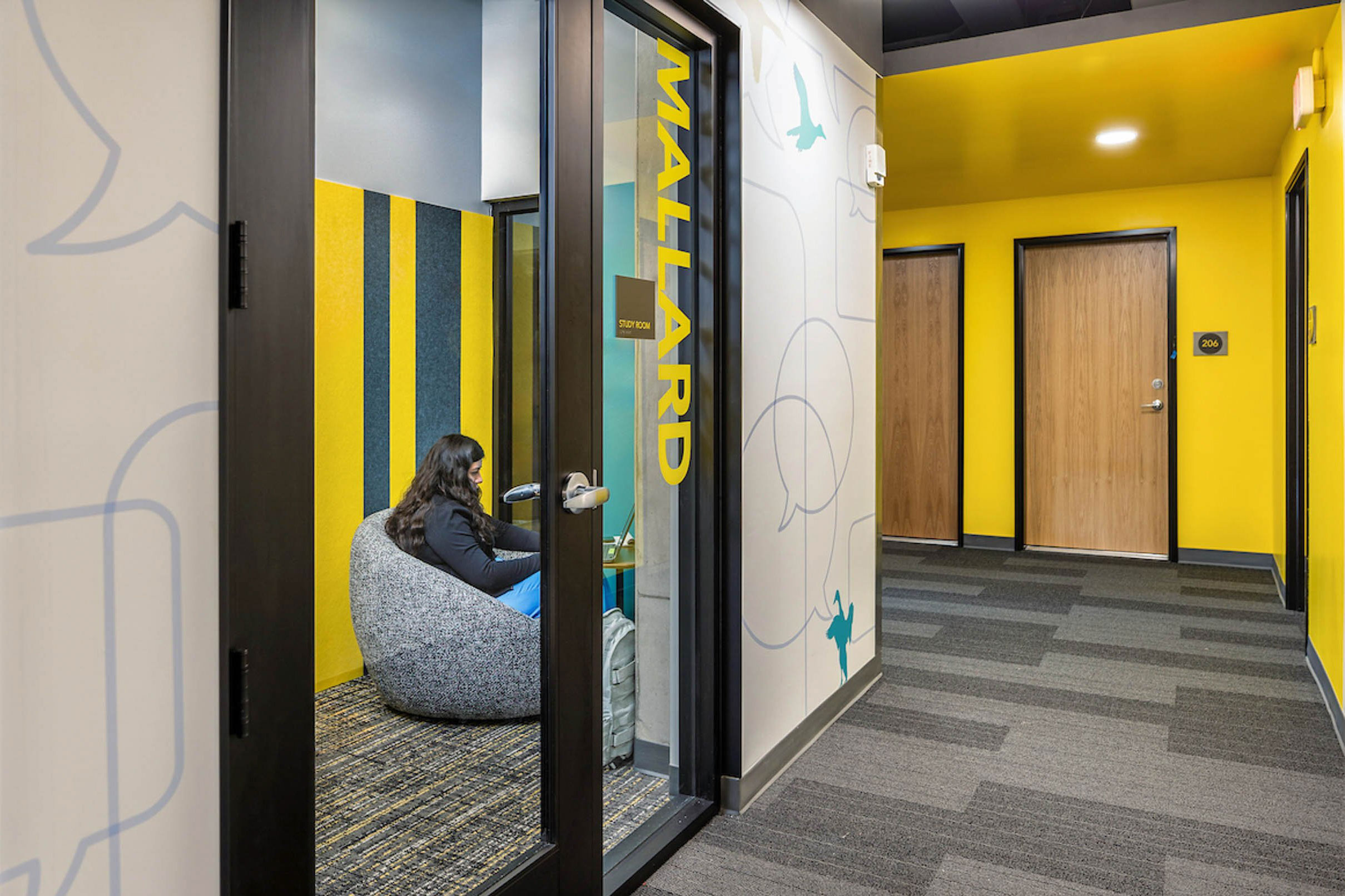
Flock 13


Delivery_
Branding
Visual Identity
Environmental Graphics
Year_
2024
About_
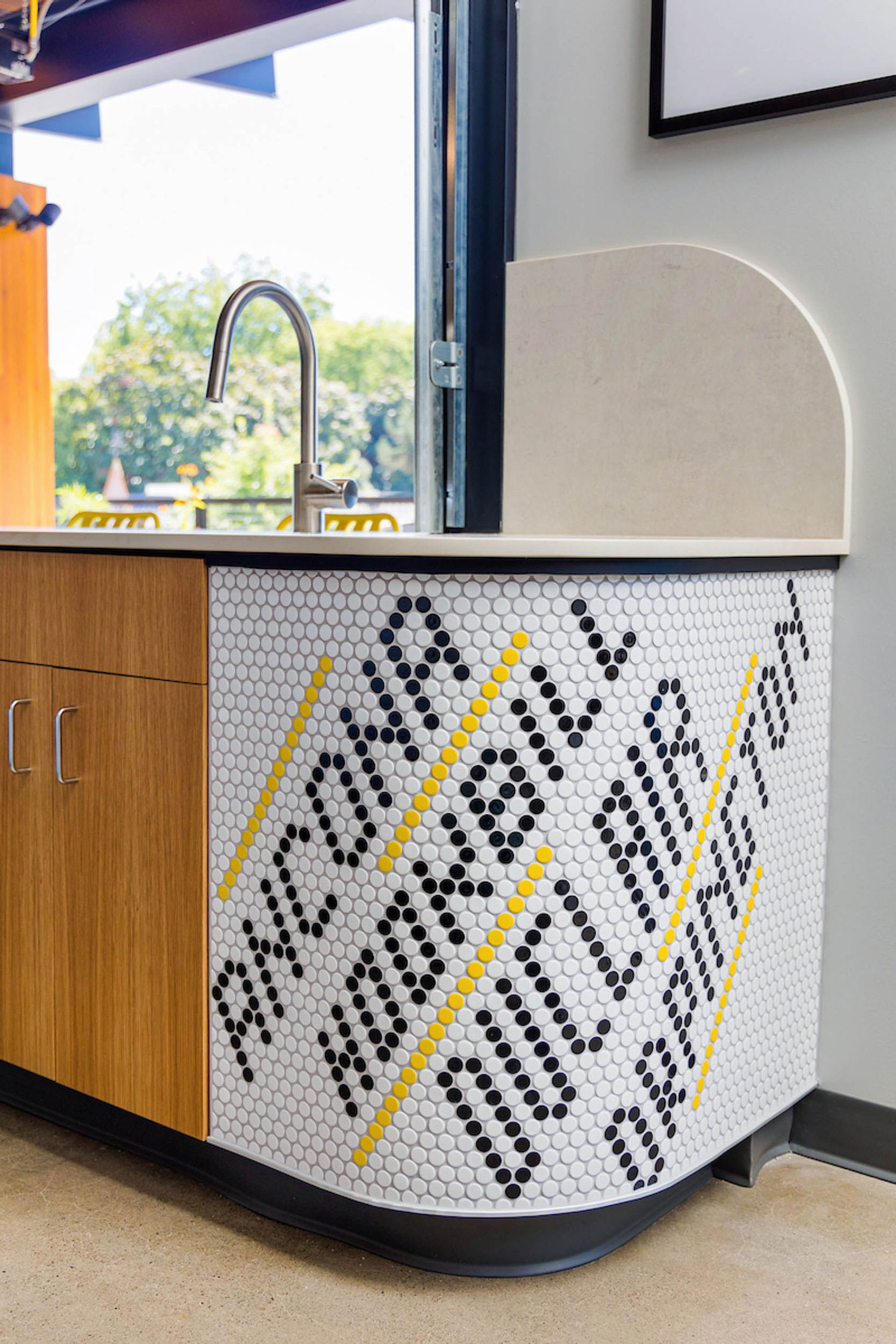
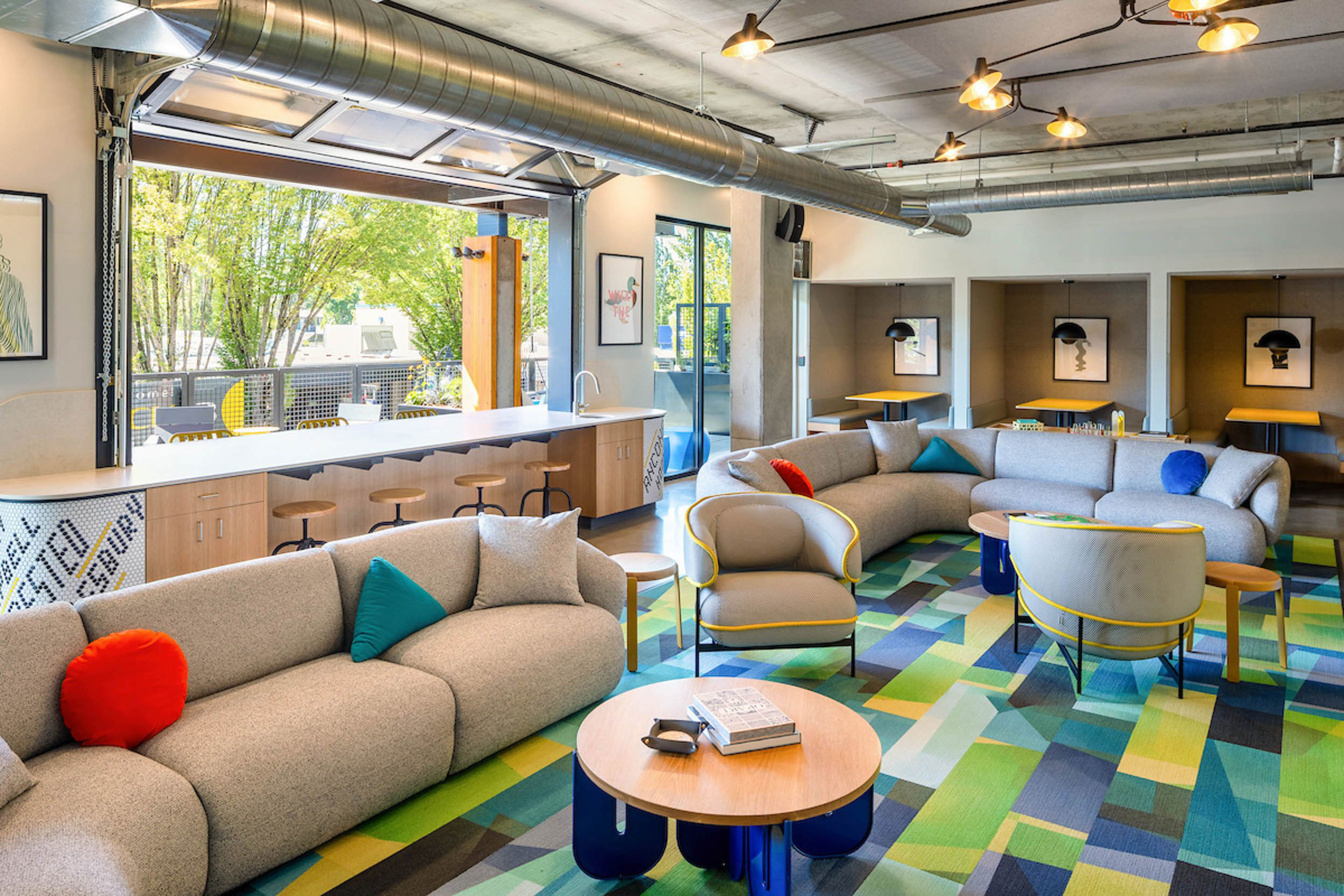
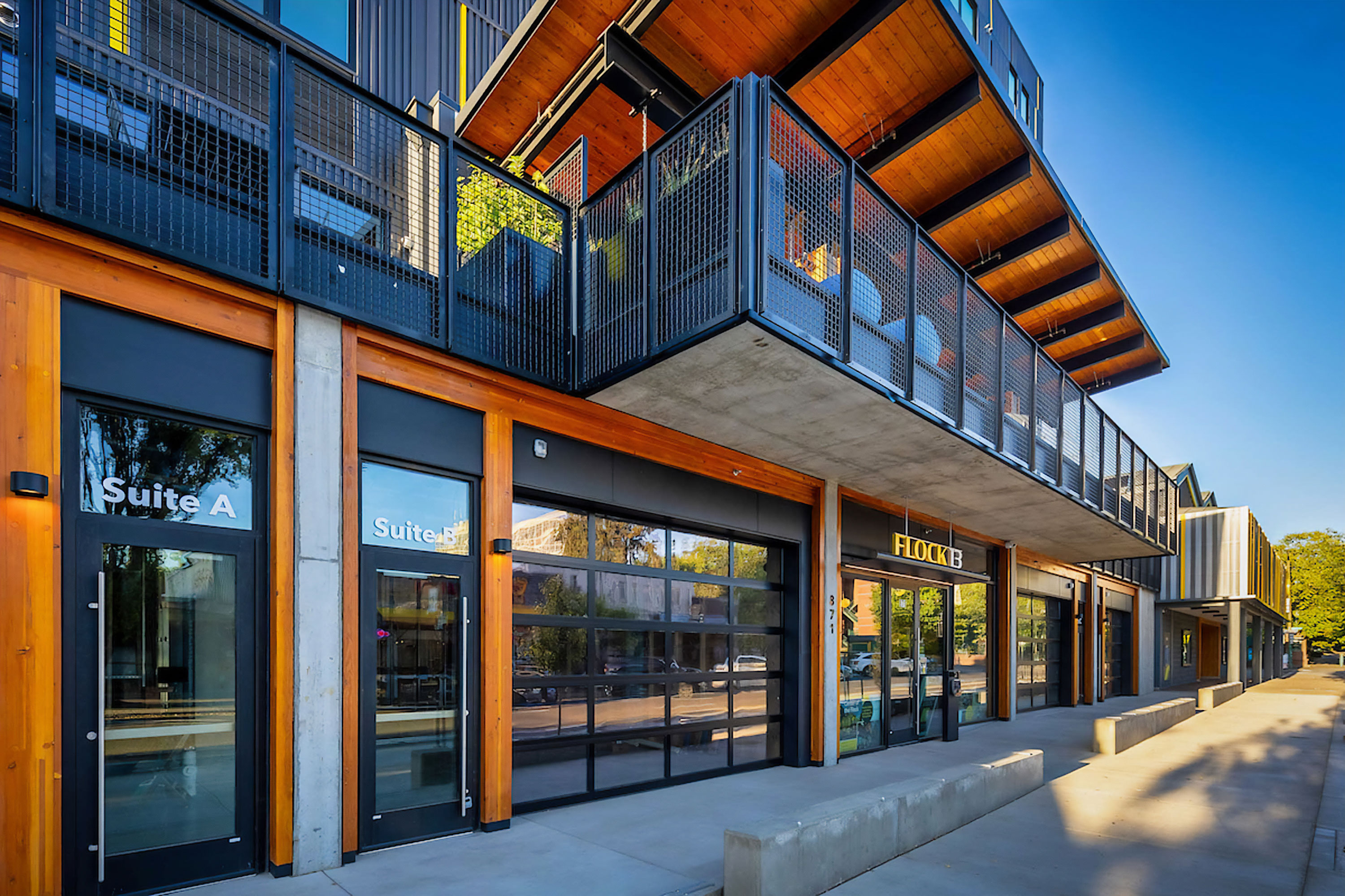
Flock13 is a high quality off-campus housing community that encourages collaboration and community in the most convenient district one step from campus. The building strengthens and enhances the vitality of 13th Avenue as the commercial center serving the students, staff, and visitors of the University of Oregon. Amenities include shared common space, the second-floor terrace, secure bike storage, pet washing area, and a mail room. Designed in conjunction with an exterior refresh of The Duck Store. The new façade of this flagship store introduces a wood-lined entry, graphic and illuminated signage over a perforated screen with metal panels. Each thoughtfully designed floor plan reflects a fresh, modern, and contemporary aesthetic. With a variety of outfitted study spaces and communal living rooms, the student experience strikes a balance between quiet contemplation and uplifting partnerships.
The name and identity welcome students through familiar connection to the University while maintaining a distinct visual impression all its own. Through iconography and flight references the tone is inspirational and whimsical with a sense of community gathering that makes Flock 13 a welcome place to have fun but also a place to achieve great heights.
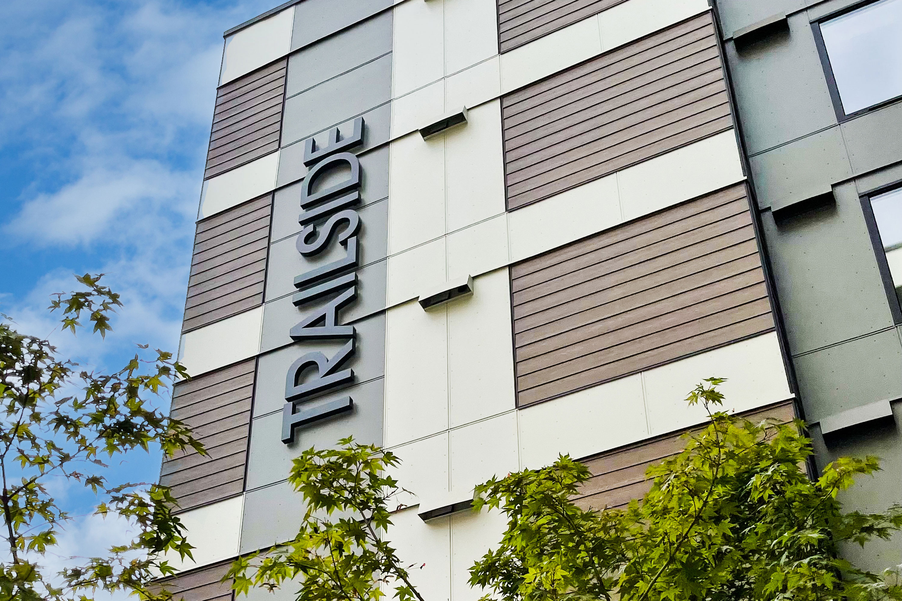
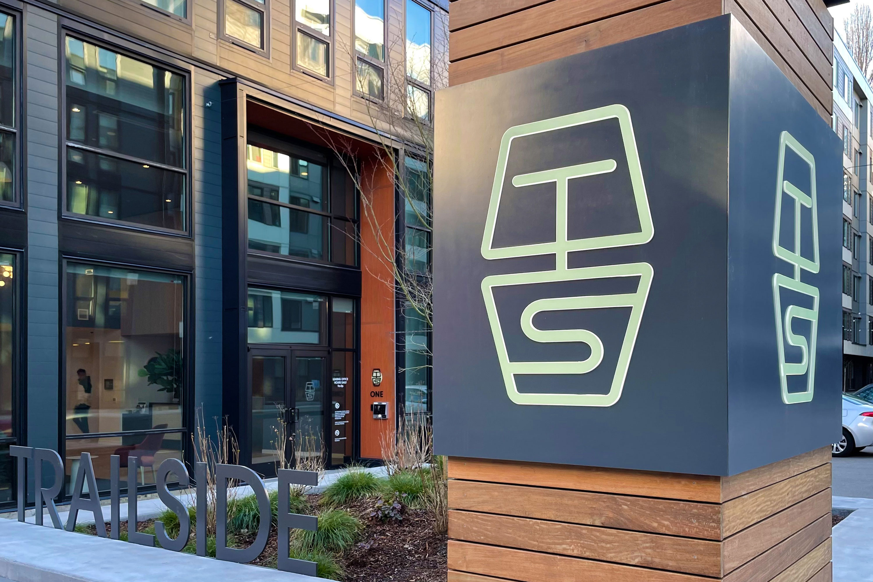
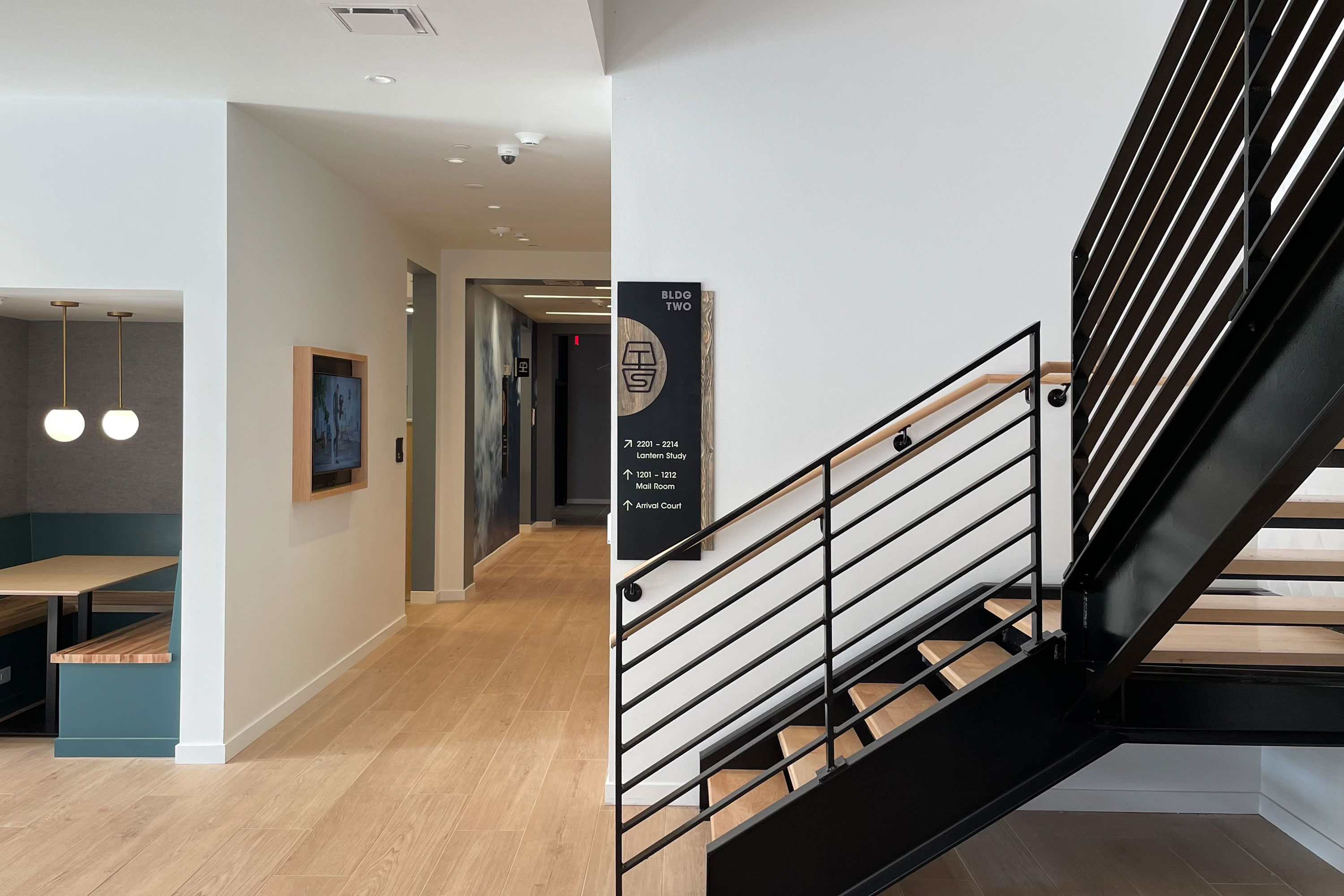
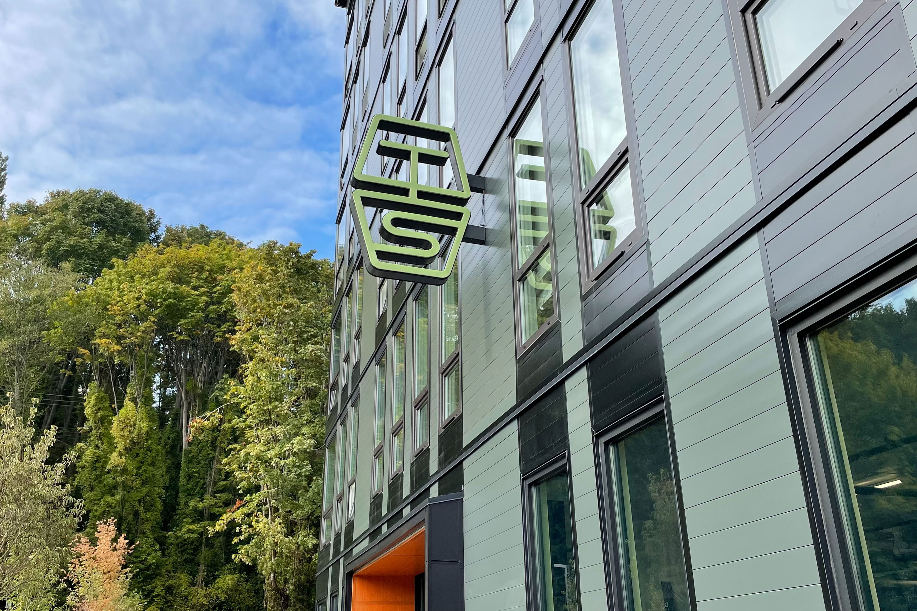
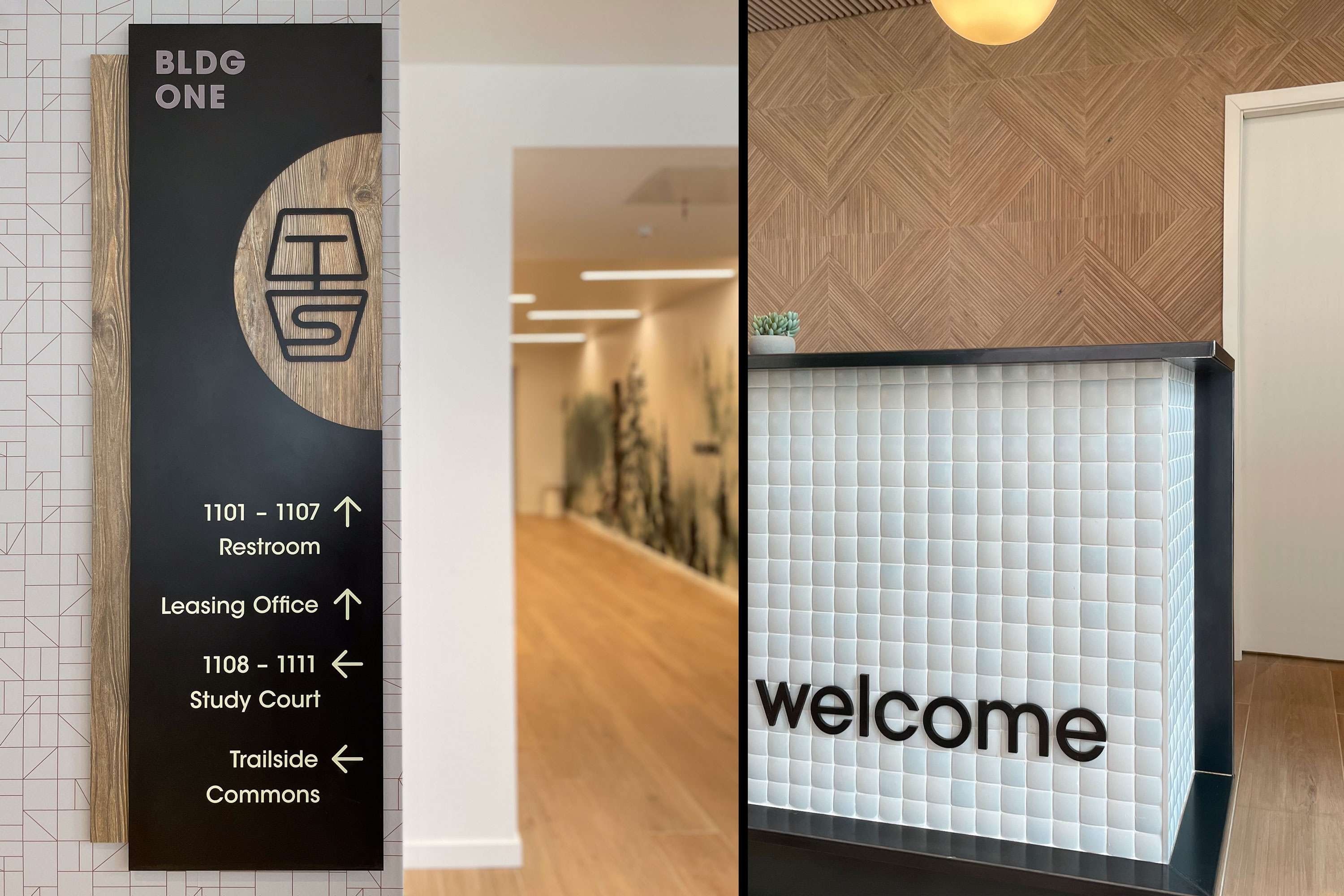
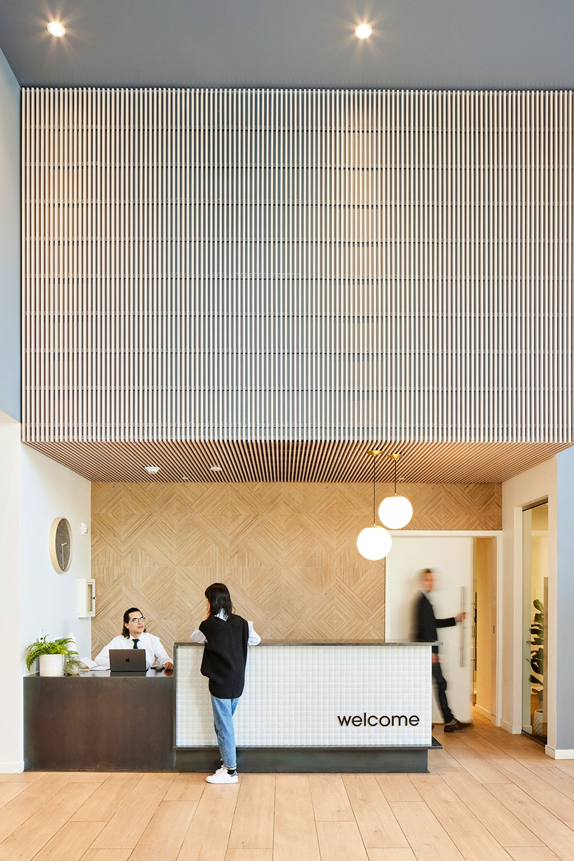
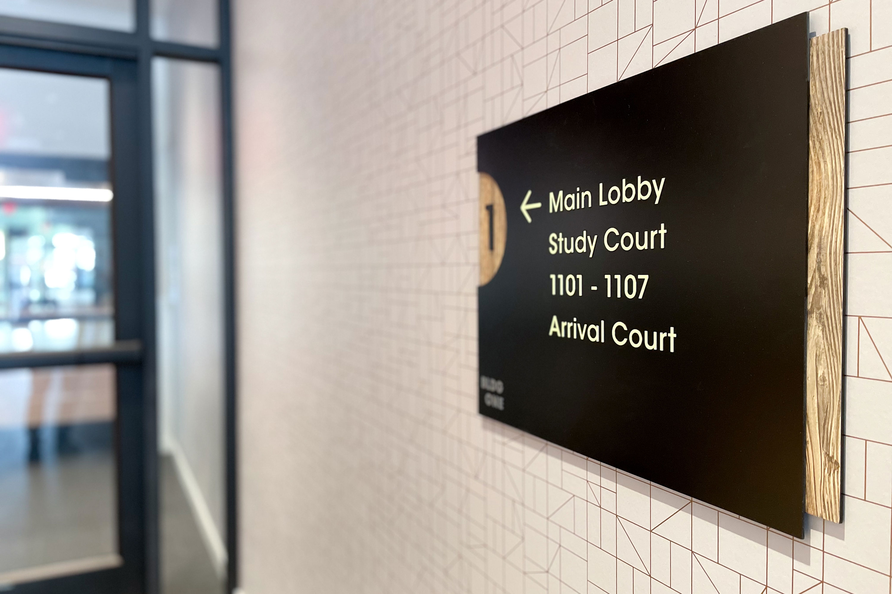
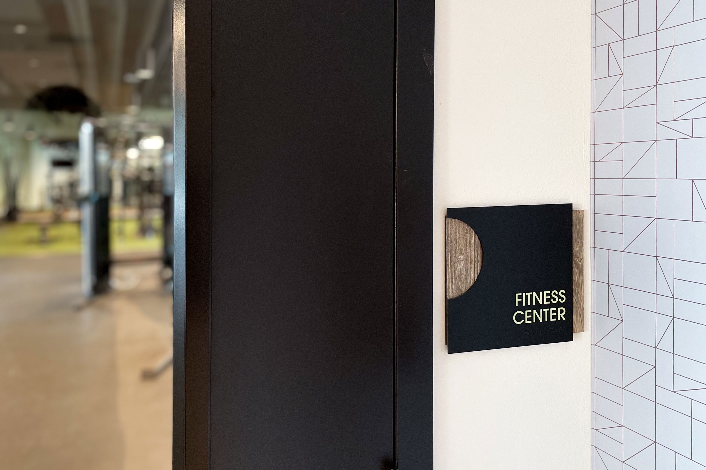
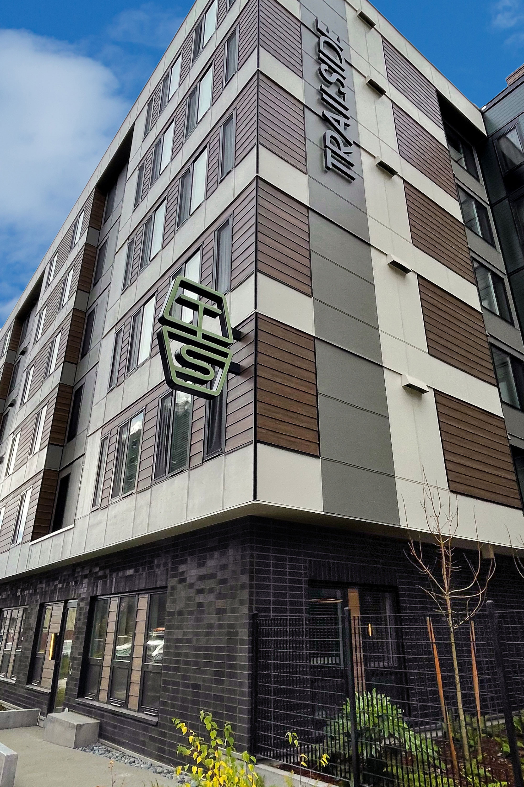
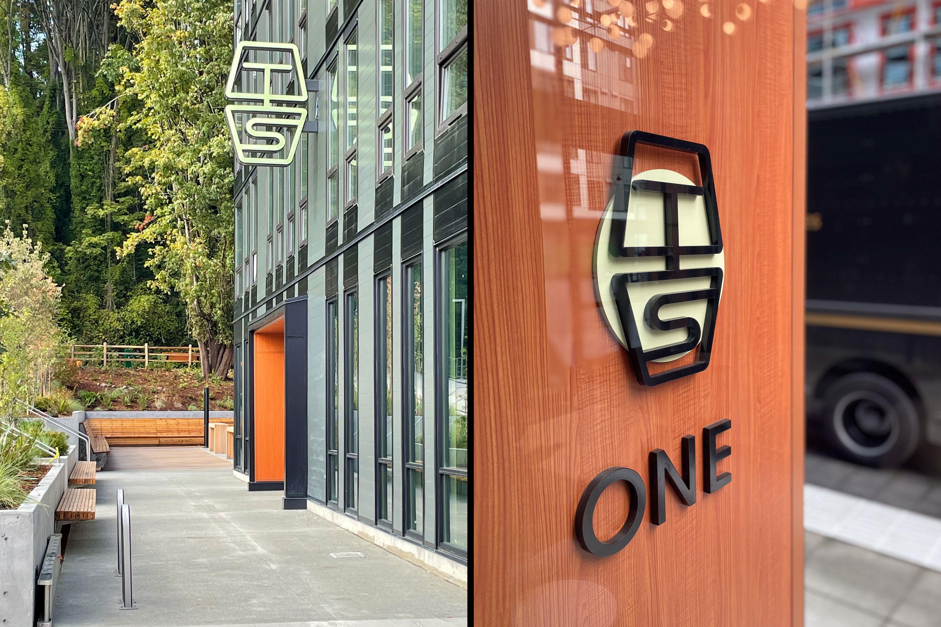
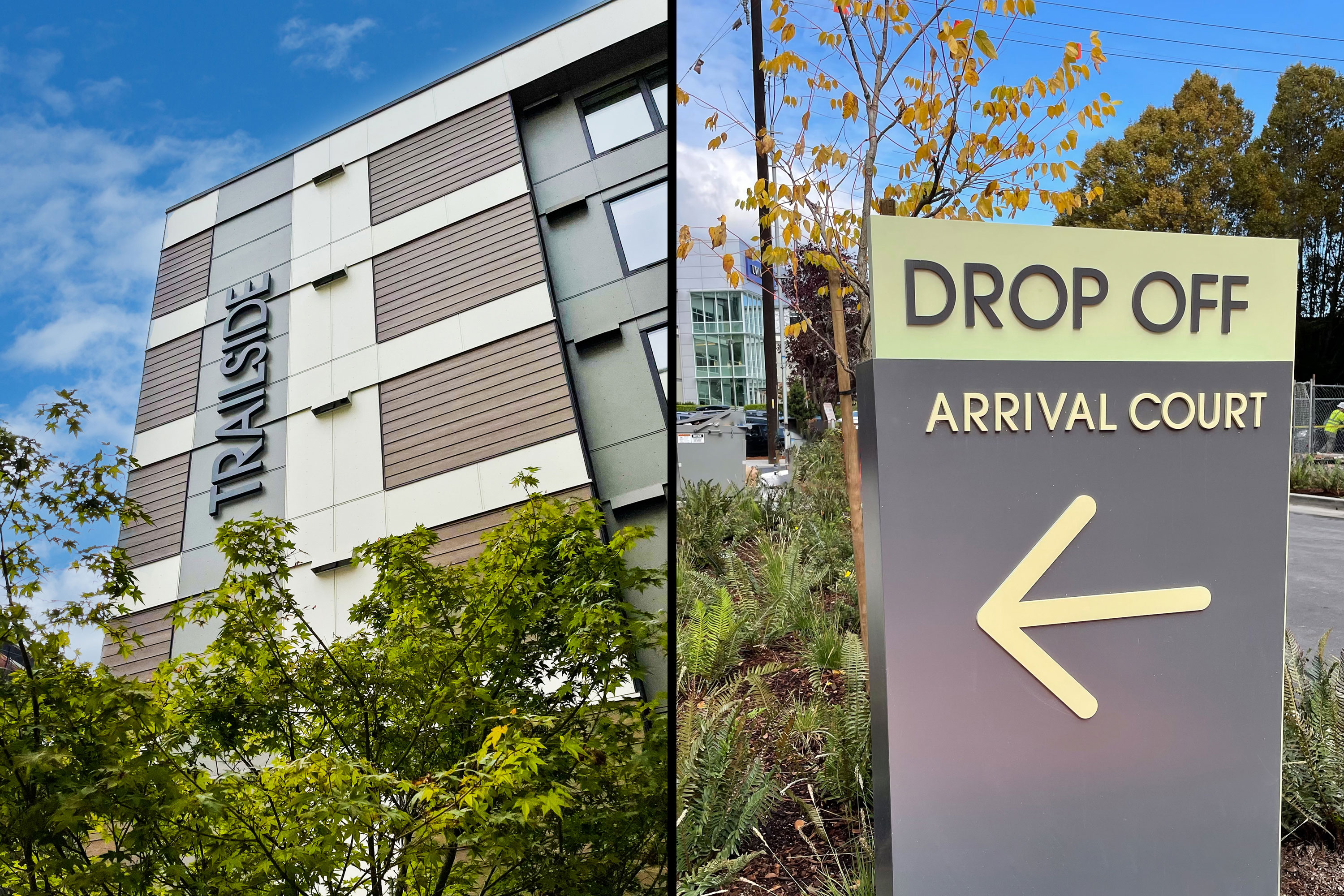
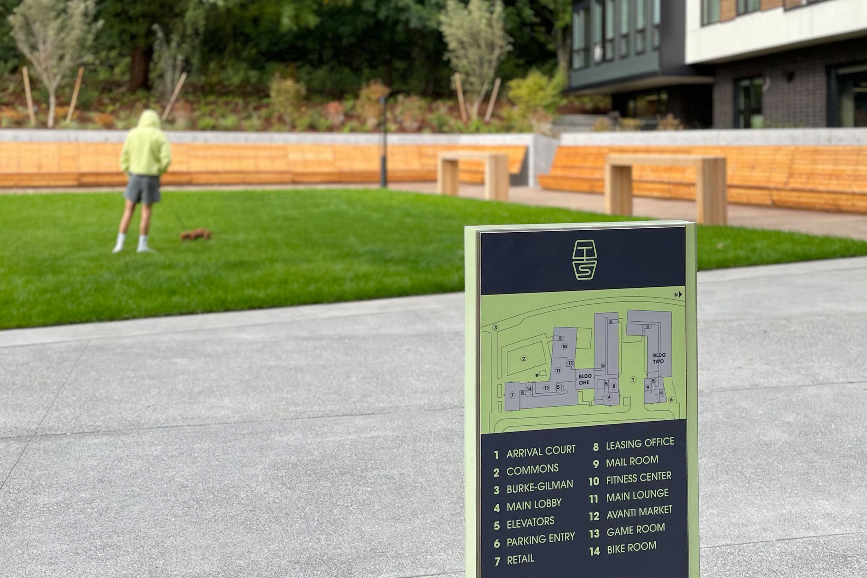
Trailside Student Living
Delivery_
Branding
Visual Identity
Environmental Graphics
Year_
2020
About_
A student-targeted residential community near the University of Washington, Trailside Student Living is a learning and living community adjacent to the Burke-Gilman Trail that has become a coveted new place for the modern student to call home.
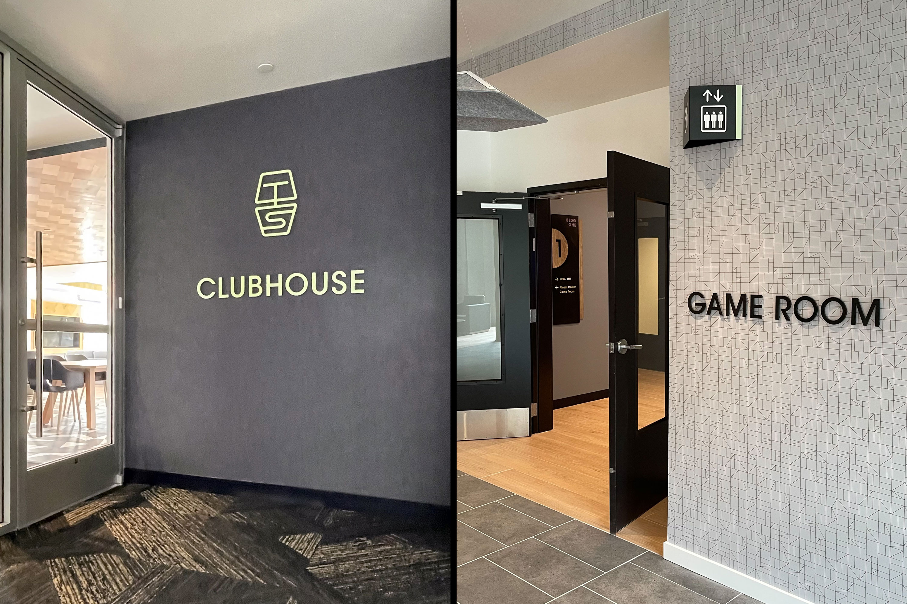
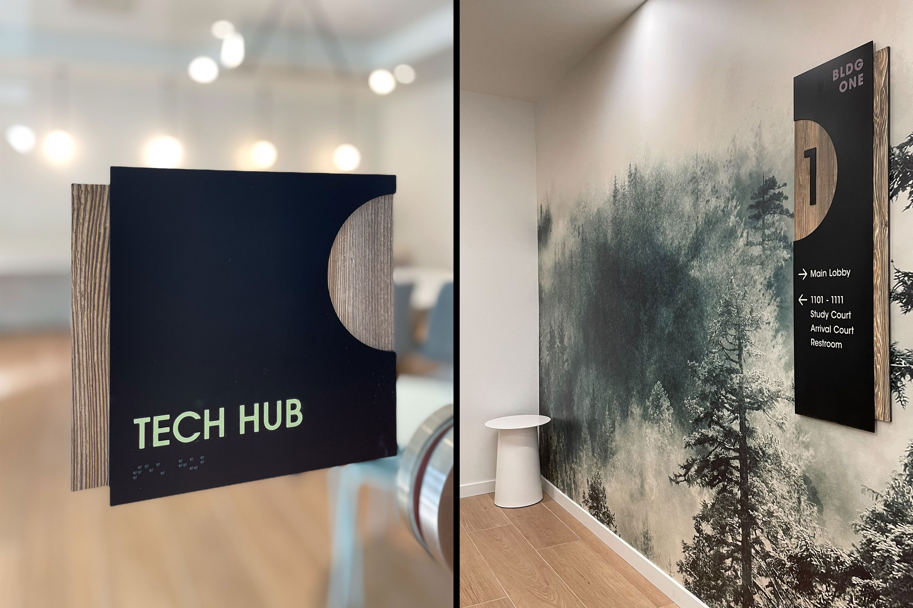
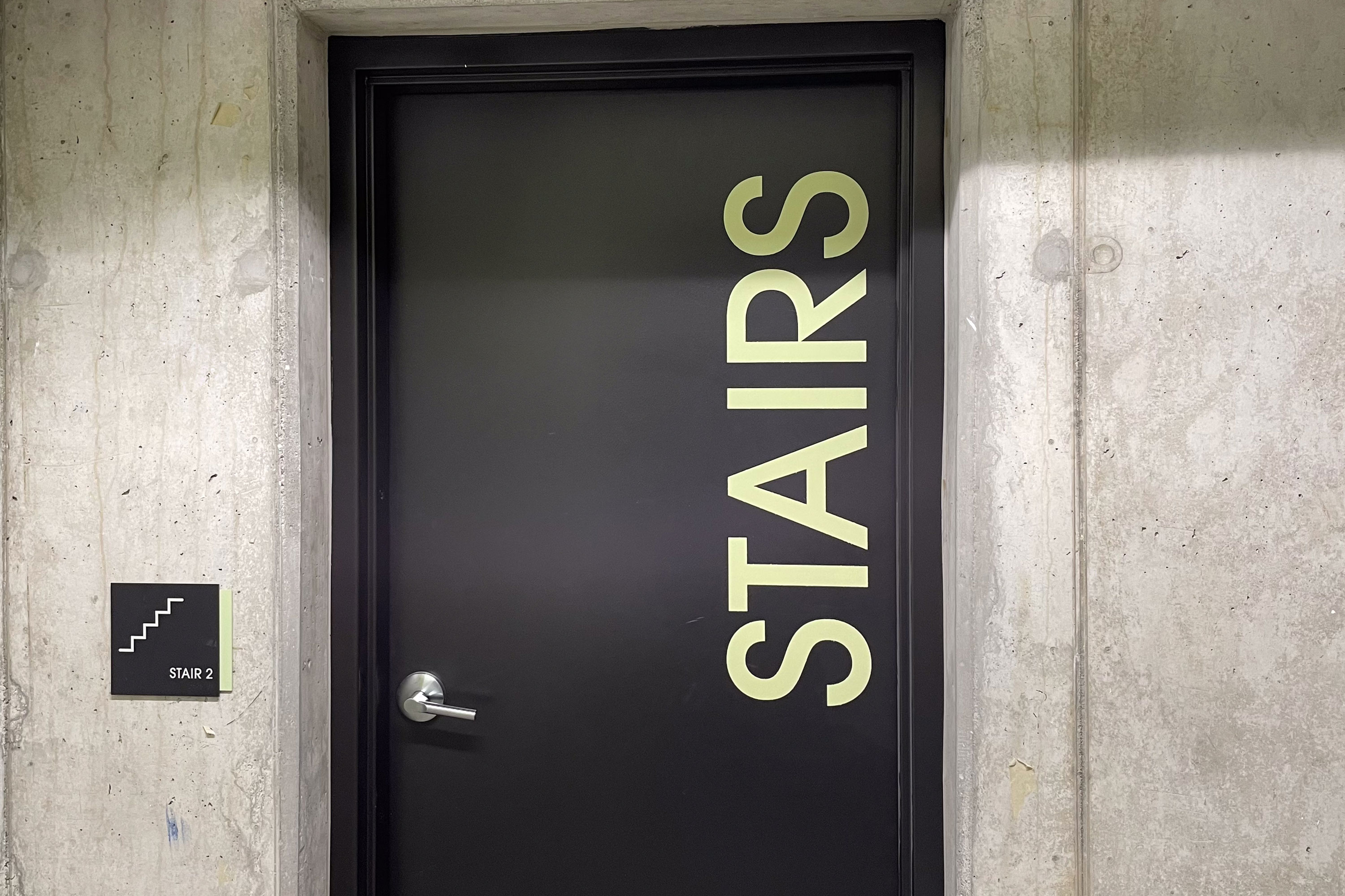
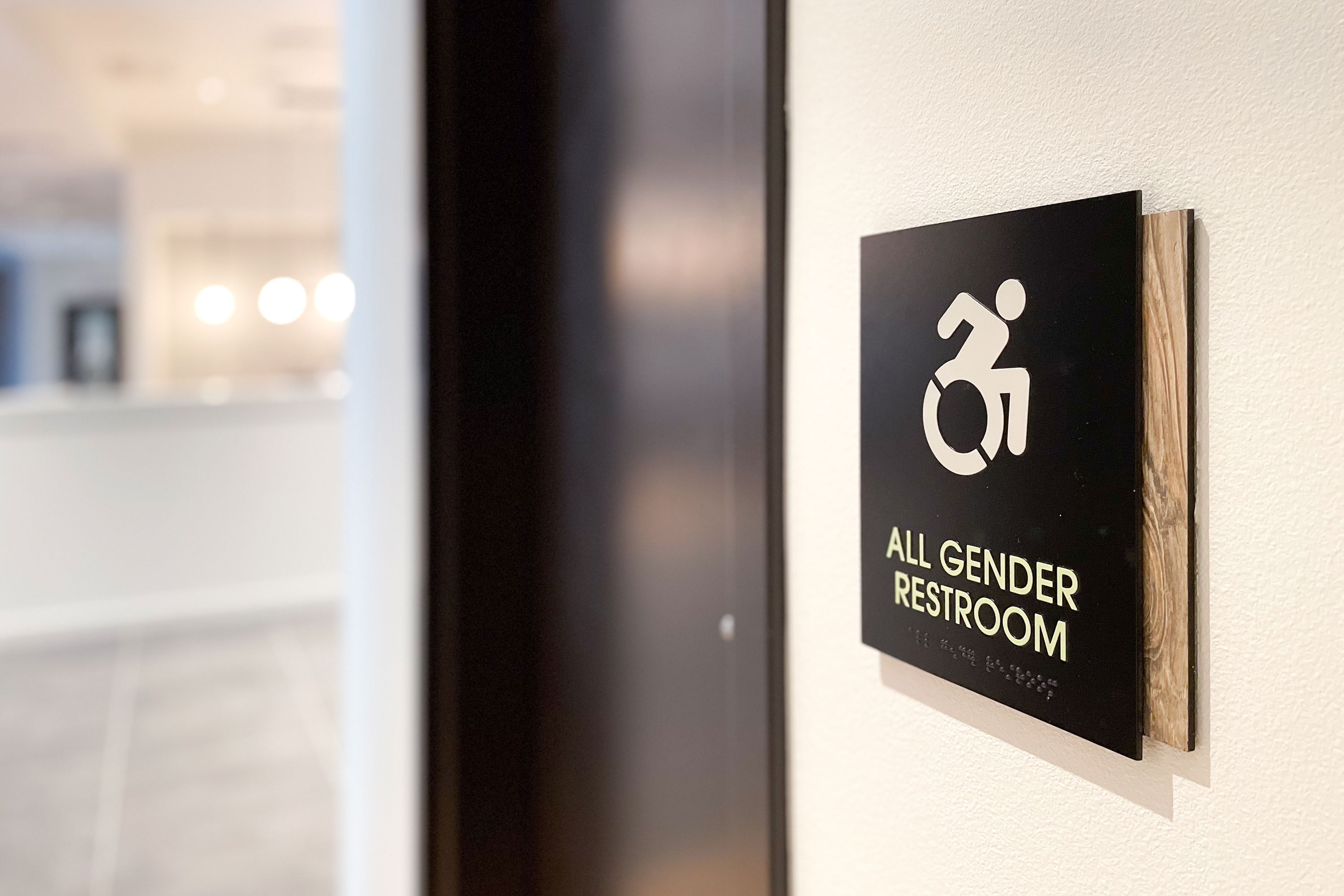
Two seven story residential blocks, with plentiful common areas and green spaces, evoke the building identity which draws inspiration from the active lifestyle along the Trail. Wayfinding signage is integrated into the surrounding landscape at the Arrival Court and Trailside Commons, complemented by naturalistic wayfinding and room signage on the interior that invites the outdoors in. The plethora of common areas have a variety of sign types, from the welcome lobby and the clubhouse to the commons and dog run. Altogether, the outdoorsy palette coupled with the sleek urban city vibe proves student living does not need to be garish or unrefined.
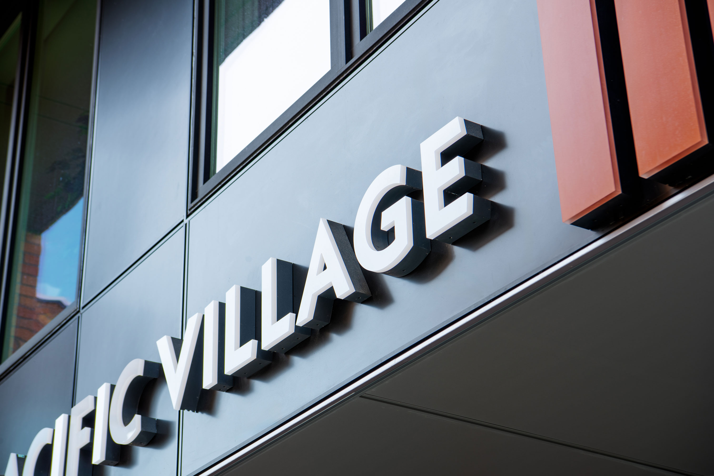
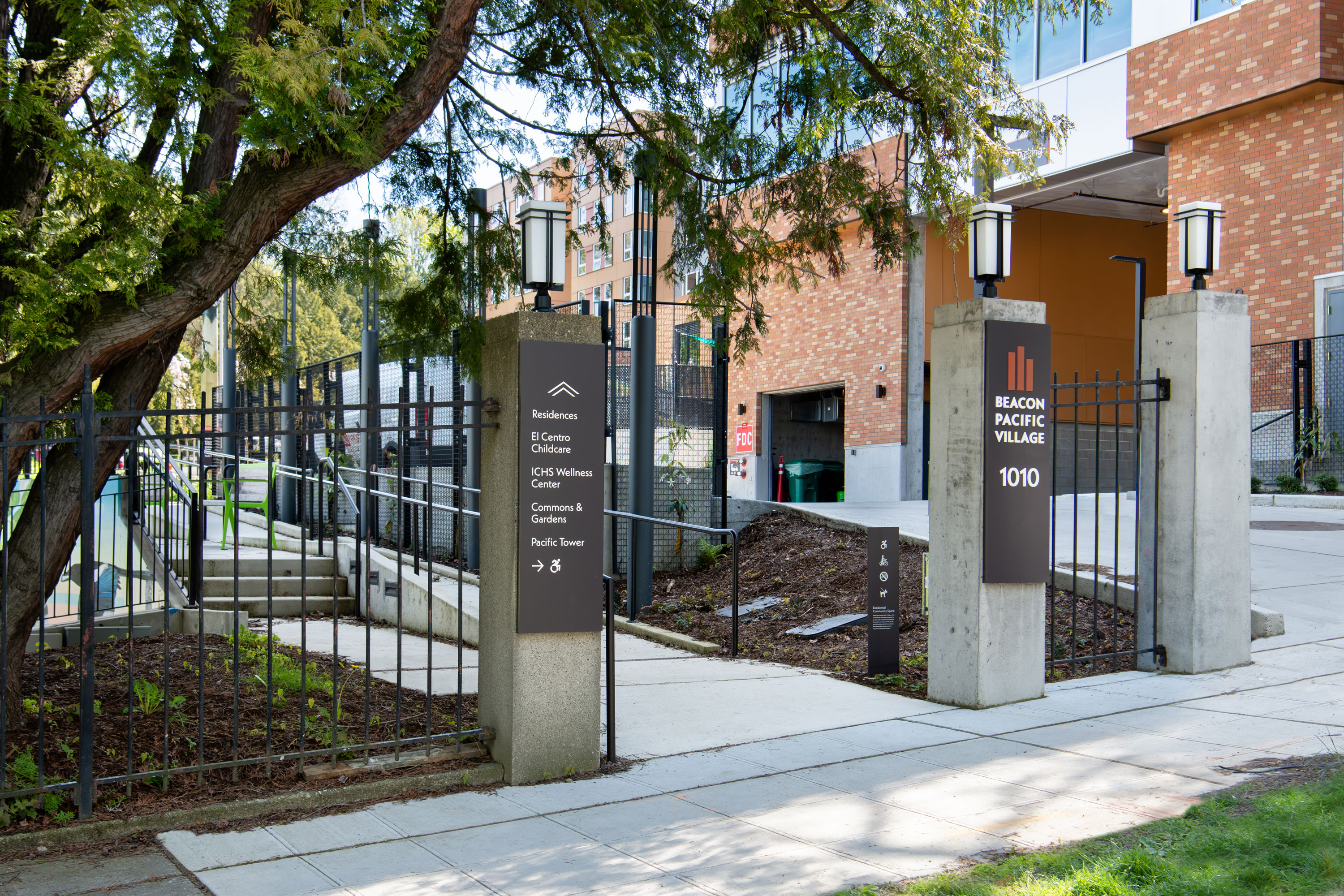
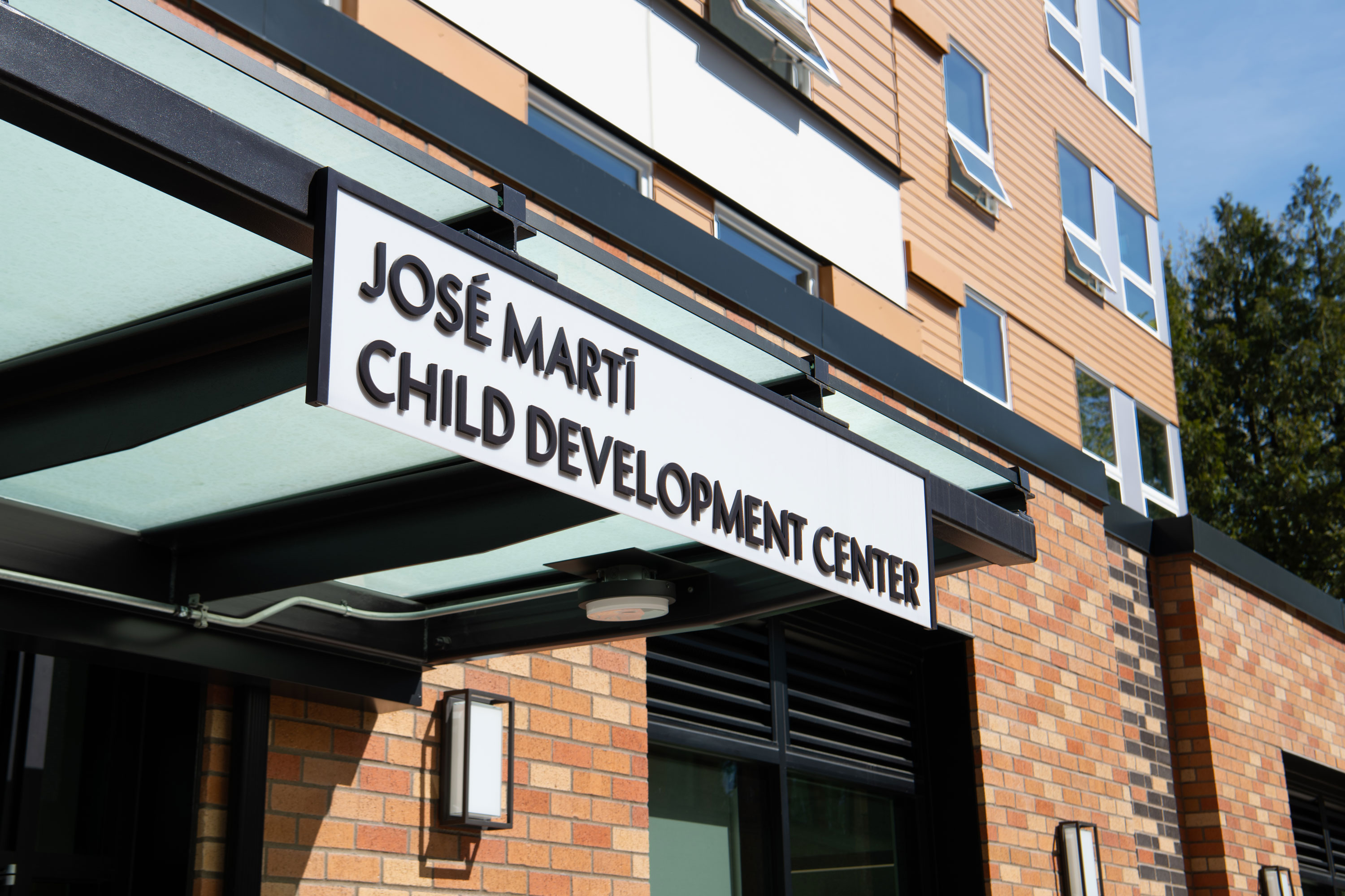
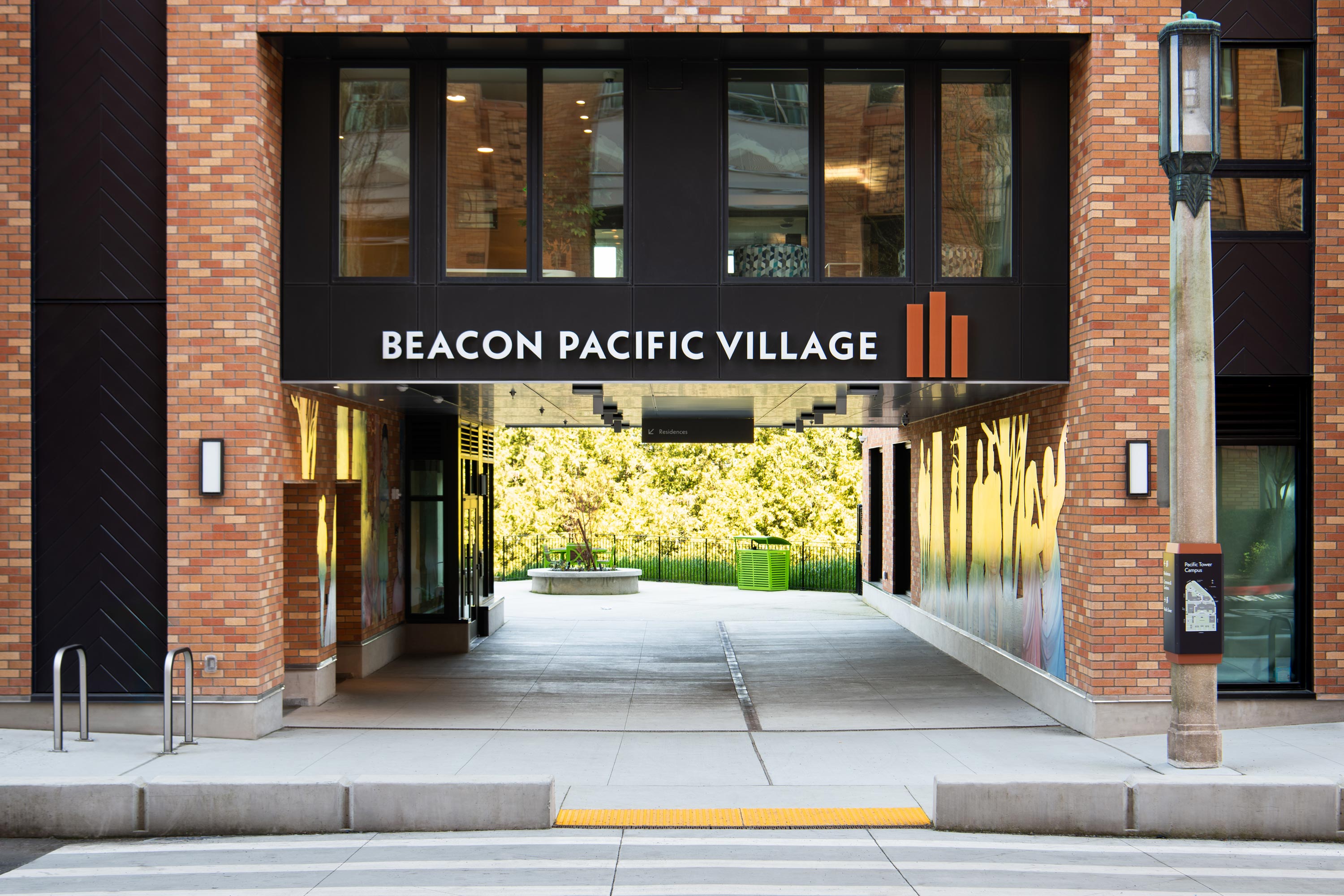
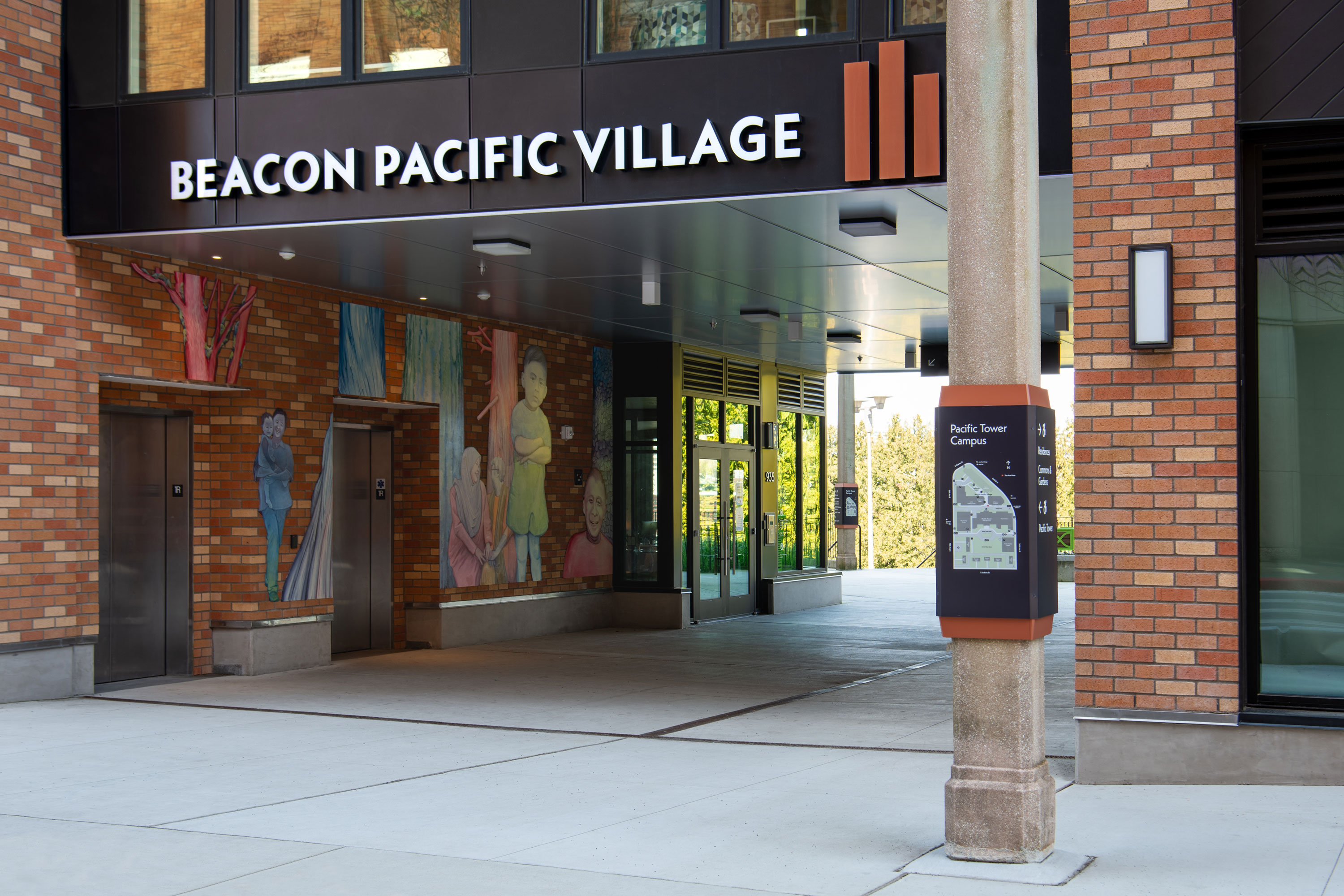
Beacon Pacific Village


Delivery_
Branding, Visual Identity, Environmental Graphics
Year_
2024
About_
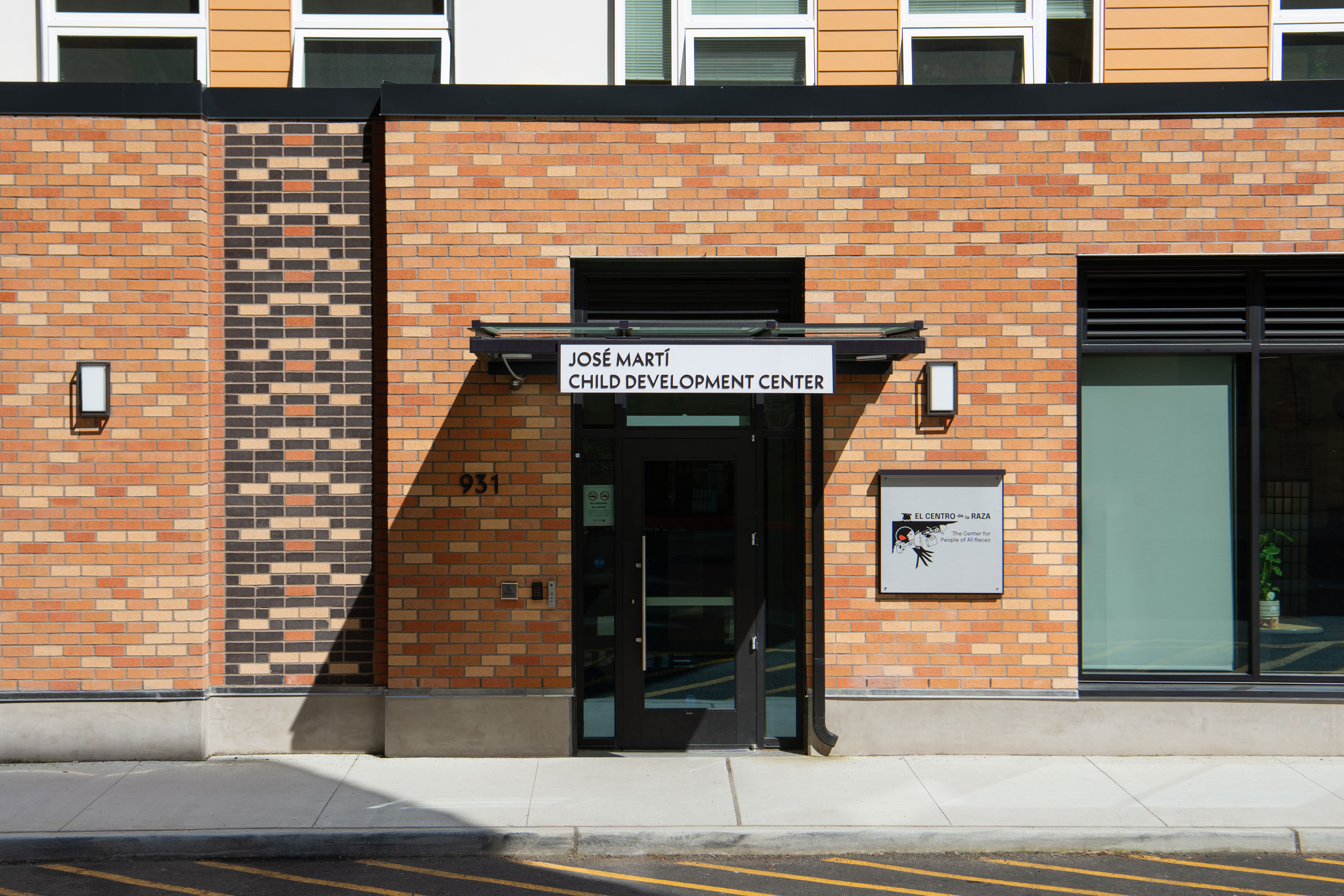
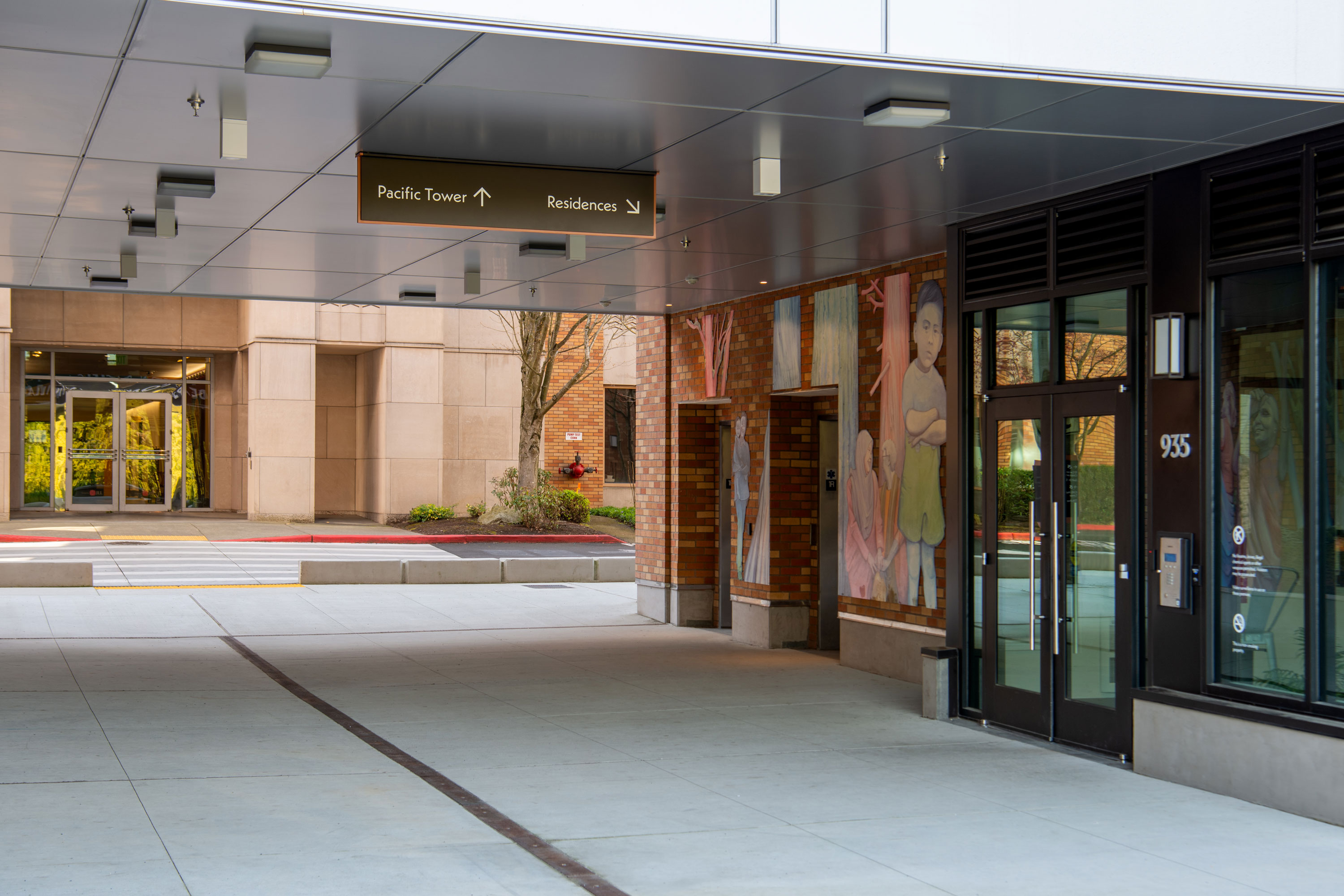
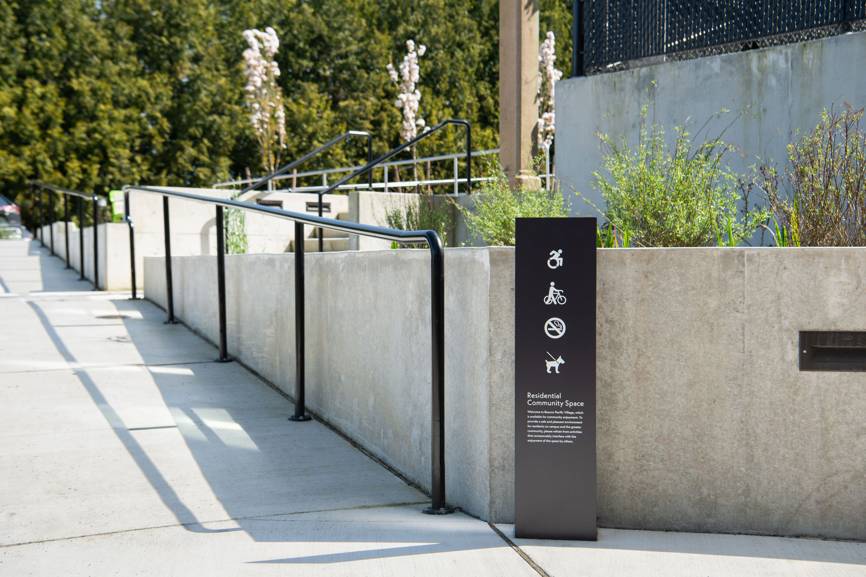
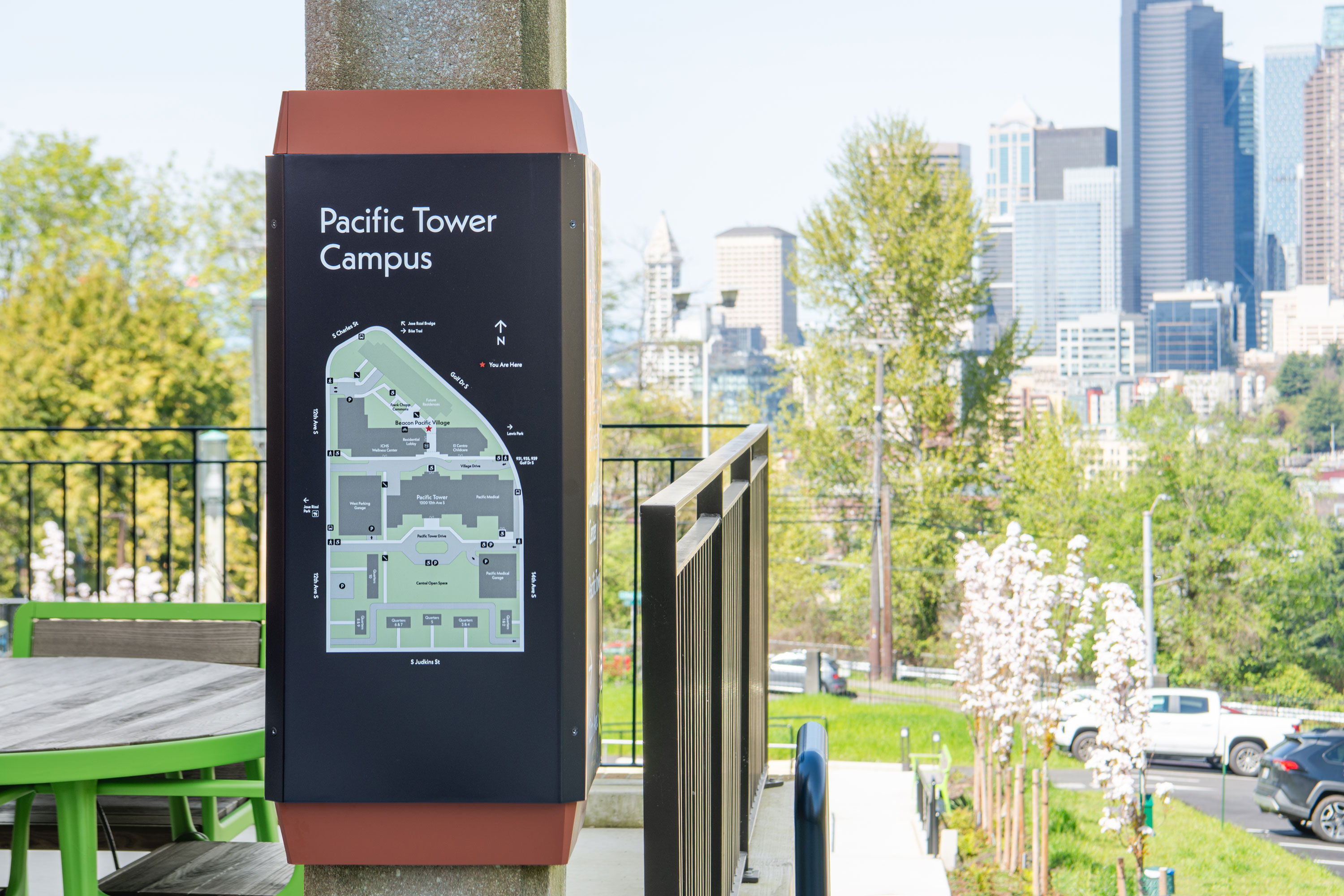
Beacon Pacific Village, developed by Seattle Chinatown International District Preservation and Development Authority (SCIDpda), is a mixed-use community situated on the historic Pacific Tower Campus. The community offers 160 affordable family-sized units and landscaped plazas overlooking Downtown Seattle. The development features a Healthy Aging and Wellness Center operated by ICHS and a childcare center operated by El Centro de la Raza. Beacon Pacific Village is dedicated to combating displacement in Beacon Hill and the International District by providing essential services and housing for multi-generational families.
Sharing the grounds with the iconic Pacific Tower, the visual identity evokes design details of the historic landmark and an inclusive ‘Village’ name to reflect the hub of social services and multi-cultural programs that have long-resided on campus. At pedestrian-friendly arrival points, identity markers and wayfinding welcome visitors to campus. Along the internal Village Drive, a prominent façade mounted identity announces the main entry portal to the residences. And for site design continuity, historic campus lampposts were salvaged and repurposed along the new pathways to become ideal placements for wayfinding and campus orientation maps.
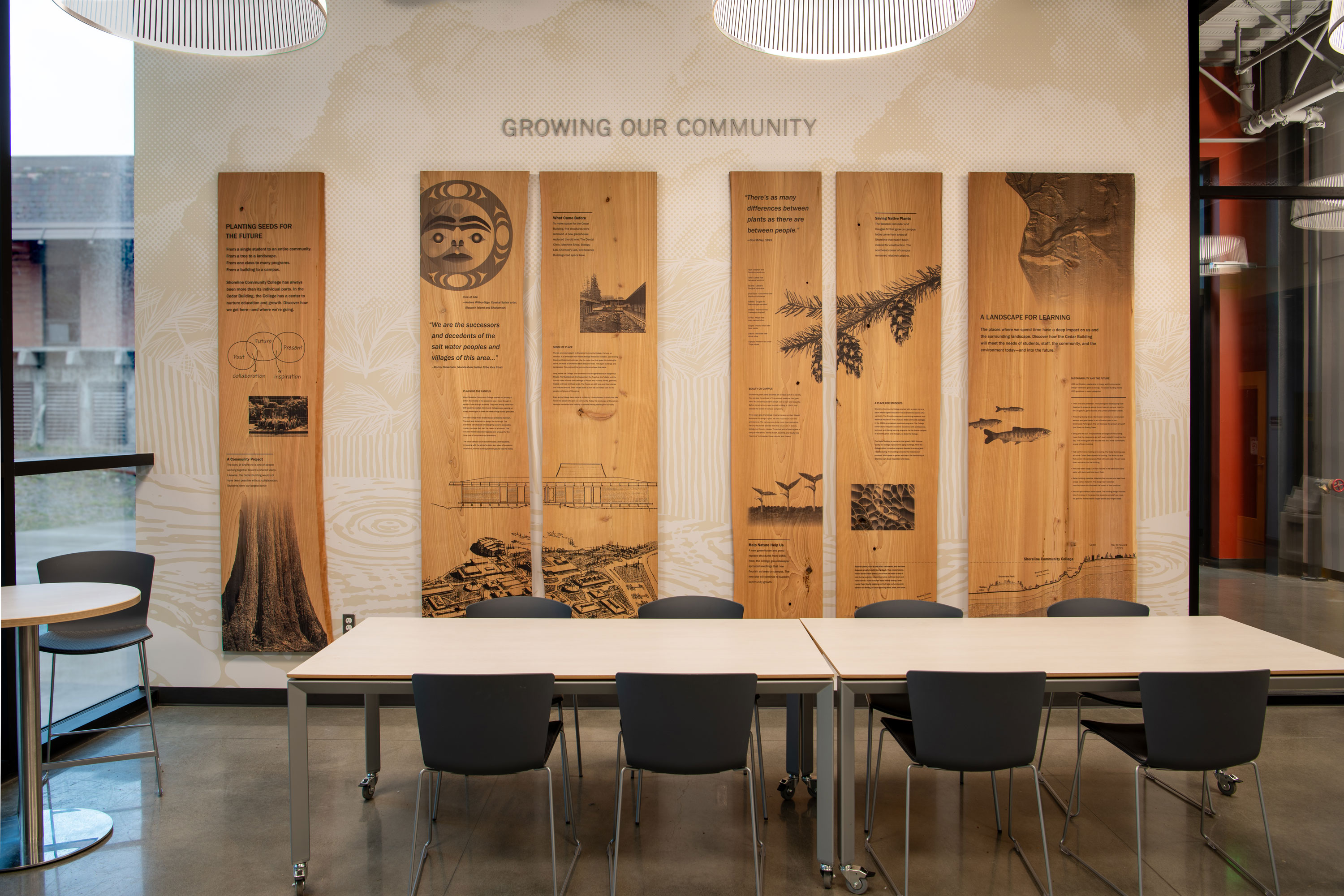
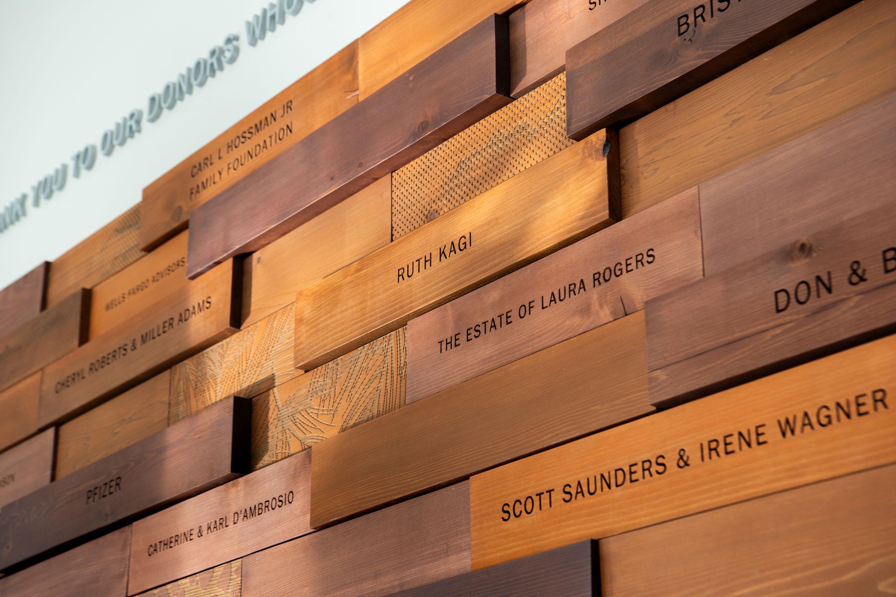
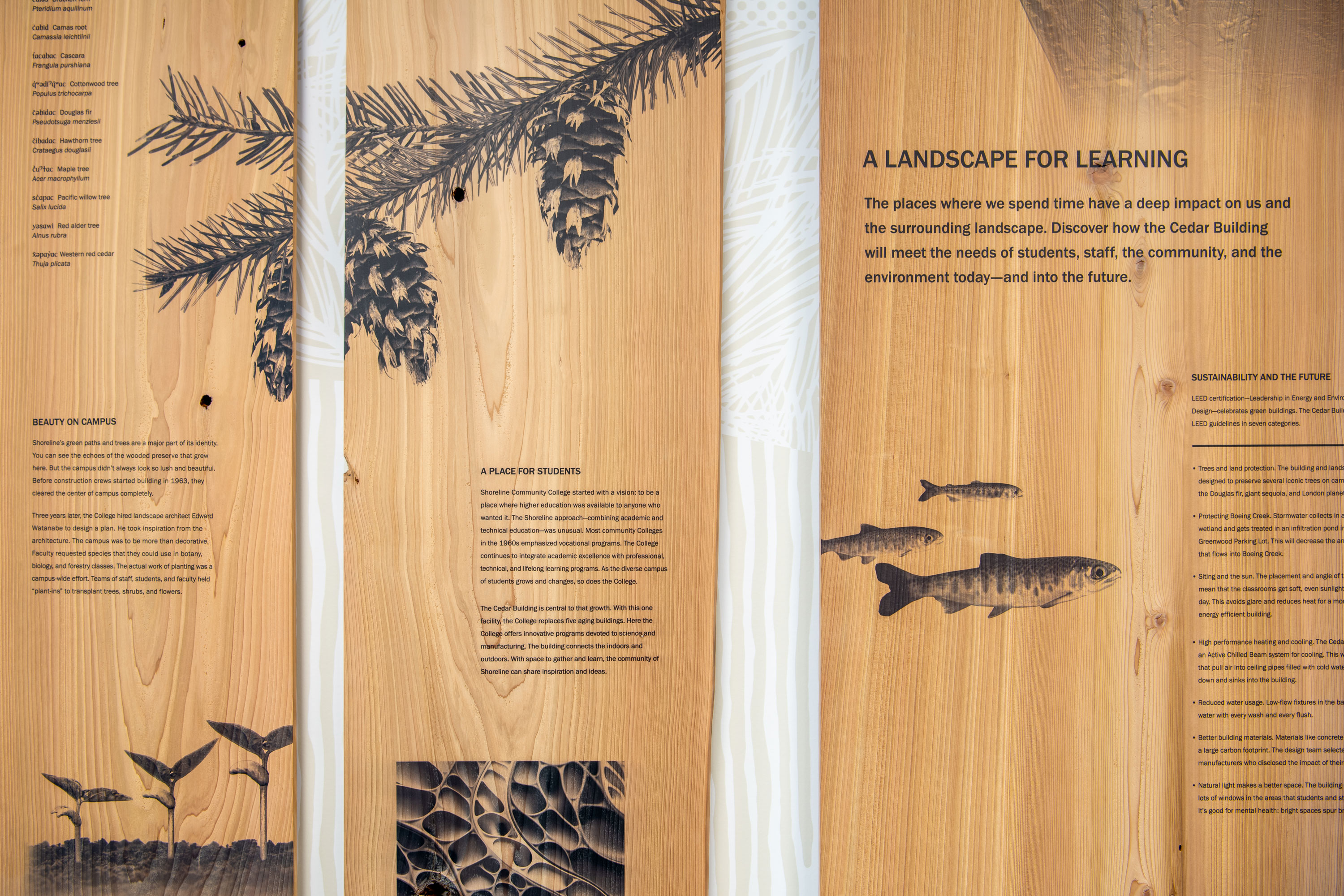
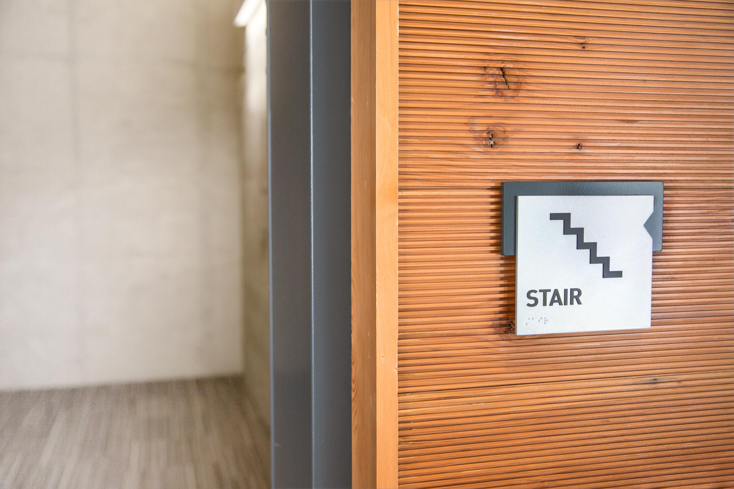
Shoreline College


Delivery_
Environmental Graphics
Year_
2024
About_
Shoreline College is undergoing a transformation. Through educational advancement to state-of-the-art facilities and an eye toward blending contemporary building styles with its midcentury modern vernacular and abundant greenery, the College is reshaping for the future and forging new partnerships to honor the rich cultural heritage of the Indigenous Peoples of the Pacific Northwest. The new Cedar Building leading the way, replaces five existing buildings with a new facility that will house the Chemistry, Biology, Medical Laboratory Technology, Advanced Manufacturing, Engineering and BioManufacturing departments. As a leading indicator of campus improvements, the Cedar building pays homage to the region’s natural environment, characterized by towering trees, native and sustainable plantings, and a collaboration with Indigenous Peoples.
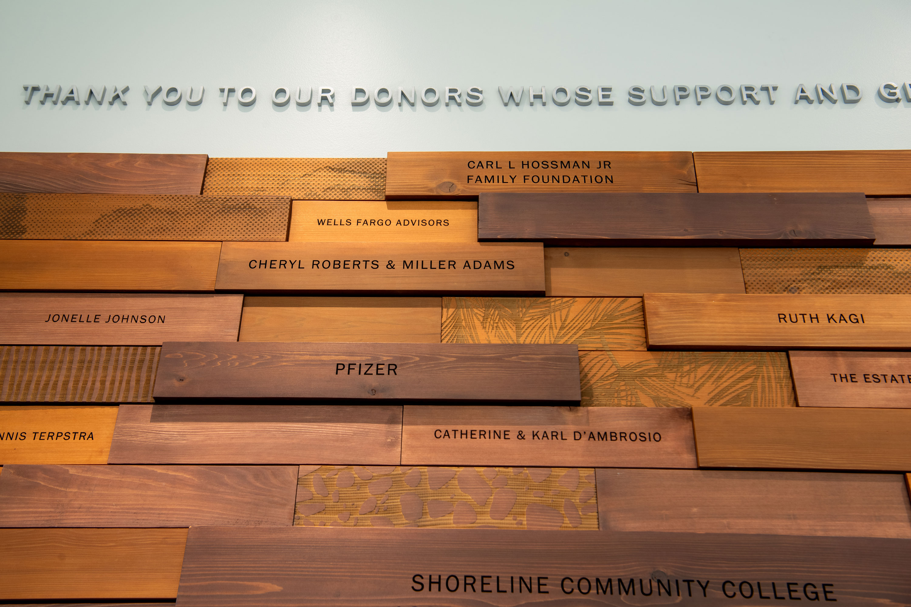
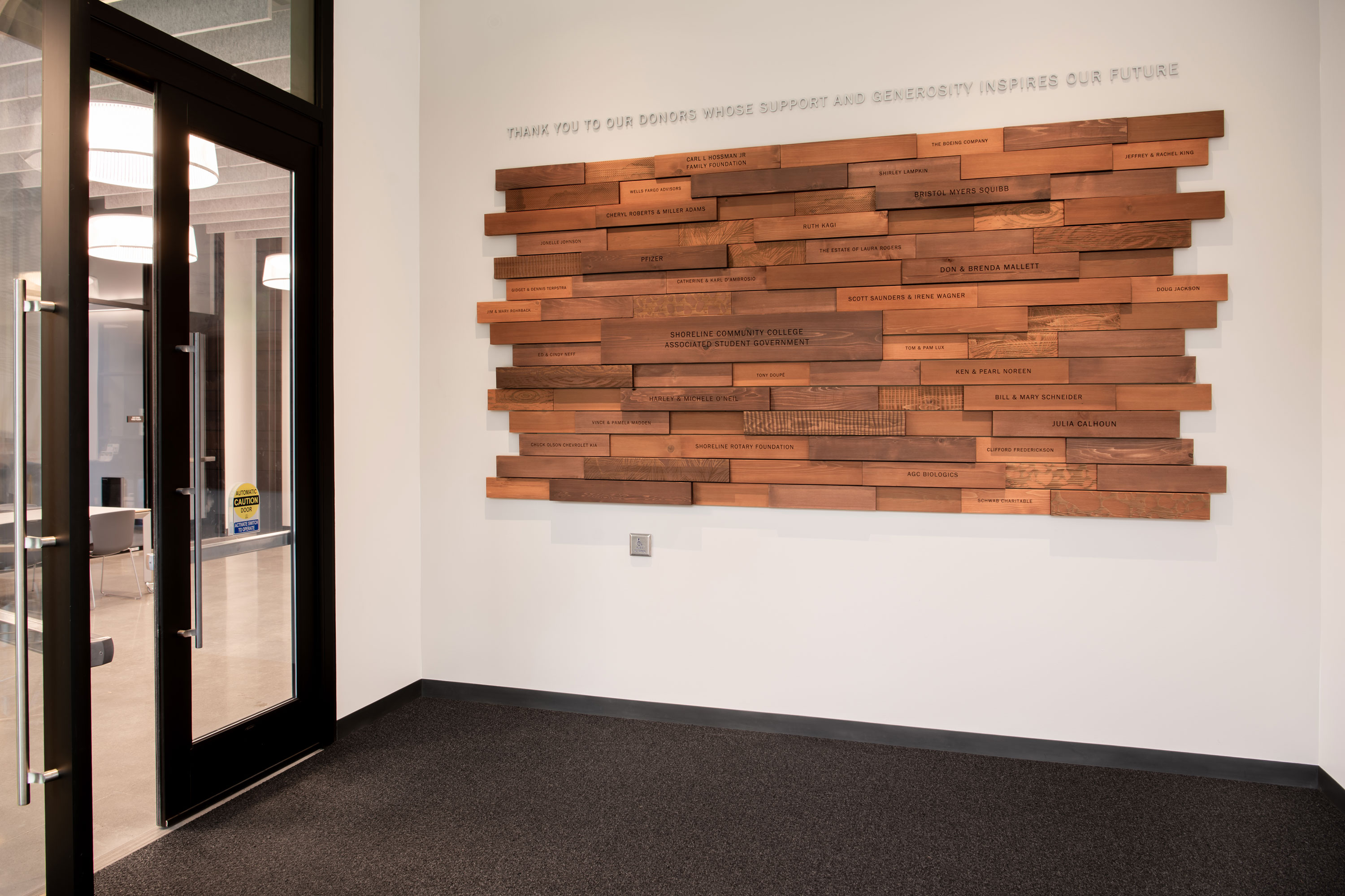
The Cedar building is named after the prolific Western Red Cedar trees, x̌əpay̓ac in Southern Lushootseed, which are beloved by Pacific Northwest Tribal Nations. Many styles of canoes are made from the trunks of the x̌əpay̓ac, the inner bark and roots are used to weave baskets and hats, and the leaves can be used to support respiratory systems. The Cedar building features two installations to honor this important Tribal resource and document the historic founding of the College and its evolution to a modern campus. The installations include, an interpretive display fabricated from cedar slabs in the main lobby and a donor wall at the entry assembled of cedar tiles, both constructed with natural wood elements to celebrate these revered campus trees and acknowledge the ongoing partnership with the Tribes.
Navos Mental Health
Delivery_
Environmental Graphics
Website
Year_
2015
About_
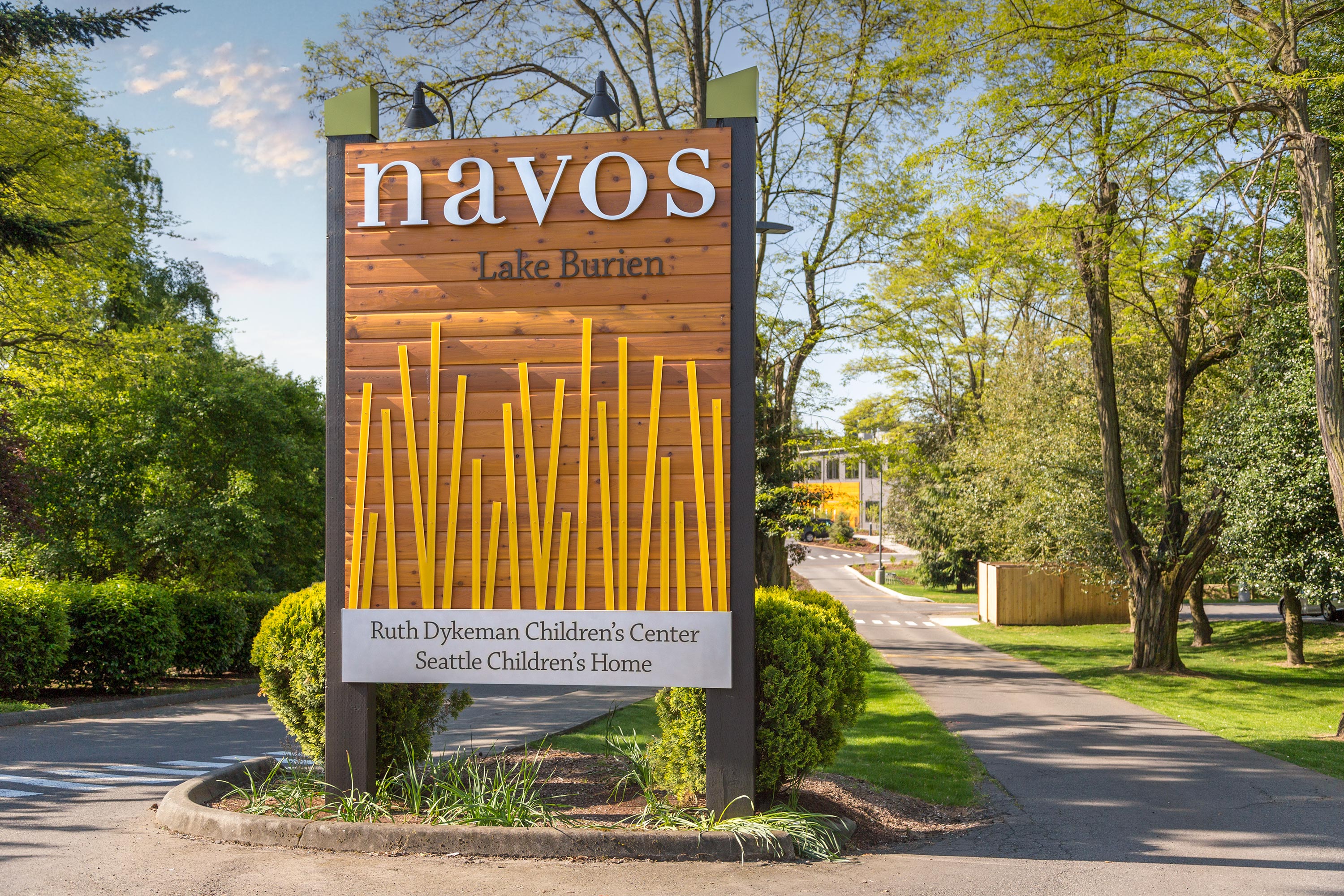
The Behavioral Care Center has been designed to better support long-term inpatient and outpatient mental health care for children, youth, and their families. Located in a compelling natural setting on Lake Burien, the campus offers expanded services. The project includes a studio apartment housing complex for 24 young adults transitioning out of foster care, three welcoming homes for children in long-term treatment programs, and an outpatient counseling center which will also offer primary care physician services for clients. Environmental graphics enhance the campus by providing a welcoming and colorful first impression for visitors and clients. The main entry sign evokes the beauty of the natural setting, while the campus building identities evoke the majesty of the Northwest with mountain names designed as unique guideposts marking the entrances.
To complement the new campus at Lake Burien, the team also designed and implemented a new website to better serve the clients and members of all the communities Navos serves. The new design features a user interface that makes it easy to get help fast from any internet enabled device. Phone numbers, locations, and services are organized by child, family and adult so the most relevant information is delivered expediently to those in need.
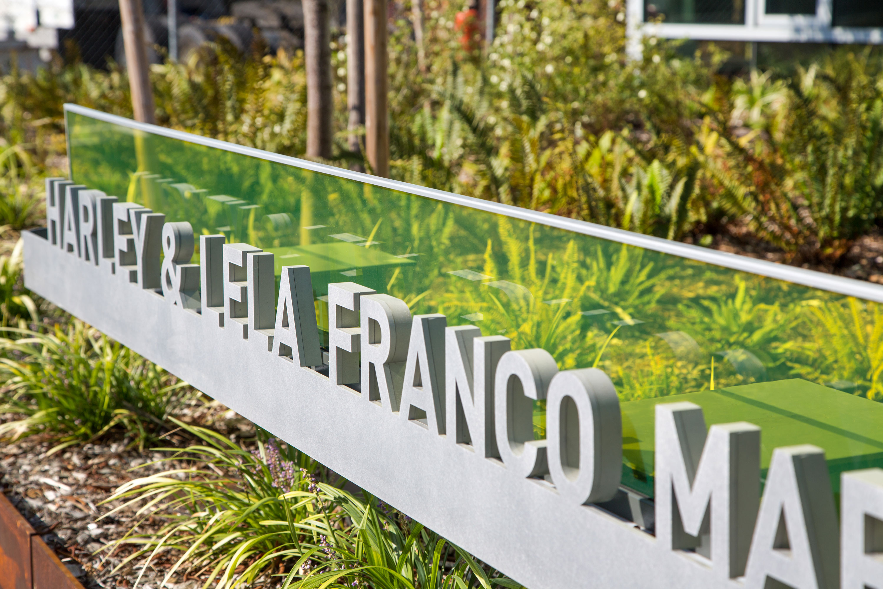
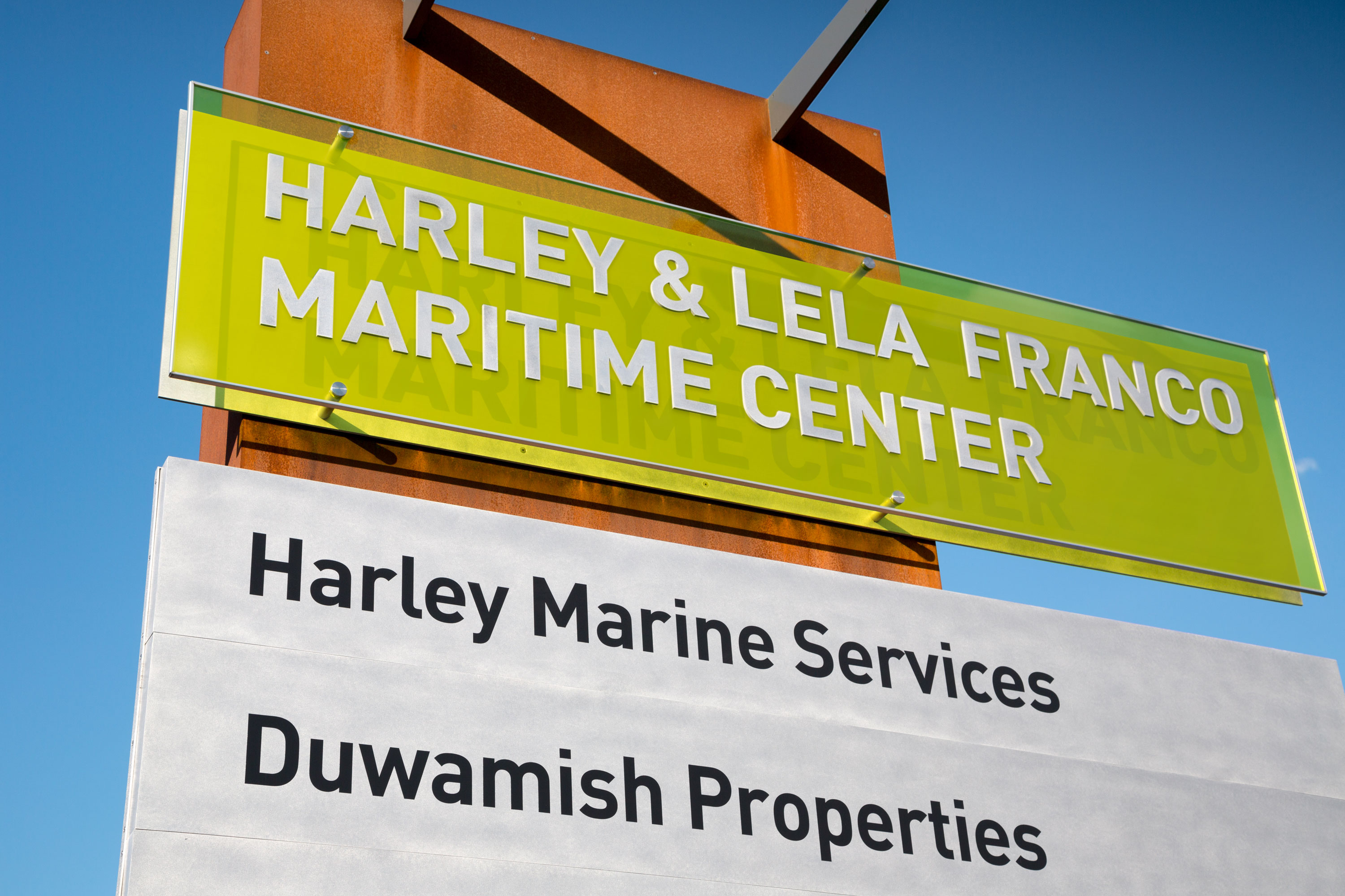
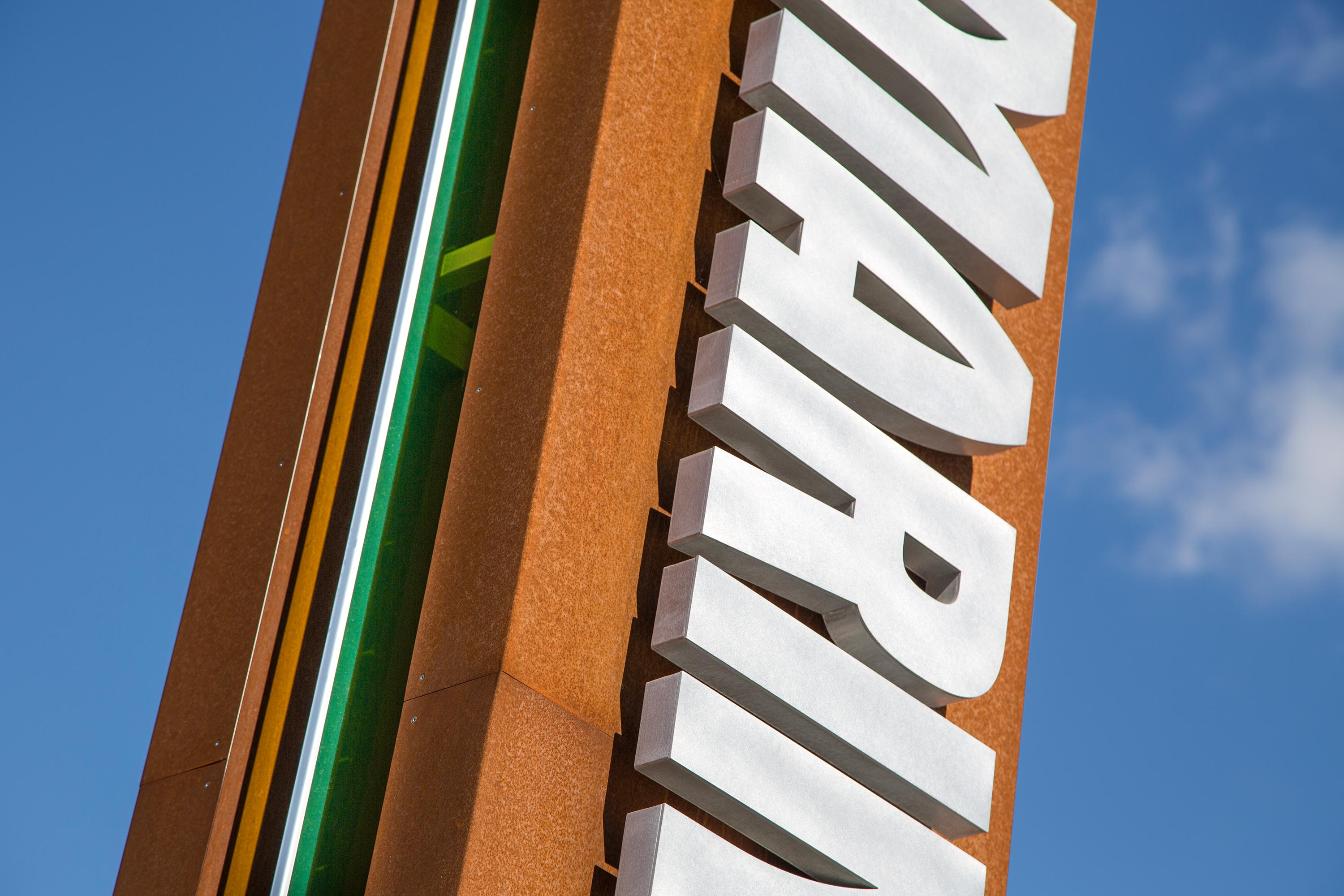
Harley Marine Headquarters


Delivery_
Environmental Graphics
Year_
2013
About_
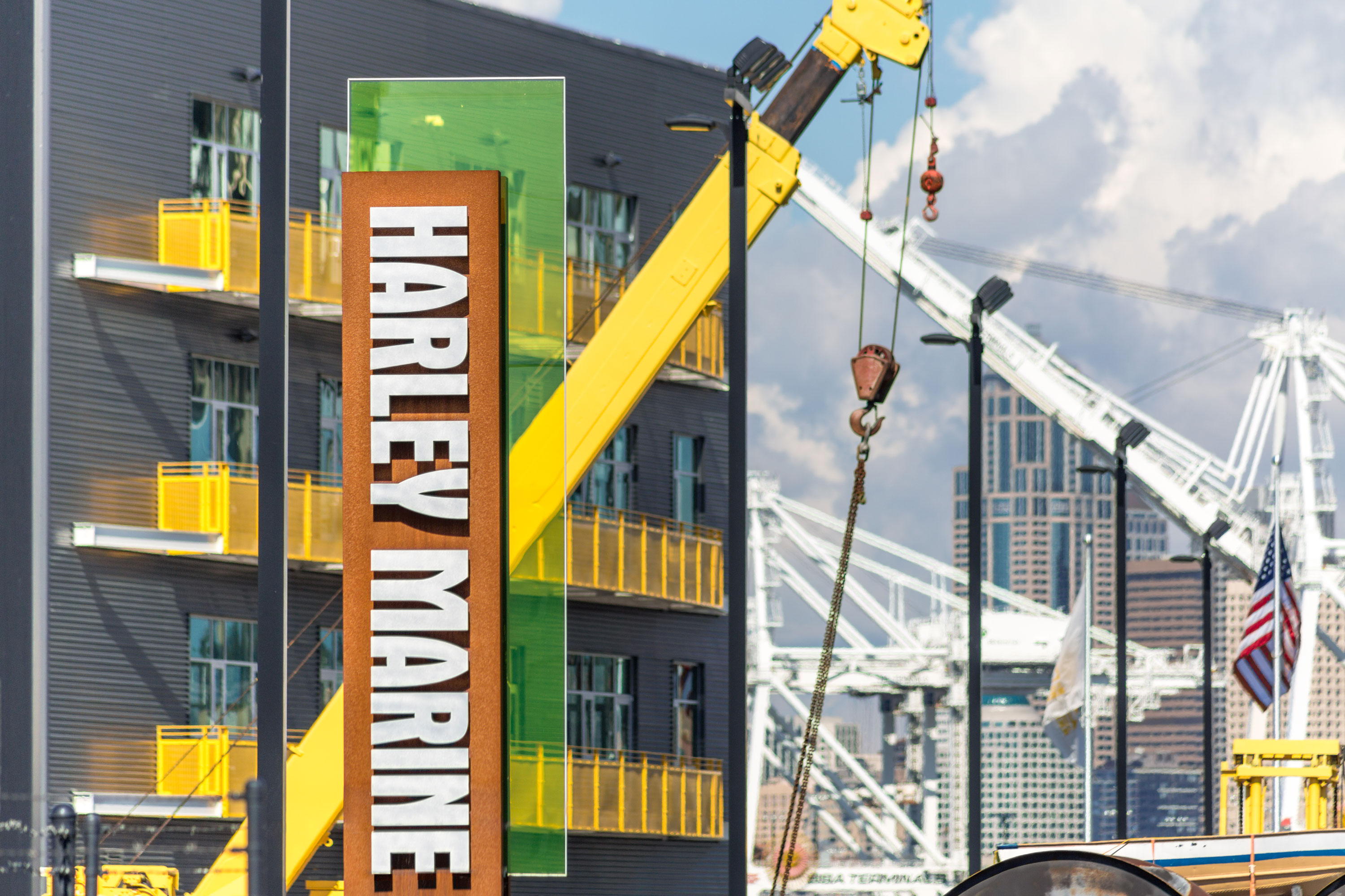
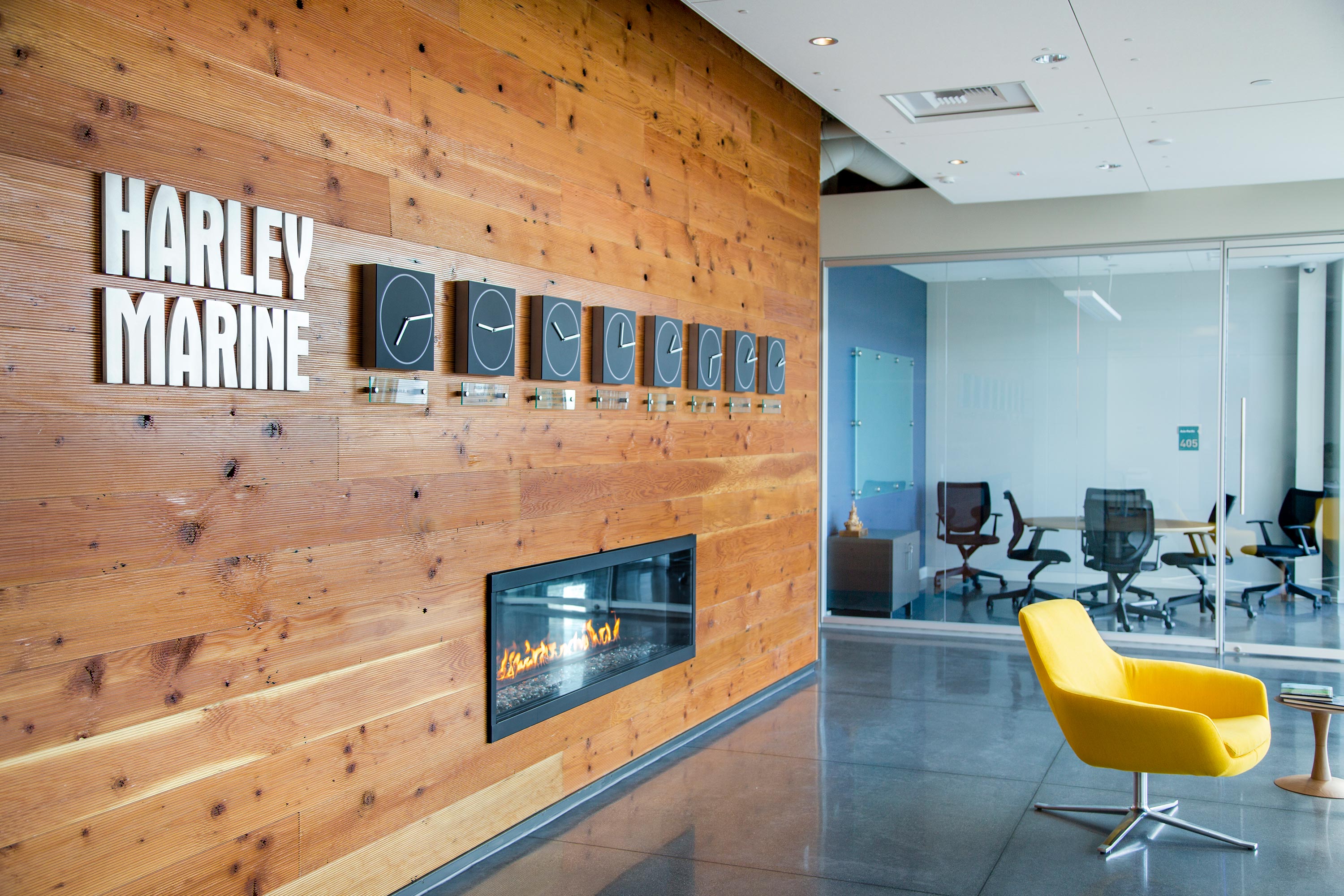
Harley Marine Services’ corporate headquarters balance industrial function with an operationally efficient environment. The project’s waterfront location and tremendous views inspire a design concept that merges indoor and outdoor spaces. A light-filled atrium serves as the building’s entry and orients visitors with simplicity and clarity. Flexibility is an important component of the design—inside solutions adapt to future configurations, while outside zones for pedestrians and vehicles are delineated simply with color and graphics.
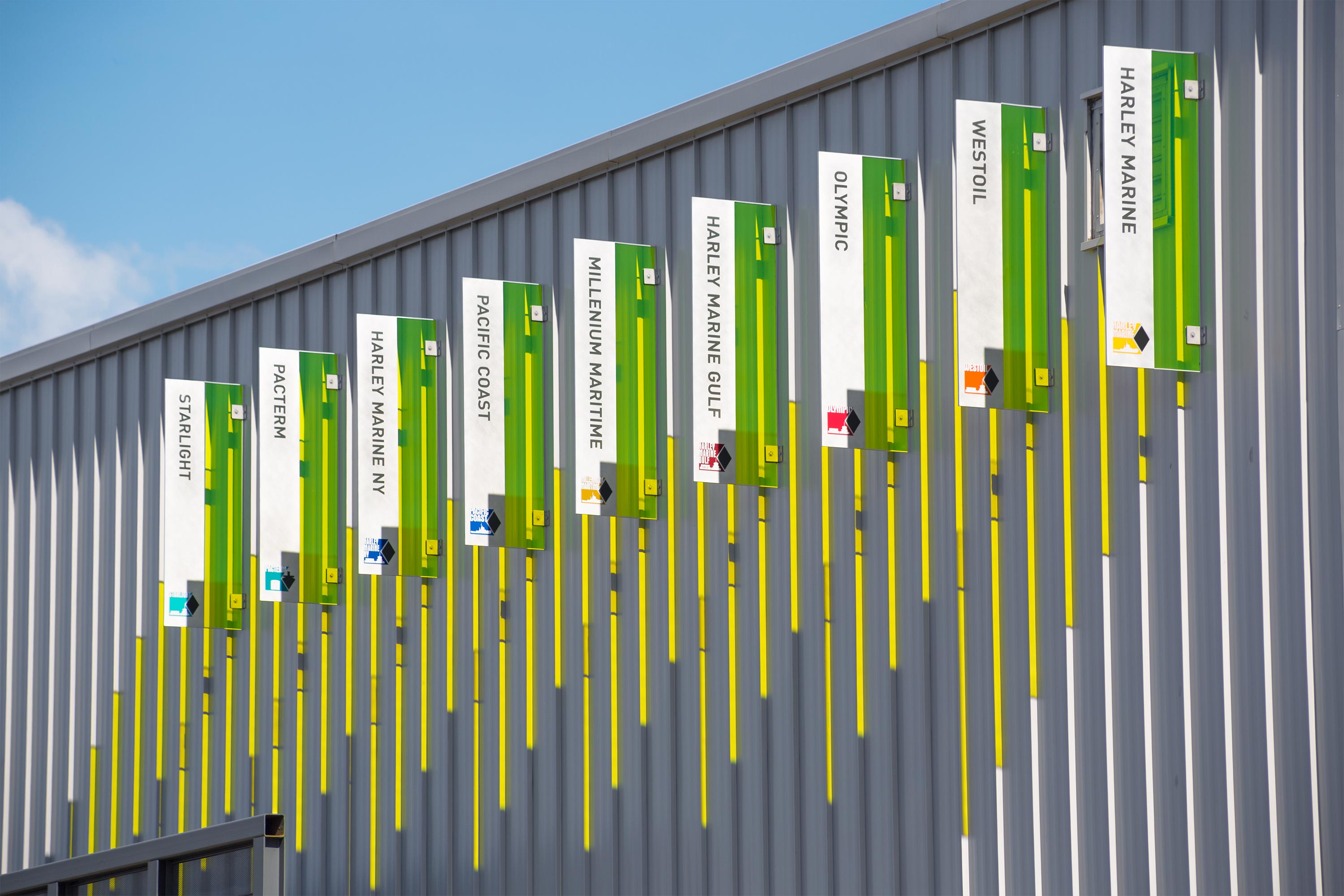
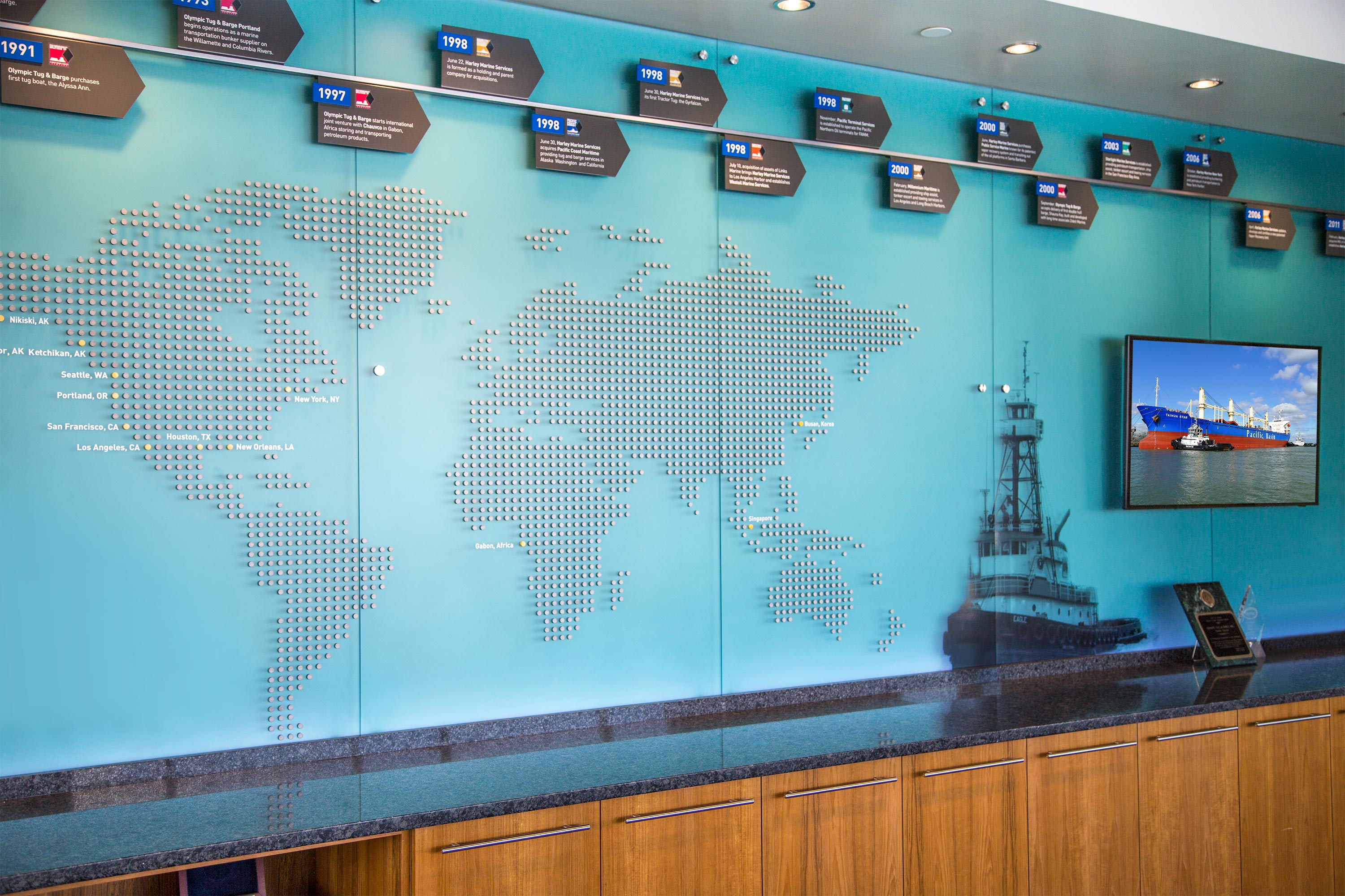
Environmental graphics highlight the Maritime Center inside and out. On approach to the site, Corten steel monuments and building entrance signage extend the Mithun building design and materials palette. Along the outside west wall of the shop, Harley Marine Services companies are displayed proudly on glass and metal banners. Inside, the company history and locations are featured on a world map installation across from the main conference room overlooking the Duwamish. In the lobby, a time zone display featuring illuminated clocks and company logo demonstrate operations are 24/7 in the maritime business. Throughout the office interior, conference rooms and office signage draw inspiration from the HMS identity and nautical themes.
Cocoon House
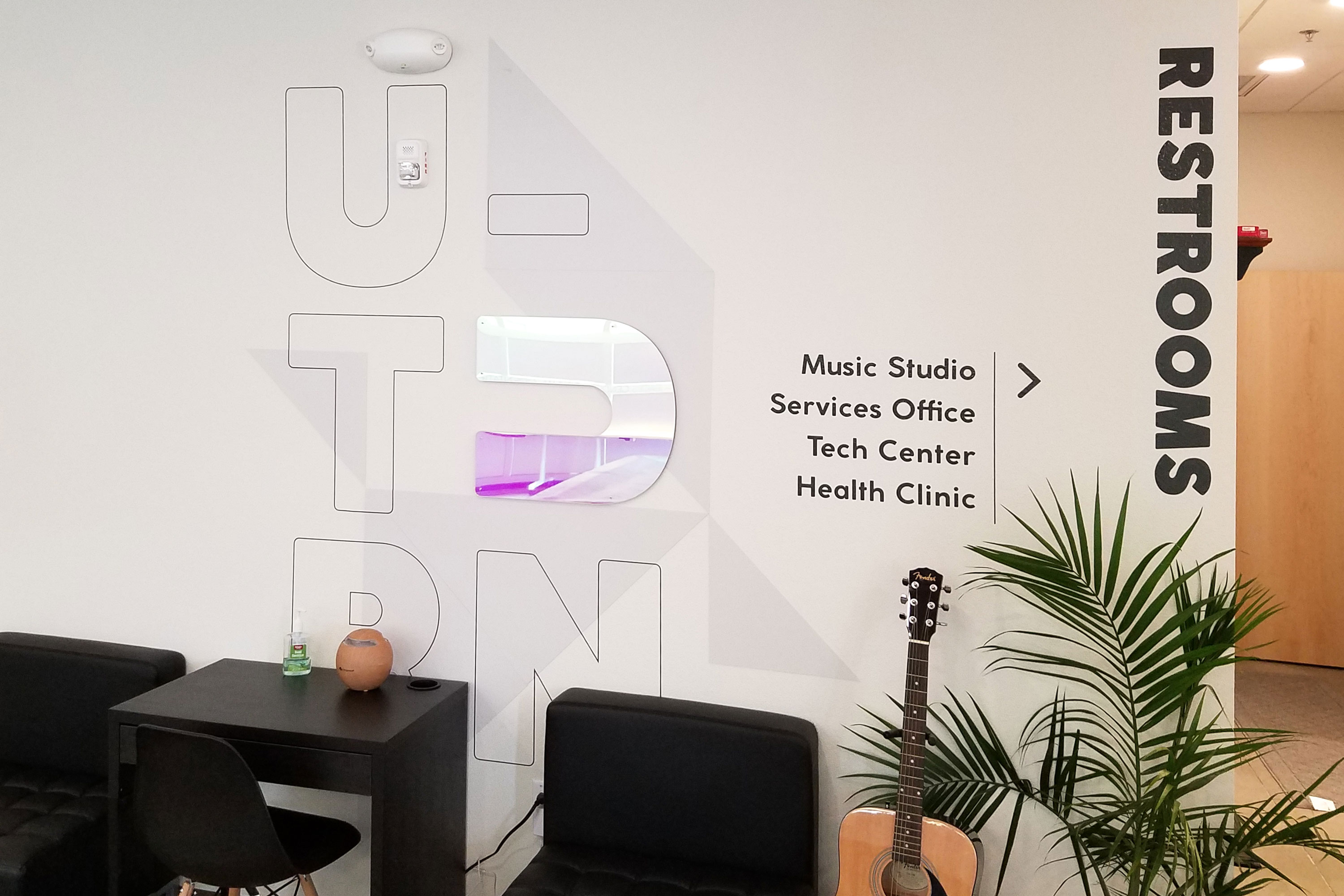
Delivery_
Environmental Graphics
Year_
2019
About_
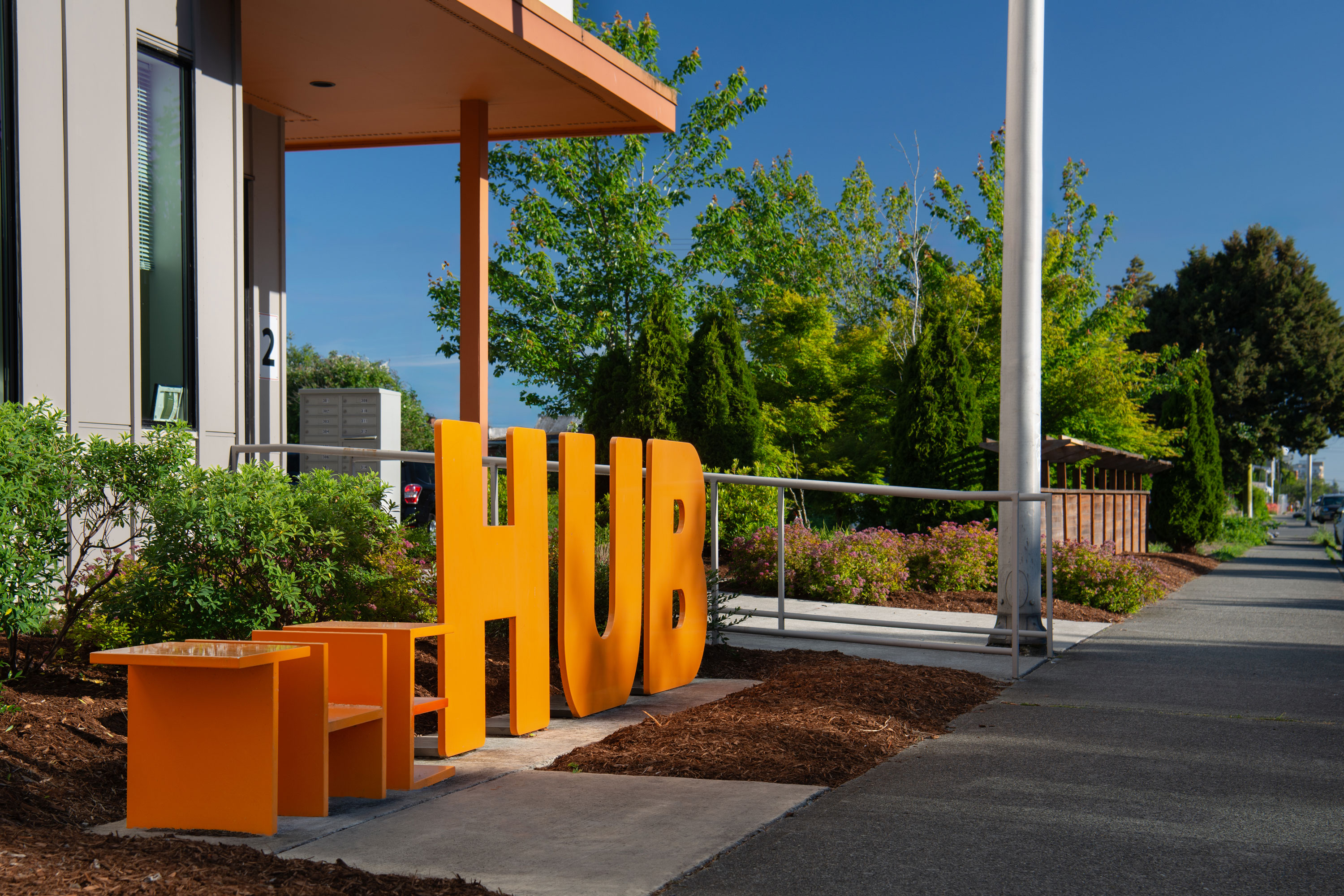
The Hub is a unique and innovative affordable housing and service center for homeless youth and young adults. It provides comprehensive resources, services and opportunities for homeless and at-risk youth to recover from trauma as they learn skills to transition to adult roles and responsibilities. The center includes a welcoming youth day center with on-site services, Cocoon House prevention and outreach services 20 units for homeless young adults and 20 units with services for homeless youth. The Center will provide homeless youth the services they need in one safe secure location—a proven model for how to successfully engage and support youth who have experienced trauma.
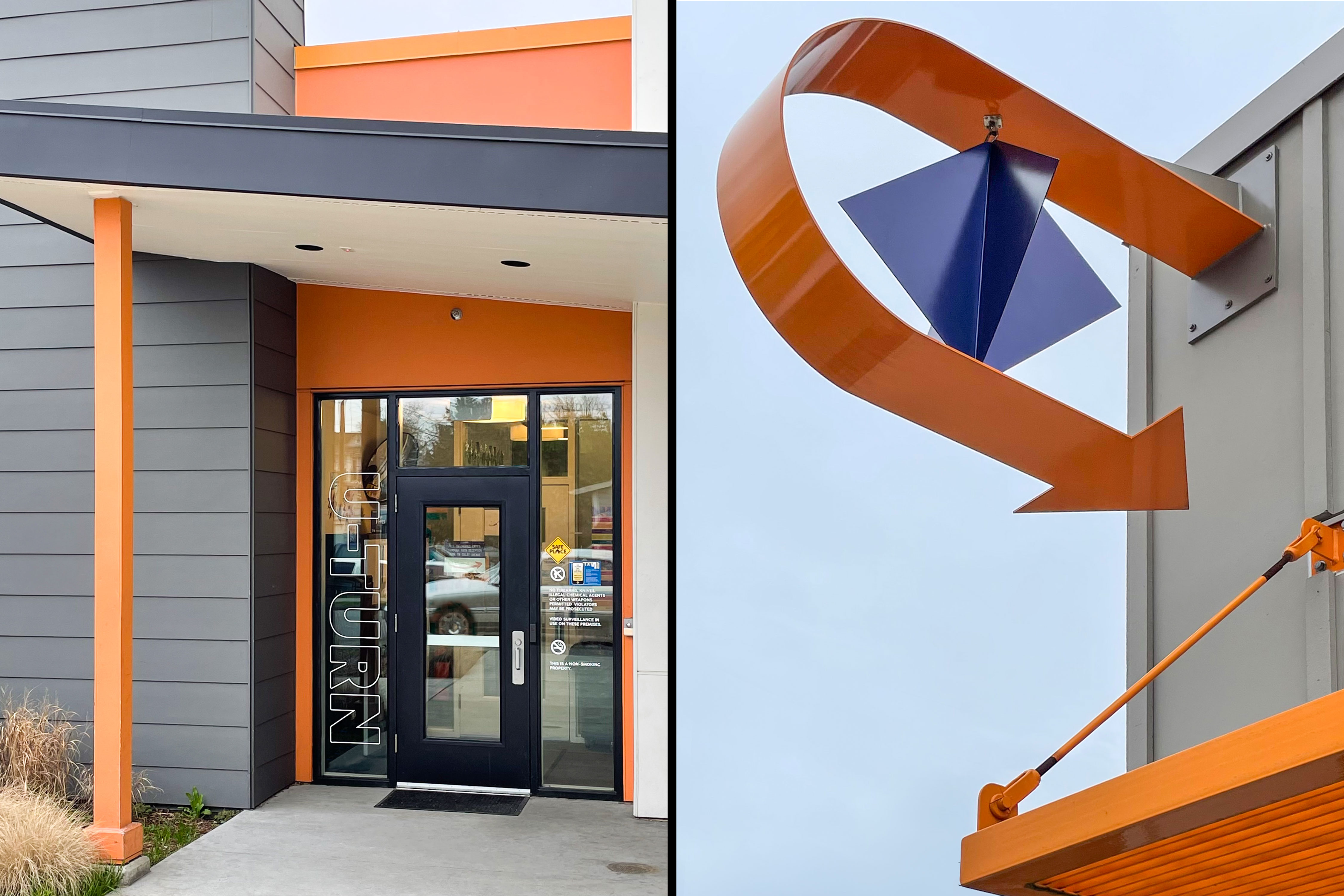
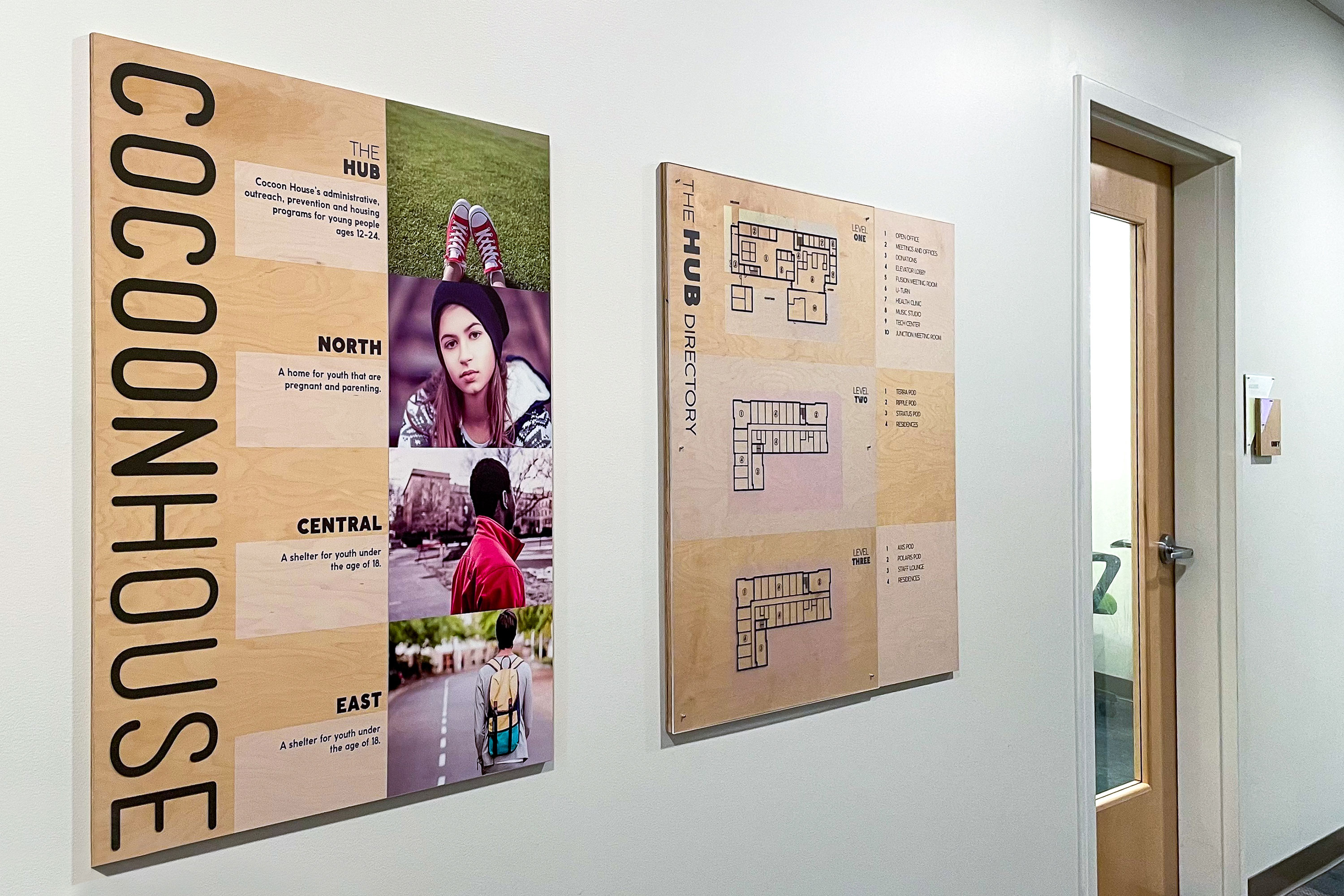
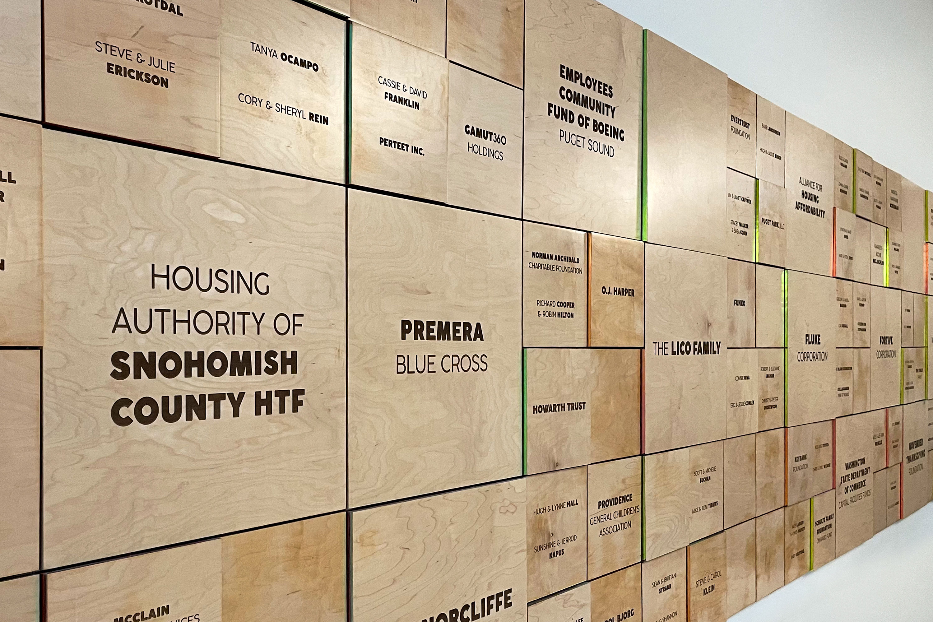
Made possible by an influential group of community donors, the environmental graphics include a donor wall design featuring inviting materials and color accents conveying the strong sense of community embodied at The Hub. In addition, the vital youth day center within The Hub, U-Turn, is celebrated with a playful kinetic sign near its entrance to enhance visibility and create a welcoming invitation to visit the center. For visitors, an interior directory provides an overview of Cocoon House services with an orientation map to communicate the breadth of services at The Hub.
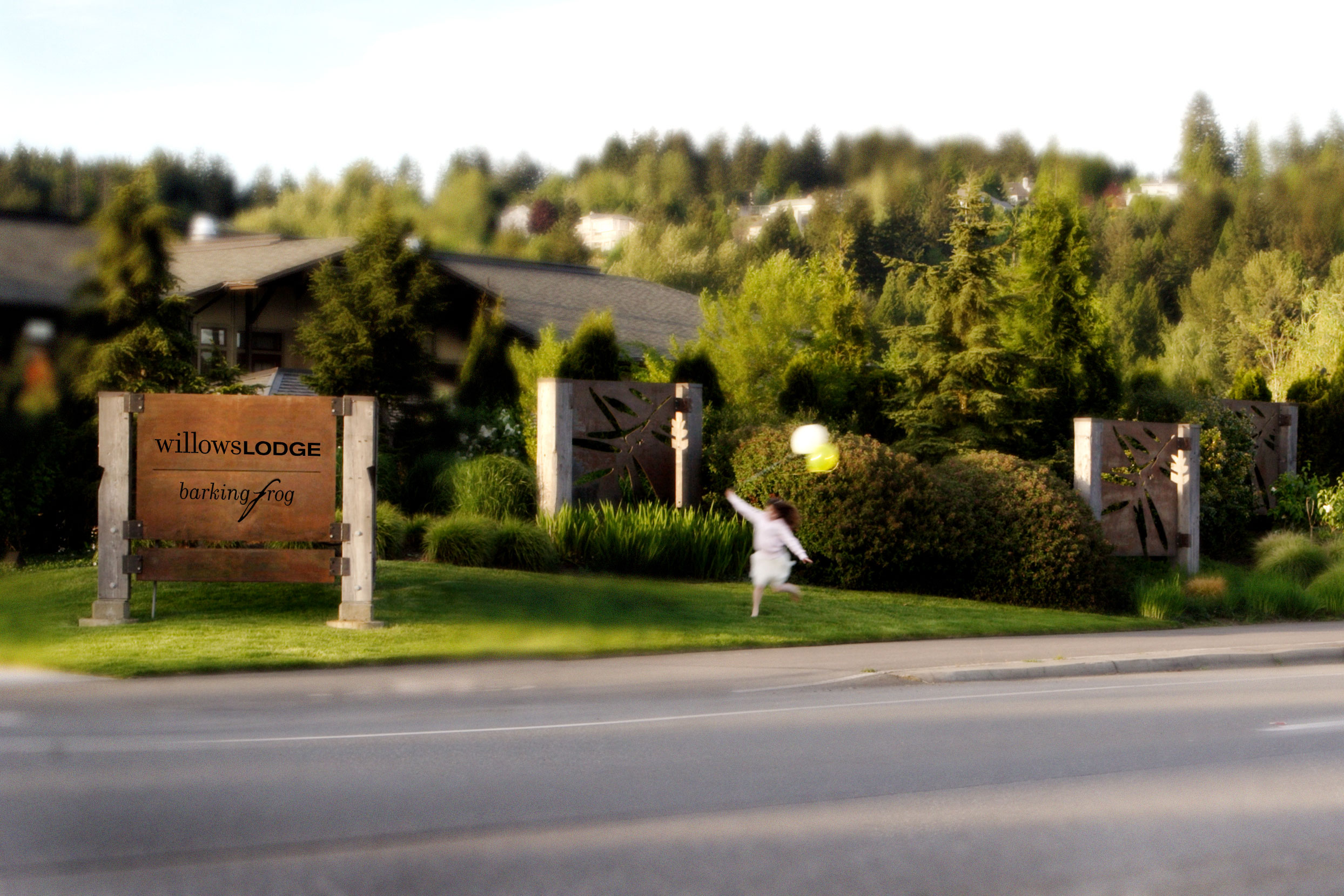
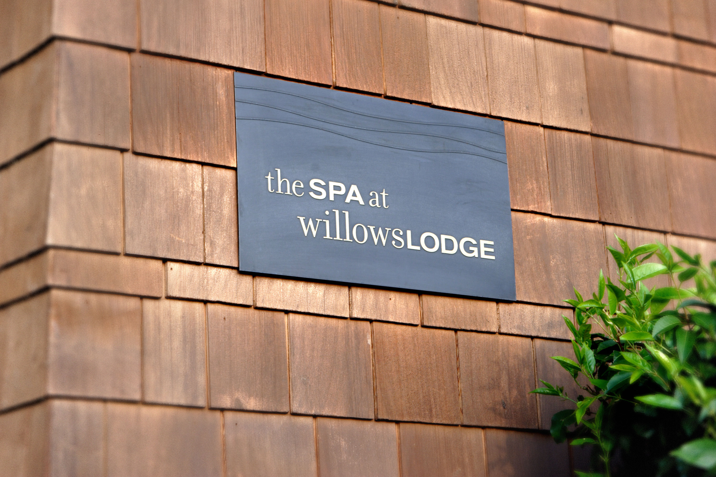
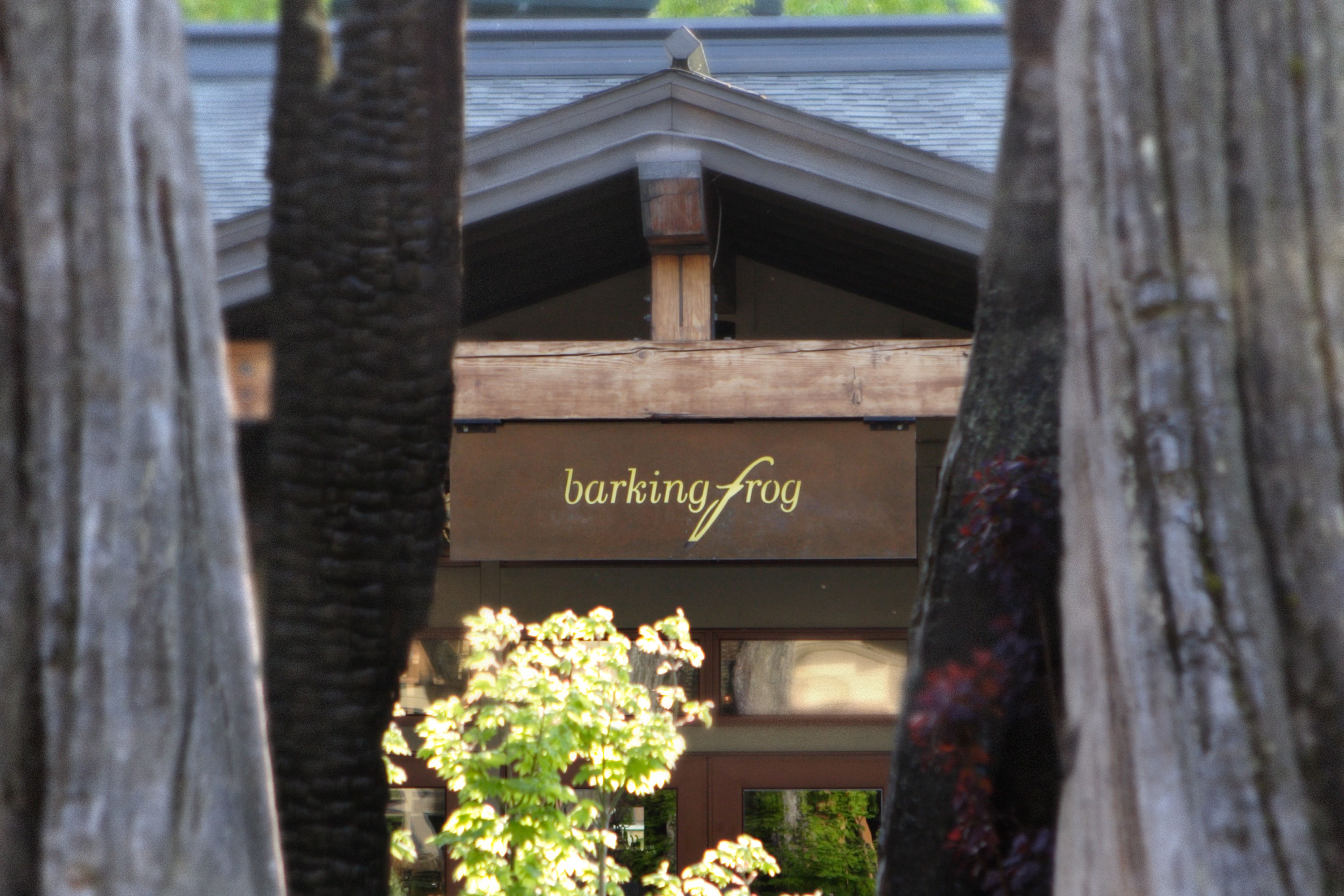
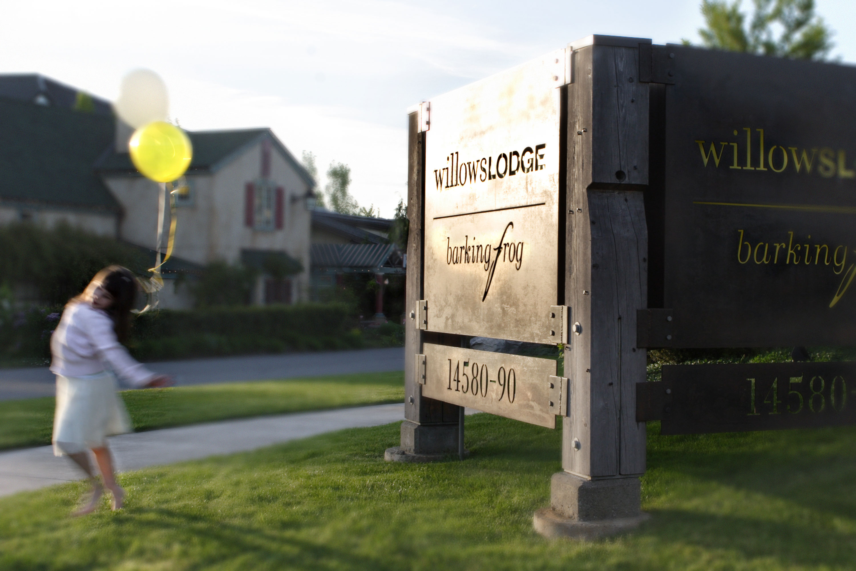
Willows Lodge

Delivery_
Branding
Visual Identity
Environmental Graphics
Year_
2001
About_
Working closely with the hotelier, the Willows Lodge visual identity was creatively translated throughout the property to create a unique sense of place. Local artists and fabricators interpreted elements and guidelines created by the design team to extend the visual identity motif and embody a sense of harmony and consistency throughout the grounds of the hotel.
The signage and environmental graphics were thoughtfully integrated with exterior and interior architectural features that ranged from the fence design at the front of the property to shower screens in the rooms and metal railings in the lobby, all tied together by a cohesive wayfinding system sensitive to the Northwest character of the lodge. The on-site restaurant ‘Barking Frog’ expresses the essence of the lodge experience through its connection to the environment and the commitment to locally sourced foods.
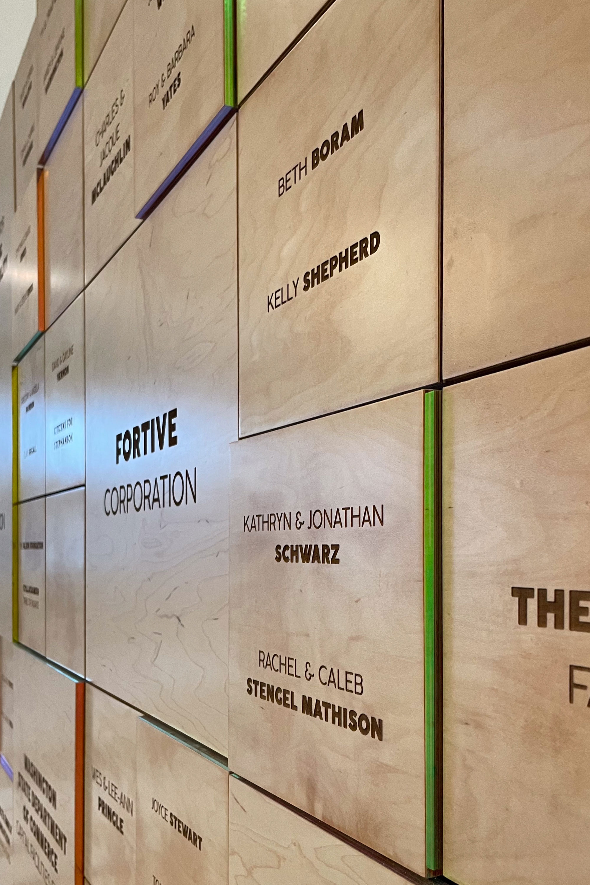
Jewish Family Service


Delivery_
Environmental Graphics
Year_
2012
About_
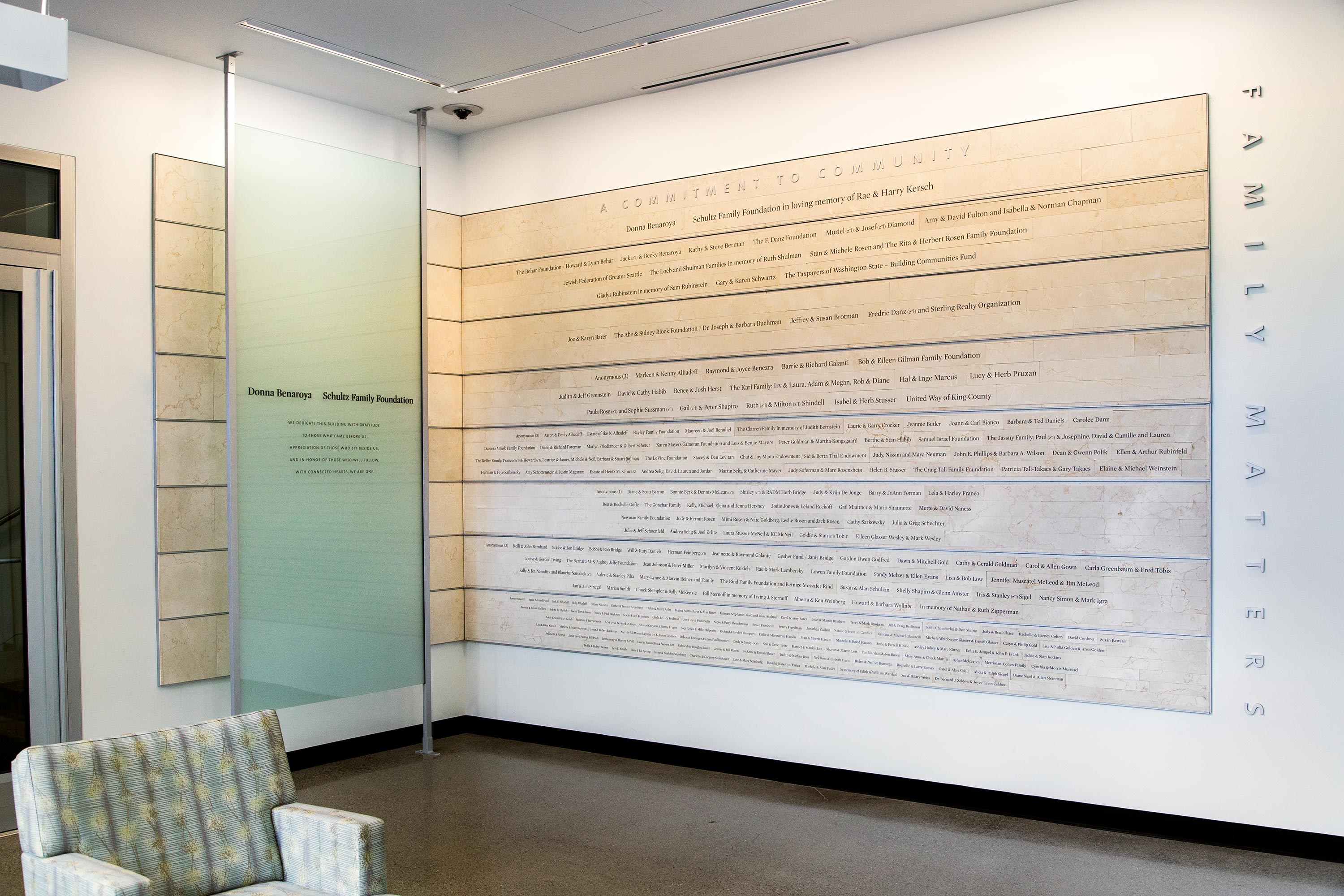
For the first time in 120 years, Jewish Family Service has built a facility designed specifically to meet the needs of clients, volunteers, staff and the greater community at a location in the heart of Capitol Hill, which better serves the social, emotional and physical needs of JFS clients.
Over 200 donors made this building possible with many generous gifts to the JFS Family Matters Campaign. The names of these donors have been inscribed on a permanent donor wall and spaces throughout the new building in heartfelt appreciation and recognition of their unique commitment to our local community. The donor names inscribed on Jerusalem limestone affirms a lasting commitment that “we are all in this together” and is consistent with the Jewish Family Service mandate to treat people with dignity and respect in times of need by providing strong responsive programs and services in a welcoming and accessible new facility. The building designed by Weinstein AU draws inspiration from these words by creating an entry passage of inviting design forms leading into the lobby and up through the office and meeting spaces of the building. The timeless and respectful materials complement the thoughtful architecture and traditions of a modern Jewish agency.
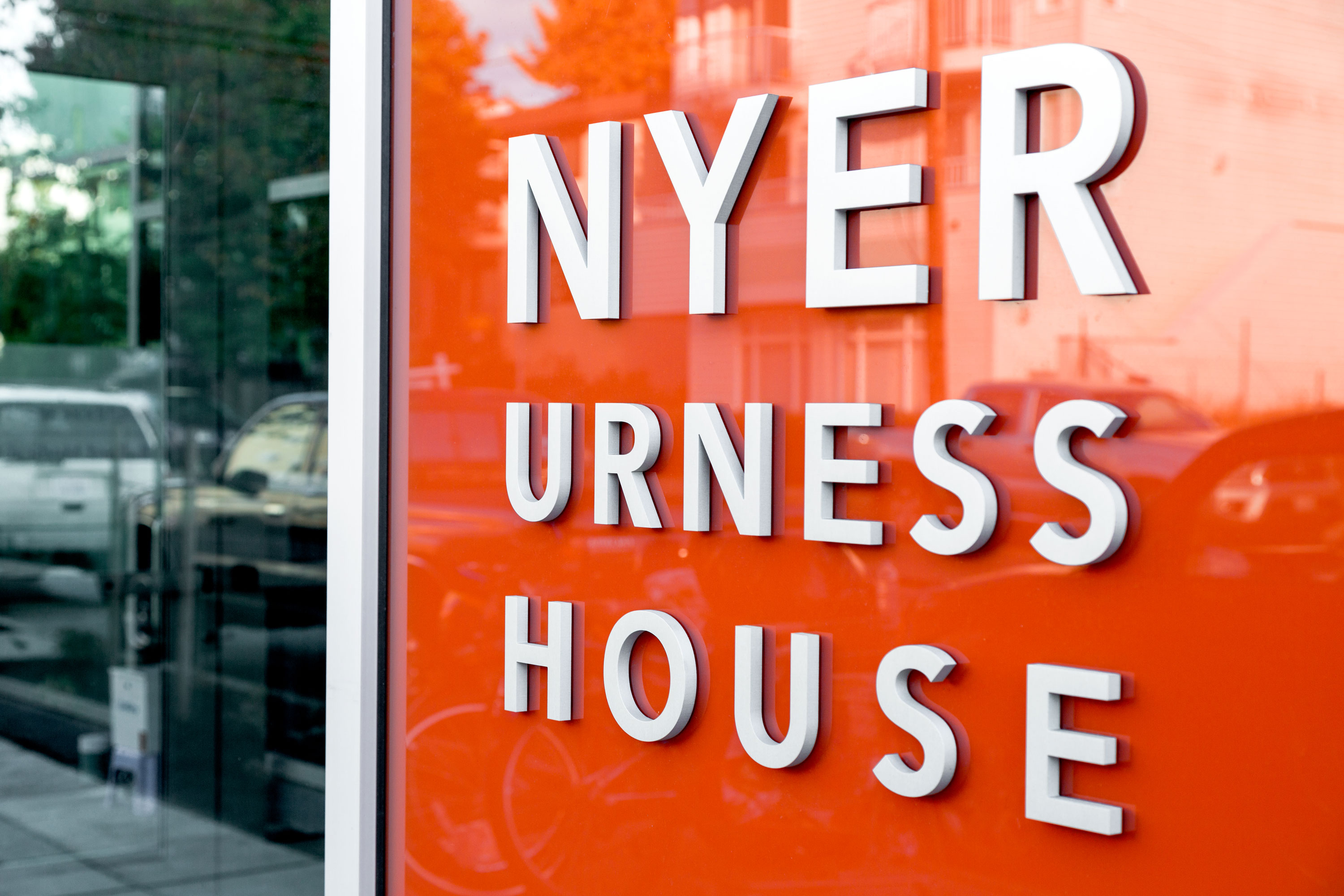
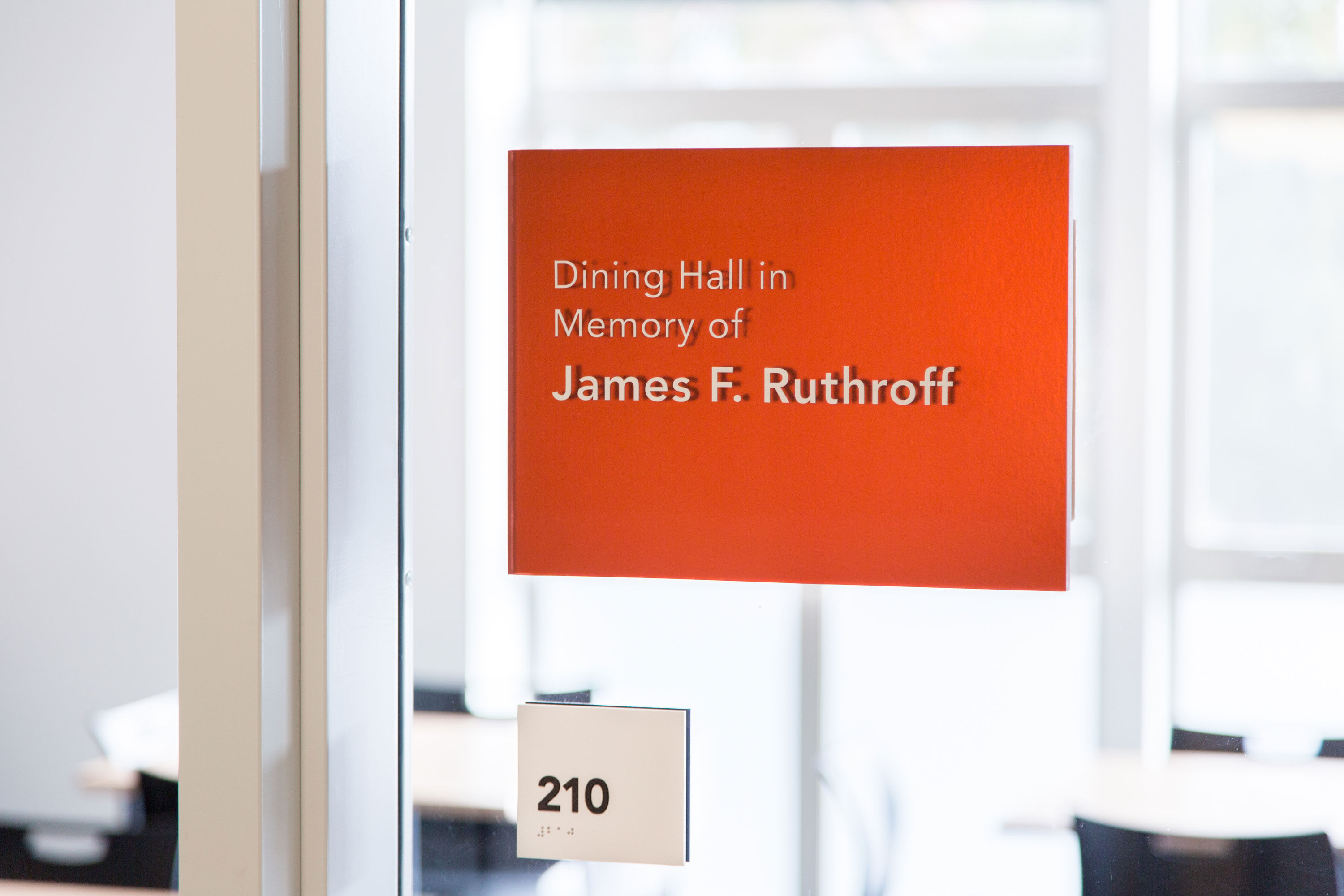
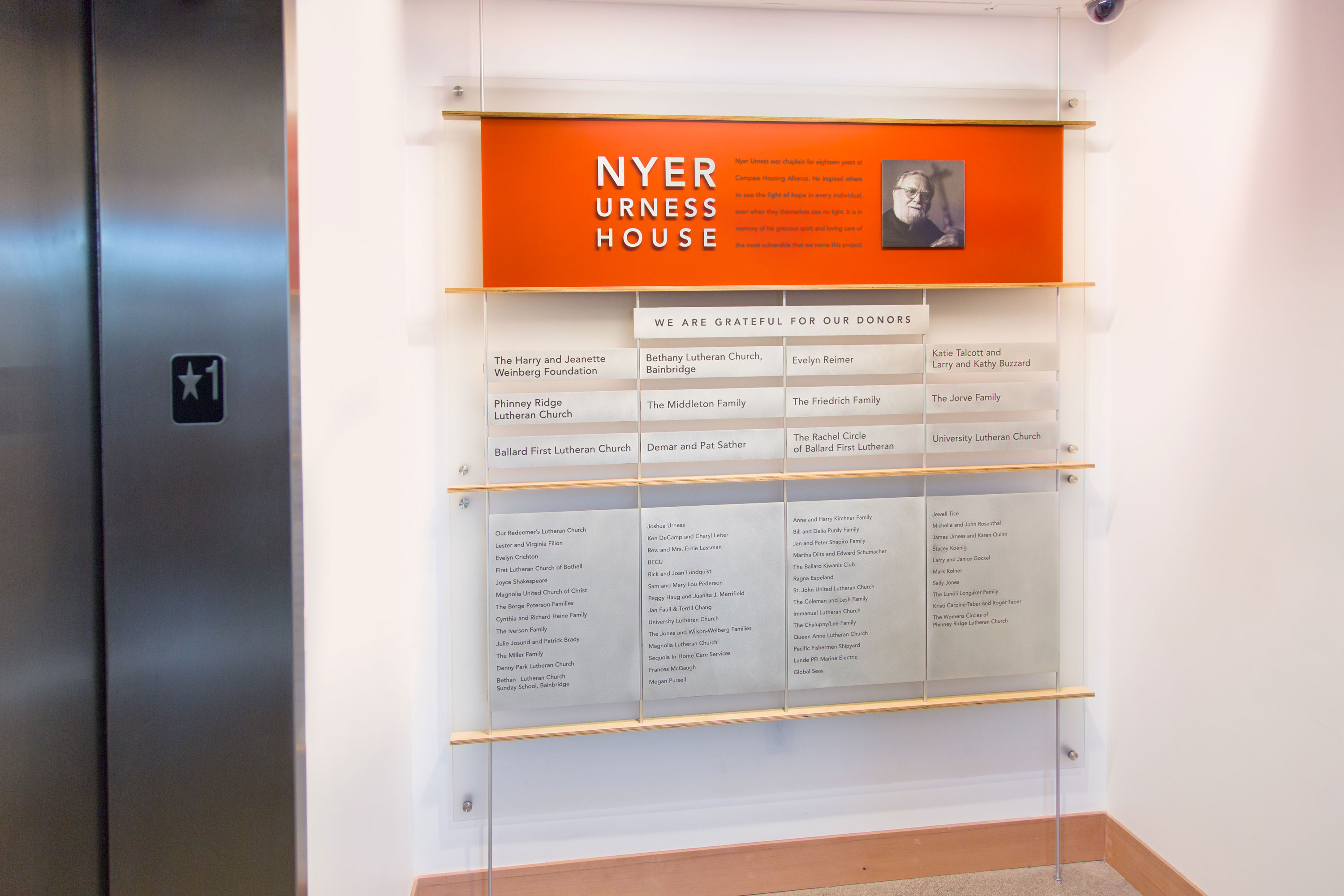
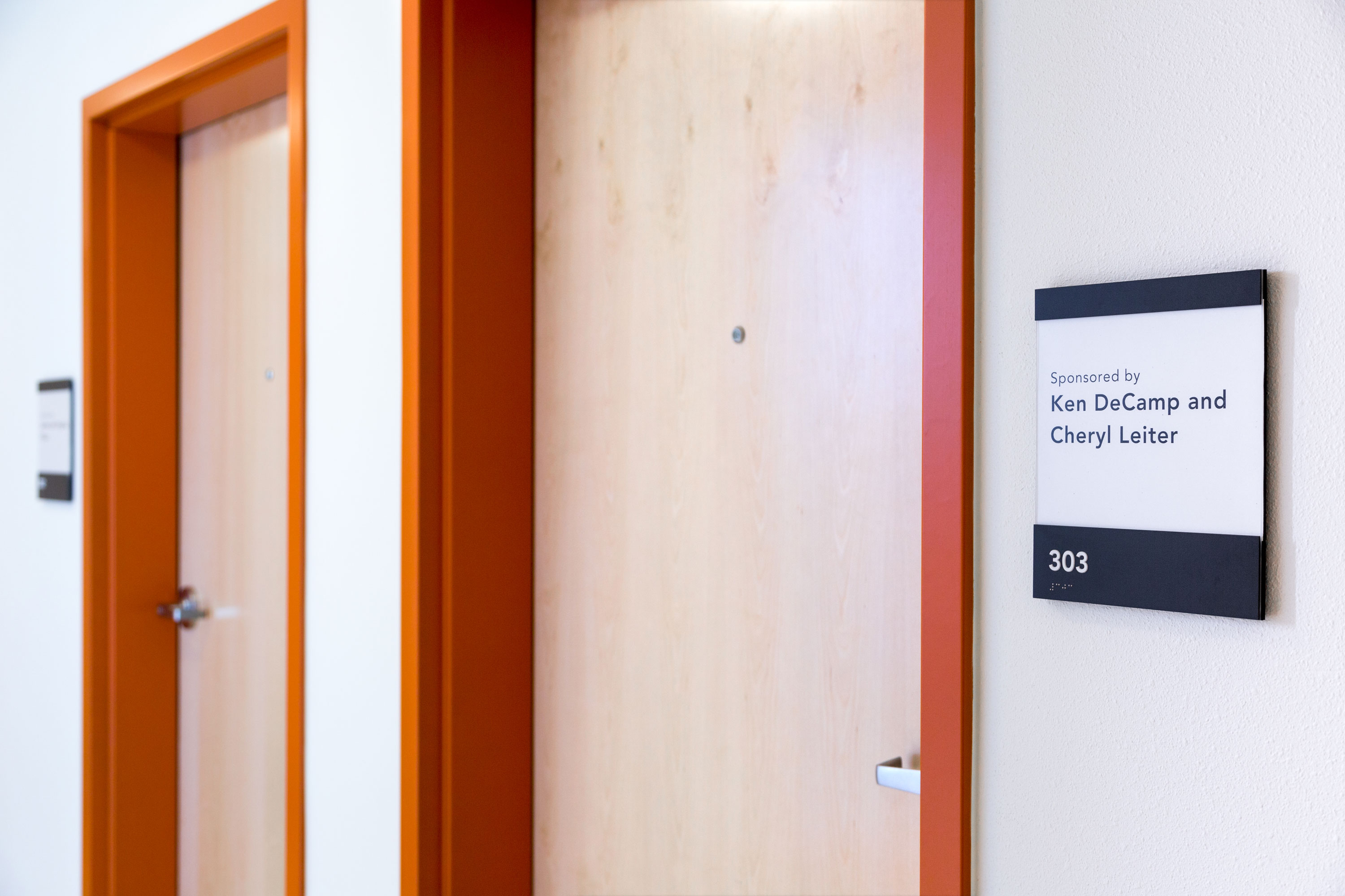
Nyer Urness House

Delivery_
Environmental Graphics
Year_
2013
About_
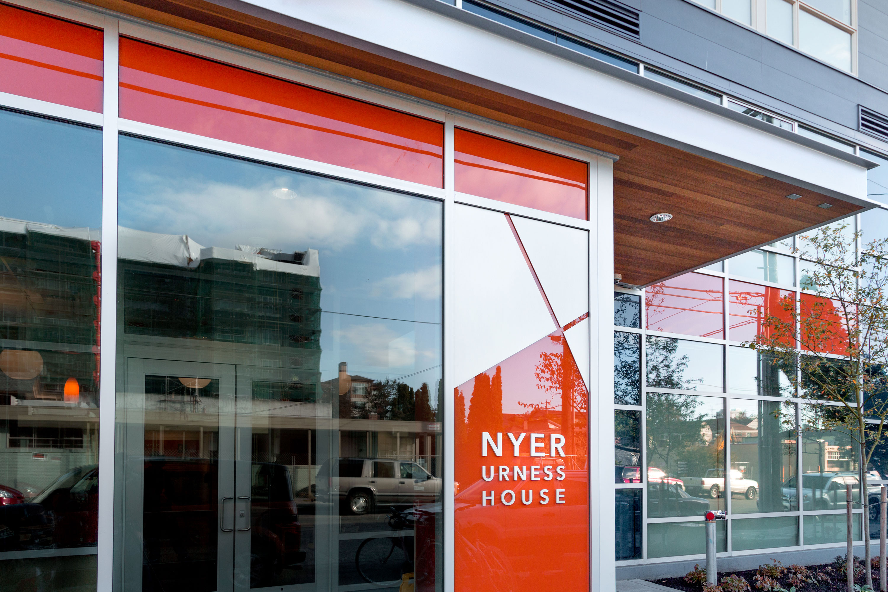
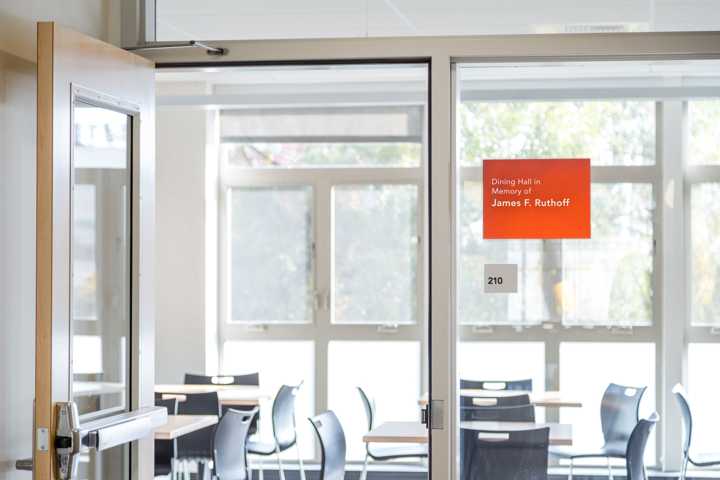
In the Lutheran tradition of caring through serving, Compass Housing Alliance offers unique services and structured programs that promote the dignity of each person and leads individuals from homelessness to independence and healthy community life. To follow through with their mission, they built Nyer Urness House to provide formerly homeless adults in the heart of Seattle’s Ballard neighborhood with a safe and comfortable place to live.
The building designed by Weinstein AU is filled with light and a simple bright palette of modern materials. Drawing upon this design language, Nyer Urness House donors are honored throughout the building on commemorative signage at main rooms and featured together on a Donor Wall display in the entry lobby. The Donor Wall and building dedication to Nyer Urness are presented with etched metal panels displaying the names of all those who generously gave to the project. In one wall display, these lightweight materials are consistent with the modern appeal of the lobby space, using colored resin, natural finish maple apple-ply and simple metal fasteners. On the exterior facade, the building name in dimensional metal lettering and color glass welcomes all to Nyer Urness House.
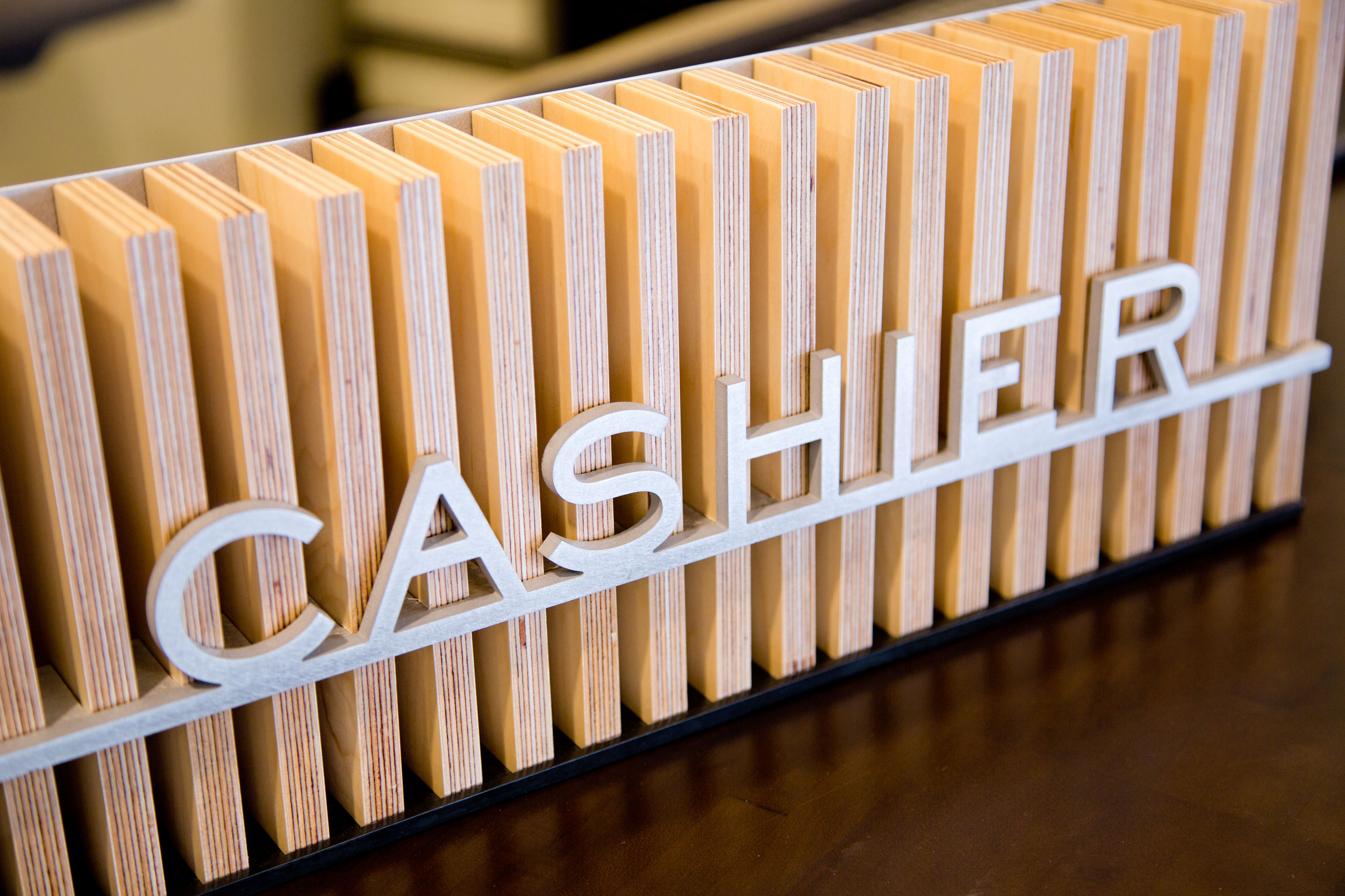
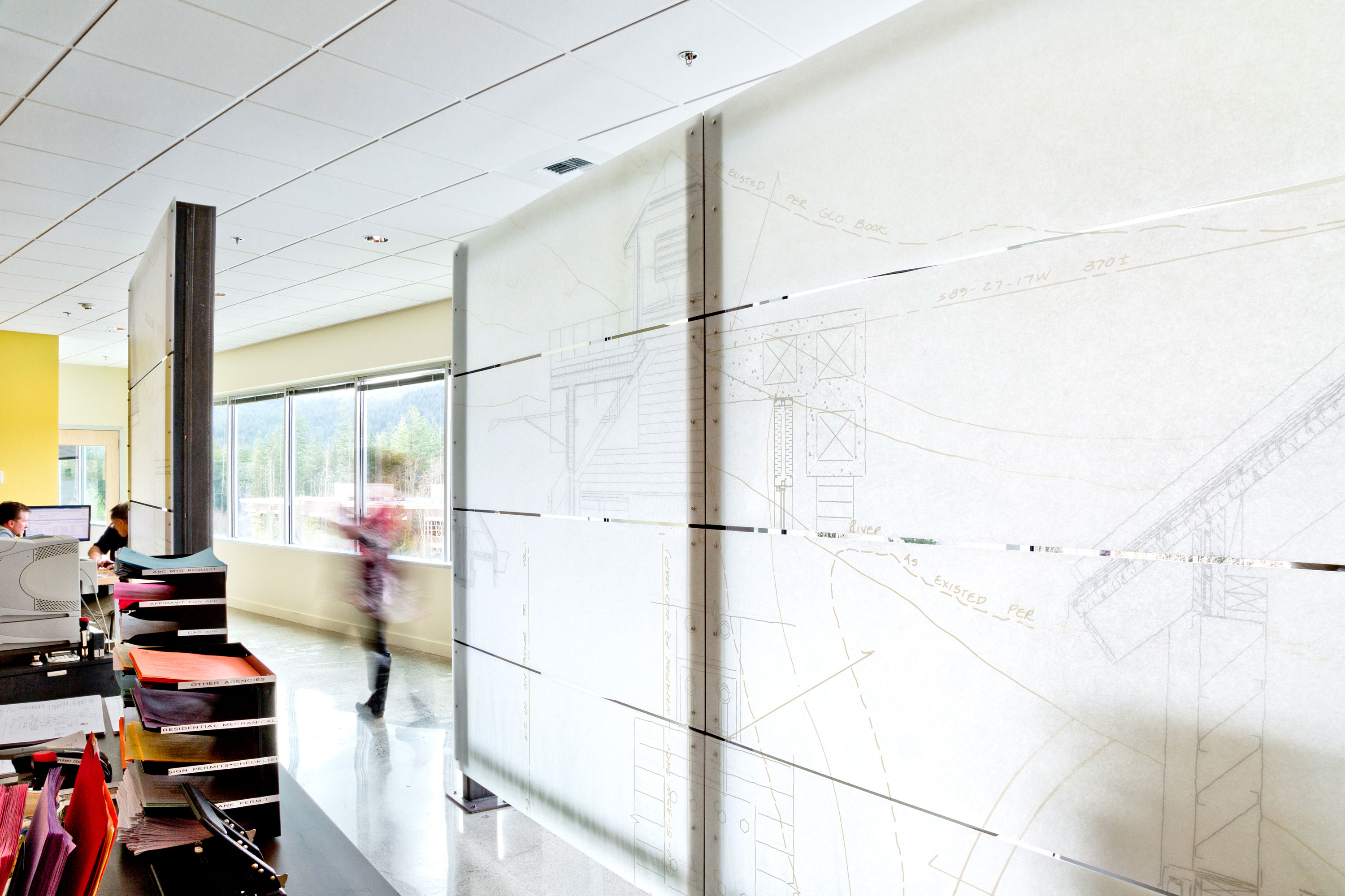
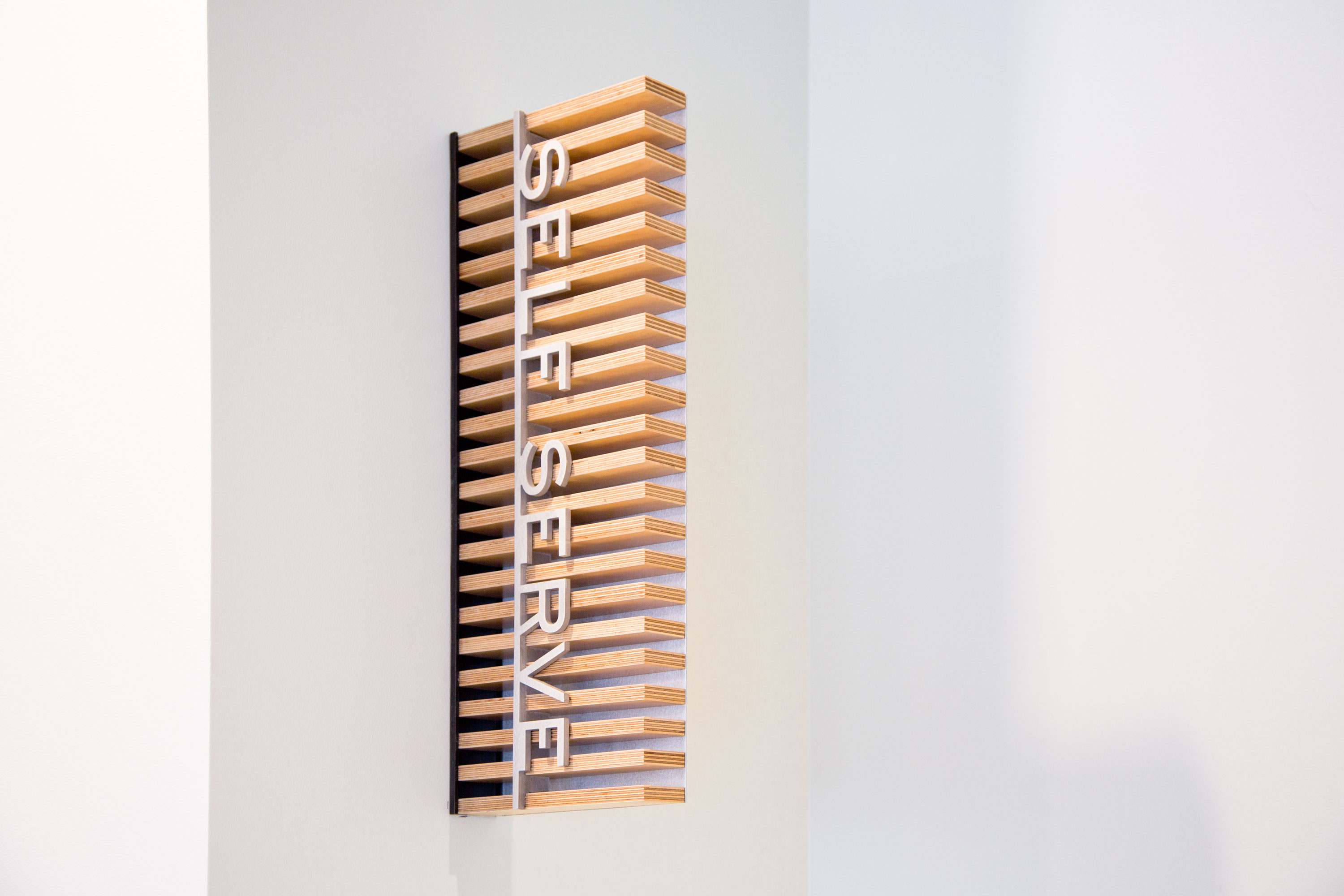
King County Permitting

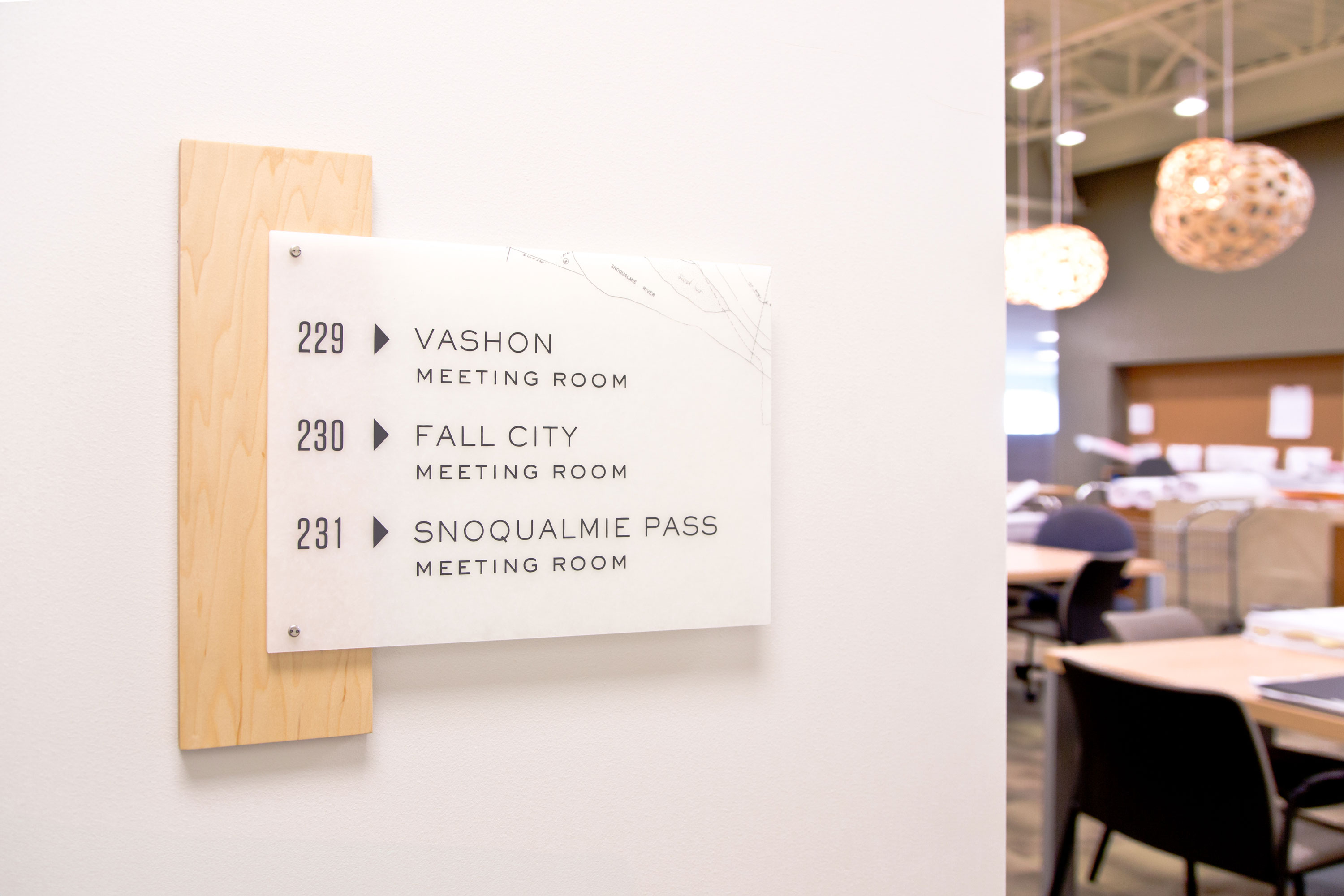
Delivery_
Environmental Graphics
Year_
2011
About_
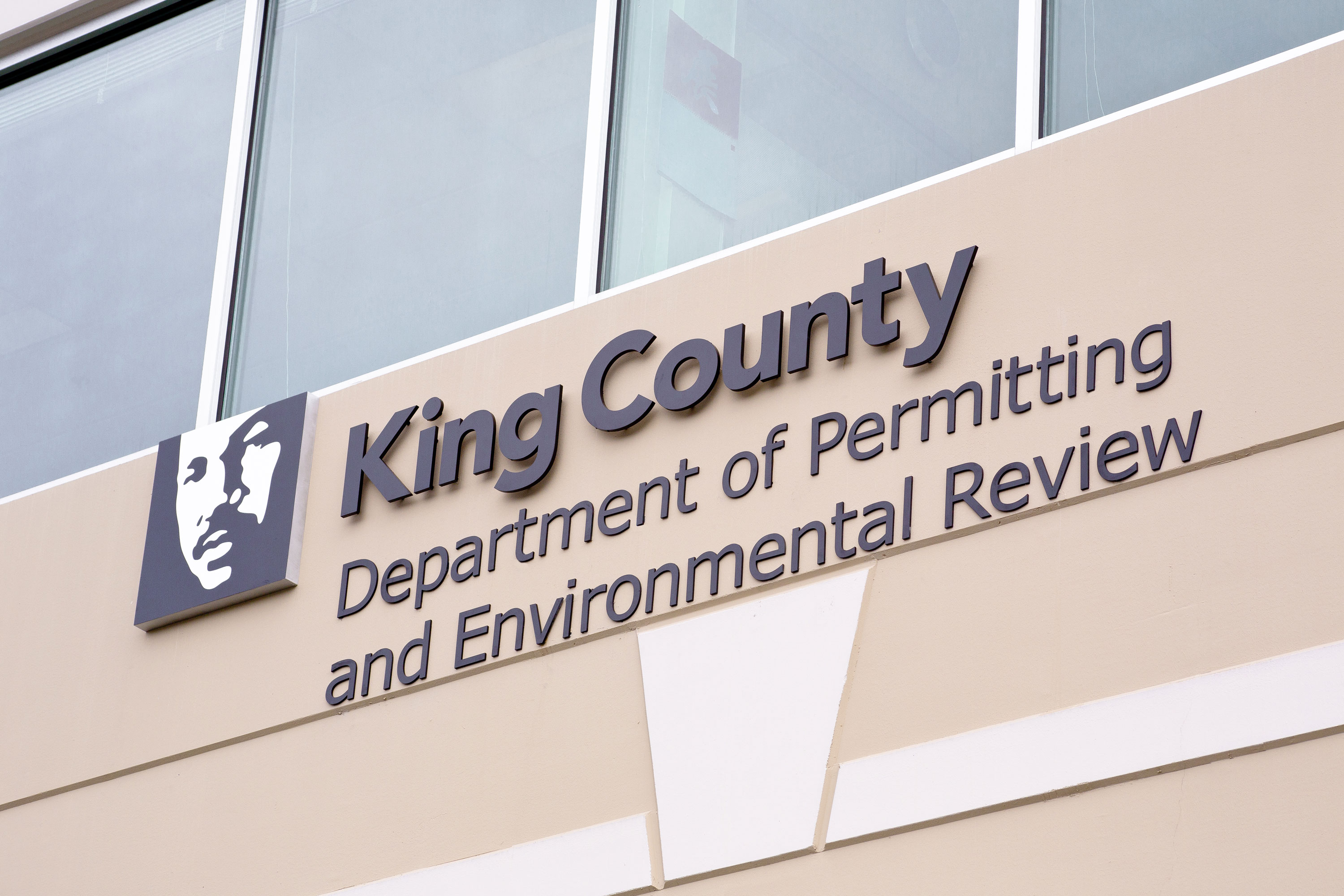
The Department of Permitting and Environmental Review is the King County agency that issues permits for properties located in unincorporated King County. The office enforces county land use and building codes, staffs the King County Fire Marshal, and issues business licenses. The department moved offices from an older out of date office in Renton to a newer building in Snoqualmie. King County hired Mithun to bring a modern and sustainable vision to this tenant improvement project.
At the heart of the project, the main welcome desk delivers on the Mithun design theme of transparency and honest materials in the form of a multi-panel translucent screen made of Lumasite. The surface of the screen was a perfect opportunity to apply an atmospheric graphic depiction of land use and building motifs. With a focus on rural properties and construction plans, the composition highlights plats and building parts with an emphasis on sustainability in the form silhouetted reeds at the base of the wall. In addition, the office entry identity and lobby counter signs are built from simple unadorned building materials which complement each of the conference rooms that are named after nearby locales featuring plat diagrams on simple Lumasite panels.
Lincoln Square Office
Delivery_
Environmental Graphics
Year_
2015
About_
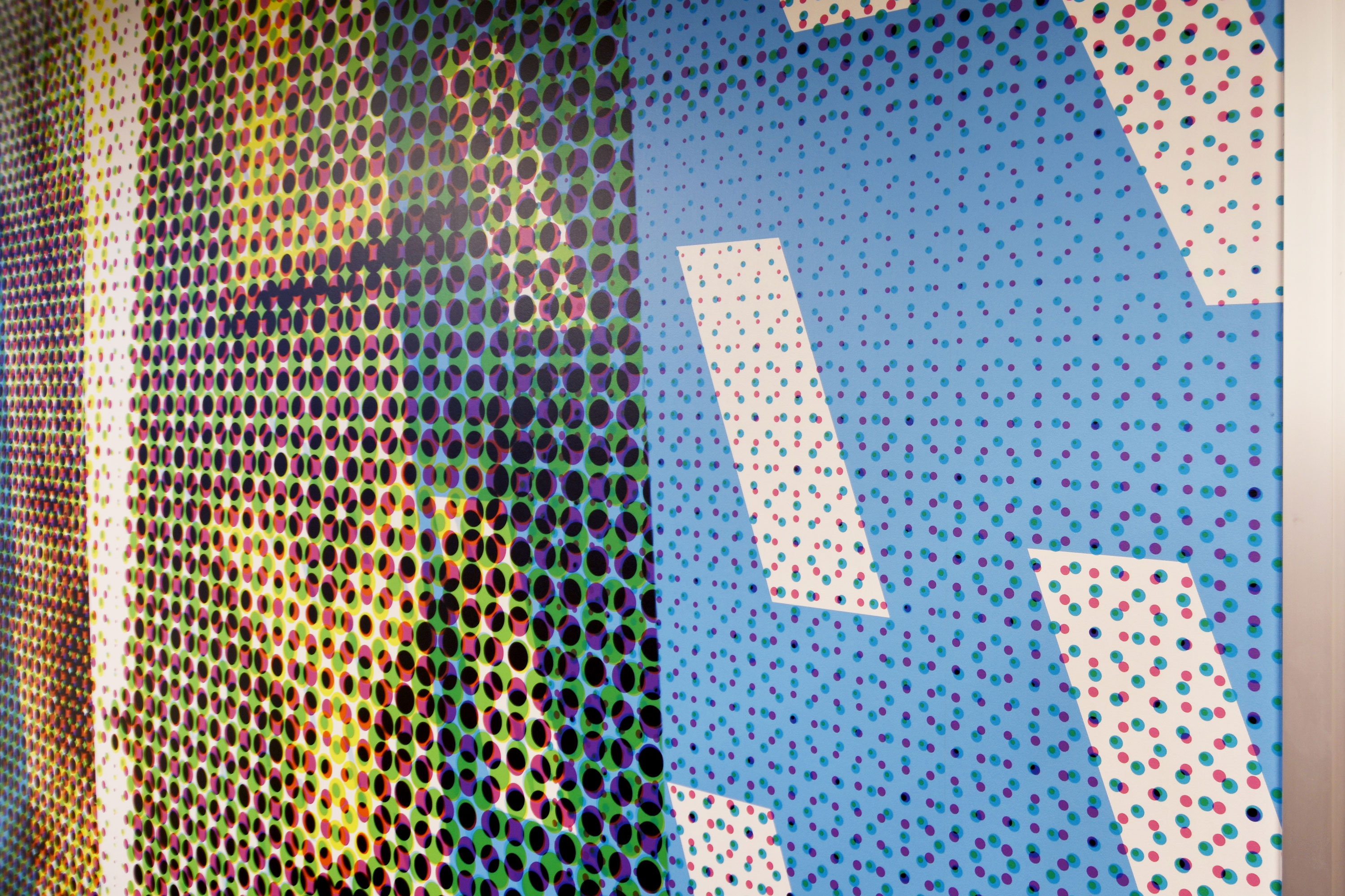
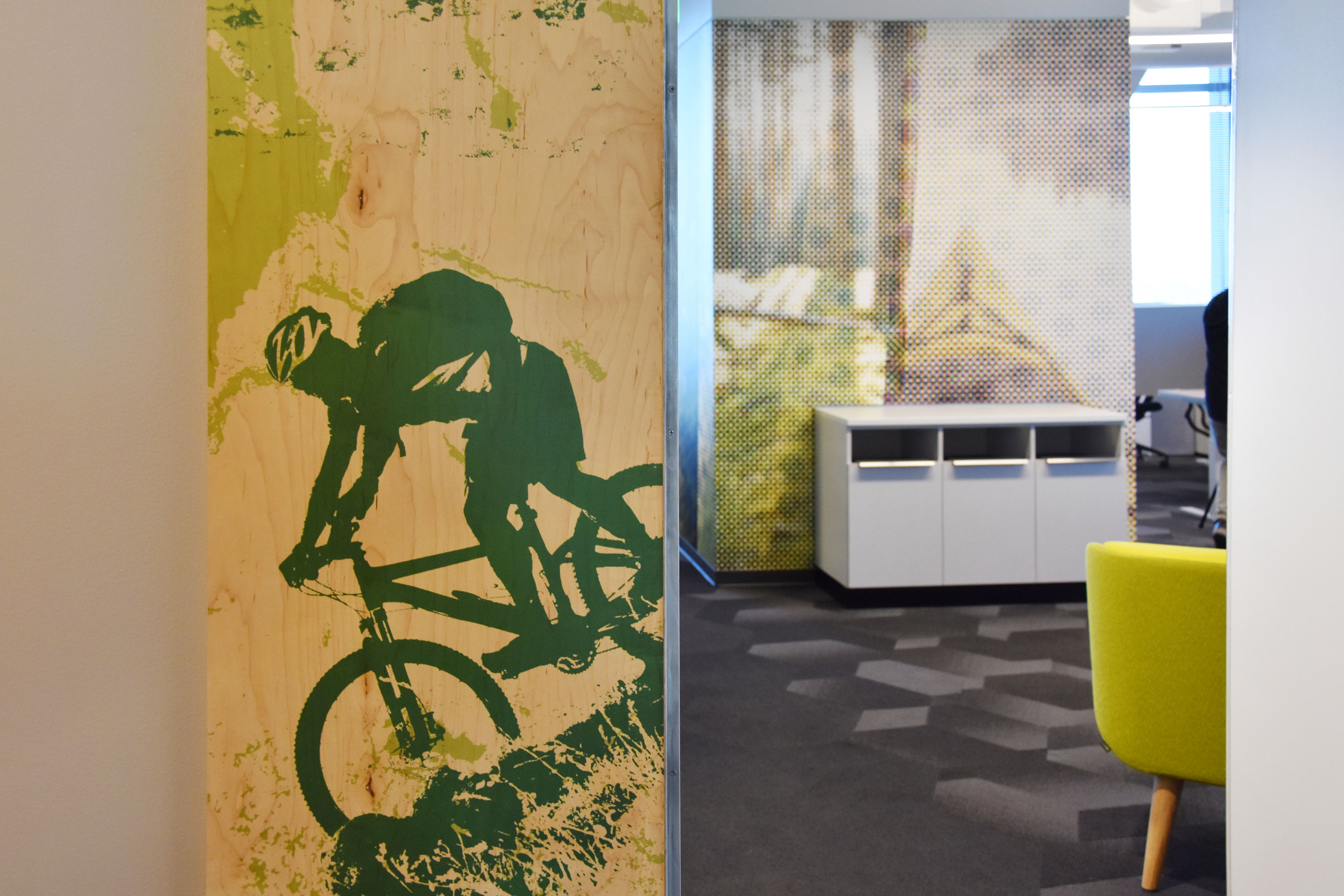
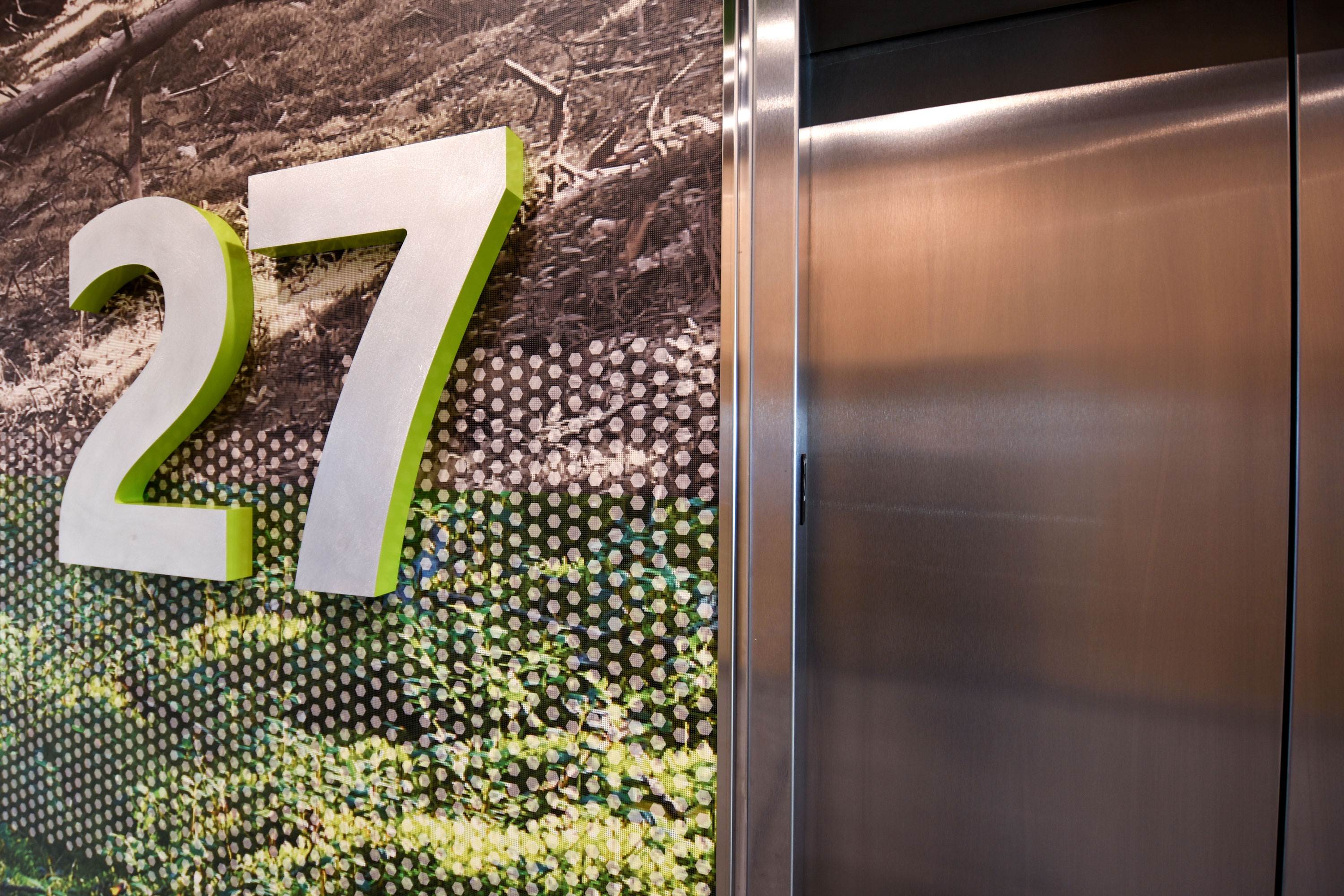
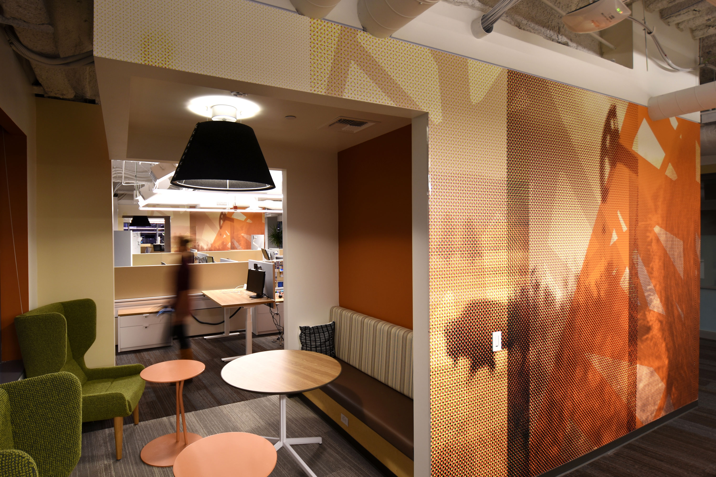
This office tenant improvement for a local tech company featured immersive wall graphics to complement new Interiors by Mithun. Designed in collaboration with Robert Murray, the interior design schemes and graphic content evoke geographical regions of the United States. The graphic package included conference room wall wraps, corner wayfinding displays and elevator lobby numbers with floor-to-ceiling wall murals. The graphics, ranging from abstract to iconic, provide character, interest, distinction, and continuity between the seven floors of the office spaces. An eco-friendly wall-covering material complemented sustainable carpet tiles and low-voc paints throughout all the floors.
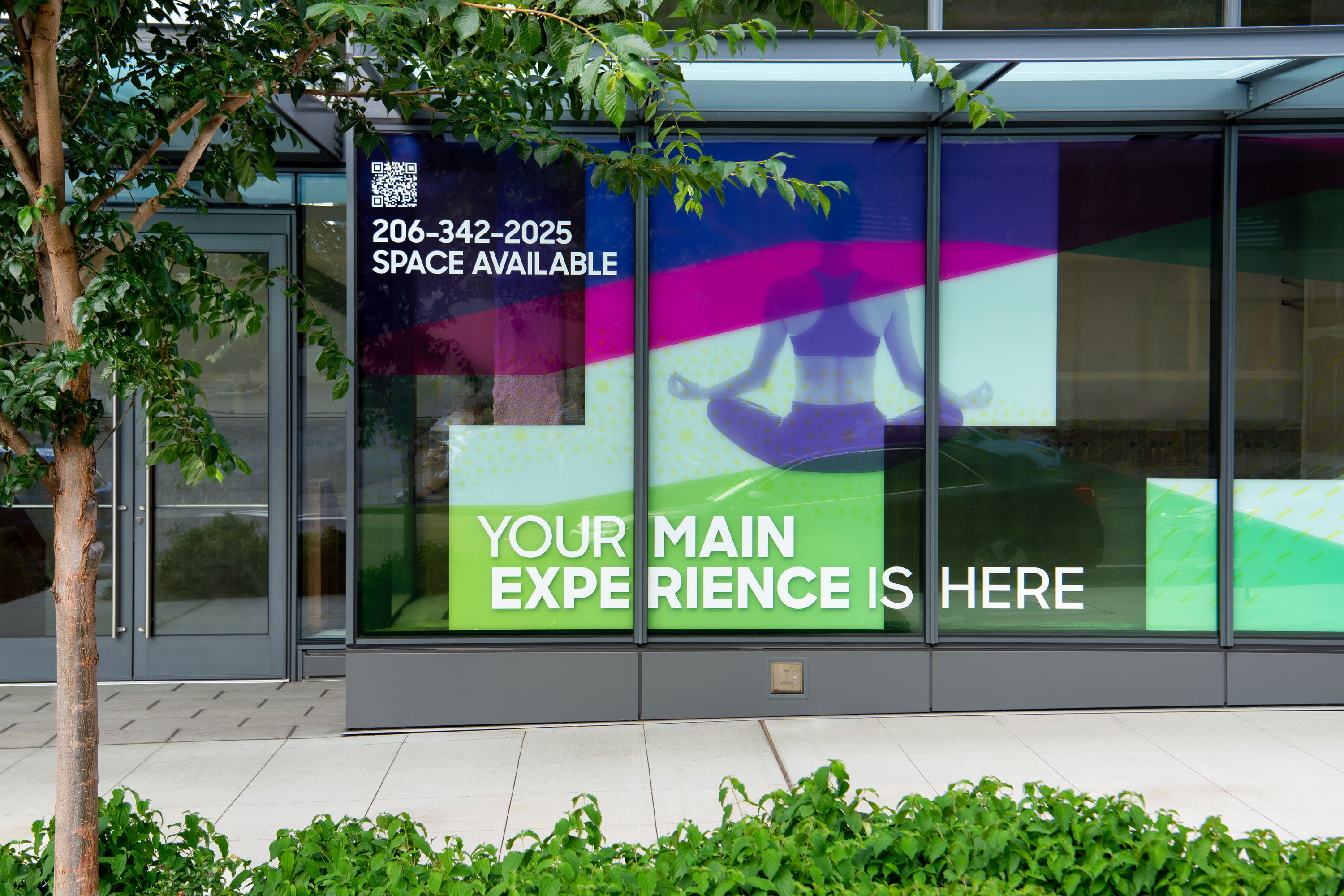
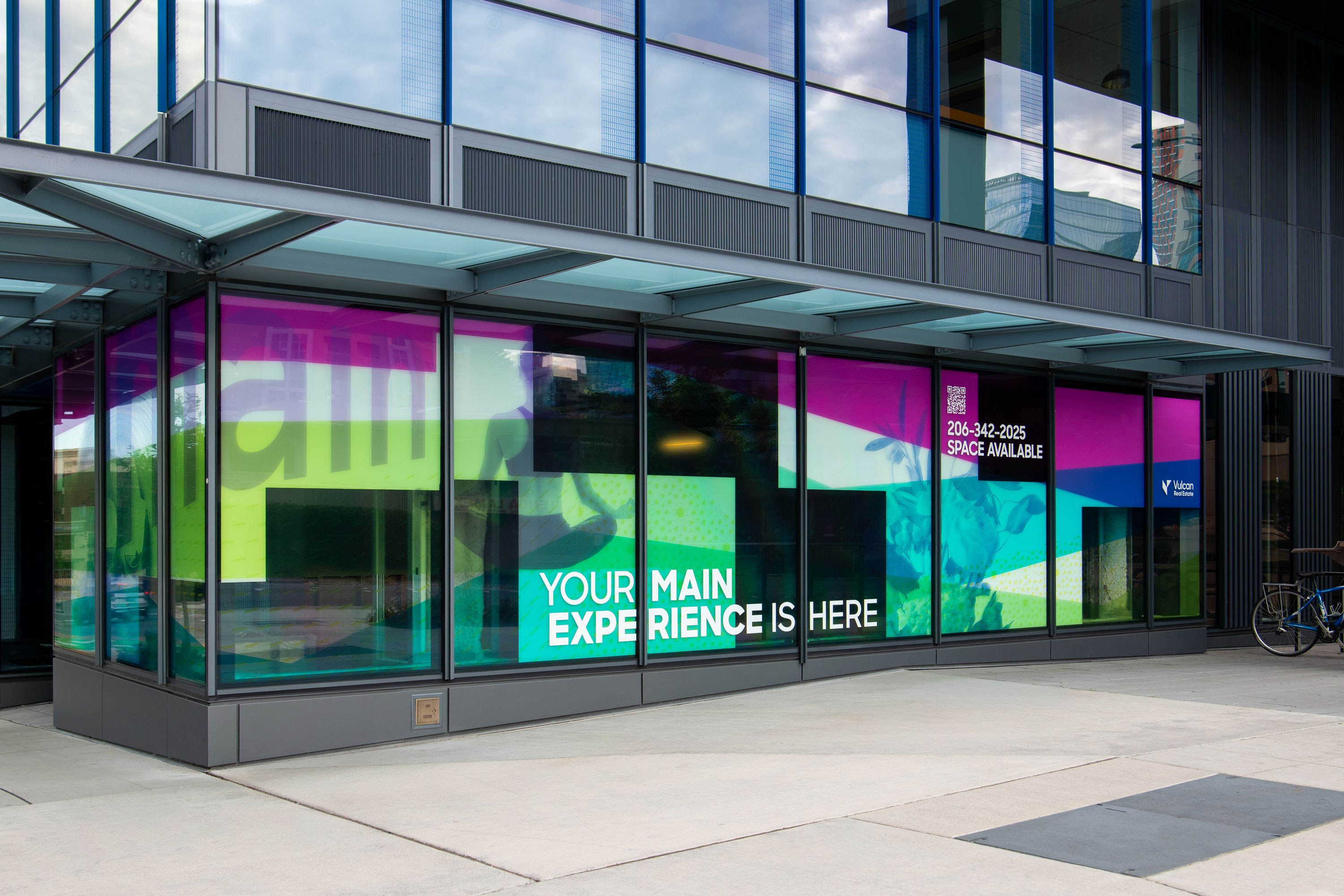
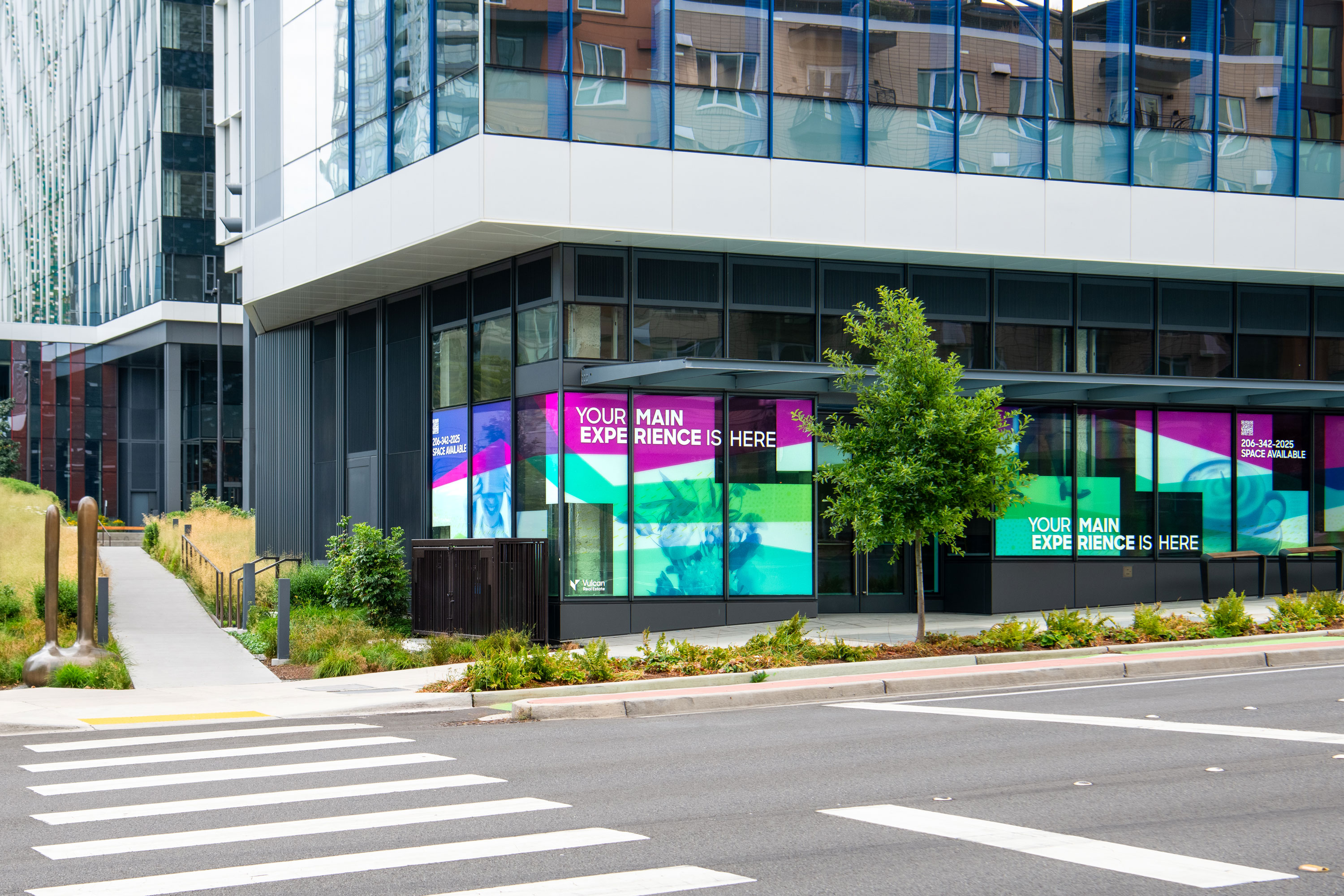
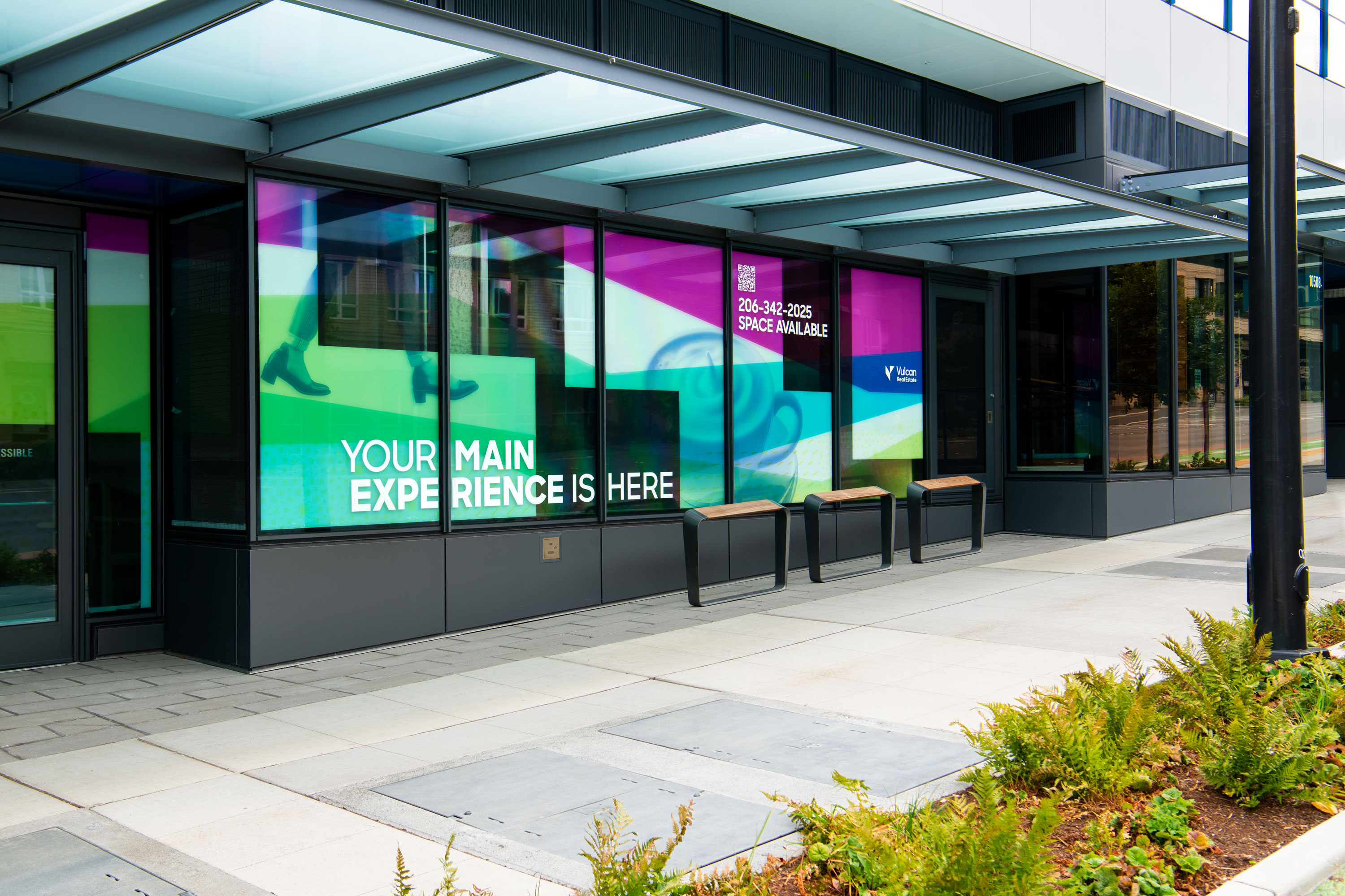
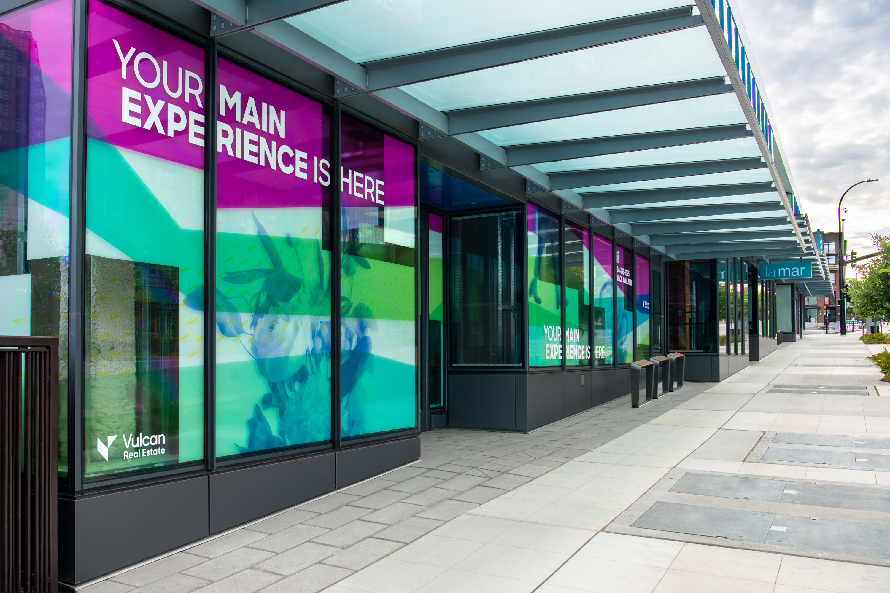
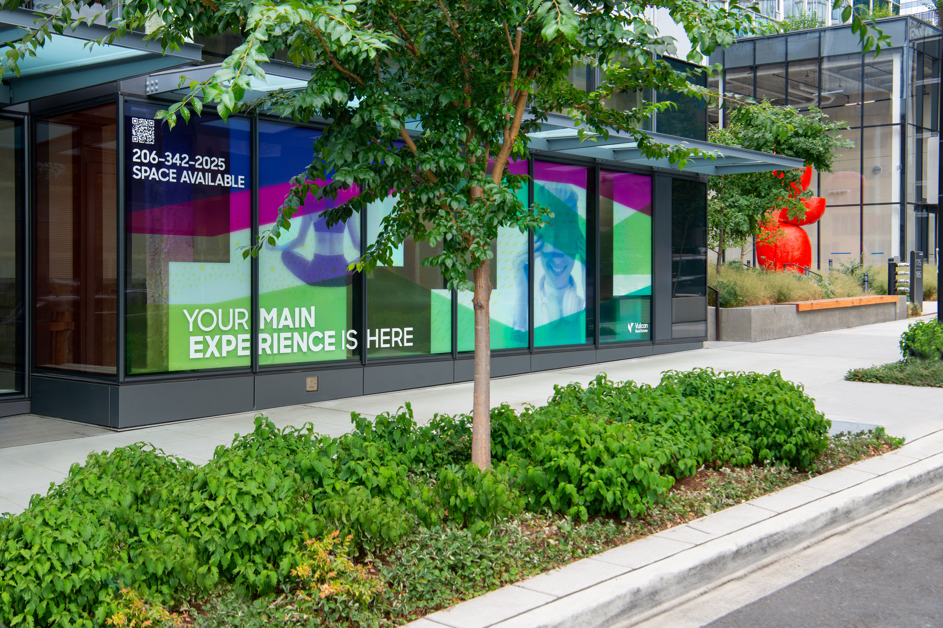
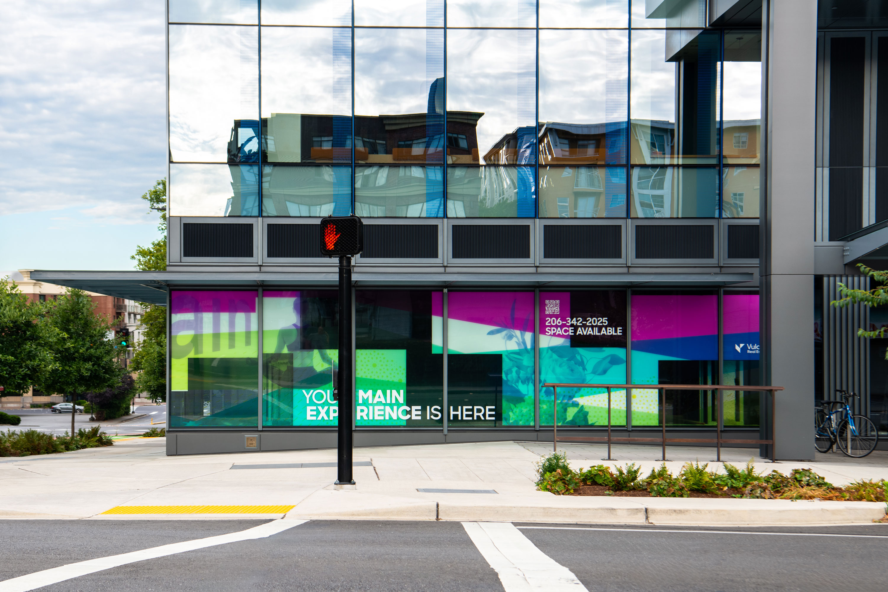
Vulcan
Real Estate
Delivery_
Environmental Graphics
Year_
2024
About_
Vulcan Real Estate needed a creative design solution to promote available Retail Space at West Main, 550 Union and Batik. Rather than standard for lease signage, the intent was to develop an enticing window graphics system that is upscale, arty, creates an attractive presence, and suits each neighborhood with unique imagery.
The resulting design is a common visual language that can be applied to glazing, with accented features and messages unique to the location. The window graphic schemes feature artistic patterns and forms evocative of the neighborhood experience and setting, complemented by messaging that communicates quality design, and the street appeal of the storefront locations.
